Donut chart in plotly with pie
Just like the matplotlib version, a donut chart in plotly is a pie chart with a hole in the middle. The pie function from plotly express accepts a hole argument directly, as a fraction of the radius.
import plotly.express as px

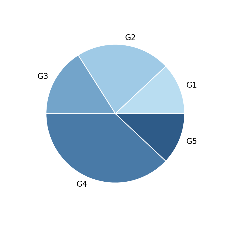
fig = px.pie(names = ["G1", "G2", "G3", "G4", "G5"],
            values = [12, 22, 16, 38, 12],
            hole = 0.4)

fig.show()
Hole size
hole is a fraction between 0 and 1, so smaller values create a bigger hole (closer to a full pie).
import plotly.express as px

fig = px.pie(names = ["G1", "G2", "G3", "G4", "G5"],
            values = [12, 22, 16, 38, 12],
            hole = 0.7)

fig.show()
Colors
Customize the fill colors with color_discrete_sequence, and the border between slices with update_traces.
import plotly.express as px

fig = px.pie(names = ["G1", "G2", "G3", "G4", "G5"],
            values = [12, 22, 16, 38, 12],
            hole = 0.4,
            color_discrete_sequence = px.colors.sequential.Blues_r)
fig = fig.update_traces(marker = dict(line = dict(color = "white", width = 2)))

fig.show()
Percentages
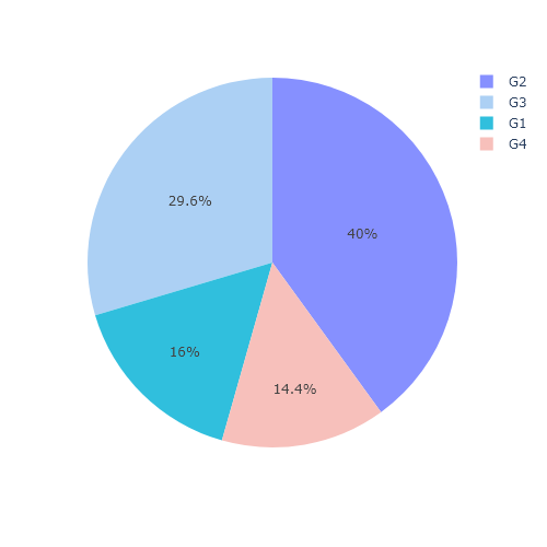
By default plotly already shows the percentage of each slice. Control what is displayed with textinfo (for example "label+percent" or "value") through update_traces.
import plotly.express as px

fig = px.pie(names = ["G1", "G2", "G3", "G4", "G5"],
            values = [12, 22, 16, 38, 12],
            hole = 0.4)
fig = fig.update_traces(textinfo = "label+percent")

fig.show()
Text in the center
Since plotly does not draw anything in the empty hole, add a summary value there with add_annotation, placed at the center of the figure (x = 0.5, y = 0.5).
import plotly.express as px

value = [12, 22, 16, 38, 12]

fig = px.pie(names = ["G1", "G2", "G3", "G4", "G5"],
            values = value,
            hole = 0.4)
fig = fig.add_annotation(text = f"Total<br>{sum(value)}",
                   x = 0.5, y = 0.5,
                   showarrow = False, font_size = 16)

fig.show()