Donut chart in matplotlib with pie
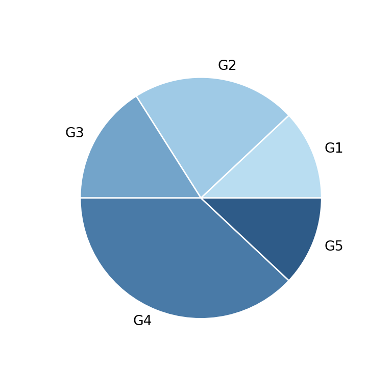
Matplotlib does not have a dedicated function for donut charts: you create one with the regular pie function and shrink the width of the wedges with the wedgeprops argument, which turns the pie into a ring.
import matplotlib.pyplot as plt

# Data
labels = ["G1", "G2", "G3", "G4", "G5"]
value = [12, 22, 16, 38, 12]

# Donut chart
fig, ax = plt.subplots()
ax.pie(value, labels = labels, wedgeprops = {"width": 0.4})

# plt.show()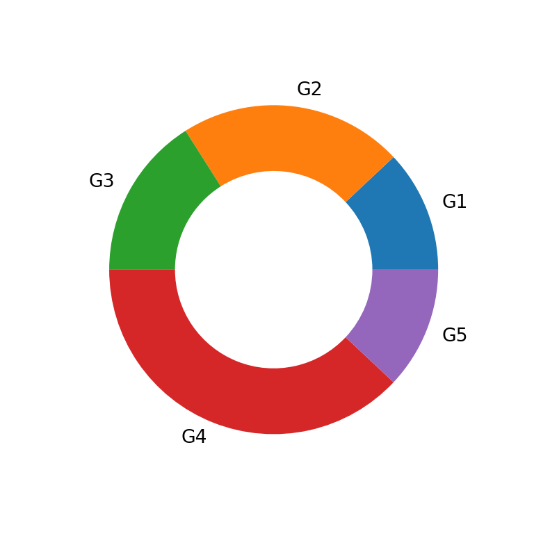
Hole size
The width key of wedgeprops sets the width of the ring as a fraction of the radius (which defaults to 1), so smaller values create a bigger hole.
import matplotlib.pyplot as plt

# Data
labels = ["G1", "G2", "G3", "G4", "G5"]
value = [12, 22, 16, 38, 12]

# Donut chart
fig, ax = plt.subplots()
ax.pie(value, labels = labels, wedgeprops = {"width": 0.2})

# plt.show()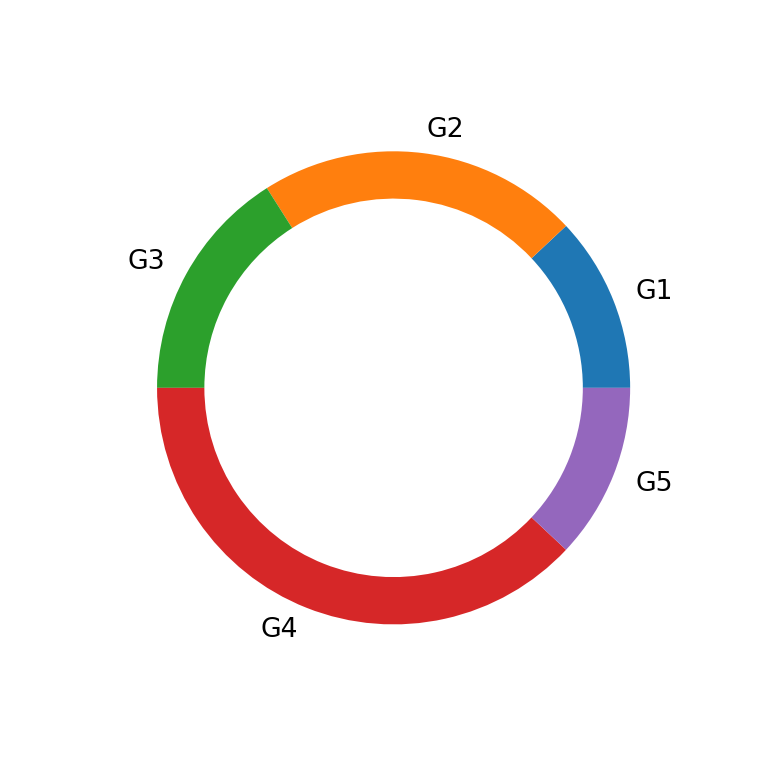
Colors
Just like a regular pie chart, the fill color of each slice can be customized with the colors argument.
import matplotlib.pyplot as plt

# Data
labels = ["G1", "G2", "G3", "G4", "G5"]
value = [12, 22, 16, 38, 12]
colors = ["#B9DDF1", "#9FCAE6", "#73A4CA", "#497AA7", "#2E5B88"]

# Donut chart
fig, ax = plt.subplots()
ax.pie(value, labels = labels, colors = colors, wedgeprops = {"width": 0.4})

# plt.show()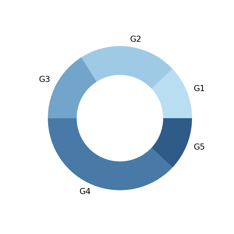
Border color
Add a border between wedges by also passing a linewidth and edgecolor to wedgeprops.
import matplotlib.pyplot as plt

# Data
labels = ["G1", "G2", "G3", "G4", "G5"]
value = [12, 22, 16, 38, 12]
colors = ["#B9DDF1", "#9FCAE6", "#73A4CA", "#497AA7", "#2E5B88"]

# Donut chart
fig, ax = plt.subplots()
ax.pie(value, labels = labels, colors = colors,
      wedgeprops = {"width": 0.4, "linewidth": 1, "edgecolor": "white"})

# plt.show()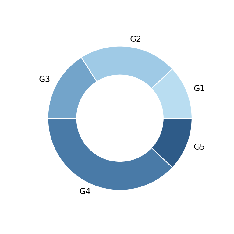
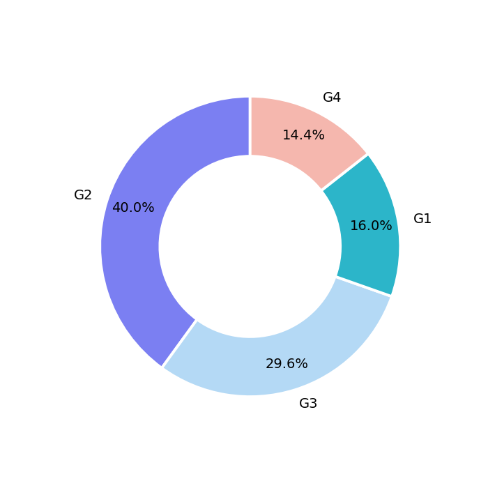
Percentages
As with a regular pie chart, pass a format string to autopct to display the percentage of each slice, and pctdistance to control how far it sits from the edge.
import matplotlib.pyplot as plt

# Data
labels = ["G1", "G2", "G3", "G4", "G5"]
value = [12, 22, 16, 38, 12]

# Donut chart
fig, ax = plt.subplots()
ax.pie(value, labels = labels, wedgeprops = {"width": 0.4},
      autopct = '%1.1f%%', pctdistance = 0.8)

# plt.show()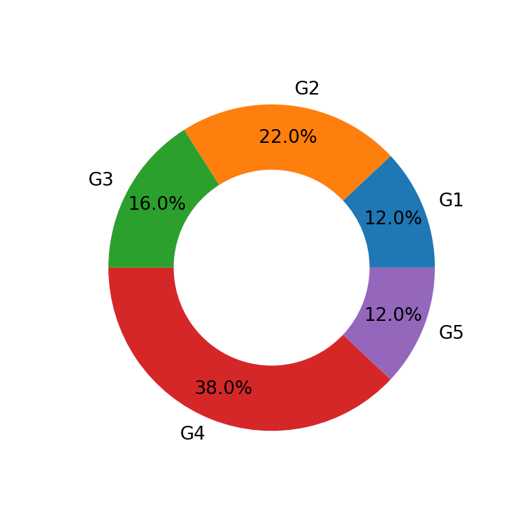
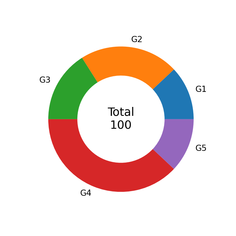
Text in the center
A common donut chart pattern is to display a summary value in the empty center, such as the total. Since the hole is just empty space, you can place any text there with ax.text.
import matplotlib.pyplot as plt

# Data
labels = ["G1", "G2", "G3", "G4", "G5"]
value = [12, 22, 16, 38, 12]

# Donut chart
fig, ax = plt.subplots()
ax.pie(value, labels = labels, wedgeprops = {"width": 0.4})
ax.text(0, 0, f"Total\n{sum(value)}", ha = "center", va = "center", fontsize = 14)

# plt.show()