The pie matplotlib function
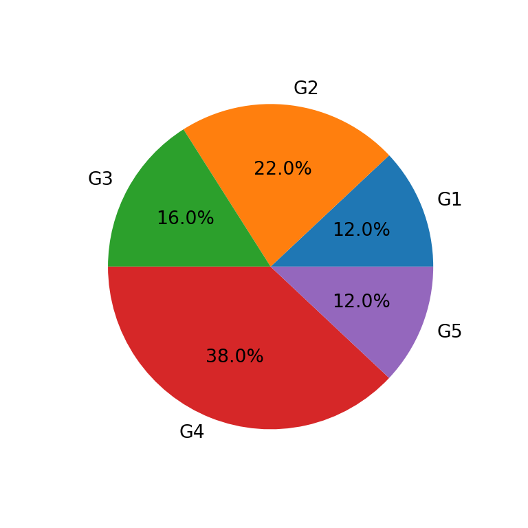
Given a set of categories or groups with their corresponding values you can make use of the pie function from matplotlib to create a pie chart in Python. Pass the labels and the values as input to the function to create a pie chart counterclockwise, as in the example below. Note that by default the area of the slices will be calculated as each value divided by the sum of values.
import matplotlib.pyplot as plt

# Data
labels = ["G1", "G2", "G3", "G4", "G5"]
value = [12, 22, 16, 38, 12]

# Pie chart
fig, ax = plt.subplots()
ax.pie(value, labels = labels)
# plt.show()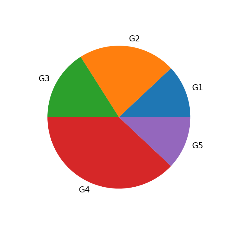
Partial pie
If your data doesn’t sum up to one and you don’t want to normalize your data you can set normalize = False, so a partial pie chart will be created.
import matplotlib.pyplot as plt

# Data
labels = ["G1", "G2", "G3", "G4", "G5"]
value = [0.1, 0.2, 0.1, 0.2, 0.1]

# Pie chart
fig, ax = plt.subplots()
ax.pie(value, labels = labels, normalize = False)
# plt.show()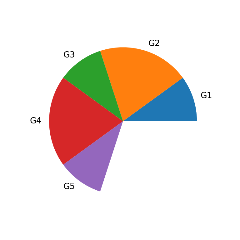
Clockwise pie chart
As stated before, the pie chart will be created by default counterclockwise. To set a clockwise direction set the argument counterclock as False.
import matplotlib.pyplot as plt

# Data
labels = ["G1", "G2", "G3", "G4", "G5"]
value = [12, 22, 16, 38, 12]

# Pie chart
fig, ax = plt.subplots()
ax.pie(value, labels = labels, counterclock = False)
# plt.show()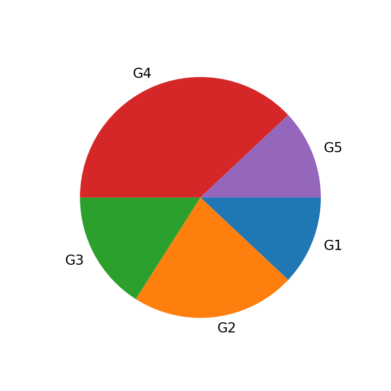
Start angle
The pie will rotate counterclockwise from the X-axis by default. You can change the start angle with startangle. As an example, if you set this argument to 90 the first slice will start to rotate counterclokwise perpendicular to the X-axis.
import matplotlib.pyplot as plt

# Data
labels = ["G1", "G2", "G3", "G4", "G5"]
value = [12, 22, 16, 38, 12]

# Pie chart
fig, ax = plt.subplots()
ax.pie(value, labels = labels, startangle = 90)
# plt.show()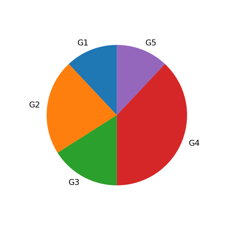
Size (radius)
The size of the pie can be controlled with the radius argument, which defaults to 1.
import matplotlib.pyplot as plt

# Data
labels = ["G1", "G2", "G3", "G4", "G5"]
value = [12, 22, 16, 38, 12]

# Pie chart
fig, ax = plt.subplots()
ax.pie(value, labels = labels, radius = 0.5)
# plt.show()
Explode
Note that you can also explode (offset) one or some slices of the pie passing an array of the length of the data to explode.
import matplotlib.pyplot as plt

# Data
labels = ["G1", "G2", "G3", "G4", "G5"]
value = [12, 22, 16, 38, 12]
explode = [0, 0, 0, 0.1, 0]

# Pie chart
fig, ax = plt.subplots()
ax.pie(value, labels = labels, explode = explode)
# plt.show()
Add a shadow
The pie function also allows adding a shadow to the pie setting the shadow argument to True.
import matplotlib.pyplot as plt

# Data
labels = ["G1", "G2", "G3", "G4", "G5"]
value = [12, 22, 16, 38, 12]

# Pie chart
fig, ax = plt.subplots()
ax.pie(value, labels = labels, shadow = True)
# plt.show()
Add the frame of the plot
You might have noticed that the default pie doesn’t display the typical frame of the charts created with matplotlib. In case you want to add it you can set frame = True.
import matplotlib.pyplot as plt

# Data
labels = ["G1", "G2", "G3", "G4", "G5"]
value = [12, 22, 16, 38, 12]

# Pie chart
fig, ax = plt.subplots()
ax.pie(value, labels = labels, frame = True)
# plt.show()
Pie chart labels
Pie chart with percentages
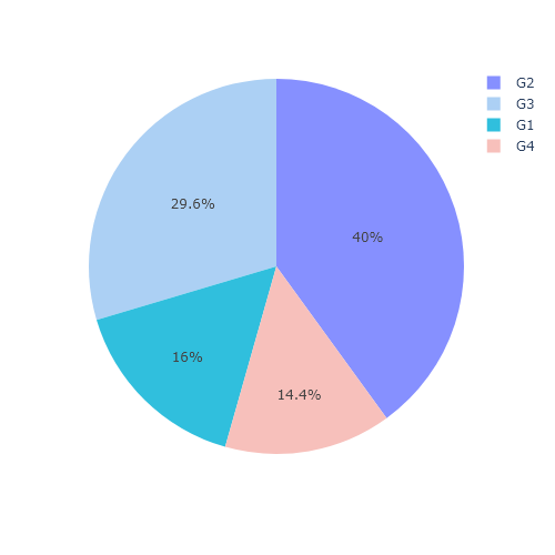
In addition to the group labels you can also display the count or the percentages for each slice with the autopct argument, as shown below.
import matplotlib.pyplot as plt

# Data
labels = ["G1", "G2", "G3", "G4", "G5"]
value = [12, 22, 16, 38, 12]

# Pie chart
fig, ax = plt.subplots()
ax.pie(value, labels = labels, autopct = '%1.1f%%')
# plt.show()
Percentage labels distance to the origin
Note that you can customize the distance of these labels from the origin and display them instead of the group labels. The default value is 0.6.
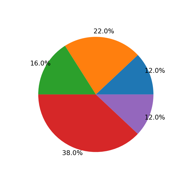
import matplotlib.pyplot as plt

# Data
labels = ["G1", "G2", "G3", "G4", "G5"]
value = [12, 22, 16, 38, 12]

# Pie chart
fig, ax = plt.subplots()
ax.pie(value, autopct = '%1.1f%%', pctdistance = 1.1)
# plt.show()
Group labels distance to the origin
In addition, you can also modify the default distance (1.1 for a slice of radius 1) of the group labels with labeldistance.
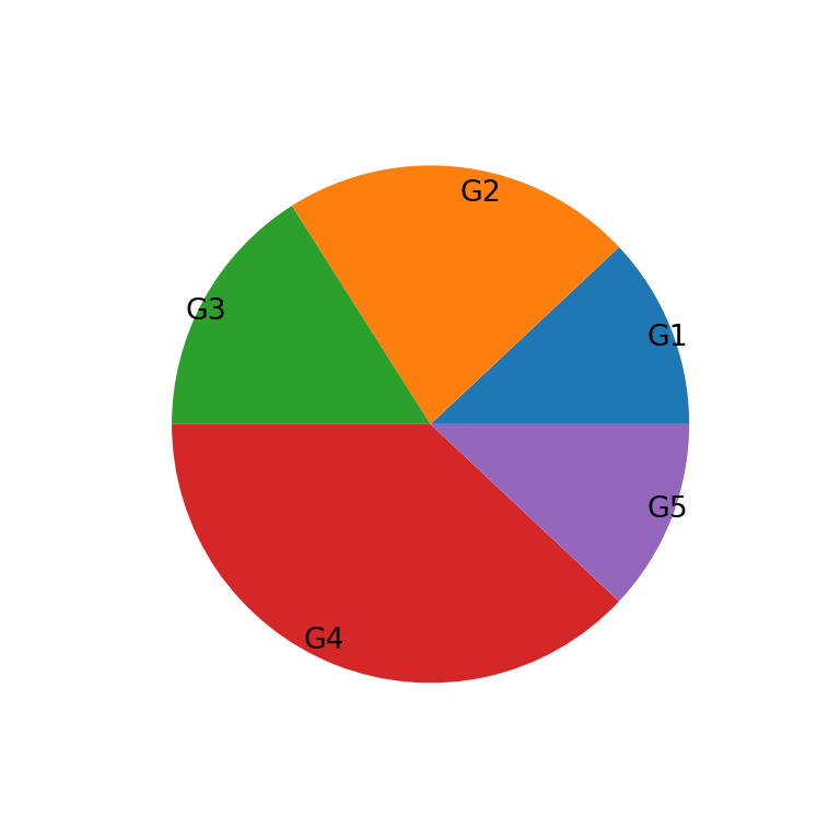
import matplotlib.pyplot as plt

# Data
labels = ["G1", "G2", "G3", "G4", "G5"]
value = [12, 22, 16, 38, 12]

# Pie chart
fig, ax = plt.subplots()
ax.pie(value, labels = labels, labeldistance = 0.9)
# plt.show()
Labels rotation
Finally, it is also possible to rotate the group labels to the angle of the corresponding slice setting rotatelabels as True.
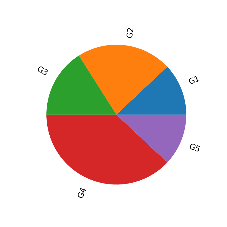
import matplotlib.pyplot as plt

# Data
labels = ["G1", "G2", "G3", "G4", "G5"]
value = [12, 22, 16, 38, 12]

# Pie chart
fig, ax = plt.subplots()
ax.pie(value, labels = labels, rotatelabels = True)
# plt.show()
Pie chart colors
The colors argument allows customizing the fill color for each slice. You can input an array of ordered colors to change the color for each category.
import matplotlib.pyplot as plt

# Data
labels = ["G1", "G2", "G3", "G4", "G5"]
value = [12, 22, 16, 38, 12]
colors = ["#B9DDF1", "#9FCAE6", "#73A4CA", "#497AA7", "#2E5B88"]

# Pie chart
fig, ax = plt.subplots()
ax.pie(value, labels = labels, colors = colors)
# plt.show()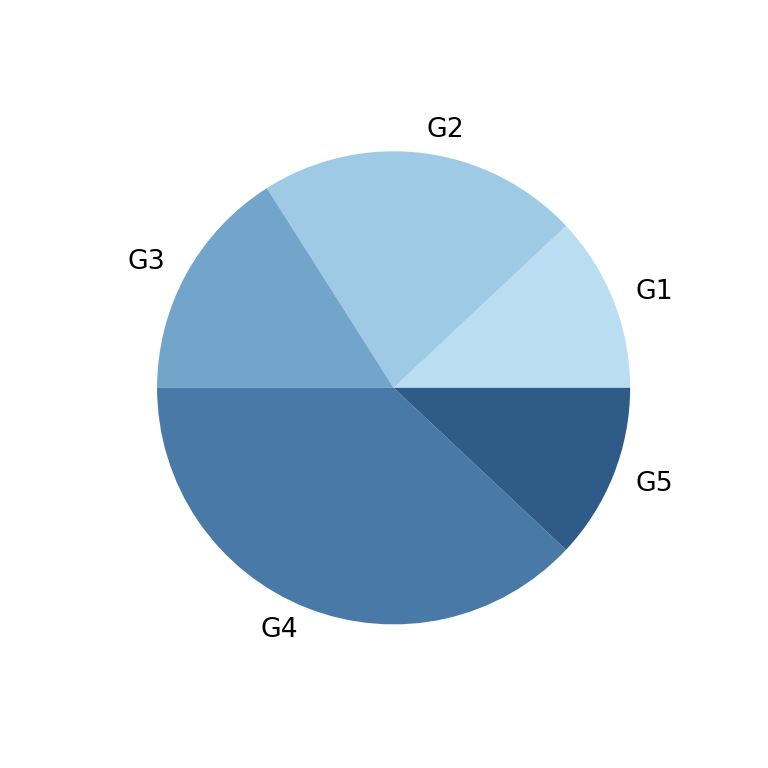
Border color
In case you want to add a border you can use the wedgeprops argument and set a line width and a border color with a dict, as in the example below.
import matplotlib.pyplot as plt

# Data
labels = ["G1", "G2", "G3", "G4", "G5"]
value = [12, 22, 16, 38, 12]
colors = ["#B9DDF1", "#9FCAE6", "#73A4CA", "#497AA7", "#2E5B88"]

# Pie chart
fig, ax = plt.subplots()
ax.pie(value, labels = labels, colors = colors,
      wedgeprops = {"linewidth": 1, "edgecolor": "white"})
# plt.show()