Treemaps in Python with squarify
The squarify library provides a function named squarify.plot which can be used to create beautiful treemaps in Python. In order to create a basic treemap pass an array of values to the sizes argument. Note that this kind of graph doesn’t need an axis, so you can remove it with plt.axis("off").
import matplotlib.pyplot as plt
import squarify

# Sample data
values = [250, 120, 280, 320, 140, 95]

# Treemap
squarify.plot(sizes = values)

# Remove the axis:
plt.axis("off")

# plt.show()
Padding
The pad argument will allow you to add some padding to the tiles of the treemap. The higher the value the higher the gaps.
import matplotlib.pyplot as plt
import squarify

# Sample data
values = [250, 120, 280, 320, 140, 95]

# Treemap
squarify.plot(sizes = values,
              pad = 0.25)

# Remove the axis:
plt.axis("off")

# plt.show()
Border
It is possible to set a border color of the rectangles with the ec argument, as in the example below.
import matplotlib.pyplot as plt
import squarify

# Sample data
values = [250, 120, 280, 320, 140, 95]

# Treemap
squarify.plot(sizes = values,
              ec = 'black')

# Remove the axis:
plt.axis("off")

# plt.show()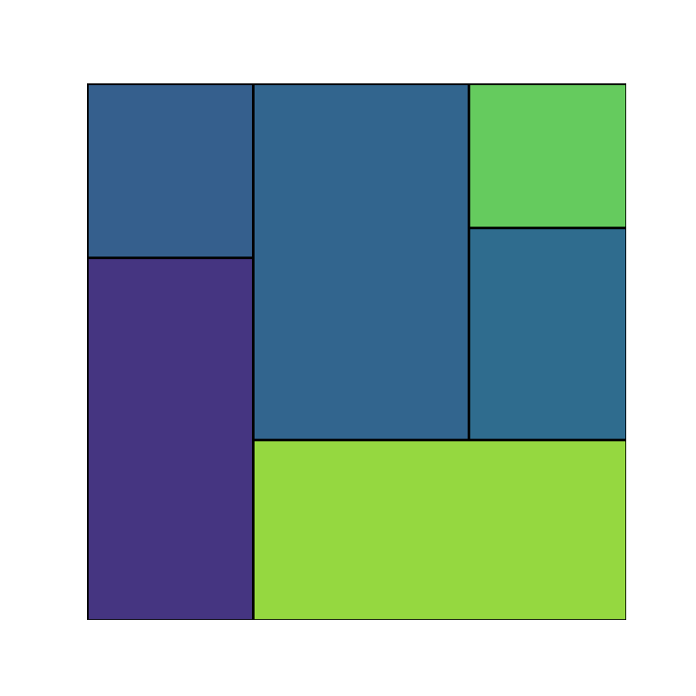
Axis scaling
By default, treemaps made with squarify are of size 100x100, but with the norm_x and norm_y arguments you can override the dimensions if needed of the X and Y-axis, respectively.
import matplotlib.pyplot as plt
import squarify

# Sample data
values = [250, 120, 280, 320, 140, 95]

# Treemap
squarify.plot(sizes = values,
              norm_x = 200,
              norm_y = 20)

# plt.show()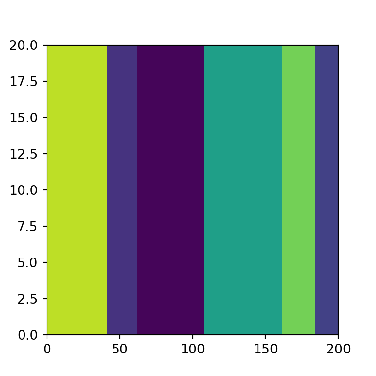
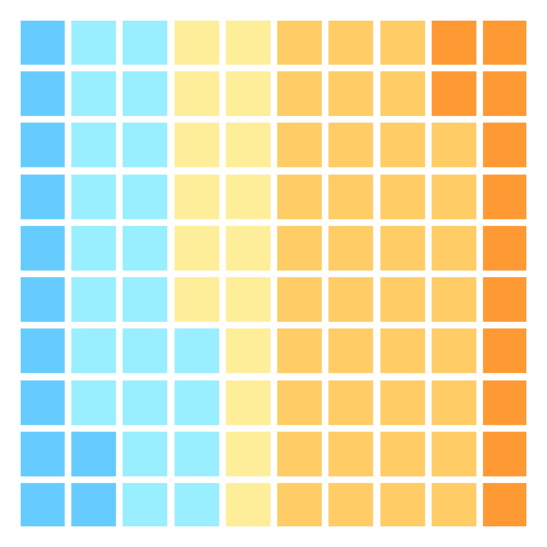
Color palettes
Squarify uses by default random colors from the viridis color palette, so each time you call the plot you will get a different result. If you want to set custom colors you can make use of the color argument and input an array of colors. Note that you can control the transparency of the colors with alpha.

import matplotlib.pyplot as plt
import squarify

# Sample data
values = [250, 120, 280, 320, 140, 95]
colors = ['#91DCEA', '#64CDCC', '#5FBB68',
          '#F9D23C', '#F9A729', '#FD6F30']

squarify.plot(sizes = values,
              color = colors, alpha = 0.7)

# Remove the axis:
plt.axis("off")

# plt.show()
You can also use a predefined color palette instead of specifying an array of colors. In the example below we are using the 'magma' color palette from seaborn.

import matplotlib.pyplot as plt
import squarify
import seaborn as sb

# Sample data
values = [250, 120, 280, 320, 140, 95]

# Treemap
squarify.plot(sizes = values,
              color = sb.color_palette("magma",
                                     len(values)), alpha = 0.7)

# Remove the axis:
plt.axis("off")

# plt.show()
Adding labels
It is possible to add labels to each division of the treemap. For this purpose you can use the label argument.
import matplotlib.pyplot as plt
import squarify

# Sample data
values = [250, 120, 280, 320, 140, 95]
labels = ['Group 1\n 250', 'Group 2\n 120', 'Group 3\n 280',
          'Group 4\n 320', 'Group 5\n 140', 'Group 6\n 95']
colors = ['#91DCEA', '#64CDCC', '#5FBB68',
          '#F9D23C', '#F9A729', '#FD6F30']

# Treemap
squarify.plot(sizes = values, label = labels,
              color = colors, alpha = 0.7)

# Remove the axis:
plt.axis("off")

# plt.show()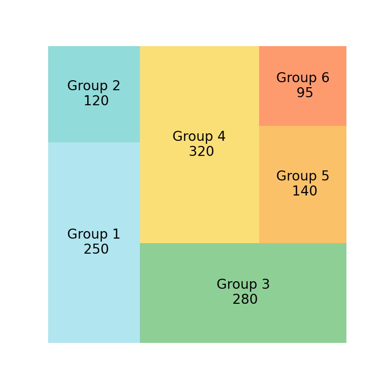
If you want to add the name for each group and the corresponding value you can use \n to split the string in two lines, as in the previuos example.
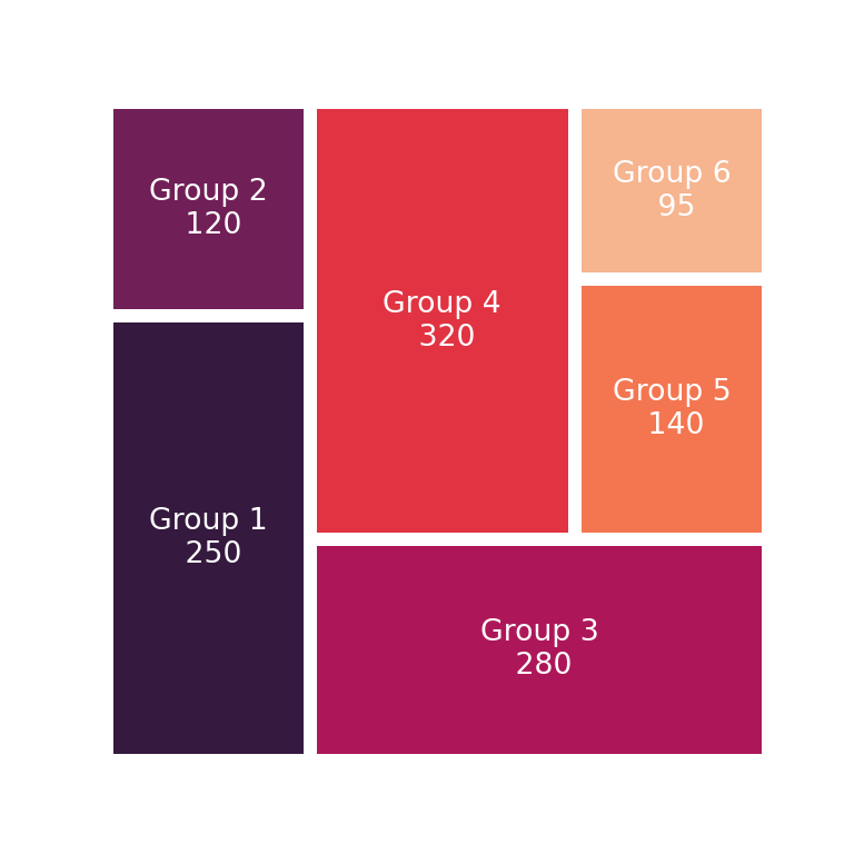
Labels customization
The text styling of the labels can be overriden passing a dict to text_kwargs. In the following example we are customizing the font size and the color of the texts, as the color palette used is very dark and white text will be easier to read.
import matplotlib.pyplot as plt
import squarify
import seaborn as sb

# Sample data
values = [250, 120, 280, 320, 140, 95]
labels = ['Group 1\n 250', 'Group 2\n 120', 'Group 3\n 280',
          'Group 4\n 320', 'Group 5\n 140', 'Group 6\n 95']

# Treemap
squarify.plot(sizes = values, label = labels,
              pad = 0.2,
              text_kwargs = {'fontsize': 10, 'color': 'white'},
              color = sb.color_palette("rocket", len(values)))

# Remove the axis:
plt.axis("off")

# plt.show()