Stacked bar charts in Python
Stacked bar charts represent the values which take different groups within other groups. For instance, consider that people living in five different cities (e.g., the groups, named 'G1', 'G2', 'G3', 'G4' and 'G5') answered Yes or No to one question and the results (the count of Yes and No for each city) were stored into values1 and values2 variables.
This data can be represented in Python with the bar function from matplotlib making use of the bottom argument, which represents the Y coordinates used to draw the bottom of the bars, so you can stack several bars.
import matplotlib.pyplot as plt

# Data
groups = ['G1', 'G2', 'G3', 'G4', 'G5']
values1 = [12, 19, 14, 27, 16]
values2 = [21, 30, 15, 17, 20]

fig, ax = plt.subplots()

# Stacked bar chart
ax.bar(groups, values1)
ax.bar(groups, values2, bottom = values1)

# plt.show()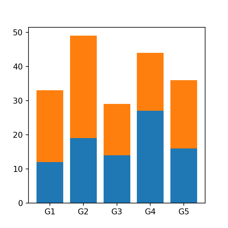
Stacked bar plot with three subgroups
If you have to stack more than two subgroups you will need to pass the added values of the previous data to bottom, as in the example below.
import matplotlib.pyplot as plt
import numpy as np

# Data
groups = ['G1', 'G2', 'G3', 'G4', 'G5']
values1 = [12, 19, 14, 27, 16]
values2 = [21, 30, 15, 17, 20]
values3 = [15, 23, 12, 11, 15]

fig, ax = plt.subplots()

# Stacked bar chart
ax.bar(groups, values1)
ax.bar(groups, values2, bottom = values1)
ax.bar(groups, values3, bottom = np.add(values1, values2))

# plt.show()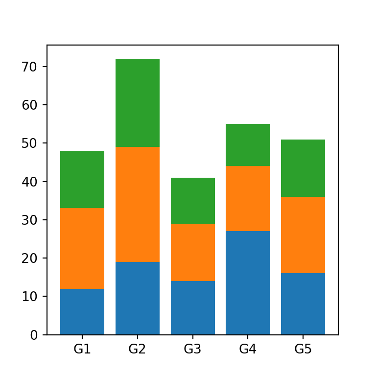
Generalization with multiple subgroups
However, if you don’t want to stack the values manually of the stacked bar graph you can join the values into a numpy array and then use the following for loop:
import matplotlib.pyplot as plt
import numpy as np

# Data
groups = ['G1', 'G2', 'G3', 'G4', 'G5']

values = np.array([[12, 19, 14, 27, 16],
                  [21, 30, 15, 17, 20],
                  [15, 23, 12, 11, 15],
                  [2, 5, 1, 6, 8]])

fig, ax = plt.subplots()

# Stacked bar chart with loop
for i in range(values.shape[0]):
  ax.bar(groups, values[i], bottom = np.sum(values[:i], axis = 0))

# plt.show()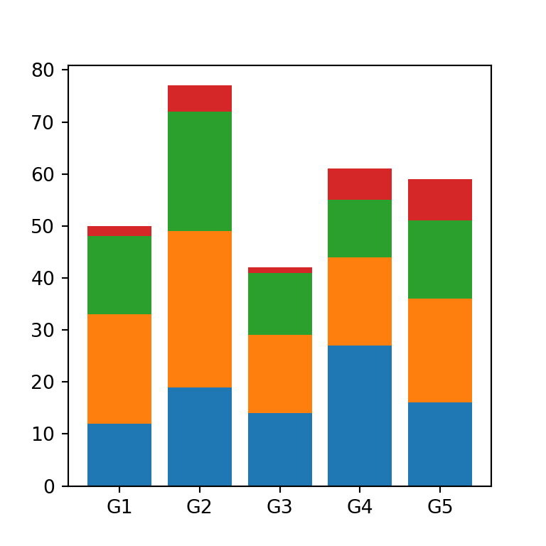
Bars width
The width argument controls the width of the bars. The default value is 0.8.
import matplotlib.pyplot as plt

# Data
groups = ['G1', 'G2', 'G3', 'G4', 'G5']
values1 = [12, 19, 14, 27, 16]
values2 = [21, 30, 15, 17, 20]
width = 0.25

fig, ax = plt.subplots()

# Stacked bar chart
ax.bar(groups, values1, width = width)
ax.bar(groups, values2, width = width, bottom = values1)

# plt.show()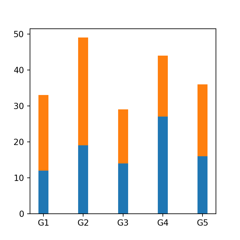
Error bars
You can add error bars to the stacked bar plot with the yerr argument. You will need to input the standard deviation for each subgroup. Note that you can customize the color of the error bars with ecolor and the size of the caps with capsize.
import matplotlib.pyplot as plt

# Data
groups = ['G1', 'G2', 'G3', 'G4', 'G5']
values1 = [12, 19, 14, 27, 16]
values2 = [21, 30, 15, 17, 20]
values1_std = [2, 1, 3, 0.5, 2]
values2_std = [1, 4, 0.25, 0.75, 1]

fig, ax = plt.subplots()

# Stacked bar chart
ax.bar(groups, values1, yerr = values1_std, ecolor = 'red')
ax.bar(groups, values2, yerr = values2_std, ecolor = 'green', bottom = values1)

# plt.show()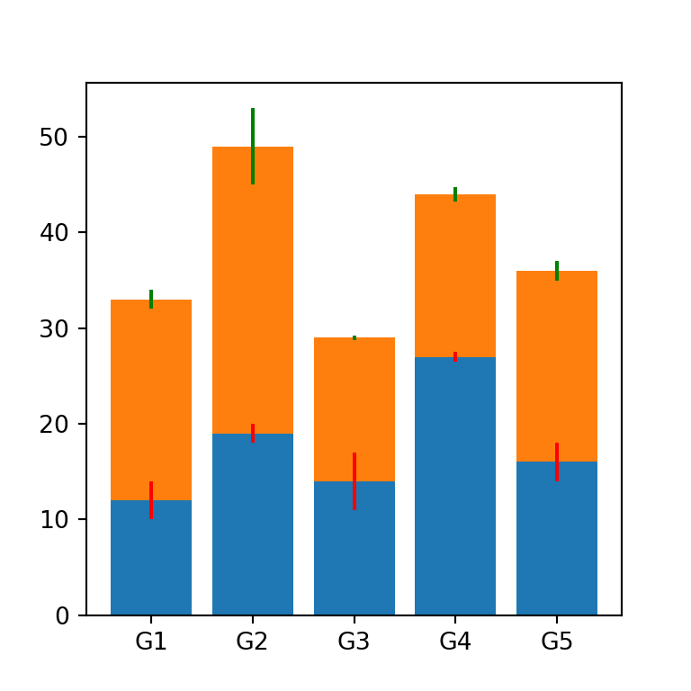
Color customization
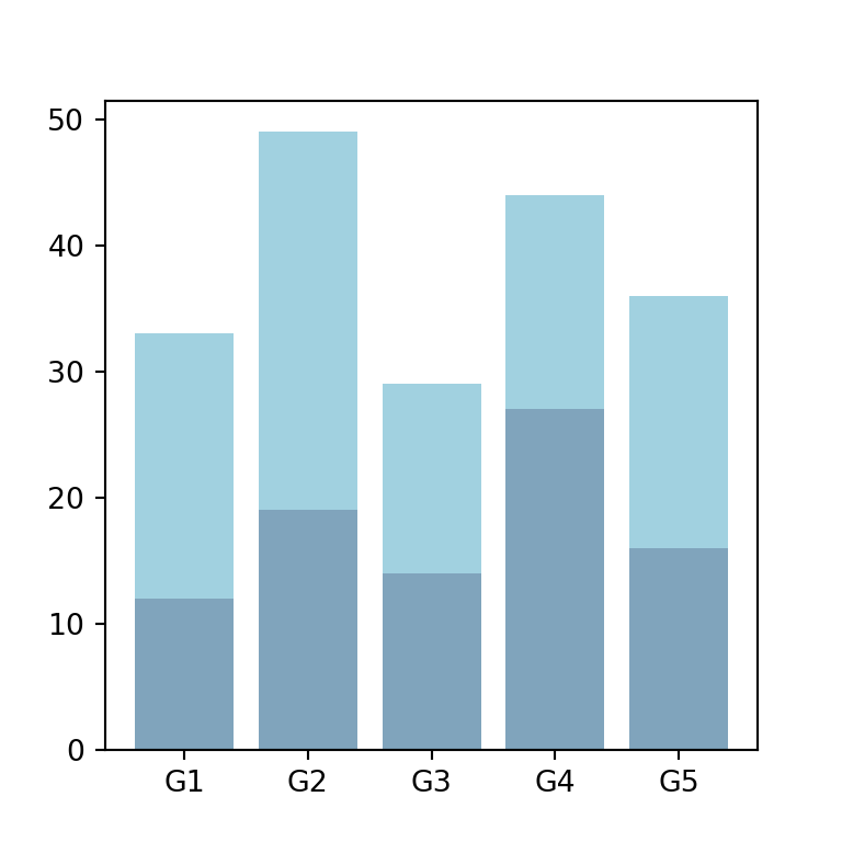
The color of the bars for each subgroup can be customized through the color argument. Note that you can also customize the transparency of the colors with alpha.
import matplotlib.pyplot as plt

# Data
groups = ['G1', 'G2', 'G3', 'G4', 'G5']
values1 = [12, 19, 14, 27, 16]
values2 = [21, 30, 15, 17, 20]

fig, ax = plt.subplots()

# Stacked bar chart
ax.bar(groups, values1, color = "#024b7a", alpha = 0.5)
ax.bar(groups, values2, bottom = values1, color = "#44a5c2", alpha = 0.5)

# plt.show()
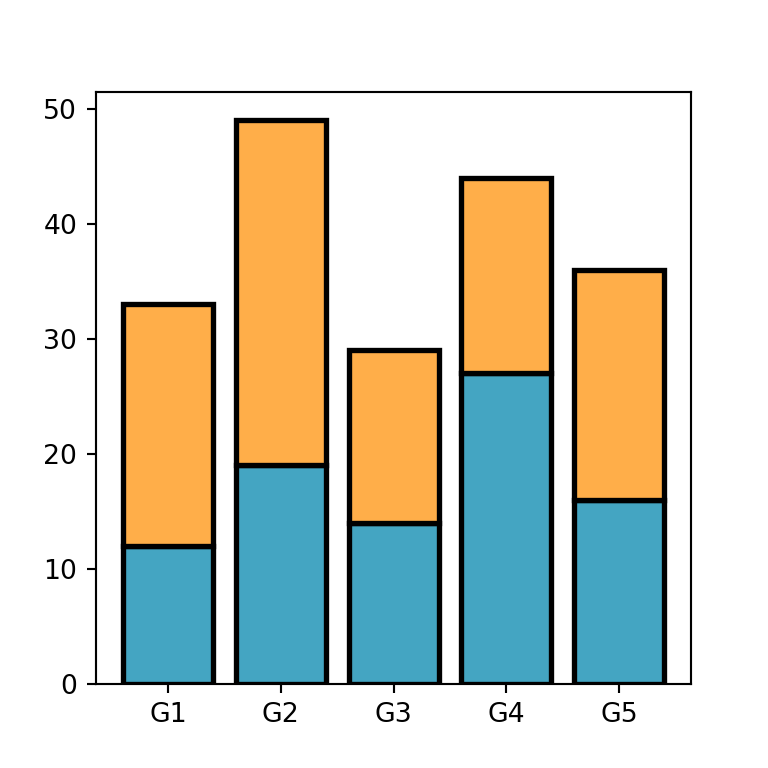
In addition, you can modify the border color and width of the bars with edgecolor and linewidth, respectively.
import matplotlib.pyplot as plt

# Data
groups = ['G1', 'G2', 'G3', 'G4', 'G5']
values1 = [12, 19, 14, 27, 16]
values2 = [21, 30, 15, 17, 20]

fig, ax = plt.subplots()

# Stacked bar chart
ax.bar(groups, values1, color = "#44a5c2",
       edgecolor = "black", linewidth = 2)
ax.bar(groups, values2, bottom = values1, color = "#ffae49",
       edgecolor = "black", linewidth = 2)

# plt.show()
Adding a legend for the subgroups
You can set a label for each subgroup with the label argument. Then, you can make use of the legend function to add the legend to the plot, as in the example below.
import matplotlib.pyplot as plt

# Data
groups = ['G1', 'G2', 'G3', 'G4', 'G5']
values1 = [12, 19, 14, 27, 16]
values2 = [21, 30, 15, 17, 20]

fig, ax = plt.subplots()

# Stacked bar chart
ax.bar(groups, values1, label = "Yes")
ax.bar(groups, values2, bottom = values1, label = "No")

ax.legend()
ax.set_ylabel('Number of answers')

# plt.show()
Stacked bar chart with labels
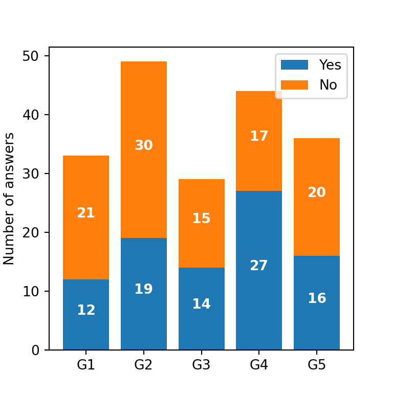
You can display the numerical values for each bar within the stack with the text function from matplotlib. In order to add them, you can use a for loop like the following:
import matplotlib.pyplot as plt

# Data
groups = ['G1', 'G2', 'G3', 'G4', 'G5']
values1 = [12, 19, 14, 27, 16]
values2 = [21, 30, 15, 17, 20]

fig, ax = plt.subplots()

# Stacked bar chart
ax.bar(groups, values1, label = "Yes")
ax.bar(groups, values2, bottom = values1, label = "No")

# Labels
for bar in ax.patches:
  ax.text(bar.get_x() + bar.get_width() / 2,
          bar.get_height() / 2 + bar.get_y(),
          round(bar.get_height()), ha = 'center',
          color = 'w', weight = 'bold', size = 10)

ax.legend()
ax.set_ylabel('Number of answers')

# plt.show()
Total value labels
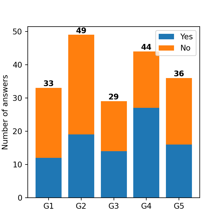
Alternatively, you can add labels representing the total value for each group or bar. For this purpose, you will need to add the values and then use a for loop to loop through each label, as in the following example.
import matplotlib.pyplot as plt
import numpy as np

# Data
groups = ['G1', 'G2', 'G3', 'G4', 'G5']
values1 = [12, 19, 14, 27, 16]
values2 = [21, 30, 15, 17, 20]

fig, ax = plt.subplots()

# Stacked bar chart
ax.bar(groups, values1, label = "Yes")
ax.bar(groups, values2, bottom = values1, label = "No")

# Sum of values
total_values = np.add(values1, values2)

# Total values labels
for i, total in enumerate(total_values):
  ax.text(i, total + 0.5, round(total),
          ha = 'center', weight = 'bold', color = 'black')

ax.legend()
ax.set_ylabel('Number of answers')

plt.show()


