Funnel charts in plotly with funnel
A funnel chart represents data in different stages of a process, generally a sales funnel. It can be used as a tool to find bottlenecks of a business process. When using plotly and Python you can create a funnel plot with the funnel function from plotly express module. You will need to input values to x and the stages to y.
import plotly.express as px
import pandas as pd

# Sample data
df = pd.DataFrame(dict(
    stage = ['Sent', 'Received', 'Clicks', 'Sales'],
    percentage = [100, 70, 30, 10]))

fig = px.funnel(df, x = 'percentage', y = 'stage', title = "Funnel title")

# Alternative:
# fig = px.funnel(x = [100, 70, 30, 10],
#                 y = ['Sent', 'Received', 'Clicks', 'Sales'], title = "Funnel title")

fig.show()
Texts
The function provides an argument named text that allows passing other array or column name as input to add texts in addition of the default values. In the following example we are passing the total number of people for each stage.
import plotly.express as px
import pandas as pd

# Sample data
df = pd.DataFrame(dict(
    stage = ['Sent', 'Received', 'Clicks', 'Sales'],
    percentage = [100, 70, 30, 10],
    number = [5000, 3500, 1500, 500]))

fig = px.funnel(df, x = 'percentage', y = 'stage', text = 'number')

fig.show()
Color
Making use of the color_discrete_sequence argument you can customize the default color of the stages. Note that with update_traces you can control other styling, such as the font color.
import plotly.express as px
import pandas as pd

# Sample data
df = pd.DataFrame(dict(
    stage = ['Sent', 'Received', 'Clicks', 'Sales'],
    percentage = [100, 70, 30, 10],
    number = [5000, 3500, 1500, 500]))

fig = px.funnel(df, x = 'percentage', y = 'stage',
                color_discrete_sequence = ['lightcoral'], opacity = 1)
fig.update_traces(textfont = {'color': 'white'})

fig.show()
Highlighting a stage
You can also customize the border style for each stage with update_traces. This will allow you to highlight some stages, as in the example below.
import plotly.express as px
import pandas as pd

# Sample data
df = pd.DataFrame(dict(
    stage = ['Sent', 'Received', 'Clicks', 'Sales'],
    percentage = [100, 70, 30, 10]))

fig = px.funnel(df, x = 'percentage', y = 'stage',
                color_discrete_sequence = ['lightcoral'], opacity = 1)
fig.update_traces(marker = {'line': {'width': [1, 1, 3, 1], 'color': ['gray', 'gray', 'blue', 'gray']}})

fig.show()
Several groups
The funnel function can be used to compare several groups, categories or campaigns. You will need to pass your categorical variable to color for this purpose.
import plotly.express as px
import pandas as pd

# Sample data
df = pd.DataFrame(dict(
    stage = ['Sent', 'Received', 'Clicks', 'Sales',
             'Sent', 'Received', 'Clicks', 'Sales'],
    percentage = [70, 32, 20, 4,
                  30, 38, 10, 6],
    campaign = ['C1', 'C1', 'C1', 'C1',
                'C2', 'C2', 'C2', 'C2']))

fig = px.funnel(df, x = 'percentage', y = 'stage', color = 'campaign')

fig.show()
Note that you can change the default color for each group passing an array with as many colors as groups to color_discrete_sequence or specifying the color for each group with color_discrete_map.
import plotly.express as px
import pandas as pd

# Sample data
df = pd.DataFrame(dict(
    stage = ['Sent', 'Received', 'Clicks', 'Sales',
             'Sent', 'Received', 'Clicks', 'Sales'],
    percentage = [70, 32, 20, 4,
                  30, 38, 10, 6],
    campaign = ['C1', 'C1', 'C1', 'C1',
                'C2', 'C2', 'C2', 'C2']))

fig = px.funnel(df, x = 'percentage', y = 'stage', color = 'campaign',
                color_discrete_map = {'C1': '#FFDD71', 'C2': '#9FCD99'})
fig.update_traces(textfont = {'color': 'white'})

fig.show()
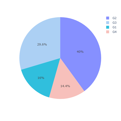
Area funnel plot with funnel_area
An alternative function to the previous is funnel_area, which calculates the percentage associated to each stage and scales the area of each stage to the calculated percentage. The syntax is very similar to funnel, but the arguments are name names and values instead of x and y.
import plotly.express as px
import pandas as pd

# Sample data
df = pd.DataFrame(dict(
    stage = ['Sent', 'Received', 'Clicks', 'Sales'],
    number = [50, 20, 15, 10]))

fig = px.funnel_area(df, names = 'stage', values = 'number')

fig.show()
Recall that the color for each stage can also be customized with color_discrete_sequence.
import plotly.express as px
import pandas as pd

# Sample data
df = pd.DataFrame(dict(
    stage = ['Sent', 'Received', 'Clicks', 'Sales'],
    number = [50, 20, 15, 10]))

fig = px.funnel_area(df, names = 'stage', values = 'number',
                     color_discrete_sequence = ['red', 'blue', 'orange', 'green'])

fig.show()