Waffle charts with pywaffle
A waffle chart is an alternative to pie charts that display the proportion of different groups with tiles. In order to create waffle charts in Python we will use the pywaffle library, which is based on matplotlib. This libary provides a function constructor class named Waffle which can be passed to matplotlib.pyplot.figure.
Absolute values
Consider that you have an array that represents the count of observations for different groups. If you want to create a waffle plot with absolute values, so each group will have as many tiles as its corresponding value, you will need to specify FigureClass = Waffle, input the array to values and then specify the number of rows or columns with rows and columns. You will need to specify only one of these arguments for absolute values.
from pywaffle import Waffle
import matplotlib.pyplot as plt

# Data
value = [12, 22, 16, 38, 12]

# Waffle chart
plt.figure(
    FigureClass = Waffle,
    rows = 10,
    values = value)

# plt.show()
Relative values (auto-scaling)
If you specify both the number of rows and columns and the chart size is not equal to the sum of values, then the values will be scaled to fit the chart. The rounding rule can be modified with the rounding_rule argument, which can take one of the following rules as input: 'nearest' (the default) 'floor' or 'ceil'.
from pywaffle import Waffle
import matplotlib.pyplot as plt

# Data
value = [12, 22, 16, 38, 12]

# Waffle chart
plt.figure(
    FigureClass = Waffle,
    rows = 5,
    columns = 5,
    values = value)

# plt.show()
Title
You can set a title to the waffle chart with the title argument. You will need to input a dict with the desired parameters.
from pywaffle import Waffle
import matplotlib.pyplot as plt

# Data
value = [12, 22, 16, 38, 12]

# Waffle chart
plt.figure(
    FigureClass = Waffle,
    rows = 10,
    columns = 10,
    values = value,
    title = {"label": "Title of the chart", "loc": "right", "size": 15})

# plt.show()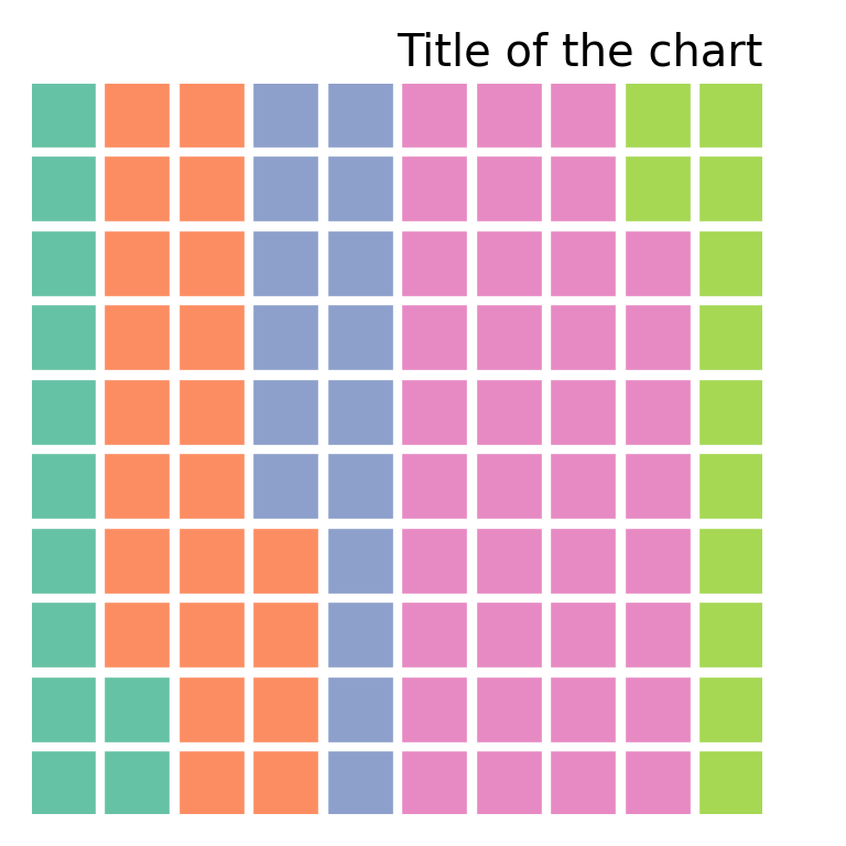
Spacing and aspect ratio
The spacing of the tiles defaults to 0.2 and can be customized with interval_ratio_x for the X-axis and with interval_ratio_y for the Y-axis. You can also customize the aspect ratio of the tiles with block_aspect_ratio, which defaults to 1.
from pywaffle import Waffle
import matplotlib.pyplot as plt

# Data
value = [12, 22, 16, 38, 12]

# Waffle chart
plt.figure(
    FigureClass = Waffle,
    rows = 10,
    columns = 10,
    values = value,
    interval_ratio_x = 1,
    interval_ratio_y = 2,
    block_aspect_ratio = 1.25)

# plt.show()
Tiles direction
The different groups are ordered by default by columns, from left to right. However, if you set vertical = True the groups will be stacked from bottom to top.
from pywaffle import Waffle
import matplotlib.pyplot as plt

# Data
value = [12, 22, 16, 38, 12]

# Waffle chart
plt.figure(
    FigureClass = Waffle,
    rows = 10,
    columns = 10,
    values = value,
    vertical = True)

# plt.show()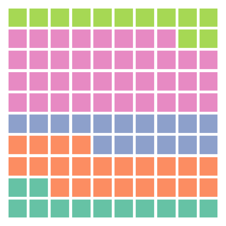
Legend
If you want to add a legend to the waffle chart the data will have to be a dict with groups and values. Then, with legend you will be able to customize the position of the legend.
from pywaffle import Waffle
import matplotlib.pyplot as plt

# Data
value = {'G1': 12, 'G2': 22, 'G3': 16, 'G4': 38, 'G5': 12}

# Waffle chart
plt.figure(
    FigureClass = Waffle,
    rows = 10,
    columns = 10,
    values = value,
    legend = {'loc': 'upper left', 'bbox_to_anchor': (1, 1)})

# plt.show()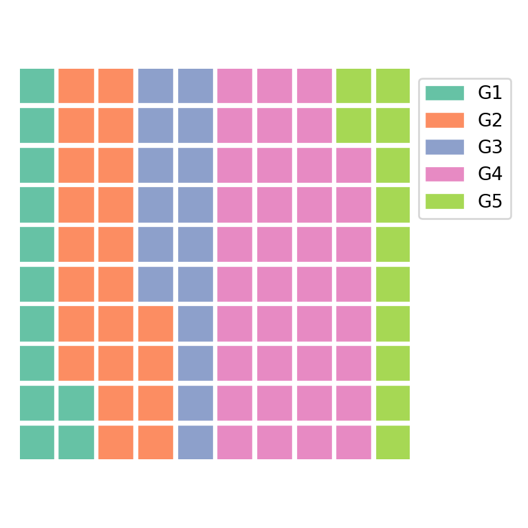
Colors
The default colors can be customized with colors. The argument can take an array with as many colors as values.
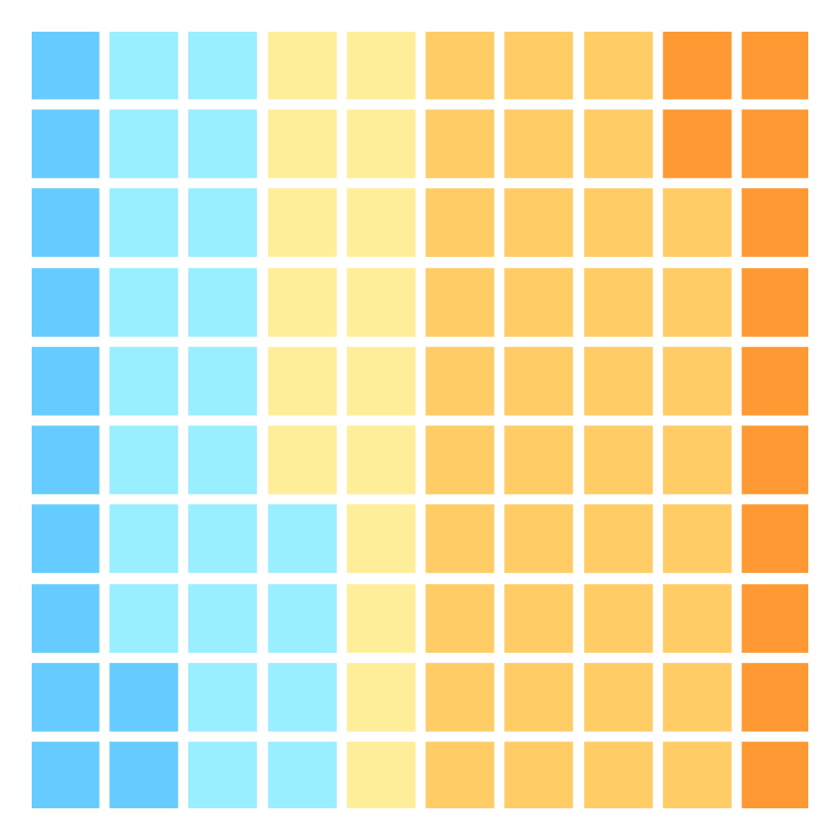
from pywaffle import Waffle
import matplotlib.pyplot as plt

# Data
value = [12, 22, 16, 38, 12]
color = ["#66CCFF", "#99EEFF", "#FFEE99", "#FFCC66", "#FF9933"]

# Waffle chart
plt.figure(
    FigureClass = Waffle,
    rows = 10,
    columns = 10,
    values = value,
    colors = color)

# plt.show()
Color palette
pywaffle also provides cmap_name to specify a predefined color palette. Possible options are Set1, Set2, Set3, Pastel1, Pastel2, tab10, tab20, tab20b, tab20c, Paired, Accent and Dark2.

from pywaffle import Waffle
import matplotlib.pyplot as plt

# Data
value = [12, 22, 16, 38, 12]

# Waffle chart
plt.figure(
    FigureClass = Waffle,
    rows = 10,
    columns = 10,
    values = value,
    cmap_name = 'Set1')

# plt.show()
Background color
The background color of the chart can be set passing a single color to facecolor.

from pywaffle import Waffle
import matplotlib.pyplot as plt

# Data
value = [12, 22, 16, 38, 12]

# Waffle chart
plt.figure(
    FigureClass = Waffle,
    rows = 10,
    columns = 10,
    values = value,
    facecolor = 'whitesmoke')

# plt.show()
Pictograms: characters and icons
The pywaffle library can also be used to create pictograms, this is, waffle charts but with characters or icons instead of the default rectangles used to represent the different groups. The characters argument takes Unicode characters as input, such as '♥', '★' or '⬤'.
from pywaffle import Waffle
import matplotlib.pyplot as plt

# Data
value = [12, 22, 16, 38, 12]

# Waffle chart
plt.figure(
    FigureClass = Waffle,
    rows = 10,
    columns = 10,
    values = value,
    characters = '♥')

# plt.show()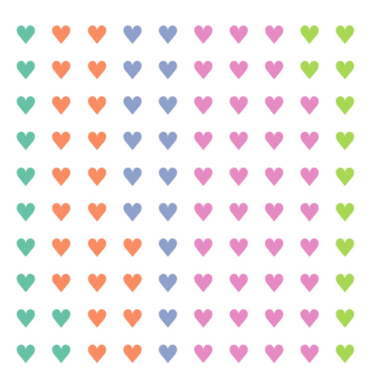
FontAwesome icons
An alternative is to add icons with icons. When you install pywaffle it will try to install the latest free version available of FontAwesome. You will need to input the name of the desired icon from the FontAwesome icons list to use it. In the example below we set the icon named 'face-smile'.
from pywaffle import Waffle
import matplotlib.pyplot as plt

# Data
value = [12, 22, 16, 38, 12]

# Waffle chart
plt.figure(
    FigureClass = Waffle,
    rows = 10,
    columns = 10,
    values = value,
    icons = 'face-smile')

# plt.show()![]()
Different icon for each group
You can pass an array with as many icons as values to the icons argument to set a different icon for each group.
from pywaffle import Waffle
import matplotlib.pyplot as plt

# Data
value = [33, 17, 20, 30]
icon = ['fish', 'hippo', 'otter', 'horse']

# Waffle chart
plt.figure(
    FigureClass = Waffle,
    rows = 10,
    values = value,
    icons = icon)

# plt.show()![]()
Legend with icons
If you want to add a legend with icons and names you will need to set icon_legend = True and specify the legend labels and position with legend.
from pywaffle import Waffle
import matplotlib.pyplot as plt

# Data
value = [33, 17, 20, 30]
icon = ['fish', 'hippo', 'otter', 'horse']

# Waffle chart
plt.figure(
    FigureClass = Waffle,
    rows = 10,
    values = value,
    icons = icon,
    icon_legend = True,
    legend = {
        'labels': ['Fish', 'Hippo', 'Otter', 'Horse'],
        'loc': 'upper left',
        'bbox_to_anchor': (1, 1)})

# plt.show()![]()
Note that you can use the font_size argument to customize the size of the icons or characters. In addition, the icon style can be customized with icon_style, which can be 'solid' (the default) 'regular' or 'brands'.
Subplots
If you want to combine several waffle charts in one single figure you can accomplish it following the example below. You will need to input a dict to plots where the keys are integers describing the number of rows, columns and the position. For instance, in the example 211 means two rows, one column, first plot. Hence, if instead of a single column you would want a single row the indices would be 121 and 122.
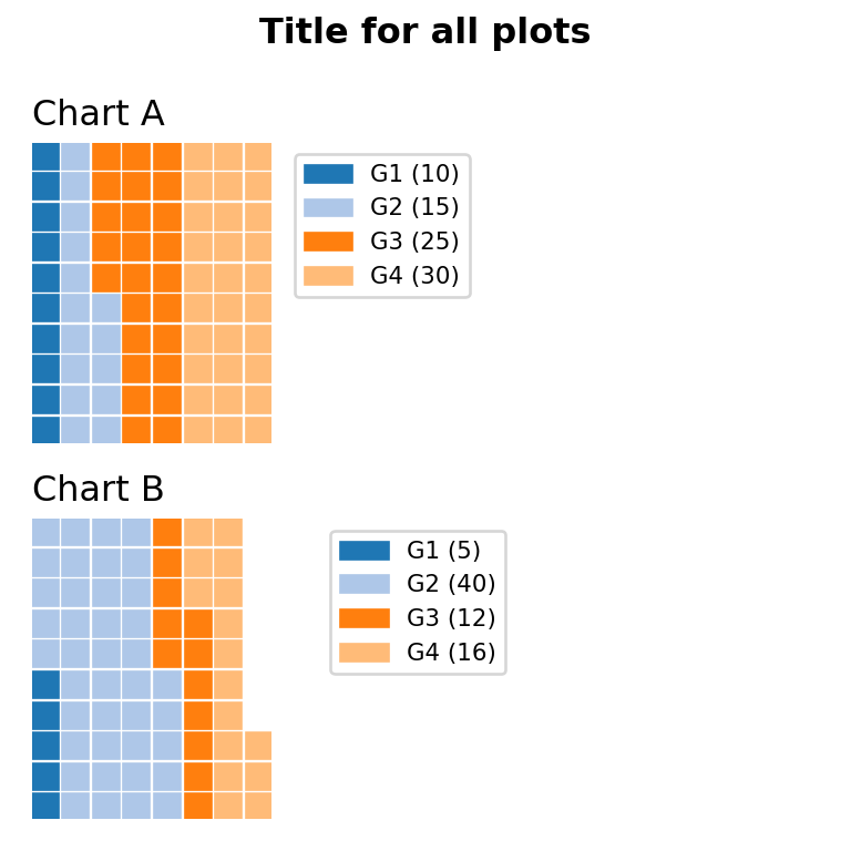
from pywaffle import Waffle
import matplotlib.pyplot as plt
import pandas as pd

# Data
df = pd.DataFrame({
        'labels': ['G1', 'G2', 'G3', 'G4'],
        'A': [10, 15, 25, 30],
        'B': [5, 40, 12, 16]}).set_index('labels')

# Waffle subfigure
fig = plt.figure(
    FigureClass = Waffle,
    plots = {
        211: {
            'values': df['A'],
            'labels': [f"{k} ({v})" for k, v in df['A'].items()],
            'legend': {'loc': 'upper left', 'bbox_to_anchor': (1.05, 1), 'fontsize': 8},
            'title': {'label': 'Chart A', 'loc': 'left', 'fontsize': 12}
        },
        212: {
            'values': df['B'],
            'labels': [f"{k} ({v})" for k, v in df['B'].items()],
            'legend': {'loc': 'upper left', 'bbox_to_anchor': (1.2, 1), 'fontsize': 8},
            'title': {'label': 'Chart B', 'loc': 'left', 'fontsize': 12}
        }
    },
    rows = 10,
    cmap_name = "tab20b")

fig.suptitle('Title for all plots', fontsize = 12, fontweight = 'bold')

# plt.show()