Sample data
Consider the following data for illustration purposes:
import pandas as pd

# Data set
df = pd.DataFrame({
    "gender": ["Male", "Male", "Male", "Male",
               "Female", "Female", "Female", "Female"],
    "smoker": ["Yes", "Yes", "No", "No",
               "Yes", "No", "No", "No"]})
Mosaic plot with mosaic
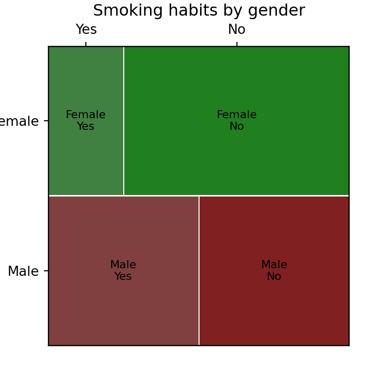
A mosaic plot represents the relationship between two or more categorical variables: the area of each tile is proportional to the number of observations in that combination of categories. The mosaic function from statsmodels.graphics.mosaicplot builds one directly from a pandas data frame and a list of the columns to cross.
from statsmodels.graphics.mosaicplot import mosaic

mosaic(df, ["gender", "smoker"])

# plt.show()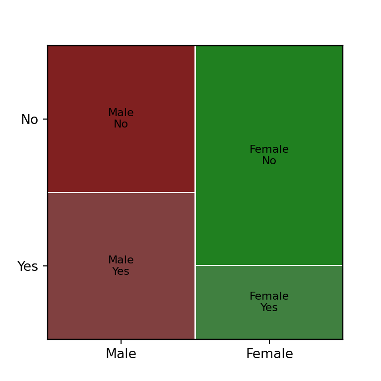
Colors
Pass a function to properties: it receives the tuple of categories for each tile (for example ("Male", "Yes")) and must return a dict of matplotlib patch properties, such as color.
from statsmodels.graphics.mosaicplot import mosaic

colors = {"Yes": "#DD8452", "No": "#4C72B0"}

def props(key):
    return {"color": colors[key[1]]}

mosaic(df, ["gender", "smoker"], properties = props)

# plt.show()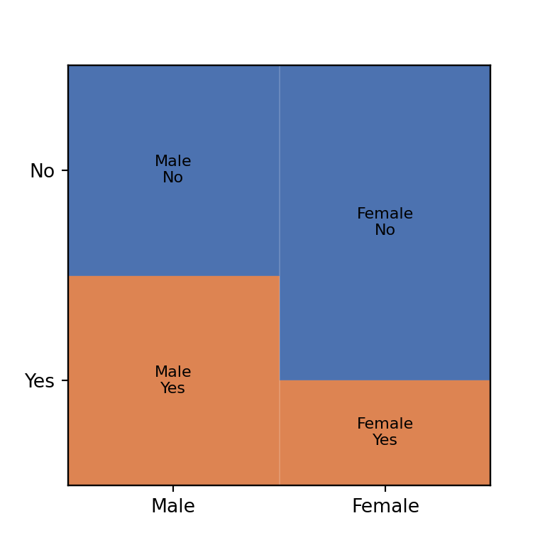
Labels
By default each tile is labeled with its category tuple. Override this with labelizer, a function that also receives the category tuple and returns the text to display.
from statsmodels.graphics.mosaicplot import mosaic

def labelizer(key):
    return "/".join(key)

mosaic(df, ["gender", "smoker"], labelizer = labelizer)

# plt.show()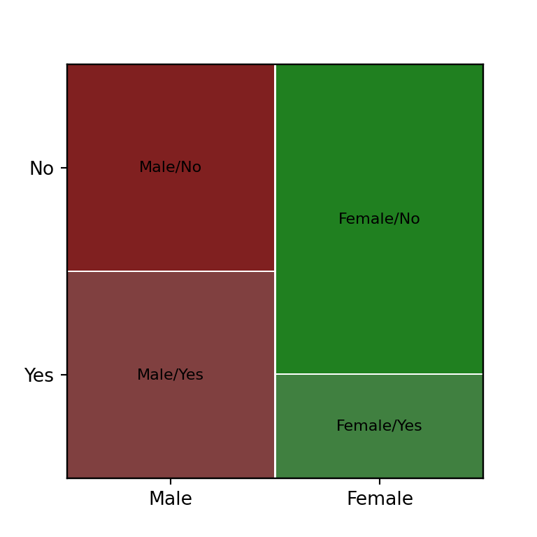
Gap between tiles
Control the spacing between tiles with gap, either a single value for all of them or a list with one gap per level of the first categorical variable.
from statsmodels.graphics.mosaicplot import mosaic

mosaic(df, ["gender", "smoker"], gap = 0.03)

# plt.show()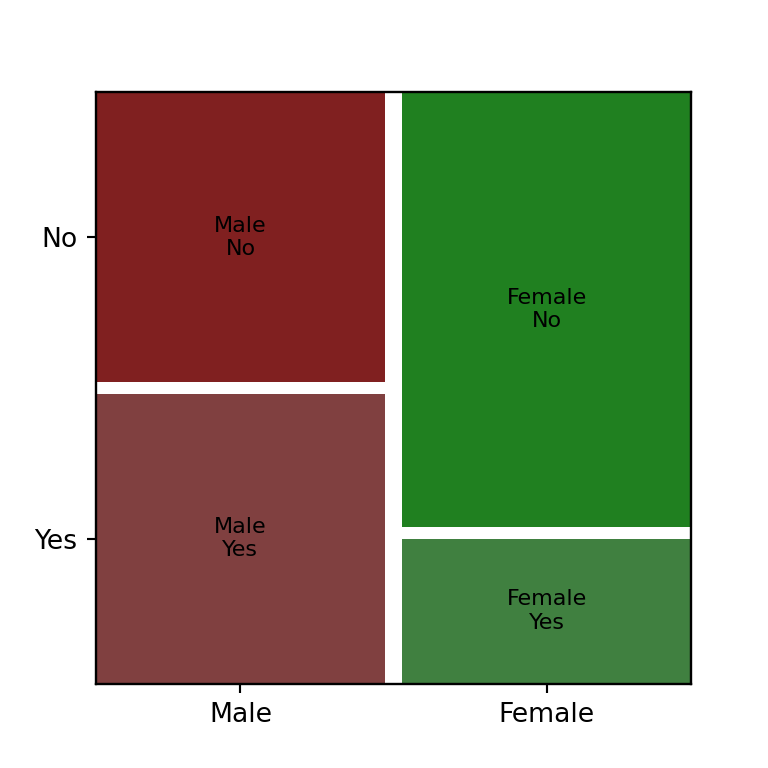
Orientation and title
Set horizontal = False to flip the split order of the categorical variables, and pass title to add a title directly (instead of a separate plt.title call).
from statsmodels.graphics.mosaicplot import mosaic

mosaic(df, ["gender", "smoker"],
      horizontal = False, title = "Smoking habits by gender")

# plt.show()