Sample data
Copy the following code to get the data that will be used in the following examples.
import numpy as np
import seaborn as sns
import random

# Data simulation
rng = np.random.RandomState(5)
variable = rng.normal(0, 1, size = 2000)
random.seed(5)
group = random.choices(["G1", "G2", "G3"], k = 2000)
df = {'variable': variable, 'group': group}
Boxenplot in seaborn with boxenplot
A boxenplot (also called a letter-value plot) is a box plot with more quantile levels, which shows more detail about the shape of the distribution in the tails. It is most useful for larger data sets, where a regular box plot only shows the outliers as individual points instead of extra boxes.
import seaborn as sns

sns.boxenplot(x = "variable", data = df)

# Equivalent to:
sns.boxenplot(x = variable)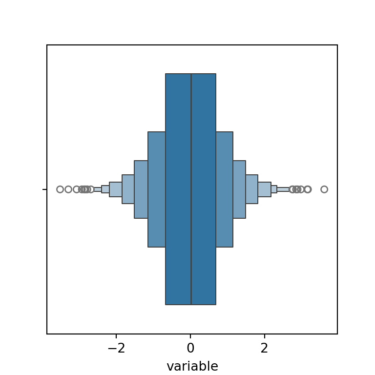
Grouped boxenplot
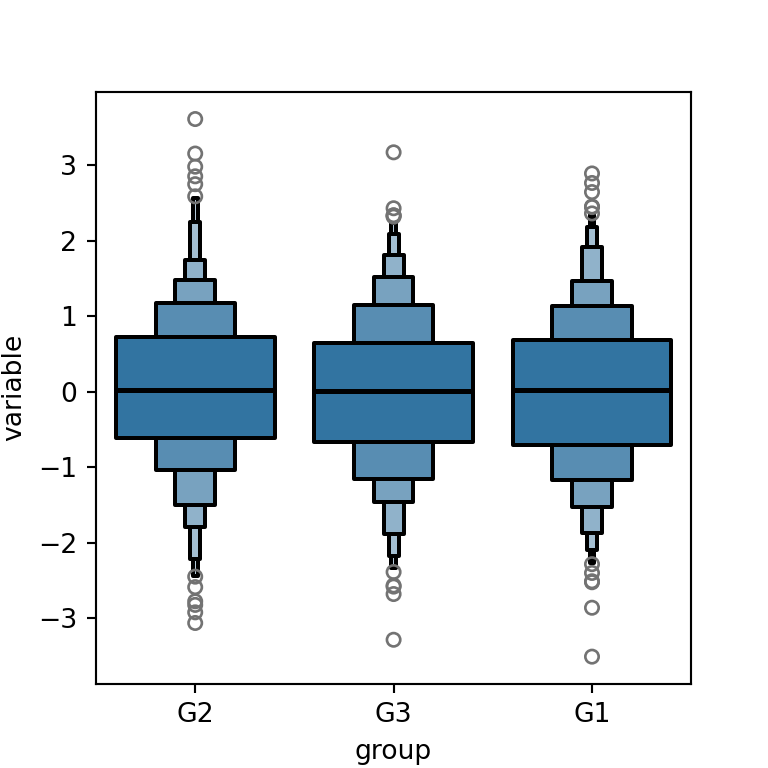
As with a regular box plot, pass a categorical variable to y (or x for a horizontal orientation) to draw one boxenplot per group.
import seaborn as sns

sns.boxenplot(x = "group", y = "variable", data = df)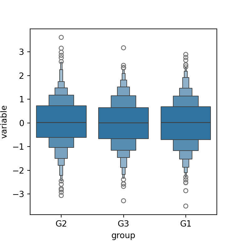
Colors
Use palette to assign a color per group, or color for a single fixed color.
import seaborn as sns

sns.boxenplot(x = "group", y = "variable", data = df, palette = "deep")
Number of levels
The number of quantile boxes is controlled by k_depth, which defaults to "tukey". Pass an integer to fix the number of levels manually, or "proportion" / "trustworthy" to let seaborn pick it based on other rules.
import seaborn as sns

sns.boxenplot(x = "variable", data = df, k_depth = 3)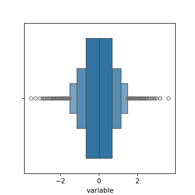
Outline width
The width and color of the box outlines can be set with linewidth and linecolor.
import seaborn as sns

sns.boxenplot(x = "group", y = "variable", data = df,
              linewidth = 1.5, linecolor = "black")