The violinplot function in matplotlib
When using matplotlib, you can make use of the violinplot function to create a violin plot, as shown in the example below.
import numpy as np
import matplotlib.pyplot as plt

# Seed for reproducibility
np.random.seed(5)

# Data simulation
x = np.random.normal(0, 2, 100)

# Plot
fig, ax = plt.subplots()
ax.violinplot(x)
# plt.show()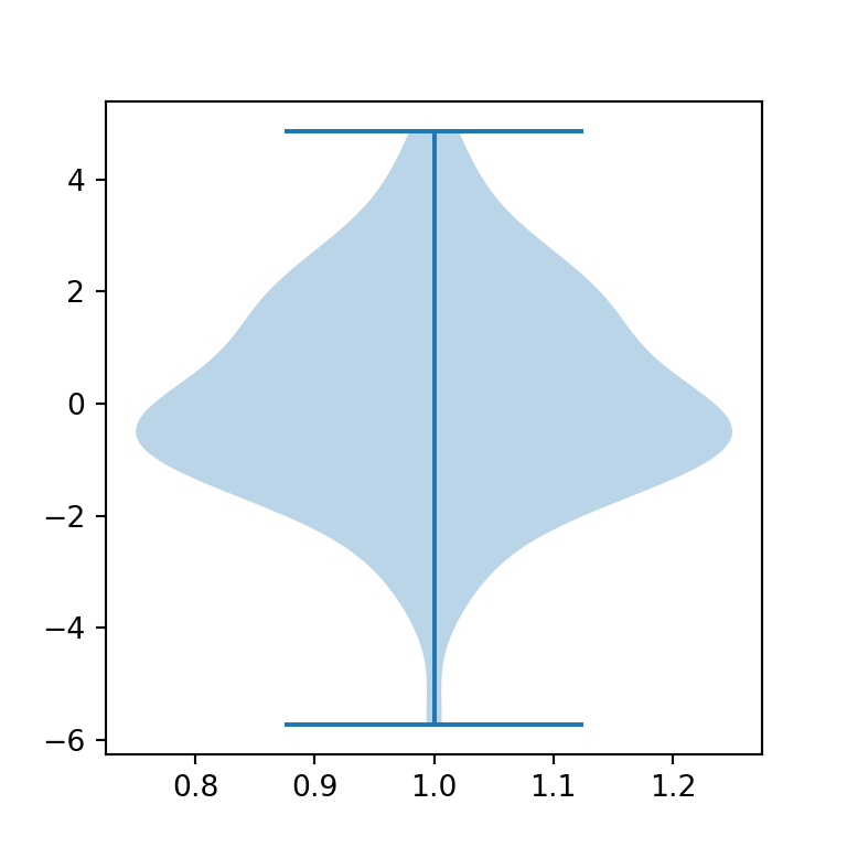
Horizontal violin plot
The violin plots are vertical by default. Setting vert = False the violin plot will be horizontal instead of vertical.
import numpy as np
import matplotlib.pyplot as plt

# Seed for reproducibility
np.random.seed(5)

# Data simulation
x = np.random.normal(0, 2, 100)

# Plot
fig, ax = plt.subplots()
ax.violinplot(x, vert = False)
# plt.show()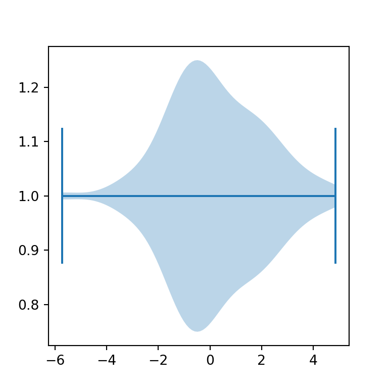
Removing the extrema
Setting the showextrema argument to False you can toggle the rendering of the extreme values of the data.
import numpy as np
import matplotlib.pyplot as plt

# Semilla para reproducibilidad
np.random.seed(5)

# Simulación de datos
x = np.random.normal(0, 2, 100)

# Gráfico de violín
fig, ax = plt.subplots()
ax.violinplot(x, showextrema = False)

# plt.show()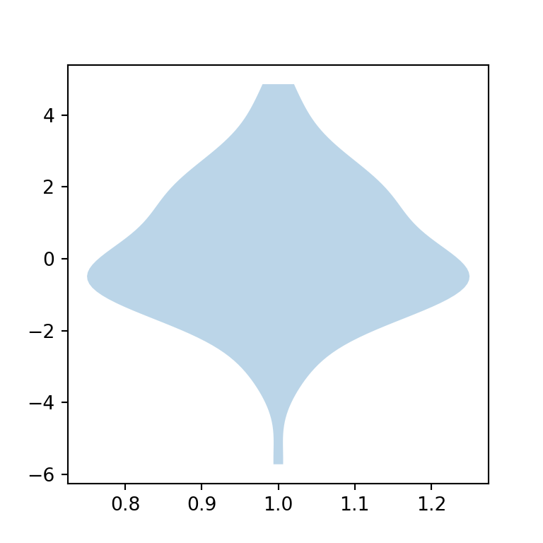
Fill and border color
The violin plots created in matplotlib are blue by default, both the fill and border color. In order to modify these colors you will need to access the bodies key from the dict returned from the plot and set new colors with set_facecolor, set_edgecolor or customize the transparency with set_alpha, as shown in the example below.
import numpy as np
import matplotlib.pyplot as plt

# Seed for reproducibility
np.random.seed(5)

# Data simulation
x = np.random.normal(0, 2, 100)

# Plot
fig, ax = plt.subplots()
violin = ax.violinplot(x)

for pc in violin["bodies"]:
    pc.set_facecolor("green")
    pc.set_edgecolor("black")
    pc.set_alpha(0.5)

# plt.show()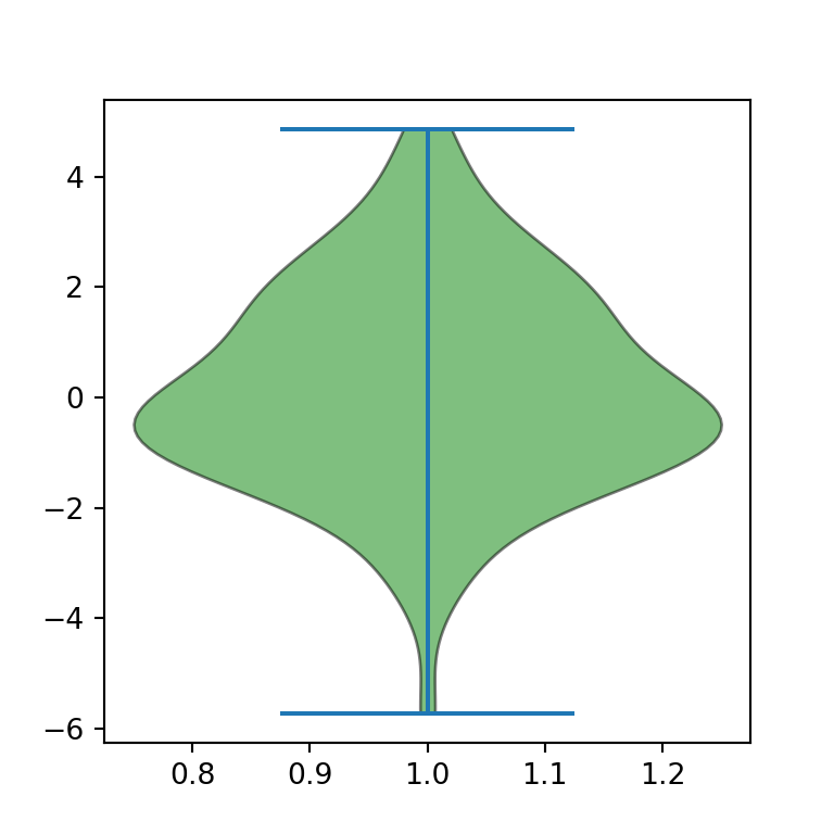
Adding the mean and the median
It is possible to render lines representing the mean and/or the median of the data just setting the showmeans and/or the showmedians argument to True, respectively.
import numpy as np
import matplotlib.pyplot as plt

# Seed for reproducibility
np.random.seed(5)

# Data simulation
x = np.random.normal(0, 2, 100)

# Plot
fig, ax = plt.subplots()
ax.violinplot(x, showmeans = True, showmedians = True)

# plt.show()
Adding quantiles
The violinplot function also provides an argument named quantiles to render quantiles. You will need to pass an array with values between 0 and 1 to the argument.
import numpy as np
import matplotlib.pyplot as plt

# Seed for reproducibility
np.random.seed(5)

# Data simulation
x = np.random.normal(0, 2, 100)

# Plot
fig, ax = plt.subplots()
ax.violinplot(x, quantiles = [0.25, 0.5, 0.75])
# plt.show()
Whiskers, mean and median lines color
All the lines of the plot can be customized. Equivalently to changing the fill color you can access the different keys returned from the plot ('cbars', 'cmins', 'cmaxes', 'cmeans', 'cmedians' or 'cquantiles') to customize the lines. In the following example we are setting all the lines to the same style.
import numpy as np
import matplotlib.pyplot as plt

# Seed for reproducibility
np.random.seed(5)

# Data simulation
x = np.random.normal(0, 2, 100)

# Plot
fig, ax = plt.subplots()
violin = ax.violinplot(x, showmeans = True, showmedians = True)

for partname in ('cbars', 'cmins', 'cmaxes', 'cmeans', 'cmedians'):
    vp = violin[partname]
    vp.set_edgecolor("red")
    vp.set_linewidth(1)

# plt.show()
Note that it is possible to customize each line independently. In the example below we are setting a different color for the whiskers (red) and for the mean and median lines (green), just accessing different keys each time.
import numpy as np
import matplotlib.pyplot as plt

# Seed for reproducibility
np.random.seed(5)

# Data simulation
x = np.random.normal(0, 2, 100)

# Plot
fig, ax = plt.subplots()
violin = ax.violinplot(x, showmeans = True, showmedians = True)

for partname in ('cbars', 'cmins', 'cmaxes'):
    vp = violin[partname]
    vp.set_edgecolor("red")
    vp.set_linewidth(1)

for partname in ('cmeans', 'cmedians'):
    vp = violin[partname]
    vp.set_edgecolor("green")
    vp.set_linewidth(1)

# plt.show()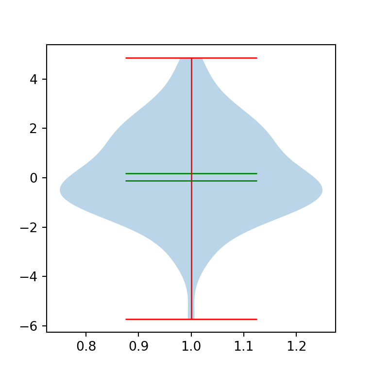
Violin plot by group
With the same function you can also create grouped violin plots in matplotlib. The only difference is the input data you pass to the function.
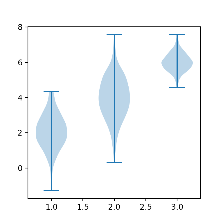
import numpy as np
import matplotlib.pyplot as plt

# Seed for reproducibility
np.random.seed(5)

# Data simulation (three groups)
X = np.random.normal((2, 4, 6), (1, 1.2, 0.5), (300, 3))

# Grouped violin plot
fig, ax = plt.subplots()
ax.violinplot(X)
# plt.show()
Custom order for the groups
Finally, in this scenario it is possible to customize the default order of the groups passing an array with the desired order to the positions argument of the violinplot function.
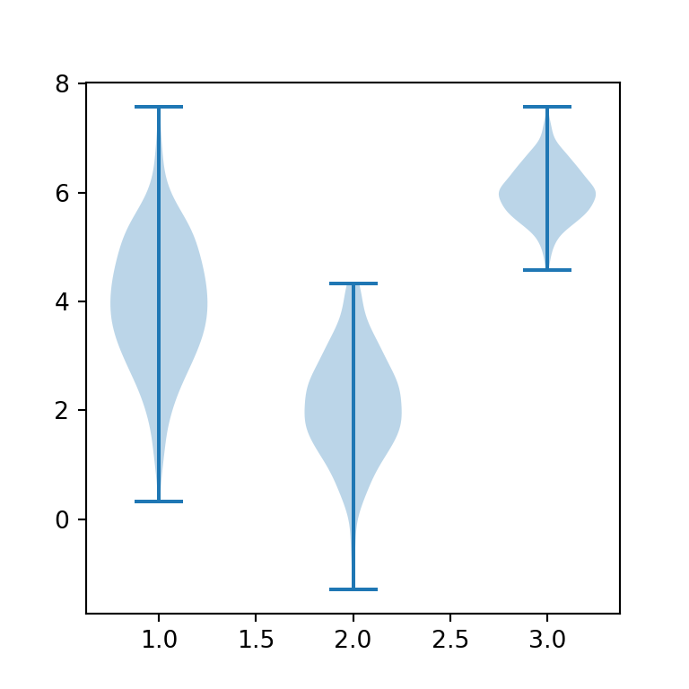
import numpy as np
import matplotlib.pyplot as plt

# Semilla para reproducibilidad
np.random.seed(5)

# Simulación de datos (tres grupos)
X = np.random.normal((2, 4, 6), (1, 1.2, 0.5), (300, 3))

# Gráfico de violín por grupo
fig, ax = plt.subplots()
ax.violinplot(X, positions = [2, 1, 3])
# plt.show()