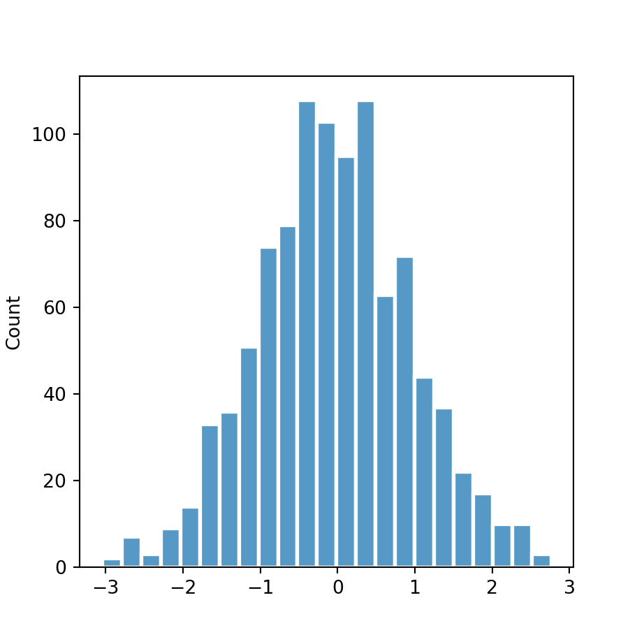
Histogram with kernel density estimation
Setting the kde argument of the histplot function to True will add a curve representing the kernel density estimate of the data, calculated with the default parameters of the kdeplot function.
import numpy as np
import seaborn as sns

# Data simulation
rng = np.random.RandomState(1)
x = rng.normal(0, 1, size = 1000)
df = {'x': x}

# Histogram
sns.distplot(x = x, kde = True)

# Equivalent to:
sns.distplot(x = "x", kde = True, data = df)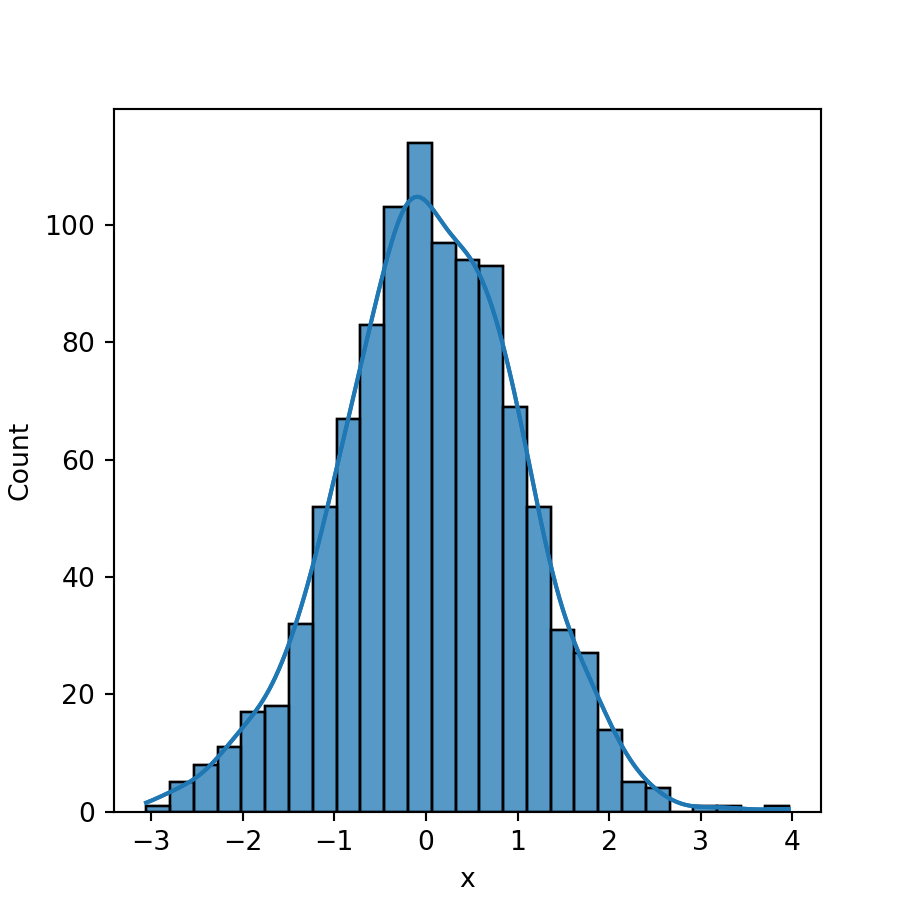
Kernel density estimate computation
Note that you can pass additional arguments to the kdeplot function with kde_kws. This will allow you to override the default arguments for the computation, such as the bandwidth used.
import numpy as np
import seaborn as sns

# Data simulation
rng = np.random.RandomState(1)
x = rng.normal(0, 1, size = 1000)
df = {'x': x}

# Histogram
sns.histplot(x = x, kde = True,
             kde_kws = {'bw_adjust': 0.5})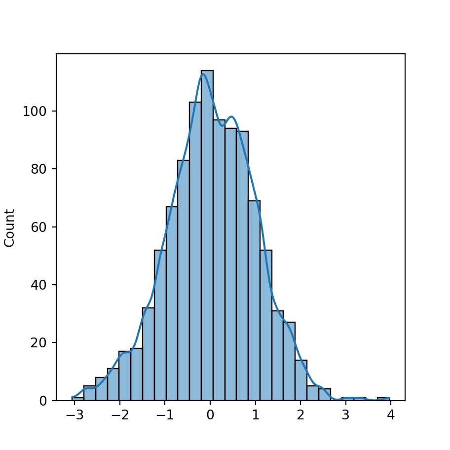
Curve styling
The line_kws argument of the function can be used to customize the style of the kernel density estimate line passing a dictionary with the desired values. Note that you can override the default color of the line with set_color, as shown below.

import numpy as np
import seaborn as sns

# Data simulation
rng = np.random.RandomState(1)
x = rng.normal(0, 1, size = 1000)
df = {'x': x}

# Histogram
sns.histplot(x = x, kde = True,
             line_kws = {'linestyle':'dashed',
                         'linewidth':'2'}).lines[0].set_color('red')