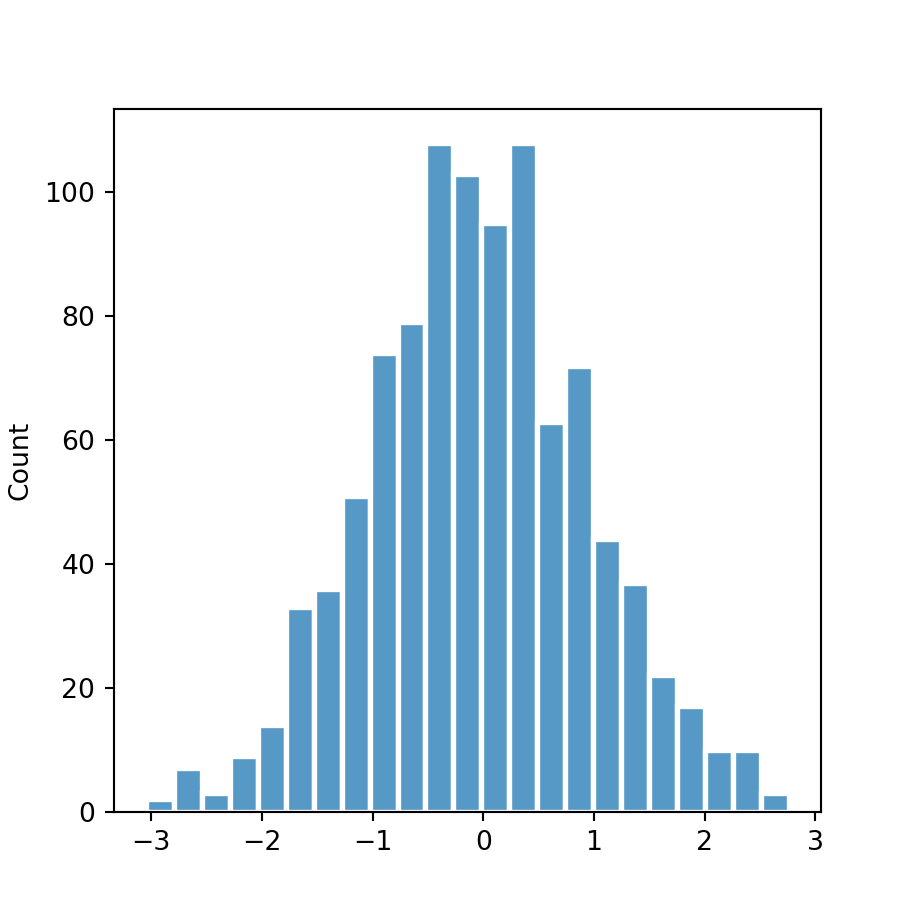
Data simulation
The following data represents two different variables stacked in a data frame. Each variable will represent a group which will define each histogram of the examples below.
import numpy as np
import pandas as pd

# Data simulation
rng = np.random.RandomState(1)
x1 = rng.normal(0, 1, size = 500)
x2 = rng.normal(3, 1.5, size = 500)
x = np.concatenate((x1, x2), axis = 0)
group = np.repeat(np.array(["G1", "G2"]), [500, 500], axis = 0)
df = {'x': x, 'group': group}

# Pandas data frame
df = pd.DataFrame(data = df)
Histogram by group
In order to create a histogram by group in seaborn you will need to pass your data to the histplot function and the grouping variable to the hue argument.
import seaborn as sns

# Histogram
sns.histplot(x = x, hue = group)

# Equivalent to:
sns.histplot(x = "x", hue = "group", data = df)
Dodge
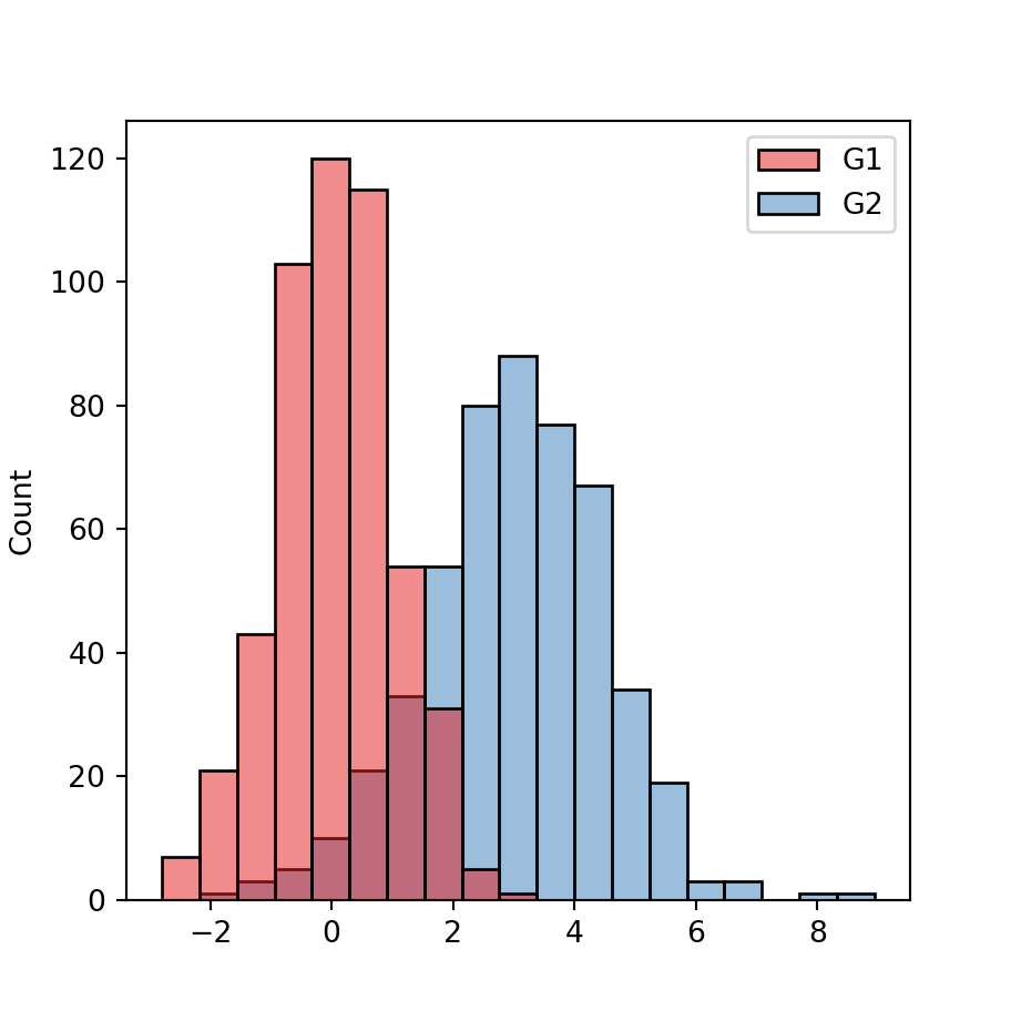
Note that by default, the histograms could overlap, as in the previous example. Setting the multiple argument to "dodge" will avoid the overlapping making the bars of the histograms thinner.
import seaborn as sns

# Histogram
sns.histplot(x = x, hue = group,
             multiple = "dodge")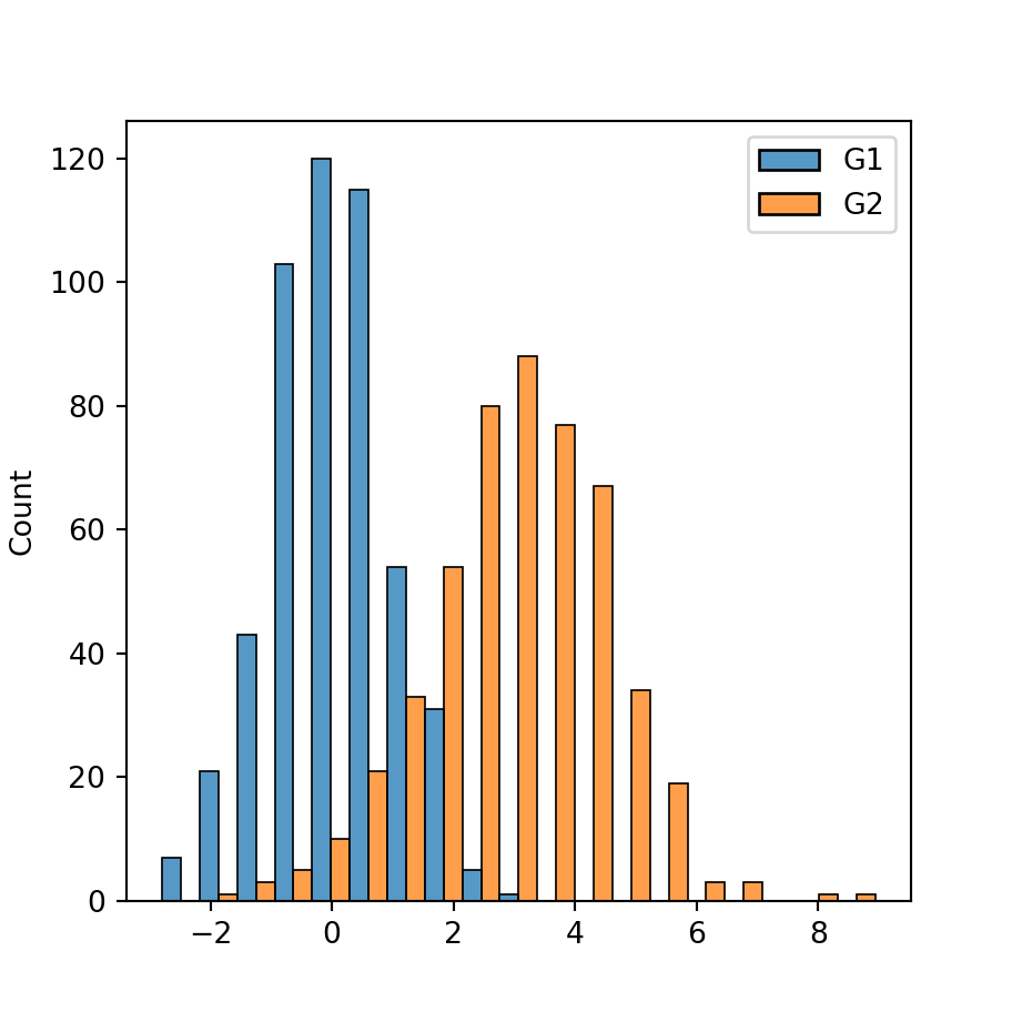
Stack
Other option is stacking the histograms setting the argument to "stack". However, this tends to be more difficult to interpret.
import seaborn as sns

# Histogram
sns.histplot(x = x, hue = group,
             multiple = "stack")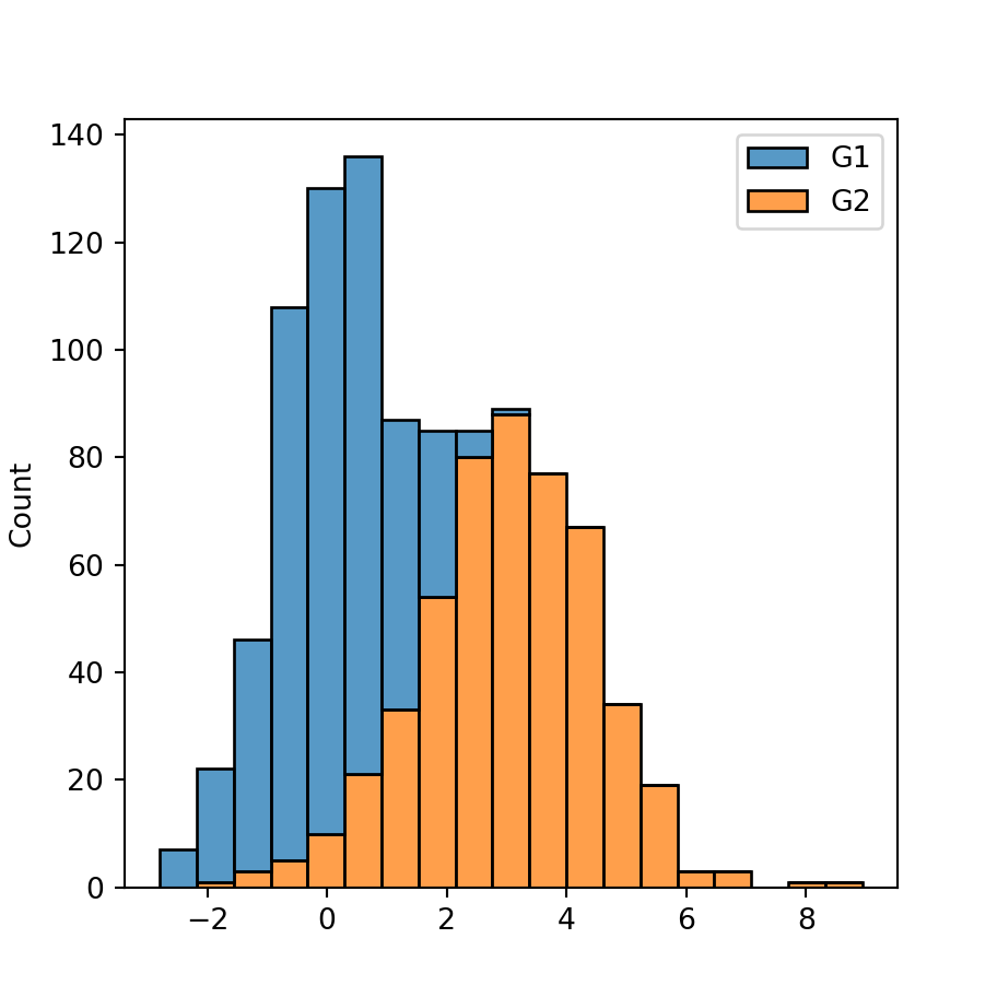
Fill
The last option is setting the argument to "fill", which will create the following visualization, representing the percentage for each histogram over the bins of the X-axis.
import seaborn as sns

# Histogram
sns.histplot(x = x, hue = group,
             multiple = "fill")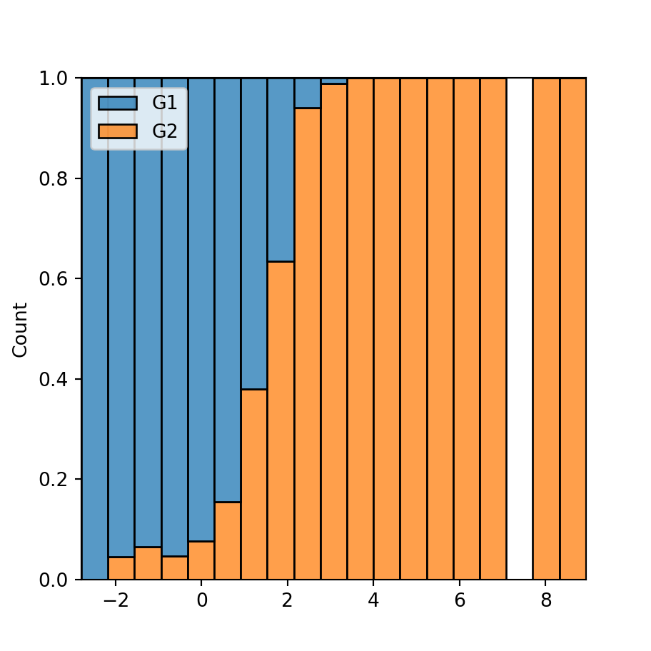
Color customization
The palette argument of the function can be used to customize the colors of the histograms. You can both pass a color palette or a dictionary containing the desired colors for each group, as shown in the examples below.
Color palette
import seaborn as sns

# Histogram
sns.histplot(x = x, hue = group,
             palette = "Set1")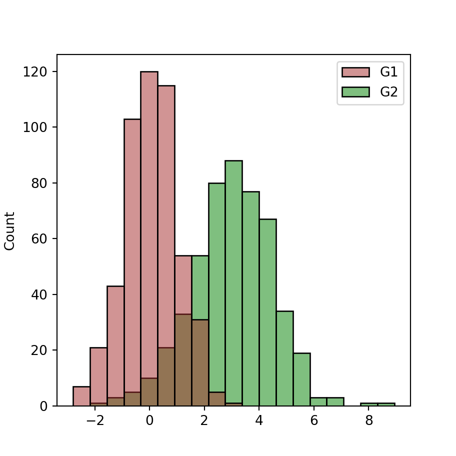
Custom colors
import seaborn as sns

colors = {'G1': 'brown', 'G2': 'green'}

# Histogram
sns.histplot(x = x, hue = group,
             palette = colors)