Sample data
The following data will be used to create the visualizations of this tutorial. Copy and paste the following code to be able to reproduce each plot.
import numpy as np
import seaborn as sns
import random

# Data simulation
rng = np.random.RandomState(1)
variable = rng.normal(0, 2, size = 50)
random.seed(1)
group = random.choices(["G1", "G2", "G3"], k = 50)
group2 = random.choices(["A", "B"], k = 50)
df = {'variable': variable, 'group': group, 'group2': group2}
Violin plot in seaborn with violinplot
When using seaborn, you can use the violinplot function to create a violin plot, as in the examples below.
import seaborn as sns

# Violin plot
sns.violinplot(x = variable)

# Equivalent to:
sns.violinplot(x = "variable", data = df)
Vertical violin plot
Note that if you pass your variable to the y argument instead of x the plot will be in portrait mode instead of landscape.
import seaborn as sns

# Violin plot
sns.violinplot(y = variable)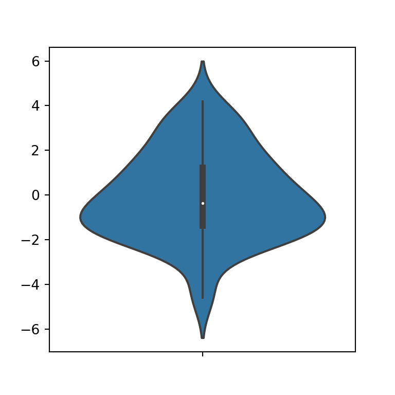
Violin plot color
The background color of the violin can be modified using the color argument of the function.
import seaborn as sns

# Violin plot
sns.violinplot(x = variable,
               color = "green")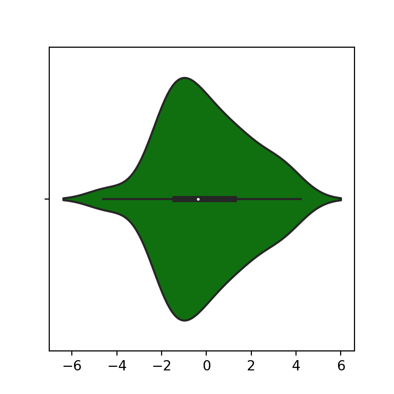
Trimming the tails
The cut argument allows to modify the distance to extend the density estimate over the extreme data points. If you set this argument to 0, the violin plot will be created with trimmed tails.
import seaborn as sns

# Violin plot
sns.violinplot(x = variable,
               cut = 0)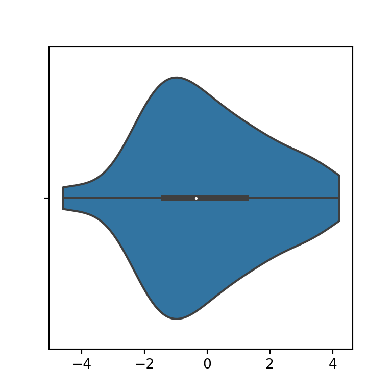
Inner figure
By default, a box plot is shown inside the violin plot, but it is possible to add the quartiles with lines, the data points in several ways or removing the box plot. For this purpose you can use the inner argument of the function, as shown in the examples below.

Quartiles
import seaborn as sns

# Violin plot
sns.violinplot(x = variable,
               inner = "quartile")
Points
import seaborn as sns

# Violin plot
sns.violinplot(x = variable,
               inner = "point")
Stick
import seaborn as sns

# Violin plot
sns.violinplot(x = variable,
               inner = "stick")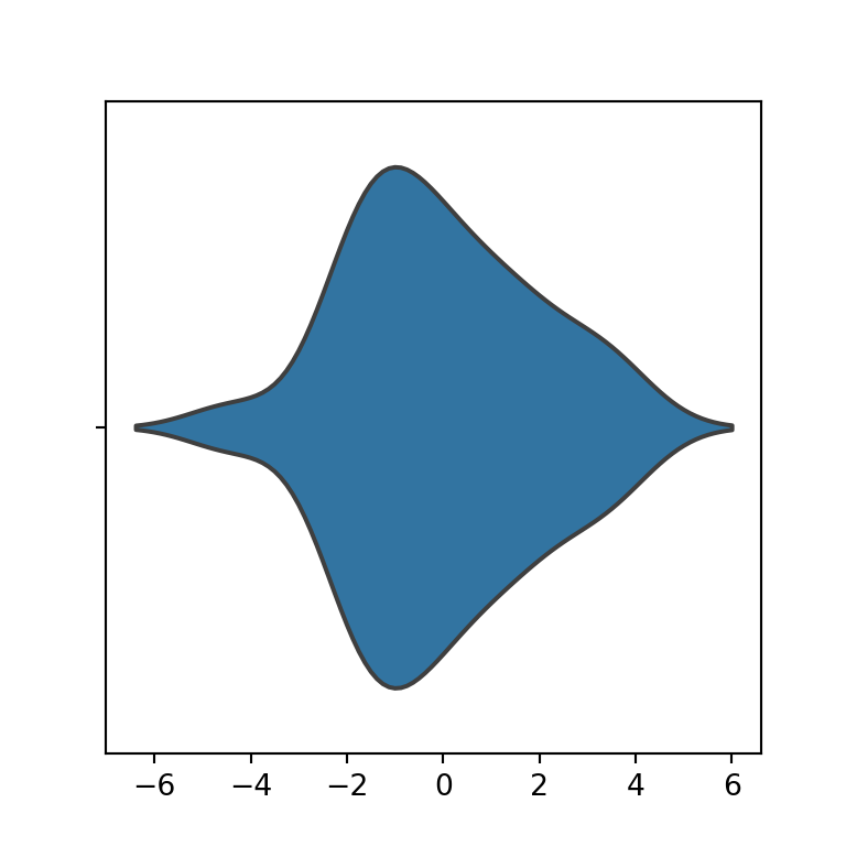
None
import seaborn as sns

# Violin plot
sns.violinplot(x = variable,
               inner = None)
Note that you can also set these arguments when creating violin plots by group.
Bandwidth
The violinplot function uses the Scott method to calculate the optimal bandwidth used to generate the violin plot (bw = 'scott'). However, you can also choose between the Silverman method or a scale factor to use when computing the bandwidth.
Silverman bandwidth
import seaborn as sns

# Violin plot
sns.violinplot(y = variable,
               bw = "silverman")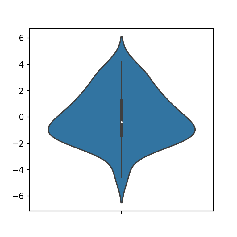
Scale factor
import seaborn as sns

# Violin plot
sns.violinplot(y = variable,
               bw = 0.25)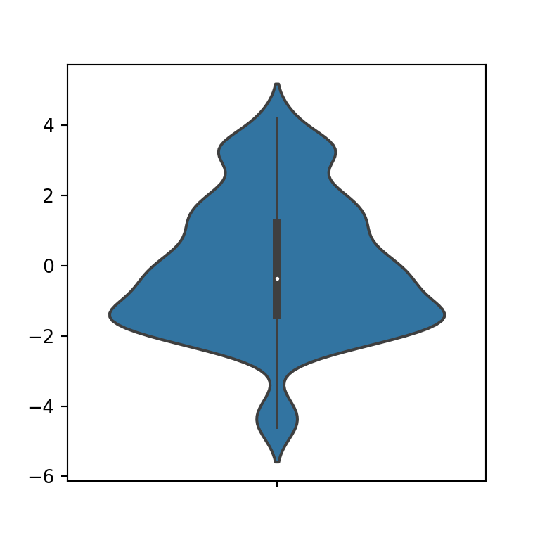
Violin plot by group
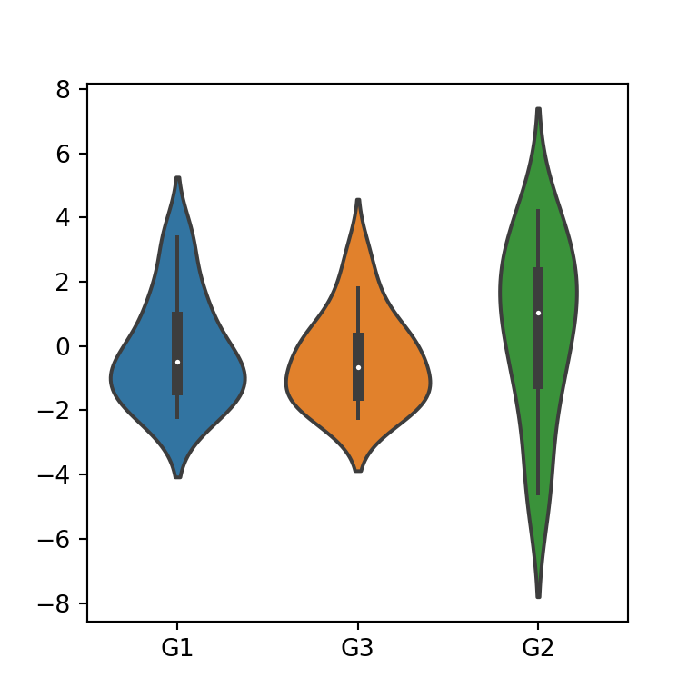
If you pass a categorical variable to the x or y arguments and a numerical variable to the other argument you can create a violin plot by group. Note that you can change the default order passing a list to the order argument with the desired order.
import seaborn as sns

# Violin plot
sns.violinplot(x = group, y = variable)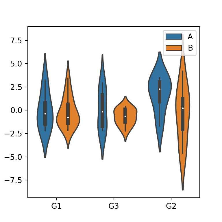
Color by subgroup
If you pass a second categorical variable to the hue argument the violin plots will be divided by group and subgroups, as shown in the following image.
import seaborn as sns

# Violin plot
sns.violinplot(x = group, y = variable,
               hue = group2)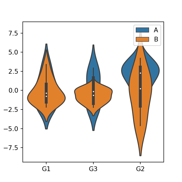
When adding a second variable, it is possible to overlap the violins of the subgroups, just setting the dodge argument to False.
import seaborn as sns

# Violin plot
sns.violinplot(x = group, y = variable,
               hue = group2,
               dodge = False)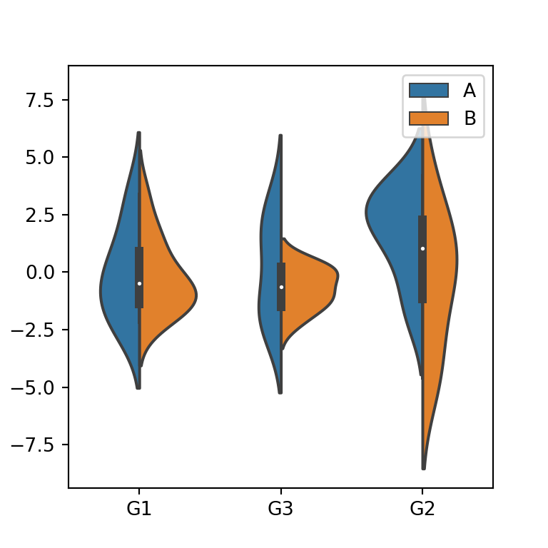
An alternative to the previous options is setting split = True, so each side of each violin plot will show the estimate for each subgroup, as shown in the following example.
import seaborn as sns

# Violin plot
sns.violinplot(x = group, y = variable,
               hue = group2,
               split = True)
Finally, if you want to customize the color palette of the violins you can pass a palette or a dictionary containing colors for each group to the palette argument.
import seaborn as sns

# Violin plot
sns.violinplot(x = group, y = variable,
               palette = "Set2")