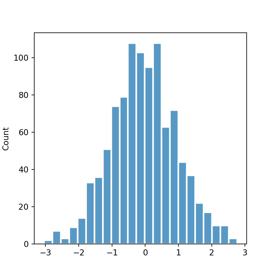
The hist function in matplotlib
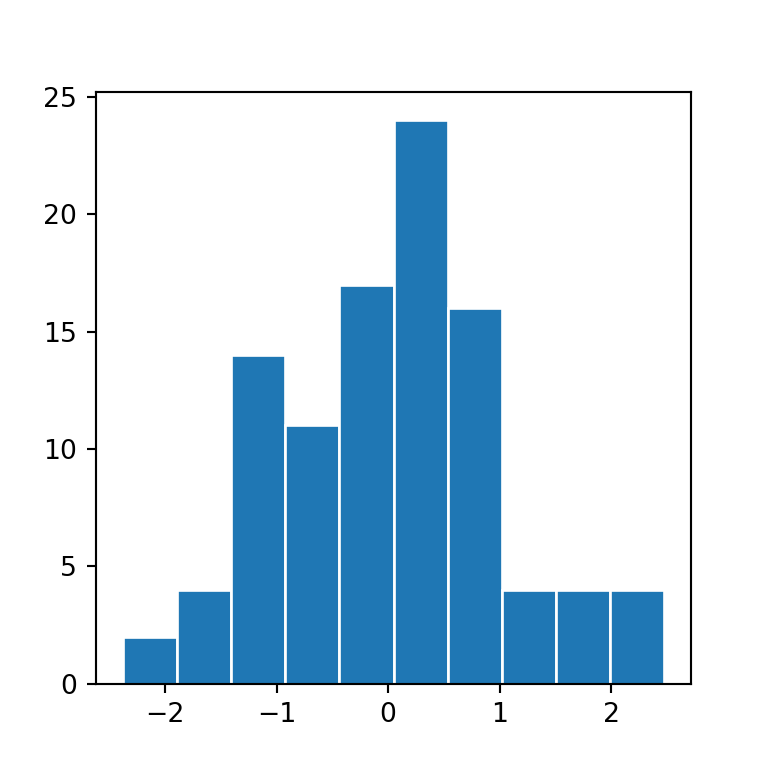
The hist function allows creating histograms in Python when using matplotlib. In order to create a basic histogram you just need to input a numerical variable to the function.
import numpy as np
import matplotlib.pyplot as plt

# Seed for reproducibility
np.random.seed(4)

# Data simulation
x = np.random.normal(0, 1, 100)

# Histogram
fig, ax = plt.subplots()
ax.hist(x)
# plt.show()
Horizontal histogram
Setting the orientation argument to "horizontal" you can flip the axes to create a horizontal histogram.
import numpy as np
import matplotlib.pyplot as plt

# Seed for reproducibility
np.random.seed(4)

# Data simulation
x = np.random.normal(0, 1, 100)

# Histogram
fig, ax = plt.subplots()
ax.hist(x, orientation = "horizontal")
# plt.show()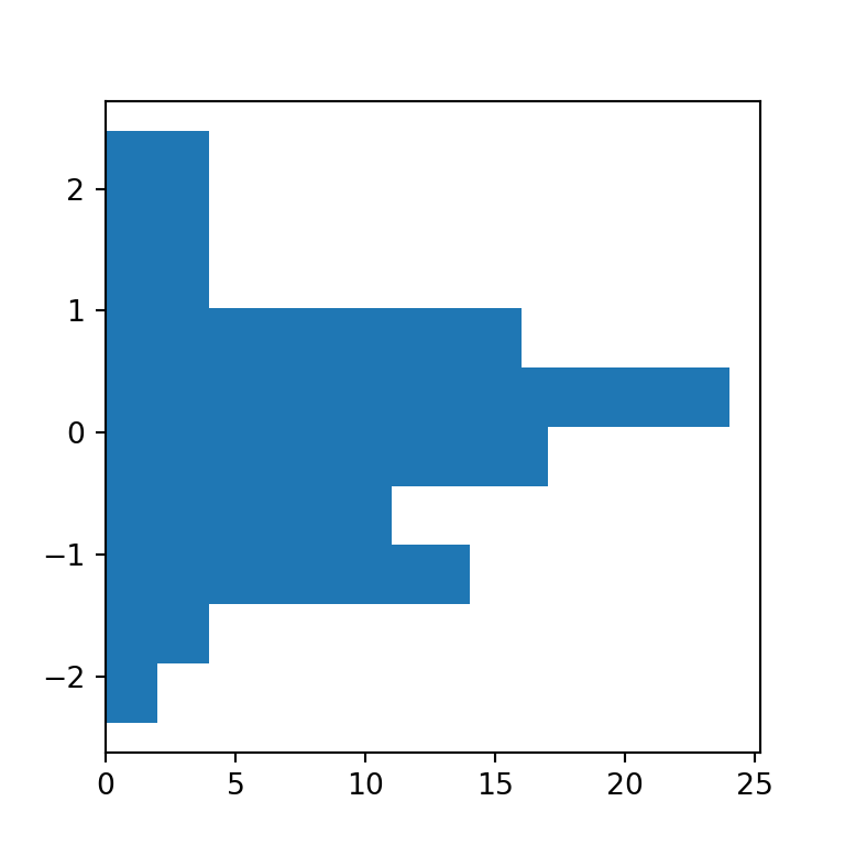
Density histogram
The default histogram created with hist is a frequency histogram. If you prefer to create a density histogram you will need to set the argument density to True.
import numpy as np
import matplotlib.pyplot as plt

# Seed for reproducibility
np.random.seed(4)

# Data simulation
x = np.random.normal(0, 1, 100)

# Histogram
fig, ax = plt.subplots()
ax.hist(x, density = True)
# plt.show()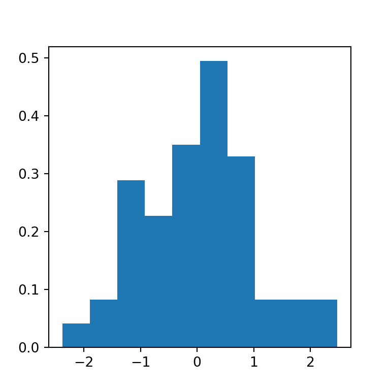
Cumulative histogram
The hist function also allows creating cumulative histograms, just setting cumulative = True as argument.
import numpy as np
import matplotlib.pyplot as plt

# Seed for reproducibility
np.random.seed(4)

# Data simulation
x = np.random.normal(0, 1, 100)

# Histogram
fig, ax = plt.subplots()
ax.hist(x, cumulative = True)
# plt.show()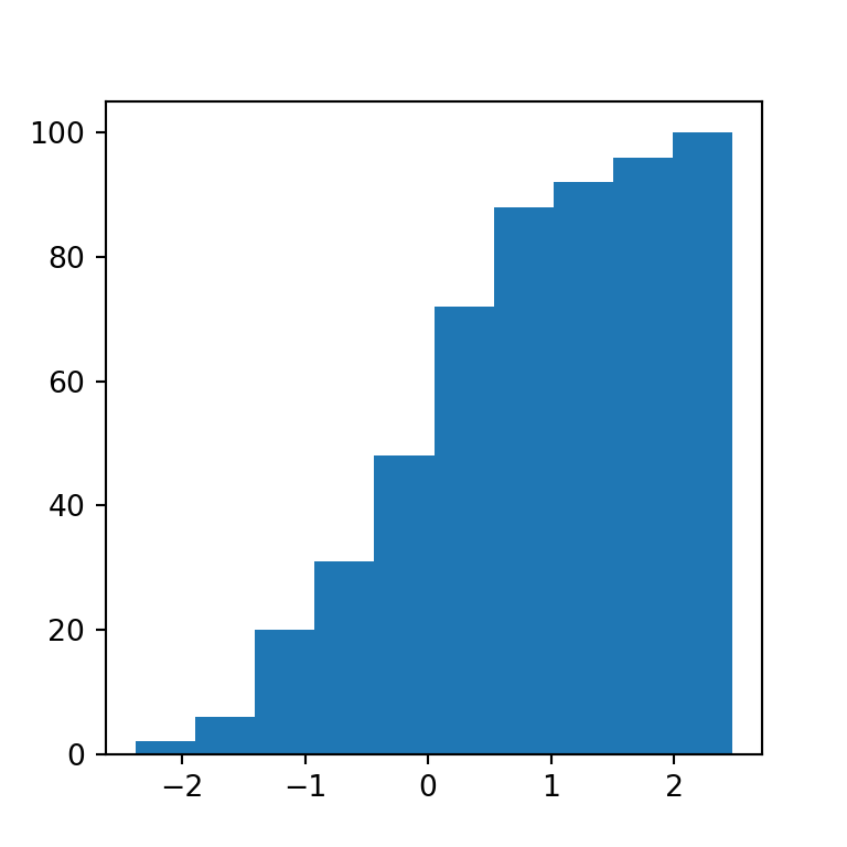
Number of bins
The default number of bins (bars) of a histogram made with the hist function is 10. However, this might not be the best option for all datasets. In this scenario you can use the bins argument to choose an adequate number of bins or to set a selection method. Possible selection methods are 'auto', 'fd', 'doane', 'scott', 'stone', 'rice', 'sturges' (the default method used on the R programming language) and 'sqrt'.
import numpy as np
import matplotlib.pyplot as plt

# Seed for reproducibility
np.random.seed(4)

# Data simulation
x = np.random.normal(0, 1, 100)

# Histogram (too many bins)
fig, ax = plt.subplots()
ax.hist(x, bins = 40)
# plt.show()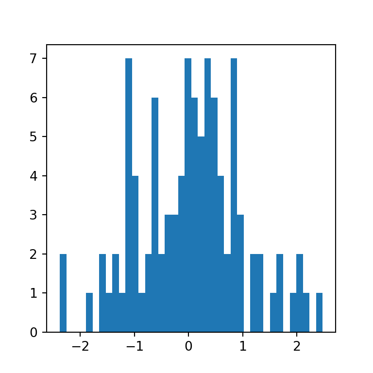
Histogram by group
You can also create a histogram with several groups with the function, just passing a list of data sets, as in the example below. By default, the bins of the different groups will be displayed side by side.
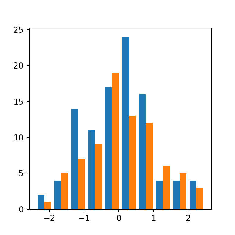
import numpy as np
import matplotlib.pyplot as plt

# Seed for reproducibility
np.random.seed(4)

# Data simulation
x1 = np.random.normal(0, 1, 100)
x2 = np.random.normal(0, 1, 100)
x = [x1, x2]

# Histogram
fig, ax = plt.subplots()
ax.hist(x)
plt.show()
# plt.show()
Note that when creating a histogram with multiple data sets, the datasets doesn’t need to be of the same length.
Histogram types
The function provides the possibility of creating several histogram types in addition to the default ("bar").
“barstacked”
The "barstacked" method stacks the bins when there are several groups. This is the same as setting stacked = True.
import numpy as np
import matplotlib.pyplot as plt

# Seed for reproducibility
np.random.seed(4)

# Data simulation
x1 = np.random.normal(0, 1, 100)
x2 = np.random.normal(0, 1, 100)
x = [x1, x2]

# Histogram
fig, ax = plt.subplots()
ax.hist(x, histtype = "barstacked")
# plt.show()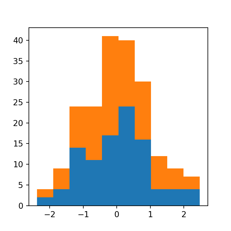
“step”
The "step" method generates an unfilled line plot, this is, it shows the outer border of the bins.
import numpy as np
import matplotlib.pyplot as plt

# Seed for reproducibility
np.random.seed(4)

# Data simulation
x = np.random.normal(0, 1, 100)

# Histogram
fig, ax = plt.subplots()
ax.hist(x, histtype = "step")
# plt.show()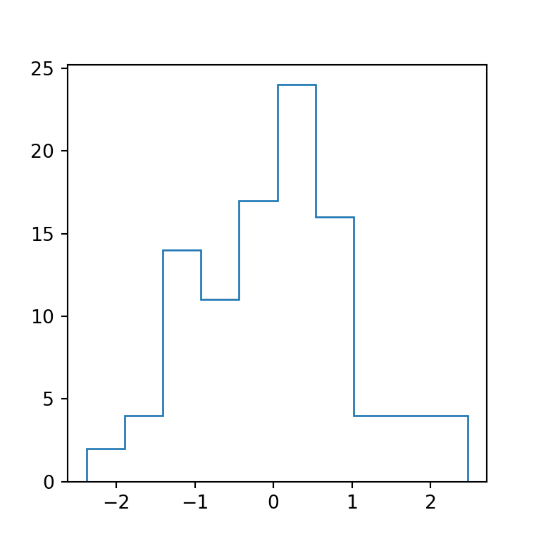
“stepfilled”
The last method is the "stepfilled" method, which is the same as "step" but the area is filled. If you have one group it will be almost the same as the default method, but if your data contains several groups the groups will overlap one over each other, as in the example below.
import numpy as np
import matplotlib.pyplot as plt

# Seed for reproducibility
np.random.seed(4)

# Data simulation
x1 = np.random.normal(0, 1, 100)
x2 = np.random.normal(0, 1, 100)
x = [x1, x2]

# Histogram
fig, ax = plt.subplots()
ax.hist(x, histtype = "stepfilled")
# plt.show()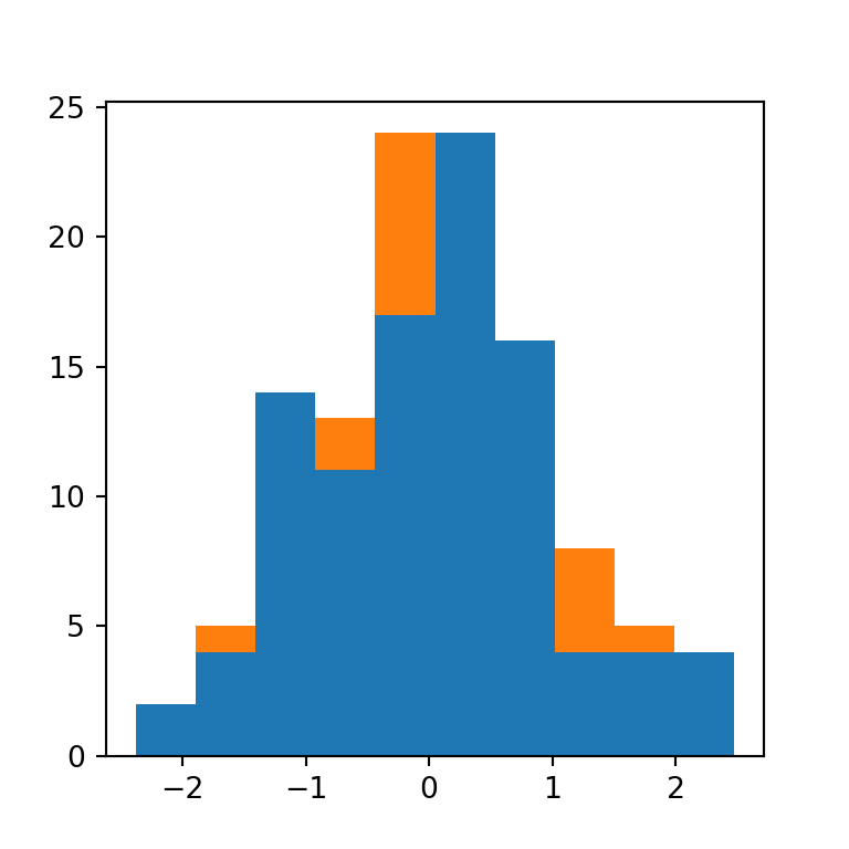
Histogram colors
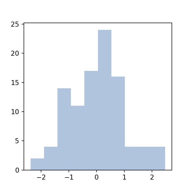
Fill color
The color argument allows changing the default blue fill color of the bins of the histogram.
import numpy as np
import matplotlib.pyplot as plt

# Seed for reproducibility
np.random.seed(4)

# Data simulation
x = np.random.normal(0, 1, 100)

# Histogram
fig, ax = plt.subplots()
ax.hist(x, color = "lightsteelblue")
# plt.show()
Border color
By default, the border color of the bins is the same as the fill color, but you can use the edgecolor argument to customize its color. The following will create a “classic” histogram where the bins are independent.
import numpy as np
import matplotlib.pyplot as plt

# Seed for reproducibility
np.random.seed(4)

# Data simulation
x = np.random.normal(0, 1, 100)

# Histogram
fig, ax = plt.subplots()
ax.hist(x, edgecolor = "white")
# plt.show()
Color by group
Finally, if your data contains several groups you can pass a list of colors to the color argument to customize the colors of the groups.

import numpy as np
import matplotlib.pyplot as plt

# Seed for reproducibility
np.random.seed(4)

# Data simulation
x1 = np.random.normal(0, 1, 100)
x2 = np.random.normal(0, 1, 100)
x = [x1, x2]

# Histogram
fig, ax = plt.subplots()
ax.hist(x, color = ["lightsalmon", "mediumaquamarine"])
# plt.show()