Sample data
The joypy library can take a pandas data frame as input with several numerical variables and also an optional categorical variable representing groups, as the sample data frame of the following block of code.
import matplotlib.pyplot as plt
import pandas as pd
import numpy as np; np.random.seed(2)
import random; random.seed(2)
import joypy

# Sample data
df = pd.DataFrame({'var1': np.random.normal(70, 100, 500),
                   'var2': np.random.normal(250, 100, 500),
                   'group': random.choices(["G1", "G2", "G3", "G4", "G5"], k = 500)})
Ridgeline plots with the joyplot function
By default, if you pass a pandas data frame as input, the joyplot function will create a ridgeline plot of the numerical variables. This is, it will show stacked density charts for each of the numerical variables of the data frame.
import matplotlib.pyplot as plt
import pandas as pd
import numpy as np; np.random.seed(2)
import random; random.seed(2)
import joypy

# Sample data
df = pd.DataFrame({'var1': np.random.normal(70, 100, 500),
                   'var2': np.random.normal(250, 100, 500),
                   'group': random.choices(["G1", "G2", "G3", "G4", "G5"], k = 500)})

fig, ax = joypy.joyplot(df)

# plt.show()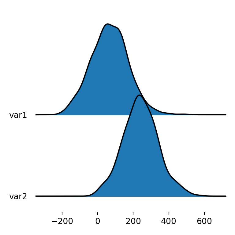
Ridgeline plot by group
However, you might also want to create a joy plot of a single variable but divided by group. In this scenario there will be as many densities as groups that represent the distribution of the variable for each group. For this purpose you will need to specify the name of the categorical variable with by and the name of the numerical variable (or variables) with column.
import matplotlib.pyplot as plt
import pandas as pd
import numpy as np; np.random.seed(2)
import random; random.seed(2)
import joypy

# Sample data
df = pd.DataFrame({'var1': np.random.normal(70, 100, 500),
                   'var2': np.random.normal(250, 100, 500),
                   'group': random.choices(["G1", "G2", "G3", "G4", "G5"], k = 500)})

fig, ax = joypy.joyplot(df, by = "group", column = "var1")

# plt.show()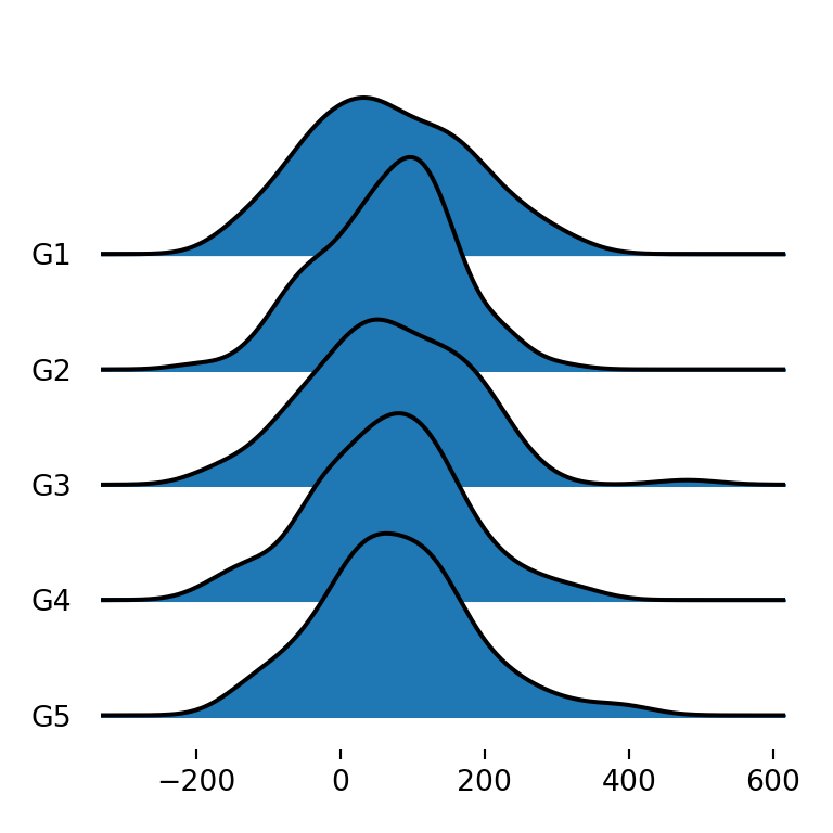
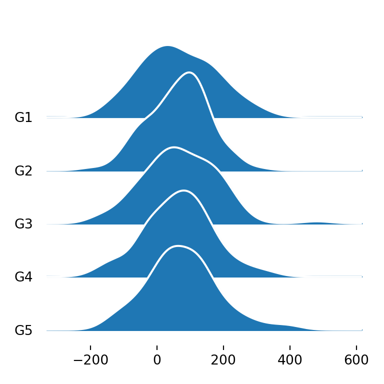
Ridgeline plot for each variable and group
The last alternative is to create a ridgeline plot that displays the density for each variable and group, so each group will have as many densities as numerical variables. You can achieve this specifying all the desired numerical variables with column (e.g. column = ["var1", "var2"]) or only using by, as in the example below.
import matplotlib.pyplot as plt
import pandas as pd
import numpy as np; np.random.seed(2)
import random; random.seed(2)
import joypy

# Sample data
df = pd.DataFrame({'var1': np.random.normal(70, 100, 500),
                   'var2': np.random.normal(250, 100, 500),
                   'group': random.choices(["G1", "G2", "G3", "G4", "G5"], k = 500)})

fig, ax = joypy.joyplot(df, by = "group")

# plt.show()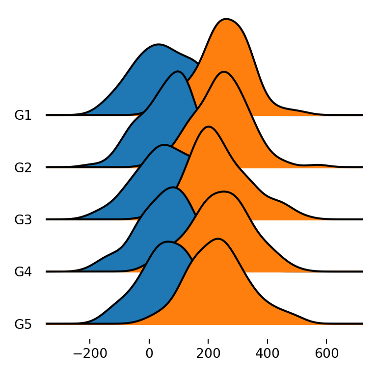
Title of the plot
The joyplot function also provides other arguments to customize the visual appearance of the plots. For instance, with title you can add a title to the figure.
import matplotlib.pyplot as plt
import pandas as pd
import numpy as np; np.random.seed(2)
import random; random.seed(2)
import joypy

# Sample data
df = pd.DataFrame({'var1': np.random.normal(70, 100, 500),
                   'var2': np.random.normal(250, 100, 500),
                   'group': random.choices(["G1", "G2", "G3", "G4", "G5"], k = 500)})

fig, ax = joypy.joyplot(df, title = "Title of the joy plot")

# plt.show()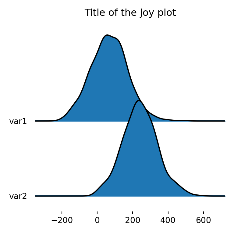
Joy plot with legend
In case you want to add a legend to the plot to identify the different variables you can specify legend = True to add an automatic legend.
import matplotlib.pyplot as plt
import pandas as pd
import numpy as np; np.random.seed(2)
import random; random.seed(2)
import joypy

# Sample data
df = pd.DataFrame({'var1': np.random.normal(70, 100, 500),
                   'var2': np.random.normal(250, 100, 500),
                   'group': random.choices(["G1", "G2", "G3", "G4", "G5"], k = 500)})

fig, ax = joypy.joyplot(df, by = "group", legend = True)

# plt.show()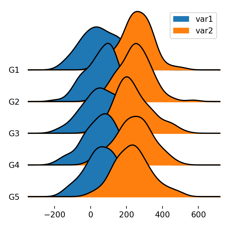
Joy plot with histograms
Ridgeline plots can also display histograms instead of density estimations. You will need to set hist = True and specify the number of bins if you want with bins, which defaults to 10.
import matplotlib.pyplot as plt
import pandas as pd
import numpy as np; np.random.seed(2)
import random; random.seed(2)
import joypy

# Sample data
df = pd.DataFrame({'var1': np.random.normal(70, 100, 500),
                   'var2': np.random.normal(250, 100, 500),
                   'group': random.choices(["G1", "G2", "G3", "G4", "G5"], k = 500)})

fig, ax = joypy.joyplot(df, by = "group", column = "var1",
                        hist = True, bins = 50)

# plt.show()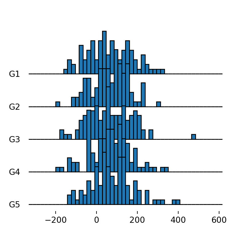
Adding a grid
The grid argument defaults to False and can be used to add a vertical grid when set to True. This feature is interesting to compare the distribution for the different groups.
import matplotlib.pyplot as plt
import pandas as pd
import numpy as np; np.random.seed(2)
import random; random.seed(2)
import joypy

# Sample data
df = pd.DataFrame({'var1': np.random.normal(70, 100, 500),
                   'var2': np.random.normal(250, 100, 500),
                   'group': random.choices(["G1", "G2", "G3", "G4", "G5"], k = 500)})

fig, ax = joypy.joyplot(df, by = "group", column = "var1", grid = True)

# plt.show()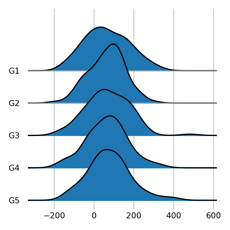
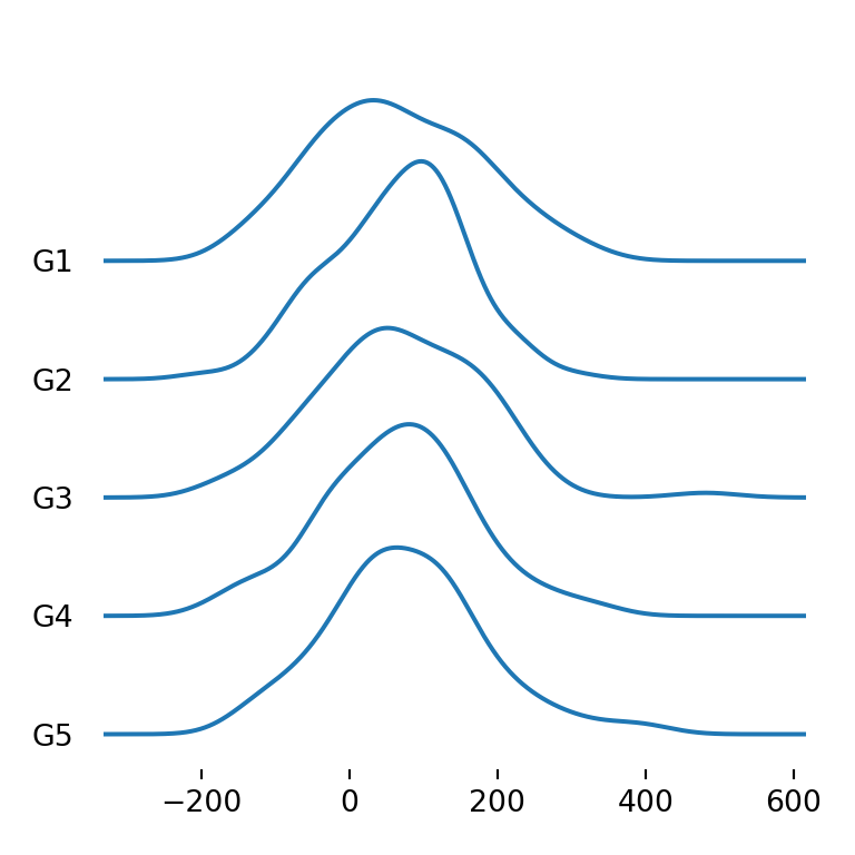
Type of density
The kind argument can be used to set the type of density to be created. Possible values are "kde" (the default), "counts", "normalized_counts" and "values".
import matplotlib.pyplot as plt
import pandas as pd
import numpy as np; np.random.seed(2)
import random; random.seed(2)
import joypy

# Sample data
df = pd.DataFrame({'var1': np.random.normal(70, 100, 500),
                   'var2': np.random.normal(250, 100, 500),
                   'group': random.choices(["G1", "G2", "G3", "G4", "G5"], k = 500)})

fig, ax = joypy.joyplot(df, by = "group", column = "var1",
                        kind = "counts")

# plt.show()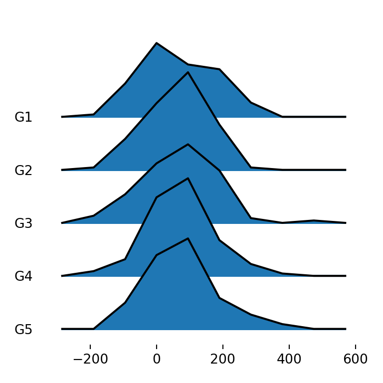
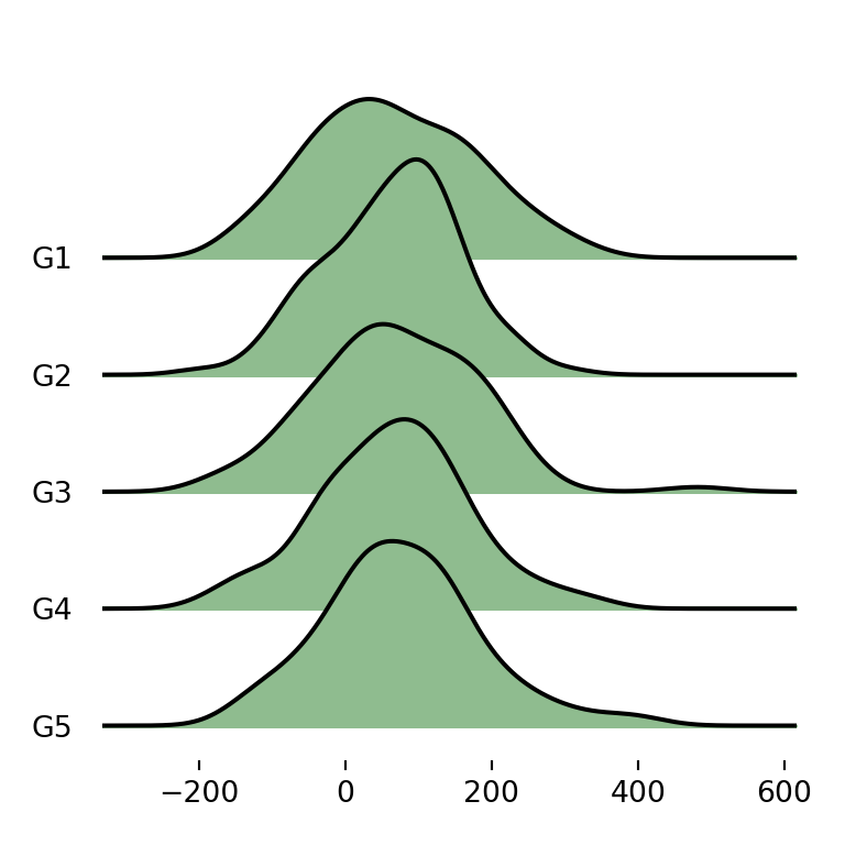
Border and fill colors
joypy also provides several ways to customize the visual appearance of the plots. If you want to change the default blue color of the densities you can specify a new color with color.
import matplotlib.pyplot as plt
import pandas as pd
import numpy as np; np.random.seed(2)
import random; random.seed(2)
import joypy

# Sample data
df = pd.DataFrame({'var1': np.random.normal(70, 100, 500),
                   'var2': np.random.normal(250, 100, 500),
                   'group': random.choices(["G1", "G2", "G3", "G4", "G5"], k = 500)})

fig, ax = joypy.joyplot(df, by = "group", column = "var1", color = "darkseagreen")

# plt.show()
Different color for each group
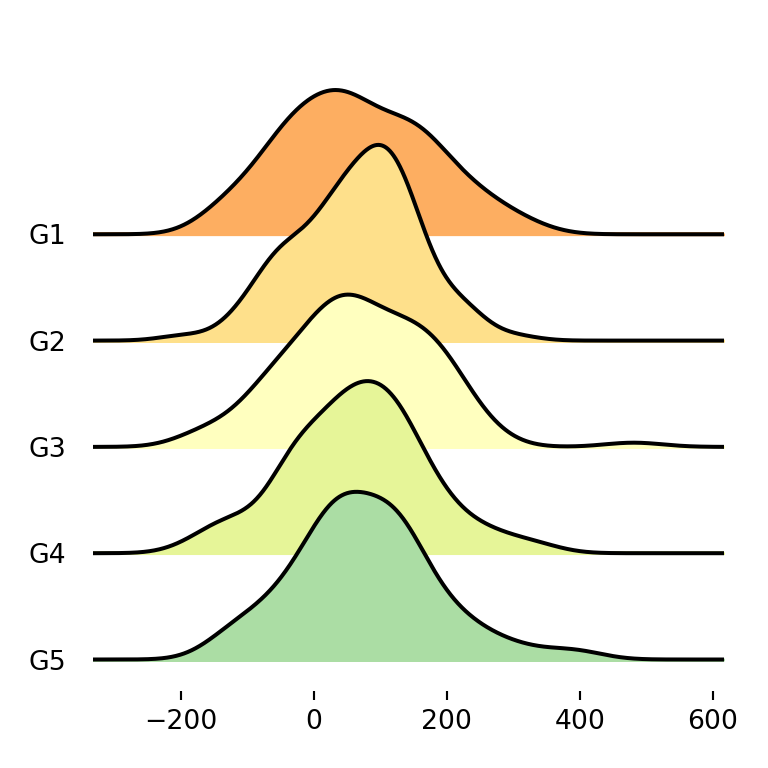
Note that you can also pass an array of colors as input of the color argument with as many colors as groups.
import matplotlib.pyplot as plt
import pandas as pd
import numpy as np; np.random.seed(2)
import random; random.seed(2)
import joypy

# Sample data
df = pd.DataFrame({'var1': np.random.normal(70, 100, 500),
                   'var2': np.random.normal(250, 100, 500),
                   'group': random.choices(["G1", "G2", "G3", "G4", "G5"], k = 500)})
colors = ["#FDAE61", "#FEE08B", "#FFFFBF", "#E6F598", "#ABDDA4"]

fig, ax = joypy.joyplot(df, by = "group", column = "var1", color = colors)

# plt.show()
Using color palettes
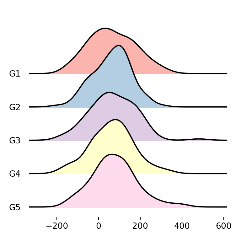
An alternative to the previous is using matplotlib predefined color palettes with colormap. Recall that you will need to import cm from matplotlib with from matplotlib import cm.
import matplotlib.pyplot as plt
from matplotlib import cm
import pandas as pd
import numpy as np; np.random.seed(2)
import random; random.seed(2)
import joypy

# Sample data
df = pd.DataFrame({'var1': np.random.normal(70, 100, 500),
                   'var2': np.random.normal(250, 100, 500),
                   'group': random.choices(["G1", "G2", "G3", "G4", "G5"], k = 500)})

fig, ax = joypy.joyplot(df, by = "group", column = "var1", colormap = cm.Pastel1)

# plt.show()
Color transparency
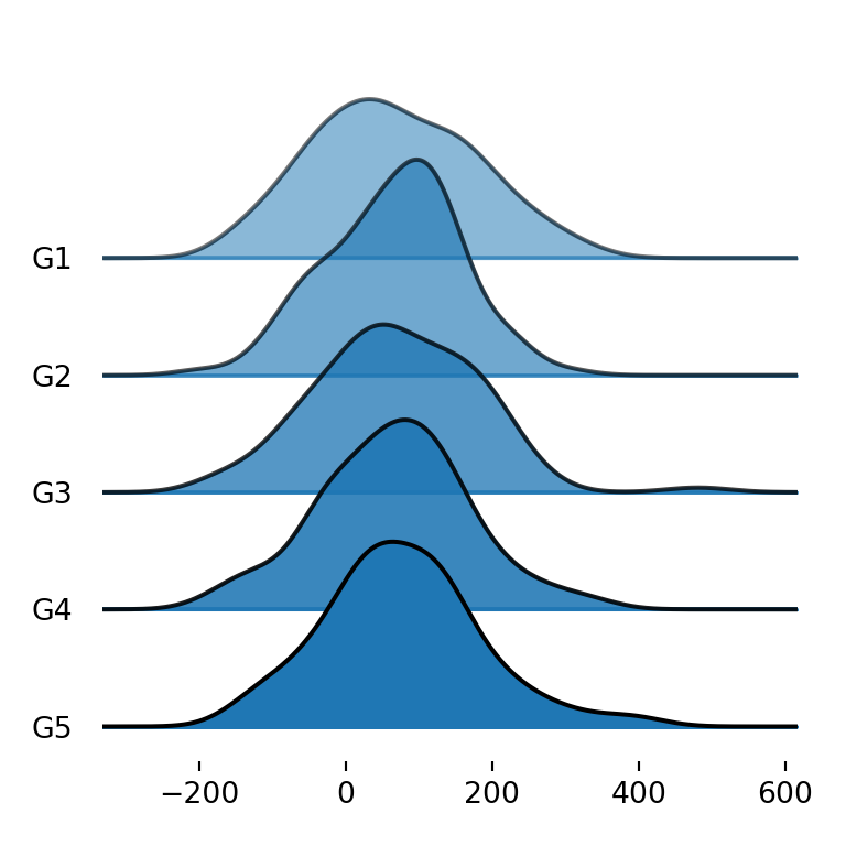
Sometimes the densities overlap one of each other. If this happens you can set fade = True so each density will be more opaque than the previous (from top to bottom), allowing a better visualization of the densities.
import matplotlib.pyplot as plt
import pandas as pd
import numpy as np; np.random.seed(2)
import random; random.seed(2)
import joypy

# Sample data
df = pd.DataFrame({'var1': np.random.normal(70, 100, 500),
                   'var2': np.random.normal(250, 100, 500),
                   'group': random.choices(["G1", "G2", "G3", "G4", "G5"], k = 500)})

fig, ax = joypy.joyplot(df, by = "group", column = "var1", fade = True)

# plt.show()
Color of the lines
The density lines are black by default, but with linecolor you can choose the color you prefer. In the following example we are setting it to white.
import matplotlib.pyplot as plt
import pandas as pd
import numpy as np; np.random.seed(2)
import random; random.seed(2)
import joypy

# Sample data
df = pd.DataFrame({'var1': np.random.normal(70, 100, 500),
                   'var2': np.random.normal(250, 100, 500),
                   'group': random.choices(["G1", "G2", "G3", "G4", "G5"], k = 500)})

fig, ax = joypy.joyplot(df, by = "group", column = "var1", linecolor = "white")

# plt.show()
Remove the fill color
Note that you can also remove the area of the densities and just left the line setting fill = False.
import matplotlib.pyplot as plt
import pandas as pd
import numpy as np; np.random.seed(2)
import random; random.seed(2)
import joypy

# Sample data
df = pd.DataFrame({'var1': np.random.normal(70, 100, 500),
                   'var2': np.random.normal(250, 100, 500),
                   'group': random.choices(["G1", "G2", "G3", "G4", "G5"], k = 500)})

fig, ax = joypy.joyplot(df, by = "group", column = "var1", fill = False)

# plt.show()
Background color
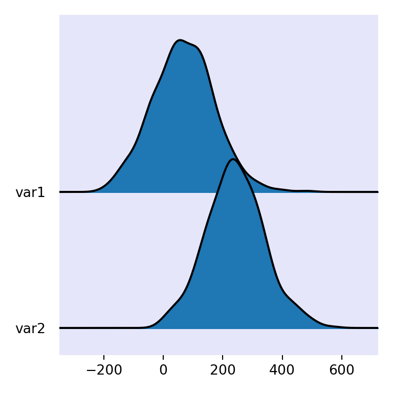
Finally, you can also customize the background color of the plot with background, which defaults to None.
import matplotlib.pyplot as plt
from matplotlib import cm
import pandas as pd
import numpy as np; np.random.seed(2)
import random; random.seed(2)
import joypy

# Sample data
df = pd.DataFrame({'var1': np.random.normal(70, 100, 500),
                   'var2': np.random.normal(250, 100, 500),
                   'group': random.choices(["G1", "G2", "G3", "G4", "G5"], k = 500)})

fig, ax = joypy.joyplot(df, background = "lavender")

# plt.show()