Sample data
Consider the following data for illustration purposes:
import numpy as np

# Seed
rng = np.random.RandomState(1)

# Data simulation
x = rng.uniform(0, 1, 40)
y = rng.uniform(0, 1, 40)
size = rng.uniform(20, 60, 40)
Bubble chart in matplotlib with scatter
A bubble chart is a scatter plot where a third numeric variable is mapped to the size of the markers. Matplotlib does not need a dedicated function: just pass an array to the s argument of scatter.
import matplotlib.pyplot as plt

fig, ax = plt.subplots()
ax.scatter(x, y, s = size)

# plt.show()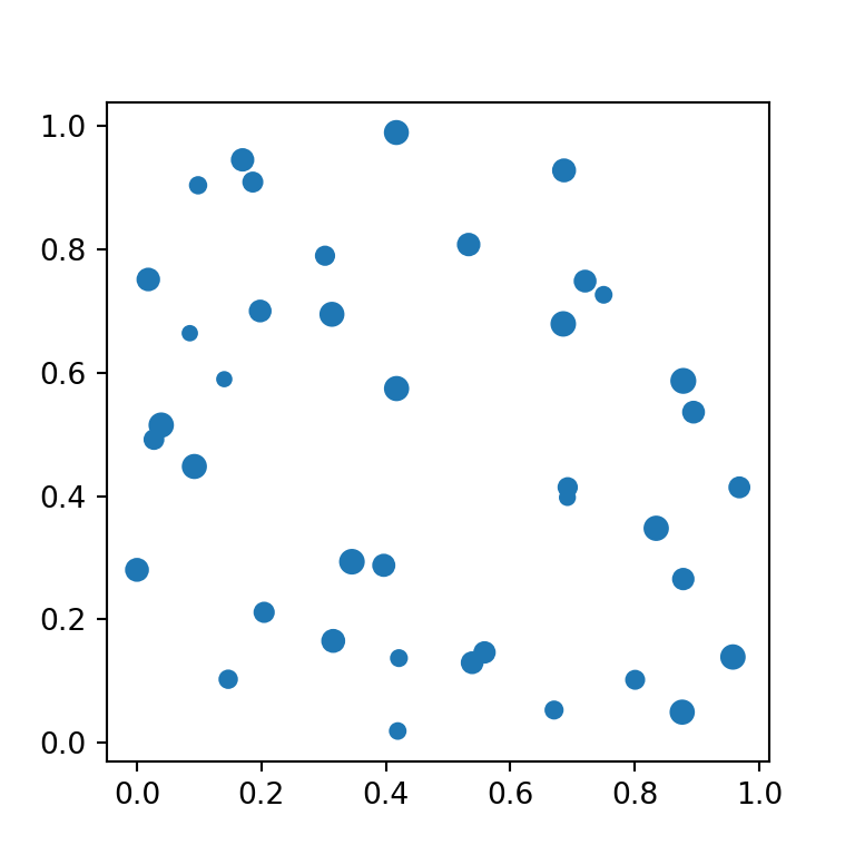
Size scale
The values passed to s are the marker area in points, not a relative scale, so you will often need to multiply your variable by a constant to get a readable range of bubble sizes.
import matplotlib.pyplot as plt

fig, ax = plt.subplots()
ax.scatter(x, y, s = size * 10)

# plt.show()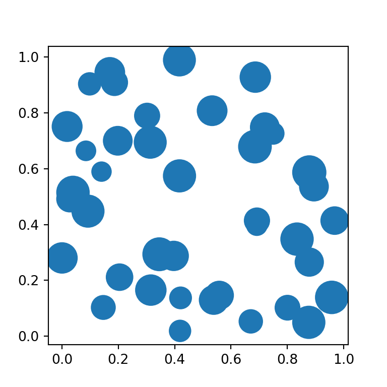
Colors
Map a fourth variable to c together with a cmap to also encode color, or pass a single fixed color for every bubble.
import matplotlib.pyplot as plt

fig, ax = plt.subplots()
ax.scatter(x, y, s = size * 10, c = size, cmap = "viridis")

# plt.show()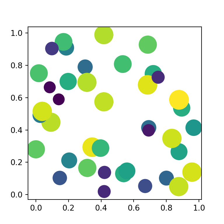
Transparency and edge color
Overlapping bubbles are easier to read with some transparency (alpha) and a border (edgecolors).
import matplotlib.pyplot as plt

fig, ax = plt.subplots()
ax.scatter(x, y, s = size * 10, color = "#4C72B0",
          alpha = 0.6, edgecolors = "white")

# plt.show()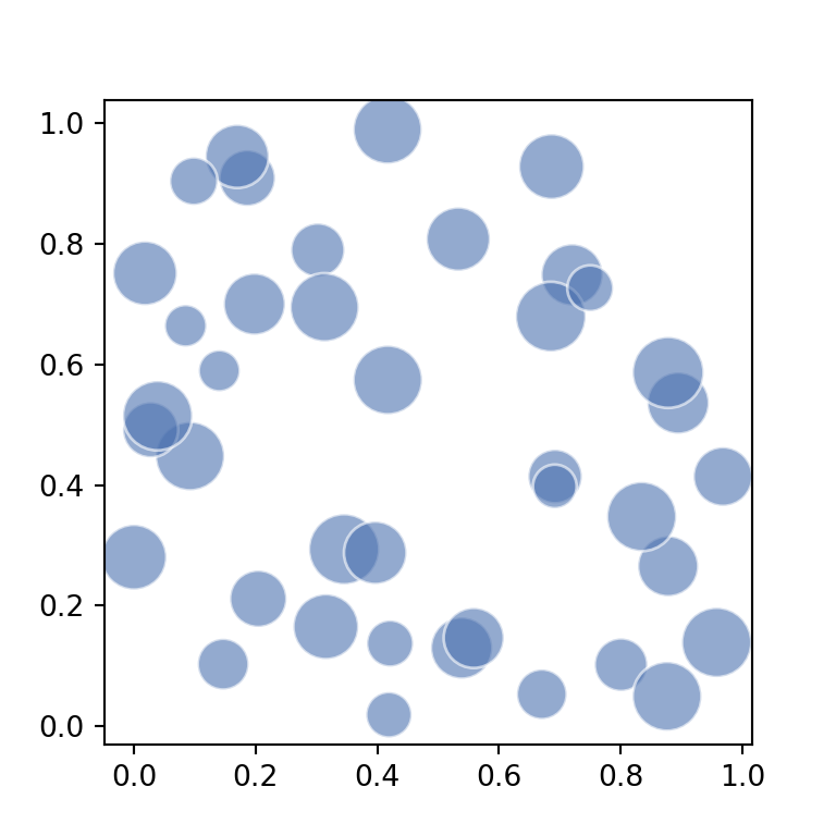
Size legend
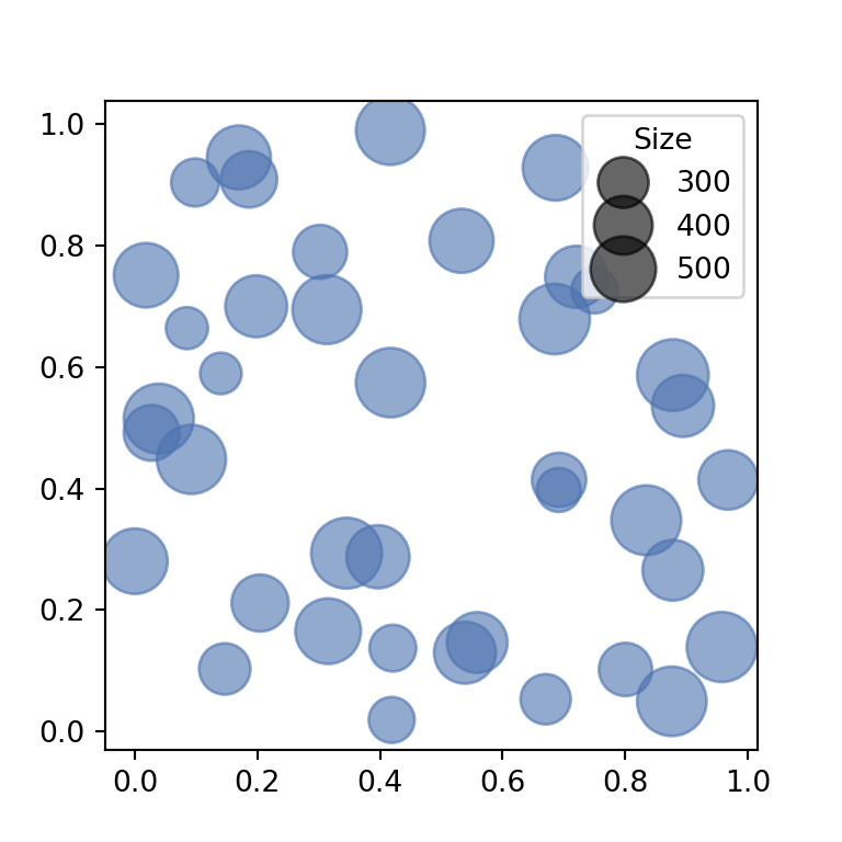
Since scatter does not create a size legend automatically, build one manually with legend_elements, which derives sample handles from the plotted sizes.
import matplotlib.pyplot as plt

fig, ax = plt.subplots()
scatter = ax.scatter(x, y, s = size * 10, color = "#4C72B0", alpha = 0.6)

handles, labels = scatter.legend_elements(prop = "sizes", num = 4, alpha = 0.6)
ax.legend(handles, labels, title = "Size", loc = "upper right")

# plt.show()