Sample data
Consider the following data for illustration purposes:
import numpy as np

# Seed
rng = np.random.RandomState(3)

# Data simulation
x = np.arange(1, 13)
y = np.cumsum(rng.normal(0, 1, size = 12)) + 10
Connected scatter plot in matplotlib
A connected scatter plot is a line chart where the individual data points are also marked, which is useful to show both the trend and the exact observations, especially when there are relatively few of them. Matplotlib does not need a dedicated function for it: just pass marker to the regular plot function.
import matplotlib.pyplot as plt

fig, ax = plt.subplots()
ax.plot(x, y, marker = "o")

# plt.show()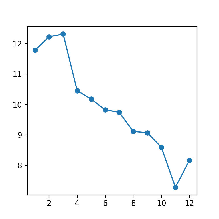
Marker shape and size
Customize the markers the same way as in a regular scatter plot, with markersize and any of matplotlib’s marker shapes.
import matplotlib.pyplot as plt

fig, ax = plt.subplots()
ax.plot(x, y, marker = "D", markersize = 8)

# plt.show()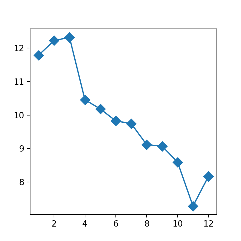
Line and marker color
Set color for the line and markerfacecolor / markeredgecolor to style the markers independently.
import matplotlib.pyplot as plt

fig, ax = plt.subplots()
ax.plot(x, y, marker = "o", color = "#4C72B0",
       markerfacecolor = "white", markeredgewidth = 2)

# plt.show()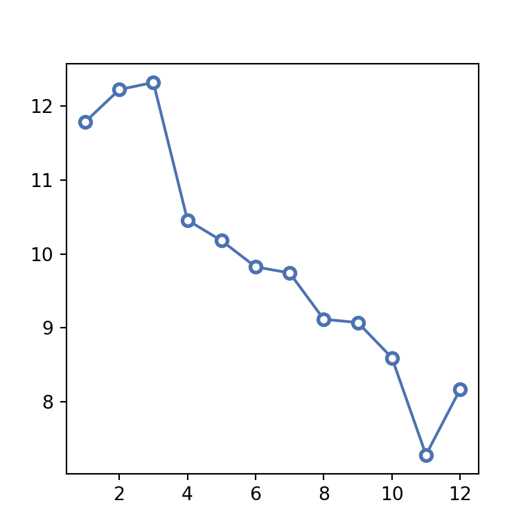
Line style
Change the line style with linestyle, for example to a dashed line.
import matplotlib.pyplot as plt

fig, ax = plt.subplots()
ax.plot(x, y, marker = "o", linestyle = "--")

# plt.show()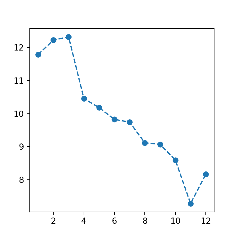
Highlighting a point
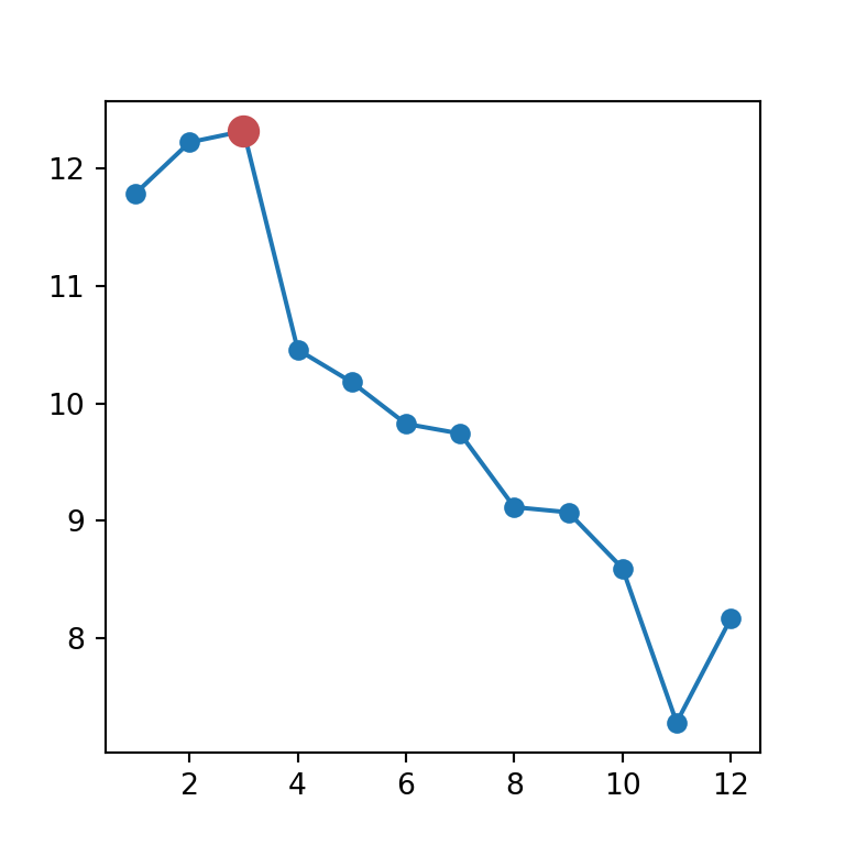
Overlay a second scatter call on top of the specific point (for example the maximum) to highlight it with a different color and size.
import matplotlib.pyplot as plt
import numpy as np

fig, ax = plt.subplots()
ax.plot(x, y, marker = "o")

i = np.argmax(y)
ax.scatter(x[i], y[i], color = "#C44E52", s = 100, zorder = 3)

# plt.show()