Sample data set
Consider the well-known iris data set for this tutorial, which contains four numerical variables representing the length and the width of sepals and petals and one categorical variable representing species of plants.
import seaborn as sns

df = sns.load_dataset("iris")
Creating and customizing a pairs plot with pairplot
Default pairs plot
The pairplot function from seaborn allows creating a pairwise plot in Python. You just need to pass your data set in long-format, where each column is a variable.
import seaborn as sns

sns.pairplot(df)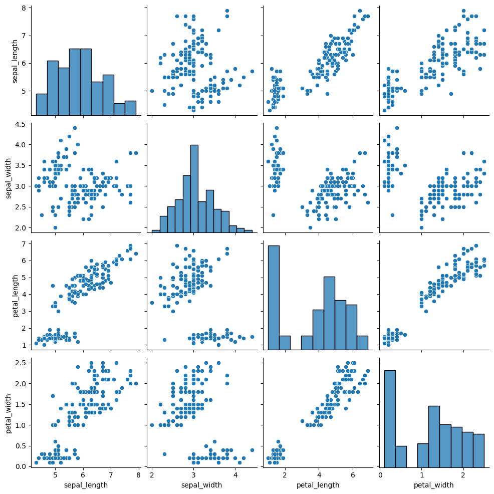
Variable selection
Note that you can also select the variables you want to include in the representation with vars. If you want to include different variables for the X and Y axes use the x_vars and y_bars arguments instead.
import seaborn as sns

sns.pairplot(df, vars = ["petal_length", "petal_width"])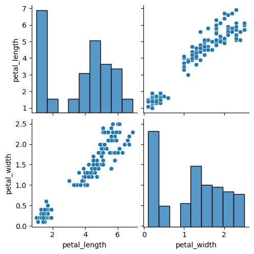
Color by group
If the data set you are working with contains a categorical variable representing groups you can pass it to the hue argument, so the graphical representations will be created and colored based on that groups.
import seaborn as sns

sns.pairplot(df, hue = "species")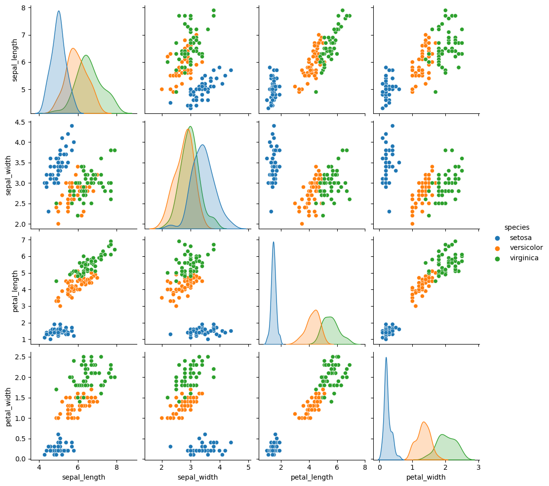
Customization
The plot_kws and diag_kws arguments can be used to make a further customization of the plot passing dictionaries. While the first can be used to modify the style of the upper and lower panels, the second argument allows customizing the styling of the diagonal.
import seaborn as sns

sns.pairplot(df,
             plot_kws = {'color': 'green', 'marker': 's'},
             diag_kws = {'color': 'orange'})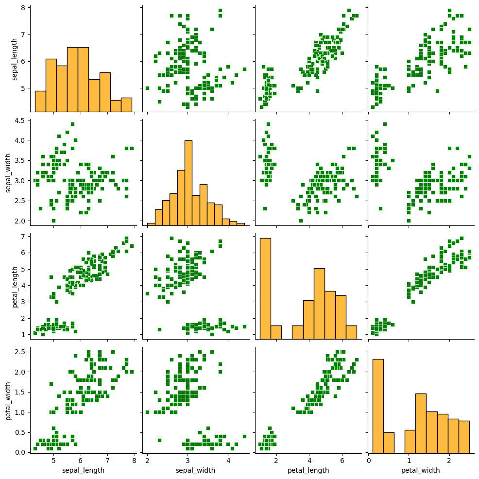
Custom markers for each group
Note that you can override the default markers for the scatter plot with the markers argument, as shown below. Recall that you can pass a selection of markers to this function.
import seaborn as sns

sns.pairplot(df, hue = "species",
             markers = ['d', 'p', 'v'])
Remove the upper panel
The corner argument is False by default. If set to True, a corner plot will be created removing the upper corner of the plot.
import seaborn as sns

sns.pairplot(df, hue = "species",
             corner = True)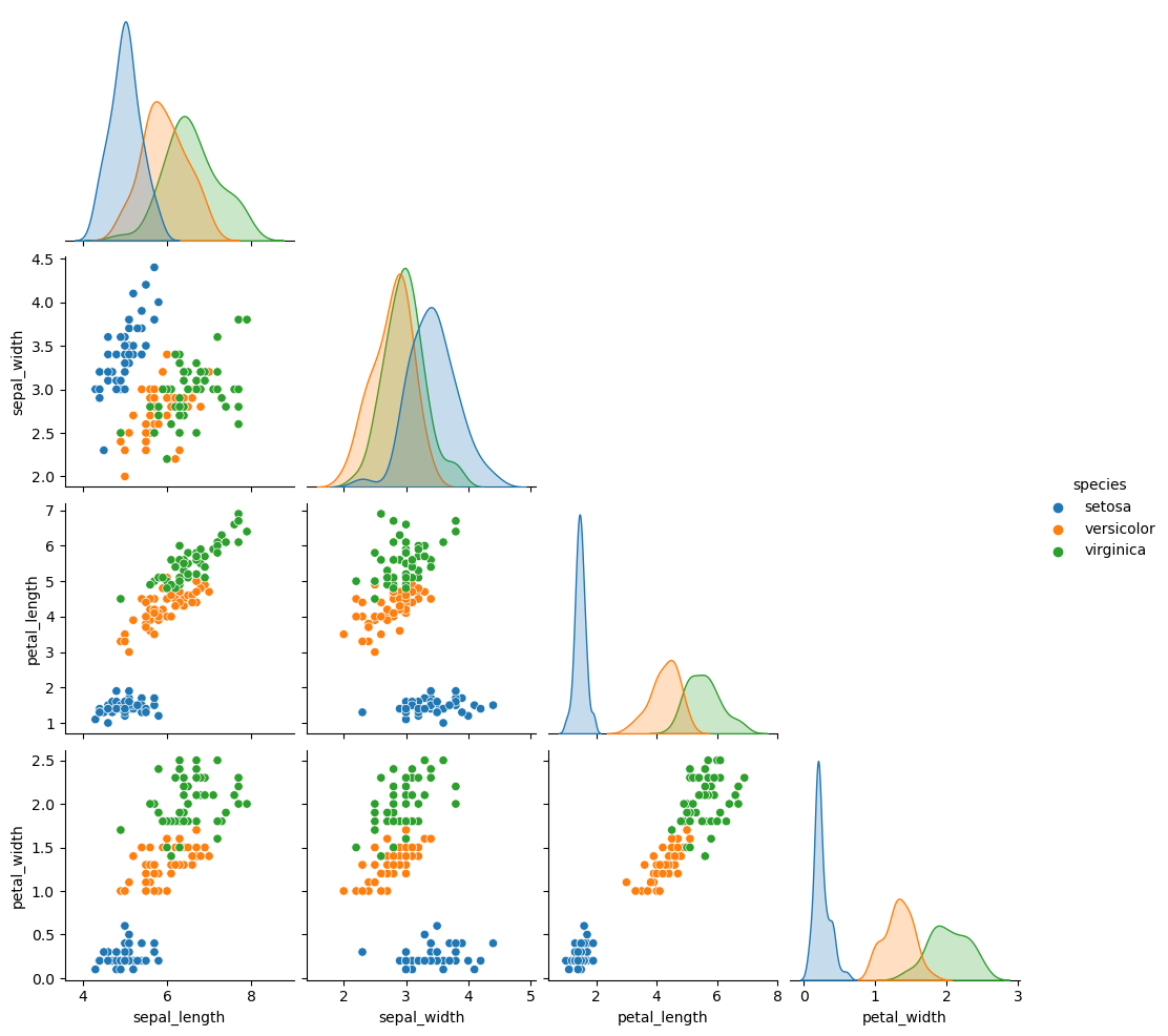
Pairwise plot types
There are several kinds of plots to create, which can be selected using the kind argument. By default, a scatter plots will be shown on the panels with histograms on the diagonal, but you can also select "kde" for kernel density estimates, "hist" for histograms and 2D histograms and "reg" to add regression lines over the scatter plots.
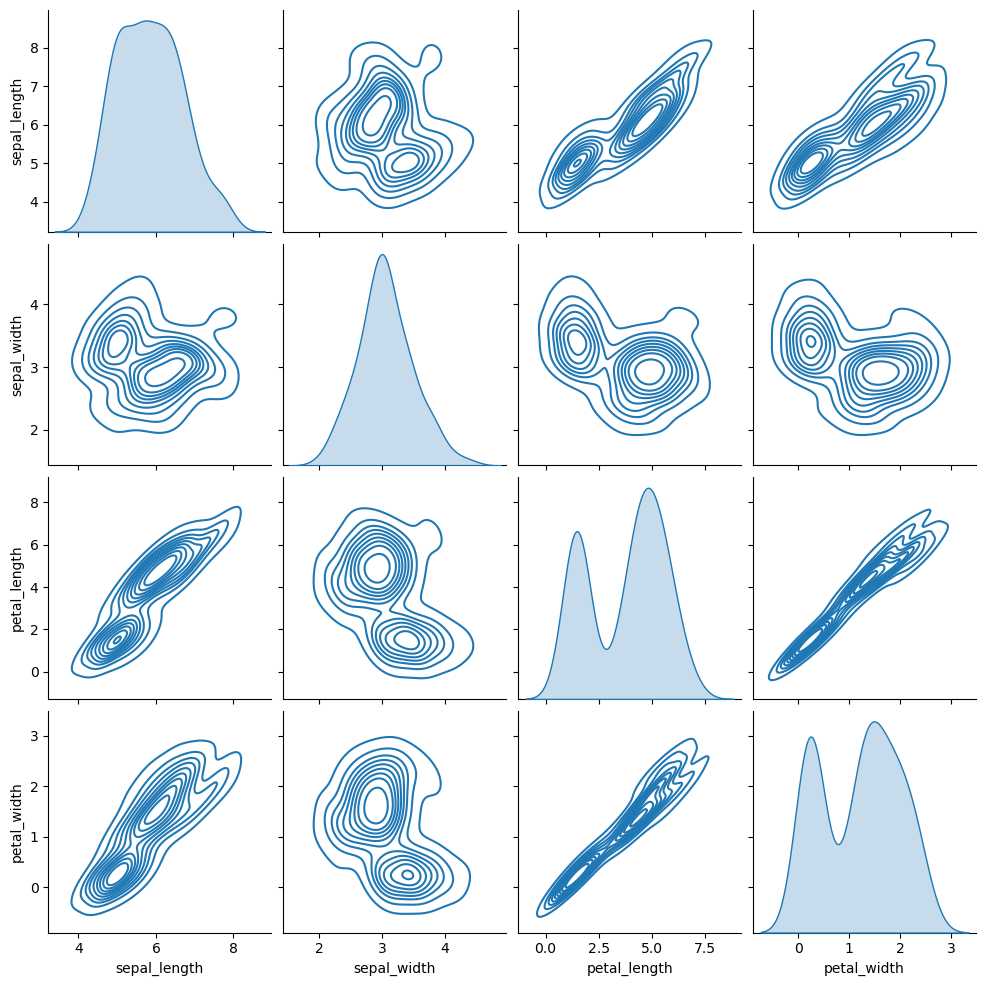
Kernel density estimate
import seaborn as sns

sns.pairplot(df, kind = "kde")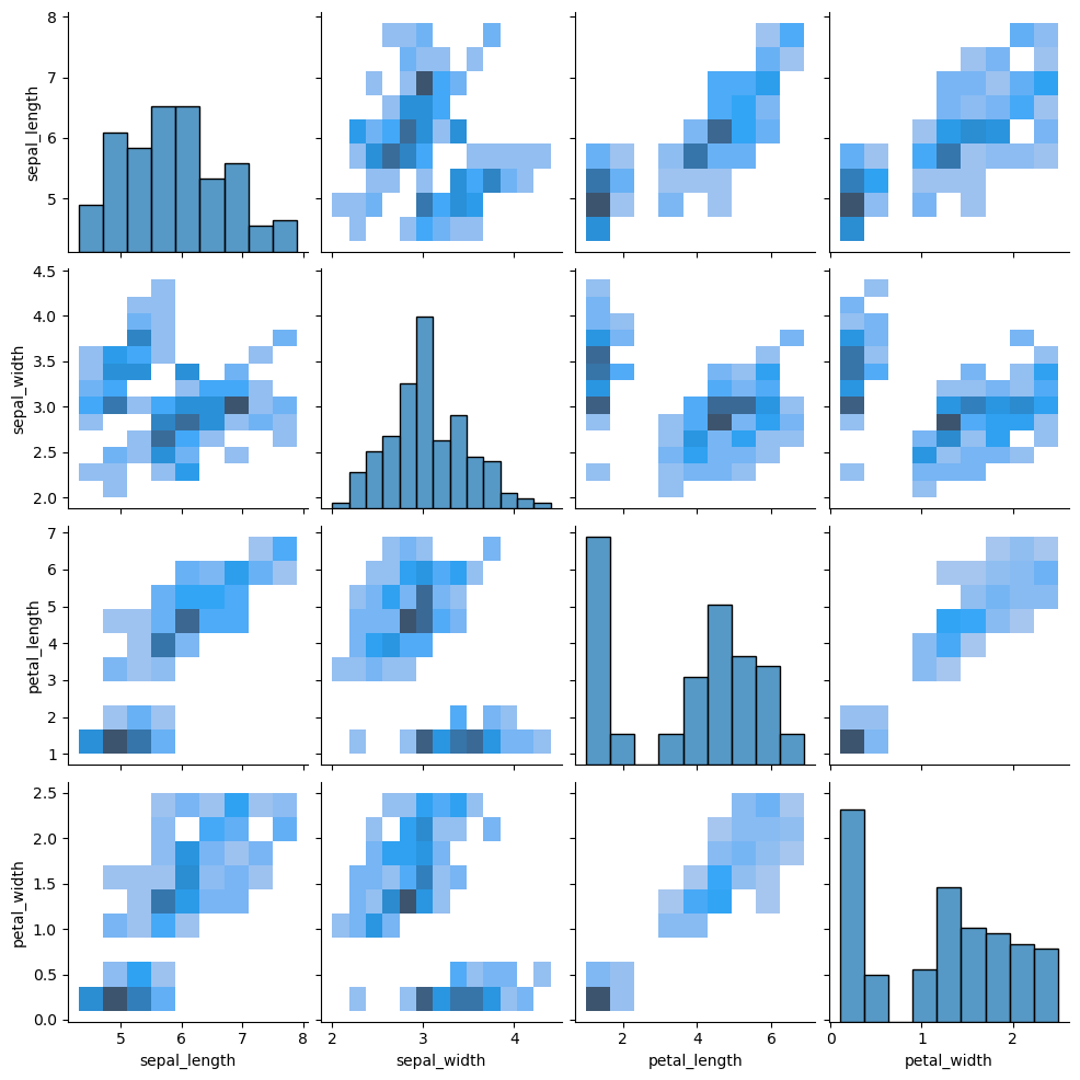
2D histogram
import seaborn as sns

sns.pairplot(df, kind = "hist")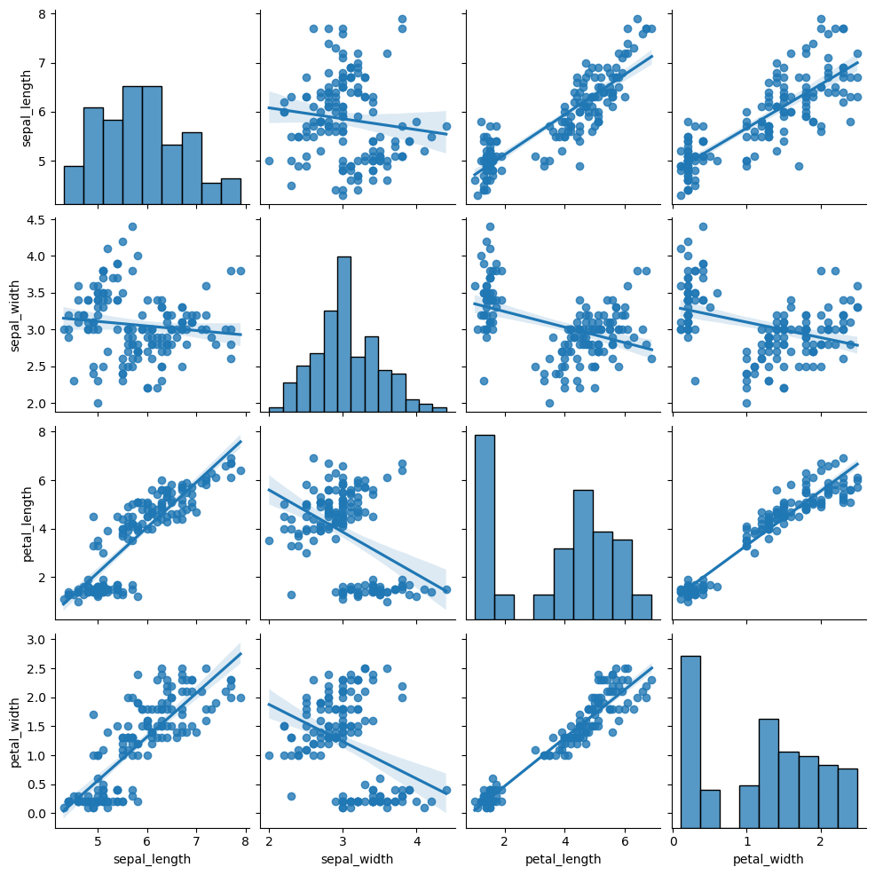
Regression
import seaborn as sns

sns.pairplot(df, kind = "reg")
Recall that you can also set the hue argument in these scenarios, so the data will be represented and colored by group.
Diagonal type
The default diagonal of the pair plot are histograms. However, setting the diag_kind argument to "kde" you can add kernel density estimates instead of histograms and setting the argument to None will display scatter plots of each variable against themselves (a straight line), as shown in the examples below.
Diagonal with kernel density estimates
import seaborn as sns

sns.pairplot(df, diag_kind = "kde")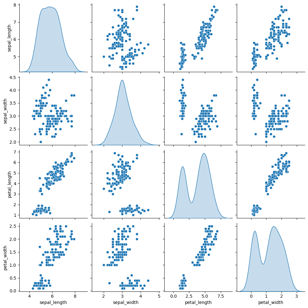
Remove the diagonal
import seaborn as sns

sns.pairplot(df, diag_kind = None)