3D scatter plot with scatter or scatter3D
The process of creating a 3D scatter plot in matplotlib is very similar to the process of creating a 2D scatter plot, as the same function is used, but for a 3D chart you will need to add a subplot with 3D projection and input the Z variable. Note that matplotlib also provides the same function but named scatter3D.
import matplotlib.pyplot as plt
import numpy as np

# Sample data
np.random.seed(4072023)
x = np.random.normal(size = 200)
y = np.random.normal(size = 200)
z = np.random.normal(size = 200)

fig = plt.figure()
ax = fig.add_subplot(projection = '3d')

# 3D scatter plot
ax.scatter(x, y, z)

# Equivalent to:
ax.scatter3D(x, y, z)

# plt.show()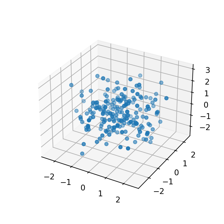
Adding a title and axis labels
If you want to add a title or the axis labels you can use the title, set_xlabel, set_ylabel and set_zlabel functions with the desired text.
import matplotlib.pyplot as plt
import numpy as np

# Sample data
np.random.seed(4072023)
x = np.random.normal(size = 200)
y = np.random.normal(size = 200)
z = np.random.normal(size = 200)

fig = plt.figure()
ax = fig.add_subplot(projection = '3d')

# 3D scatter plot
ax.scatter(x, y, z)

# Axis labels
ax.set_xlabel('X-axis label')
ax.set_ylabel('Y-axis label')
ax.set_zlabel('Z-axis label')

# Title
plt.title("3D scatter plot")

# plt.show()
Markers style, size and color
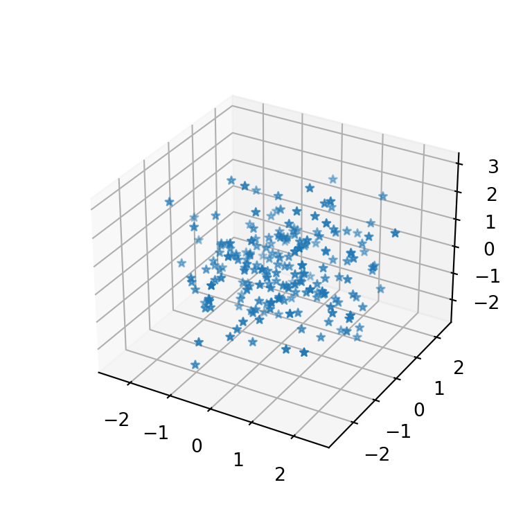
By default, the 3D scatter plot markers are blue circles of size 20, but you can customize these settings based on your preferences.
The marker argument of the function can be used to change the default marker. If you don’t know which markers are available you can pick any from this matplotlib markers list.
import matplotlib.pyplot as plt
import numpy as np

# Sample data
np.random.seed(4072023)
x = np.random.normal(size = 200)
y = np.random.normal(size = 200)
z = np.random.normal(size = 200)

fig = plt.figure()
ax = fig.add_subplot(projection = '3d')

# 3D scatter plot
ax.scatter(x, y, z, marker = '*')

# plt.show()
Size of the markers
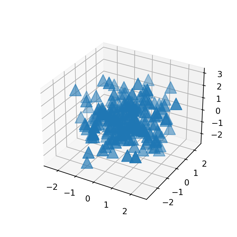
If the markers are too big or too small you can set a custom size passing an integer to the s argument. The default value is 20 ‘points ** 2’.
import matplotlib.pyplot as plt
import numpy as np

# Sample data
np.random.seed(4072023)
x = np.random.normal(size = 200)
y = np.random.normal(size = 200)
z = np.random.normal(size = 200)

fig = plt.figure()
ax = fig.add_subplot(projection = '3d')

# 3D scatter plot
ax.scatter(x, y, z, marker = '^', s = 200)

# plt.show()
If you want to add different markers based on some condition or group, you will need to split your data and add the points separately or with a loop, as markers doesn’t support a list as input.
Markers color
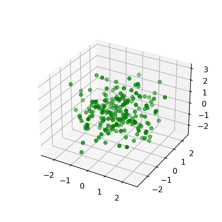
The color of the markers can be set passing a new color to c. Recall to check the list of matplotlib colors to pick the best color for your plot.
import matplotlib.pyplot as plt
import numpy as np

# Sample data
np.random.seed(4072023)
x = np.random.normal(size = 200)
y = np.random.normal(size = 200)
z = np.random.normal(size = 200)

fig = plt.figure()
ax = fig.add_subplot(projection = '3d')

# 3D scatter plot
ax.scatter(x, y, z, c = 'green')

# plt.show()
Color by group or based on a condition
The c argument admits a list of colors as input. This is very useful if you want to color the markers based on groups or a condition. In the following example we assign colors based on the values of z.
import matplotlib.pyplot as plt
import numpy as np
# Sample data
np.random.seed(4072023)
x = np.random.normal(size = 200)
y = np.random.normal(size = 200)
z = np.random.normal(size = 200)
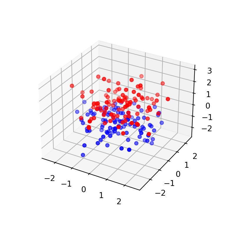
# Red if z > 0 and blue otherwise
colors = np.where(z > 0, "red", "blue")
fig = plt.figure()
ax = fig.add_subplot(projection = '3d')
# 3D scatter plot
ax.scatter(x, y, z, c = colors)
# plt.show()Continuous color palette
The color of the markers can also be based on a continuous variable, creating a color gradient. In the example below we link the color to the values of z and we specify the viridis color palette with cmap.

import matplotlib.pyplot as plt
import numpy as np
# Sample data
np.random.seed(4072023)
x = np.random.normal(size = 200)
y = np.random.normal(size = 200)
z = np.random.normal(size = 200)
fig = plt.figure()
ax = fig.add_subplot(projection = '3d')
# 3D scatter plot
ax.scatter(x, y, z, c = z, cmap = 'viridis')
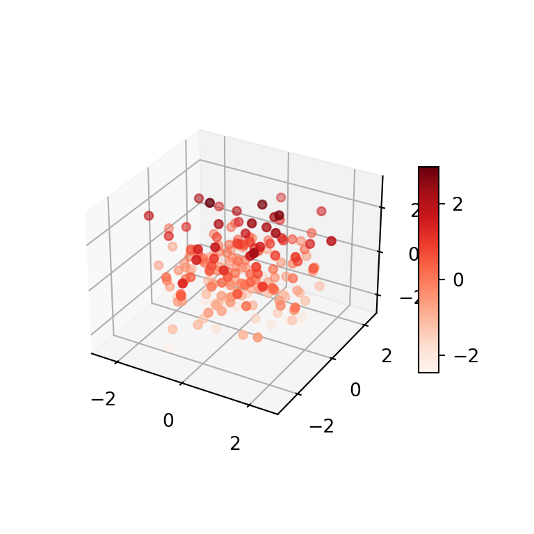
# plt.show()3D scatter plot with color bar
If the markers are colored based on a variable you might want to add a color bar as legend, so the colors will be more readable. For this purpose you will need to use the colorbar function as in the example below and customize the shrink and aspect ratio to meet your needs.
import matplotlib.pyplot as plt
import numpy as np

# Sample data
np.random.seed(4072023)
x = np.random.normal(size = 200)
y = np.random.normal(size = 200)
z = np.random.normal(size = 200)

fig = plt.figure()
ax = fig.add_subplot(projection = '3d')

# 3D scatter plot with color bar
plot = ax.scatter(x, y, z, c = z, cmap = 'Reds')
fig.colorbar(plot, ax = ax, shrink = 0.5, aspect = 10)

# plt.show()