There are two functions in seaborn to create a scatter plot with a regression line: regplot and lmplot. Despite these functions are very similar, they have some minor differences. The output of lmplot is a square figure, requires the data argument and allows visualizing the relationship of the variables based on groups while regplot doesn’t, in addition to other differences.
Sample data
The data below will be used in the examples of this tutorial. Note that the lmplot function requires a pandas data frame as argument while regplot can be used without setting the data argument.
import numpy as np
import pandas as pd
from random import choices

# Seed
rng = np.random.RandomState(0)

# Data simulation
x = rng.uniform(0, 1, 300)
y = 5 * x + rng.normal(0, 2, size = 300)
group = choices(["A", "B"], k = 300)
x = x + rng.uniform(-0.2, 0.2, 300)

# Data set
df = {'x': x, 'y': y, 'group': group}

# Pandas data frame
df = pd.DataFrame(data = df)
Single regression model with regplot
In order to create a scatter plot in seaborn with a regression line pass your data to the regplot function. Note that both the colors and the estimates will be colored in blue by default.
import seaborn as sns

sns.regplot(x = x, y = y)

# Equivalent to:
sns.regplot(x = "x", y = "y", data = df)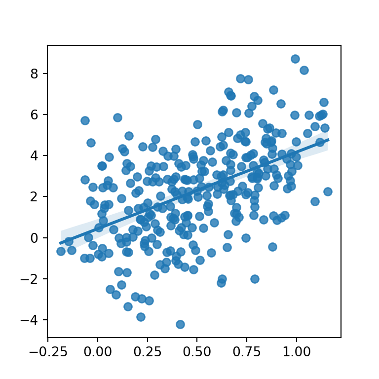
Different colors for points and line
If you need to modify the default colors of the points and the line and the confidence interval you will need to pass dictionaries to the scatter_kws and line_kws arguments, respectively, as shown in the following example.
import seaborn as sns

sns.regplot(x = x, y = y,
            scatter_kws = {"color": "black", "alpha": 0.5},
            line_kws = {"color": "red"})
Confidence interval level
Note that the default confidence interval is at 95%. You can use the ci argument to modify the level of confidence or to remove it setting the argument to None.
import seaborn as sns

sns.regplot(x = x, y = y,
            scatter_kws = {"color": "black", "alpha": 0.5},
            line_kws = {"color": "red"},
            ci = 99) # 99% level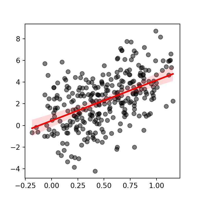
Regression lines by group with lmplot
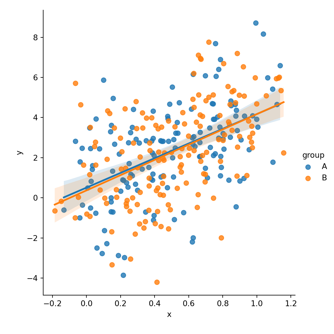
The lmplot function allows creating regression lines based on a categorical variable. You just need to pass the variable to the hue argument of the function. Note that this function requires the data argument with a pandas data frame as input.
import seaborn as sns

sns.lmplot(x = "x", y = "y",
           hue = "group", data = df)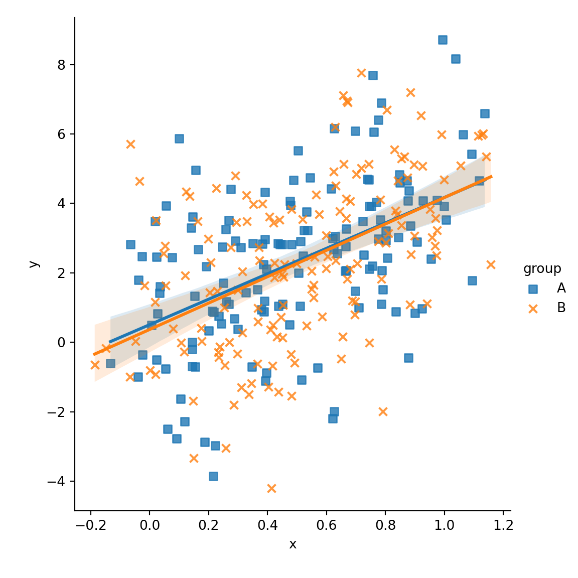
Different marker for each group
The markers argument allows customizing the shape of the symbols of the plot as shown below.
import seaborn as sns

sns.lmplot(x = "x", y = "y",
           hue = "group", markers = ["s", "x"],
           data = df)
Color palette
Note that you can override the default color palette with the palette argument of the function.
import seaborn as sns

sns.lmplot(x = "x", y = "y",
           hue = "group", markers = ["s", "x"],
           palette = "Set2",
           data = df)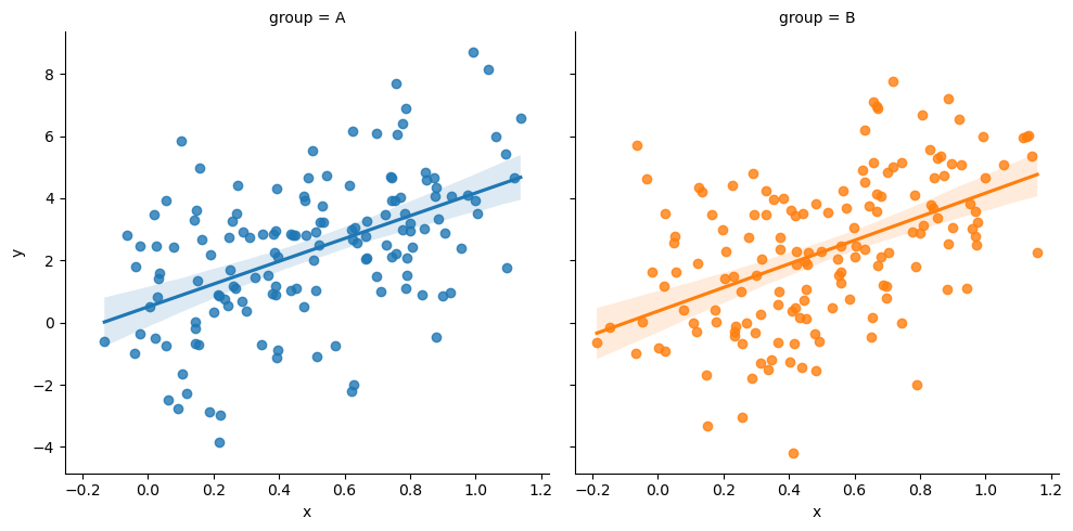
Plot across different columns
In the previous plots both estimates were displayed over the same plot. If you prefer plotting the estimates across different plots you can pass the categorical variable to the col argument of the function.
import seaborn as sns

sns.lmplot(x = "x", y = "y",
           col = "group", hue = "group",
           data = df)