Bubble plots in plotly
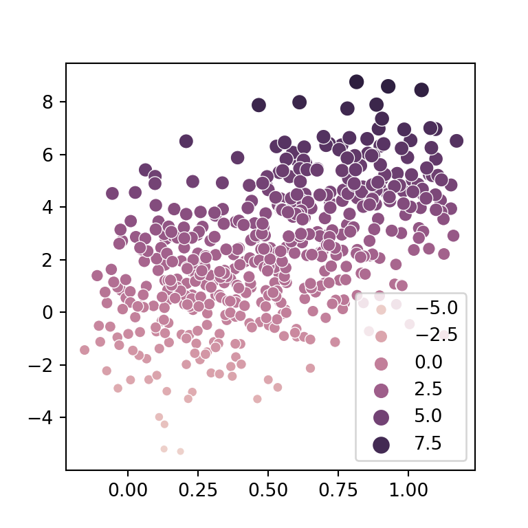
A bubble chart is a scatter plot in which the markers are sized based on a numerical variable. You can create bubble plots in Python with the scatter function from plotly express. In order to create this visualization you will need to input the coordinates of the bubbles to x and y and their sizes to size, as in the example below.
import plotly.express as px

fig = px.scatter(x = [5, 7, 3, 6, 1, 9, 2],
                 y = [2, 6, 2, 1, 4, 1, 6],
                 size = [30, 25, 250, 12, 140, 80, 36])

fig.show()
Maximum bubble size
The default maximum of the bubbles is set to 20, but you can override it with size_max. Probably you will want to set a higher size, as set below.
import plotly.express as px

fig = px.scatter(x = [5, 7, 3, 6, 1, 9, 2],
                 y = [2, 6, 2, 1, 4, 1, 6],
                 size = [30, 25, 250, 12, 140, 80, 36],
                 size_max = 50)

fig.show()
Color of the bubbles
Passing an array with a single color to color_discrete_sequence you will be able to customize the default blue color of the bubbles. You can also change the transparency of the bubbles with opacity, which takes values between 0 and 1.
import plotly.express as px

fig = px.scatter(x = [5, 7, 3, 6, 1, 9, 2],
                 y = [2, 6, 2, 1, 4, 1, 6],
                 size = [30, 25, 250, 12, 140, 80, 36],
                 size_max = 50,
                 color_discrete_sequence = ['red'], opacity = 0.7)

fig.show()
Color of the bubbles based on categories
If the bubbles are assigned to categories or groups you can use the color argument to set the color based on that groups.
import plotly.express as px

fig = px.scatter(x = [5, 7, 3, 6, 1, 9, 2],
                 y = [2, 6, 2, 1, 4, 1, 6],
                 size = [30, 25, 250, 12, 140, 80, 36],
                 size_max = 50,
                 color = ['A', 'A', 'B', 'C', 'B', 'A', 'C'])

fig.show()
Recall that the default colors can be customized with color_discrete_sequence or with color_discrete_map, as in the following example.
import plotly.express as px

fig = px.scatter(x = [5, 7, 3, 6, 1, 9, 2],
                 y = [2, 6, 2, 1, 4, 1, 6],
                 size = [30, 25, 250, 12, 140, 80, 36],
                 size_max = 50,
                 color = ['A', 'A', 'B', 'C', 'B', 'A', 'C'],
                 color_discrete_map = {'A': 'orange', 'B': 'blue', 'C': 'green'})

fig.show()
Color based on the size of the bubble
You can also assign the color to a numerical variable. In this scenario the bubbles will be colored with a continuous color palette. Remember that it is possible to set other color palette with color_continuous_scale.
import plotly.express as px

fig = px.scatter(x = [5, 7, 3, 6, 1, 9, 2],
                 y = [2, 6, 2, 1, 4, 1, 6],
                 size = [30, 25, 250, 12, 140, 80, 36],
                 size_max = 50,
                 color = ['A', 'A', 'B', 'C', 'B', 'A', 'C'])

fig.show()
Bubble plot with marginal charts
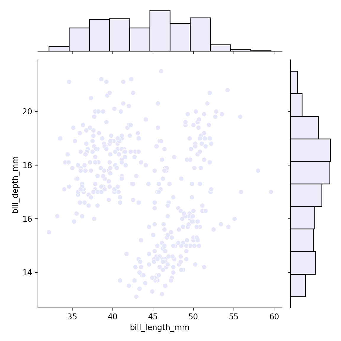
The scatter function provides the marginal_x and marginal_y arguments that allow adding marginal charts to the bubble plot. Possible options are 'box' for box plots, 'violin' for violin plots, 'histogram' for histograms and 'rug' for rug plots.
import plotly.express as px

fig = px.scatter(x = [5, 7, 3, 6, 1, 9, 2],
                 y = [2, 6, 2, 1, 4, 1, 6],
                 size = [30, 25, 250, 12, 140, 80, 36],
                 size_max = 50,
                 marginal_x = "box", marginal_y = "box")

fig.show()
