3D surface plot with plot_surface
A 3D surface plot is the representation of a three-dimensional data set, showing the relationship between a dependent variable (Y) against two independent variables (X and Z). This type of chart can be created with the plot_surface function, specifying a 3D projection. Note that surface plots are the 3D representation of contour plots.
import matplotlib.pyplot as plt
import numpy as np

# Sample data
X, Y = np.meshgrid(np.linspace(-8, 8),
                   np.linspace(-8, 8))
R = np.sqrt(X**2 + Y**2)
Z = np.sin(R) / R

fig = plt.figure()
ax = fig.add_subplot(projection = '3d')

# 3D surface plot
ax.plot_surface(X, Y, Z)

# plt.show()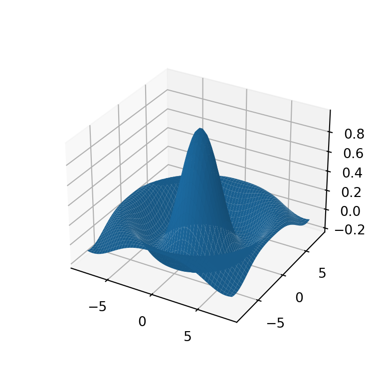
Adding a title and axis labels
When using 3D charts it is very important to specify the axis labels for better understanding of the plot. You can add the axis labels for the X, Y and Z axis with the set_xlabel, set_ylabel and set_zlabel functions, respectively. You can also add a title to the figure with the title function.
import matplotlib.pyplot as plt
import numpy as np

# Sample data
X, Y = np.meshgrid(np.linspace(-8, 8),
                   np.linspace(-8, 8))
R = np.sqrt(X**2 + Y**2)
Z = np.sin(R) / R

fig = plt.figure()
ax = fig.add_subplot(projection = '3d')

# 3D surface plot
ax.plot_surface(X, Y, Z)

# Axis labels
ax.set_xlabel('X-axis label')
ax.set_ylabel('Y-axis label')
ax.set_zlabel('Z-axis label')

# Title
plt.title("3D surface plot")

# plt.show()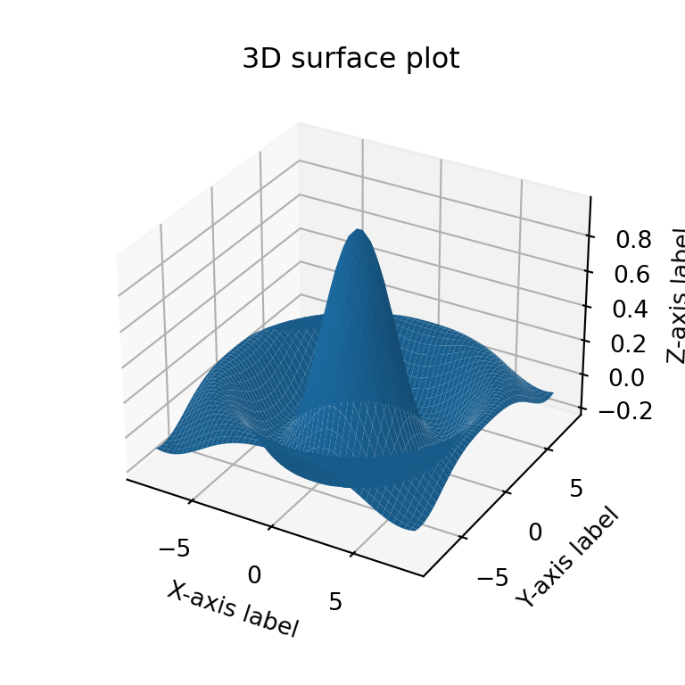
Color customization
The color of the surface is blue by default, but specifying a new color to the color argument of the function you can customize it. In the following example we are changing the color to 'lightgreen'.
import matplotlib.pyplot as plt
import numpy as np

# Sample data
X, Y = np.meshgrid(np.linspace(-8, 8),
                   np.linspace(-8, 8))
R = np.sqrt(X**2 + Y**2)
Z = np.sin(R) / R

fig = plt.figure()
ax = fig.add_subplot(projection = '3d')

# 3D surface plot
ax.plot_surface(X, Y, Z, color = 'lightgreen')

# plt.show()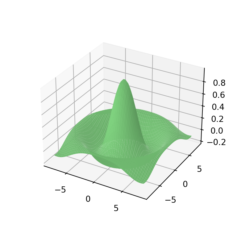
Transparency
The 3D surface is not opaque, but if you want to make it more transparent you can use the alpha argument. Note that you can also make the surface opaque setting antialiased = False.
import matplotlib.pyplot as plt
import numpy as np

# Sample data
X, Y = np.meshgrid(np.linspace(-8, 8),
                   np.linspace(-8, 8))
R = np.sqrt(X**2 + Y**2)
Z = np.sin(R) / R

fig = plt.figure()
ax = fig.add_subplot(projection = '3d')

# 3D surface plot
ax.plot_surface(X, Y, Z, alpha = 0.7)

# plt.show()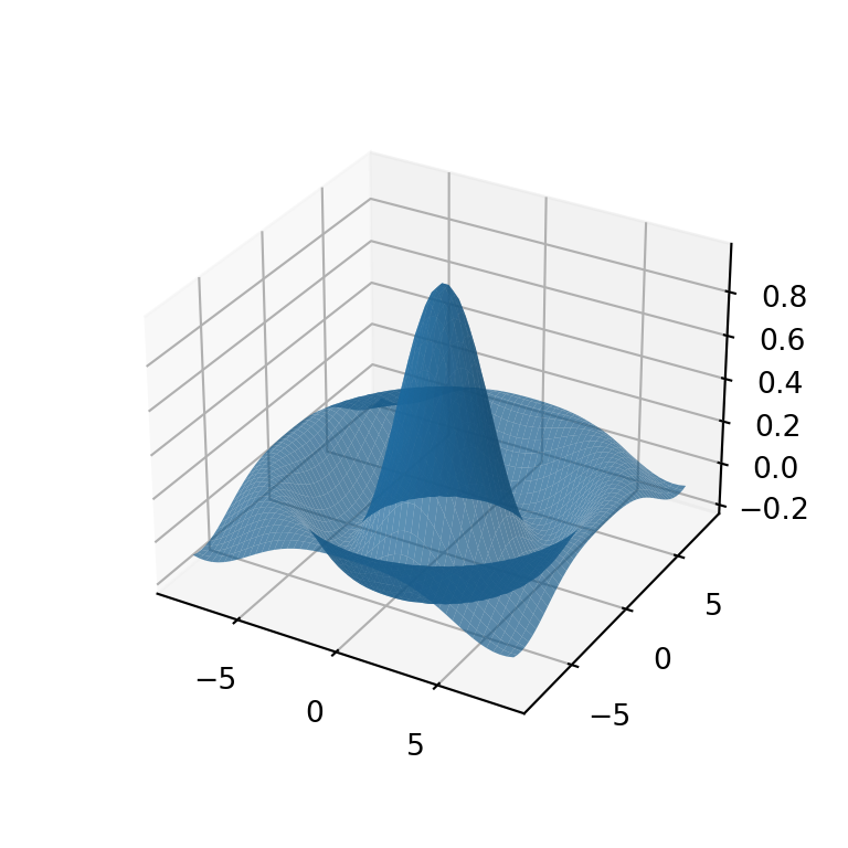
Width and color of the lines
If you made your surface more transparent you might want to make the lines more visible. In this case you can customize the width and color of the lines with linewidth and edgecolor, respectively.
import matplotlib.pyplot as plt
import numpy as np

# Sample data
X, Y = np.meshgrid(np.linspace(-8, 8),
                   np.linspace(-8, 8))
R = np.sqrt(X**2 + Y**2)
Z = np.sin(R) / R

fig = plt.figure()
ax = fig.add_subplot(projection = '3d')

# 3D surface plot
ax.plot_surface(X, Y, Z, alpha = 0.7,
                linewidth = 0.3, edgecolor = 'black')

# plt.show()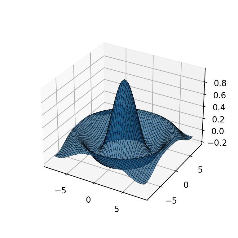
Color palette
The color of the surface can also be based on the values of a continuous variable, so higher values will have a different color than the lower values. You can specify a color palette with the cmap argument of the function, like the 'Spectral_r' matplotlib color palette.
import matplotlib.pyplot as plt
import numpy as np

# Sample data
X, Y = np.meshgrid(np.linspace(-8, 8),
                   np.linspace(-8, 8))
R = np.sqrt(X**2 + Y**2)
Z = np.sin(R) / R

fig = plt.figure()
ax = fig.add_subplot(projection = '3d')

# 3D surface plot
ax.plot_surface(X, Y, Z, cmap = 'Spectral_r')

# plt.show()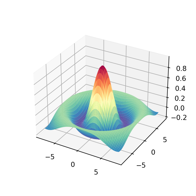
Color bar
Considering that your surface is colored with a color palette, you might want to add a color bar as a legend. For this purpose you will need to use the colorbar function as in the example below. Note that you can customize the size of the color bar with the shrink and aspect arguments of the function.
import matplotlib.pyplot as plt
import numpy as np

# Sample data
X, Y = np.meshgrid(np.linspace(-8, 8),
                   np.linspace(-8, 8))
R = np.sqrt(X**2 + Y**2)
Z = np.sin(R) / R

fig = plt.figure()
ax = fig.add_subplot(projection = '3d')

# 3D surface plot
plot = ax.plot_surface(X, Y, Z, cmap = 'bwr')
fig.colorbar(plot, ax = ax, shrink = 0.5, aspect = 10)

# plt.show()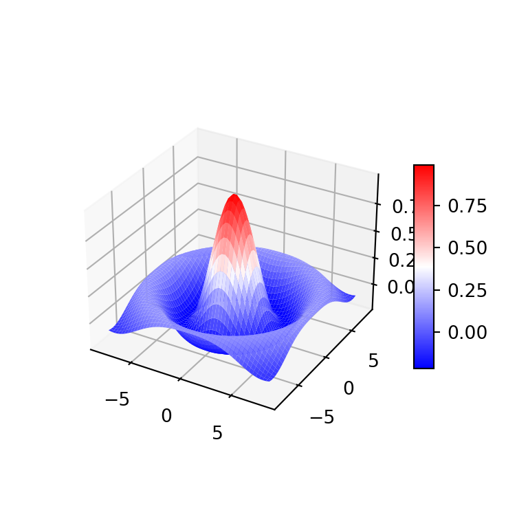
Surface plots with contours
3D surface plots are companion plots of contours. You can add both plots on the same chart adding a contour to the 3D plot. Note that you will need to specify the offset based on your data. You can also customize the Z-axis limits if needed.
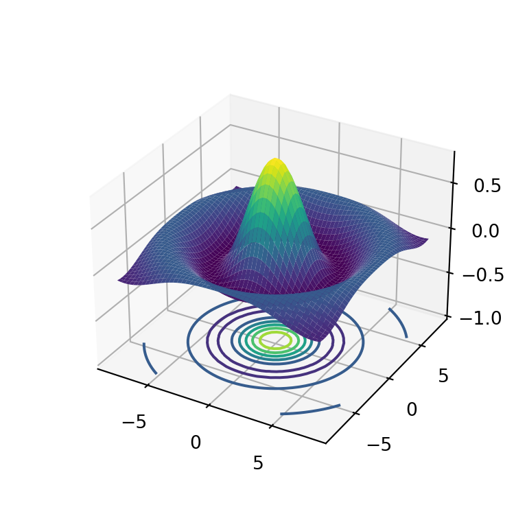
import matplotlib.pyplot as plt
import numpy as np

# Sample data
X, Y = np.meshgrid(np.linspace(-8, 8),
                   np.linspace(-8, 8))
R = np.sqrt(X**2 + Y**2)
Z = np.sin(R) / R

fig = plt.figure()
ax = fig.add_subplot(projection = '3d')

# 3D surface plot
ax.plot_surface(X, Y, Z, cmap = 'viridis')

# Contour
ax.contour(X, Y, Z, lw = 3, cmap = 'viridis', offset = -1)

# Z-axis limits
ax.set(zlim = (-1, 0.8))

# plt.show()
Surface plot with X and Y contour
The contours can also be placed on the X and Y directions making use of the zdir argument of the contour function. You will need to specify the offset to the maximum value of each axis.
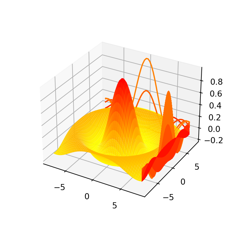
import matplotlib.pyplot as plt
import numpy as np

# Sample data
X, Y = np.meshgrid(np.linspace(-8, 8),
                   np.linspace(-8, 8))
R = np.sqrt(X**2 + Y**2)
Z = np.sin(R) / R

fig = plt.figure()
ax = fig.add_subplot(projection = '3d')

# 3D surface plot
ax.plot_surface(X, Y, Z, cmap = 'autumn_r')

# Contours for X and Y axis
ax.contour(X, Y, Z, lw = 3, cmap = 'autumn_r', offset = np.max(X), zdir = 'x')
ax.contour(X, Y, Z, lw = 3, cmap = 'autumn_r', offset = np.max(Y), zdir = 'y')

# plt.show()
Surface plot with filled contour
If you want to add a filled contour the process is the same but with the contourf function. In the following example we add a contour and also a filled contour to the 3D surface plot for better understanding of the data.

import matplotlib.pyplot as plt
import numpy as np

# Sample data
X, Y = np.meshgrid(np.linspace(-8, 8),
                   np.linspace(-8, 8))
R = np.sqrt(X**2 + Y**2)
Z = np.sin(R) / R

fig = plt.figure()
ax = fig.add_subplot(projection = '3d')

# 3D surface plot
ax.plot_surface(X, Y, Z, cmap = 'Spectral_r', alpha = 0.9)

# Filled contour with contour lines
ax.contour(X, Y, Z, lw = 2, colors = 'black', offset = -1)
ax.contourf(X, Y, Z, cmap = 'Spectral_r', offset = -1, alpha = 0.75)

# Z-axis limits
ax.set(zlim = (-1, 0.8))

# plt.show()