Heat map with imshow
When using matplotlib you can create a heat map with the imshow function. In order to create a default heat map you just need to input an array of (N, M) dimensions, where the first dimension defines the rows and the second the columns of the heat map.
import numpy as np
import matplotlib.pyplot as plt

# Seed for reproducibility
np.random.seed(2)

# Data
data = np.random.random((8, 8))

# Heat map
fig, ax = plt.subplots()
ax.imshow(data)
# plt.show()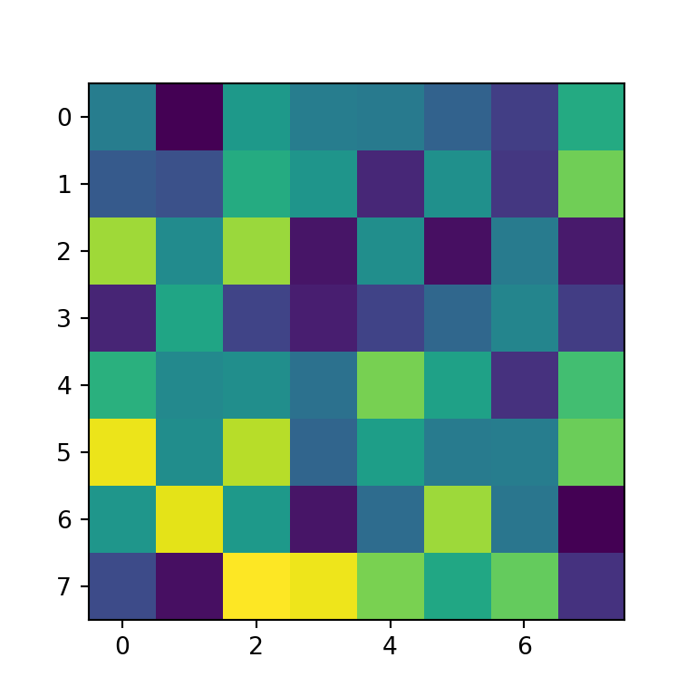
Group labels
In order to add group labels to the axes tick marks you can make use of the set_xticks and set_yticks functions, as shown below.
import numpy as np
import matplotlib.pyplot as plt

# Seed for reproducibility
np.random.seed(2)

# Data
data = np.random.random((8, 8))

# Labels
xlabs = ["G1", "G2", "G3", "G4",
         "G5", "G6", "G7", "G8"]
ylabs = ["A", "B", "C", "D",
         "E", "F", "G", "H"]

# Heat map
fig, ax = plt.subplots()
ax.imshow(data)

# Add the labels
ax.set_xticks(np.arange(len(xlabs)), labels = xlabs)
ax.set_yticks(np.arange(len(ylabs)), labels = ylabs)
# plt.show()
Rotating the tick labels
If you add tick labels to the X-axis and the labels are too long they won’t fit. In this scenario you can rotate the labels as in the example below so you will be able to read the labels.
import numpy as np
import matplotlib.pyplot as plt

# Seed for reproducibility
np.random.seed(2)

# Data
data = np.random.random((8, 8))

# Labels
xlabs = ["G1", "G2", "G3", "G4",
         "G5", "G6", "G7", "G8"]
ylabs = ["A", "B", "C", "D",
         "E", "F", "G", "H"]

# Heat map
fig, ax = plt.subplots()
ax.imshow(data)

# Add the labels
ax.set_xticks(np.arange(len(xlabs)), labels = xlabs)
ax.set_yticks(np.arange(len(ylabs)), labels = ylabs)

# Rotate the labels of the X-axis
plt.setp(ax.get_xticklabels(), rotation = 40,
         ha = "right", rotation_mode = "anchor")
# plt.show()
Color customization
By default, the imshow function uses the viridis color palette, but you can set any other palette with the cmap argument. In the following example we are using the "Blues" color palette.
import numpy as np
import matplotlib.pyplot as plt

# Seed for reproducibility
np.random.seed(2)

# Data
data = np.random.random((8, 8))

# Heat map
fig, ax = plt.subplots()
ax.imshow(data, cmap = "Blues")

# plt.show()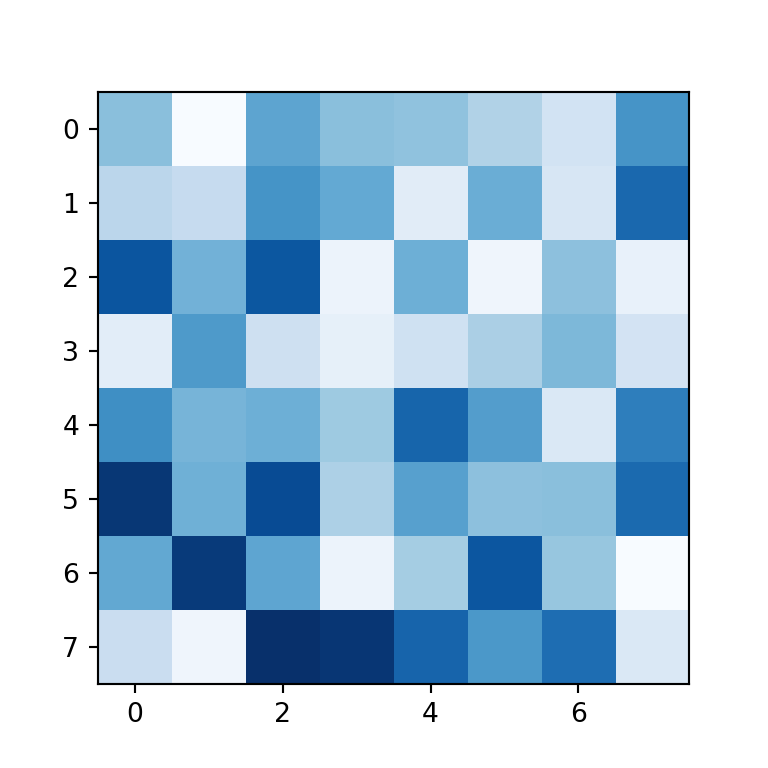
Adding the values to each cell
You can also add the values to each cell of the heat map created with matplotlib. In order to achieve it you will need to loop over the rows and columns and add each text with the text function. In the code below we are aligning the values to the center and setting them white, but you could customize the texts your own way.
import numpy as np
import matplotlib.pyplot as plt

# Seed for reproducibility
np.random.seed(2)

# Data
data = np.random.random((8, 8))

# Labels
xlabs = ["G1", "G2", "G3", "G4",
         "G5", "G6", "G7", "G8"]
ylabs = ["A", "B", "C", "D",
         "E", "F", "G", "H"]

# Heat map
fig, ax = plt.subplots()
ax.imshow(data)

# Add the labels
ax.set_xticks(np.arange(len(xlabs)), labels = xlabs)
ax.set_yticks(np.arange(len(ylabs)), labels = ylabs)

# Add the values to each cell
for i in range(len(xlabs)):
    for j in range(len(ylabs)):
        text = ax.text(j, i, round(data[i, j], 1),
                       ha = "center", va = "center", color = "w")

# plt.show()
Adding a colorbar
Heat maps usually provide a legend named color bar for better interpretation of the colors of the cells. You can add a color bar to your matplotlib heat map with figure.colorbar.
import numpy as np
import matplotlib.pyplot as plt

# Seed for reproducibility
np.random.seed(2)

# Data
data = np.random.random((8, 8))

# Heat map
fig, ax = plt.subplots()
im = ax.imshow(data)

# Add the color bar
cbar = ax.figure.colorbar(im, ax = ax)
cbar.ax.set_ylabel("Color bar", rotation = -90, va = "bottom")

# plt.show()
Simple function to create heat maps in Python
The previous examples show how to create a heat map using matplotlib, but a lot of code is required to customize the plot. For that reason you can use the following functions from the matplotlib documentation:
def heatmap(data, row_labels, col_labels, ax = None,
            cbar_kw = {}, cbarlabel = "", **kwargs):
    """
    Create a heatmap from a numpy array and two lists of labels.

    Parameters
    ----------
    data
        A 2D numpy array of shape (M, N).
    row_labels
        A list or array of length M with the labels for the rows.
    col_labels
        A list or array of length N with the labels for the columns.
    ax
        A `matplotlib.axes.Axes` instance to which the heatmap is plotted.  If
        not provided, use current axes or create a new one.  Optional.
    cbar_kw
        A dictionary with arguments to `matplotlib.Figure.colorbar`.  Optional.
    cbarlabel
        The label for the colorbar.  Optional.
    **kwargs
        All other arguments are forwarded to `imshow`.
    """

    if not ax:
      ax = plt.gca()

    # Plot the heatmap
    im = ax.imshow(data, **kwargs)

    # Create colorbar
    cbar = ax.figure.colorbar(im, ax = ax, **cbar_kw)
    cbar.ax.set_ylabel(cbarlabel, rotation = -90, va = "bottom")

    # Show all ticks and label them with the respective list entries.
    ax.set_xticks(np.arange(data.shape[1]), labels = col_labels)
    ax.set_yticks(np.arange(data.shape[0]), labels = row_labels)

    # Let the horizontal axes labeling appear on top.
    ax.tick_params(top = True, bottom = False,
                   labeltop = True, labelbottom = False)

    # Rotate the tick labels and set their alignment.
    plt.setp(ax.get_xticklabels(), rotation = -30, ha = "right",
             rotation_mode = "anchor")

    # Turn spines off and create white grid.
    ax.spines[:].set_visible(False)

    ax.set_xticks(np.arange(data.shape[1] + 1) - 0.5, minor = True)
    ax.set_yticks(np.arange(data.shape[0] + 1) - 0.5, minor = True)
    ax.grid(which = "minor", color = "w", linestyle = '-', linewidth = 3)
    ax.tick_params(which =  "minor", bottom = False, left = False)

    return im, cbar


def annotate_heatmap(im, data = None, valfmt="{x:.2f}",
                     textcolors = ("black", "white"),
                     threshold = None, **textkw):
    """
    A function to annotate a heatmap.

    Parameters
    ----------
    im
        The AxesImage to be labeled.
    data
        Data used to annotate.  If None, the image's data is used.  Optional.
    valfmt
        The format of the annotations inside the heatmap.  This should either
        use the string format method, e.g. "$ {x:.2f}", or be a
        `matplotlib.ticker.Formatter`.  Optional.
    textcolors
        A pair of colors.  The first is used for values below a threshold,
        the second for those above.  Optional.
    threshold
        Value in data units according to which the colors from textcolors are
        applied.  If None (the default) uses the middle of the colormap as
        separation.  Optional.
    **kwargs
        All other arguments are forwarded to each call to `text` used to create
        the text labels.
    """

    if not isinstance(data, (list, np.ndarray)):
        data = im.get_array()

    # Normalize the threshold to the images color range.
    if threshold is not None:
        threshold = im.norm(threshold)
    else:
        threshold = im.norm(data.max())/2.

    # Set default alignment to center,
    # but allow it to be overwritten by textkw.
    kw = dict(horizontalalignment = "center",
              verticalalignment = "center")
    kw.update(textkw)

    # Get the formatter in case a string is supplied
    if isinstance(valfmt, str):
        valfmt = matplotlib.ticker.StrMethodFormatter(valfmt)

    # Loop over the data and create a `Text` for each "pixel".
    # Change the text's color depending on the data.
    texts = []
    for i in range(data.shape[0]):
        for j in range(data.shape[1]):
            kw.update(color=textcolors[int(im.norm(data[i, j]) > threshold)])
            text = im.axes.text(j, i, valfmt(data[i, j], None), **kw)
            texts.append(text)

    return texts
Example with the heatmap matplotlib function
The heatmap function is a helper function to create heat maps in matplotlib. When using this function, you just need to input your data to data and your labels to row_labels and col_labels. In addition, you can customize the color palette with cmap and set a color bar title with cbarlabel.
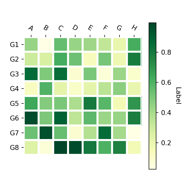
import numpy as np
import matplotlib.pyplot as plt

# Seed for reproducibility
np.random.seed(2)

# Data
data = np.random.random((8, 8))

# Labels
xlabs = ["G1", "G2", "G3", "G4",
         "G5", "G6", "G7", "G8"]
ylabs = ["A", "B", "C", "D",
         "E", "F", "G", "H"]

# Heat map
fig, ax = plt.subplots()
heatmap(data, row_labels = xlabs, col_labels = ylabs,
        ax = ax, cmap = "YlGn", cbarlabel = "Label")

# plt.show()
Adding text annotations to the cells with annotate_heatmap
Finally, if you want to add text annotations to each cell of the heat map you can use the annotate_heatmap function as shown below. Recall to import matplotlib in order to use it.
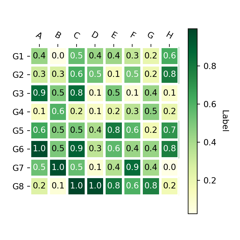
import numpy as np
import matplotlib.pyplot as plt
import matplotlib

# Seed for reproducibility
np.random.seed(2)

# Data
data = np.random.random((8, 8))

# Labels
xlabs = ["G1", "G2", "G3", "G4",
         "G5", "G6", "G7", "G8"]
ylabs = ["A", "B", "C", "D",
         "E", "F", "G", "H"]

# Heat map
fig, ax = plt.subplots()
im, cbar = heatmap(data, row_labels = xlabs, col_labels = ylabs,
                   ax = ax, cmap = "YlGn", cbarlabel = "Label")
texts = annotate_heatmap(im, valfmt = "{x:.1f}")

# plt.show()