Sample data
The data of the following block of code will be used as the sample data of this tutorial.
import numpy as np
import pandas as pd
from random import choices

# Seed
rng = np.random.RandomState(0)

# Data simulation
x = rng.uniform(0, 1, 500)
y = 5 * x + rng.normal(0, 2, size = 500)
group = np.where(x < 0.4, "A", np.where(x > 0.8, "C", "B"))
group2 = choices(["G1", "G2"], k = 500)
x = x + rng.uniform(-0.2, 0.2, 500)

# Data set
df = {'x': x, 'y': y, 'group': group, 'group2': group2}
Scatter plot by group with the hue and style arguments
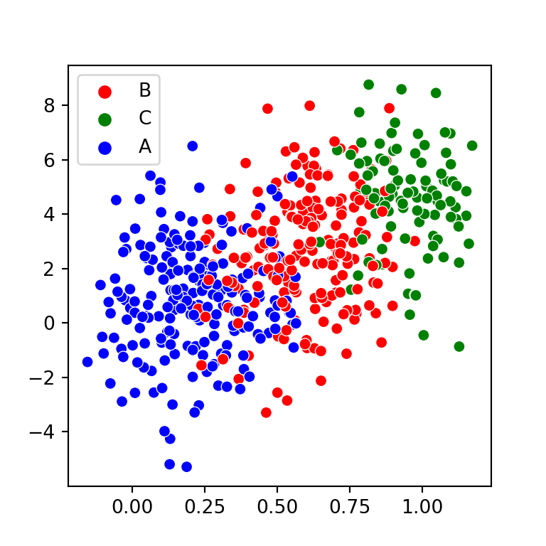
Basic scatter plot by group
Using the scatterplot function from seaborn it is very easy to create a scatter plot by group. You will need to pass your grouping variable to the hue argument of the function.
import seaborn as sns

sns.scatterplot(x = x, y = y, hue = group)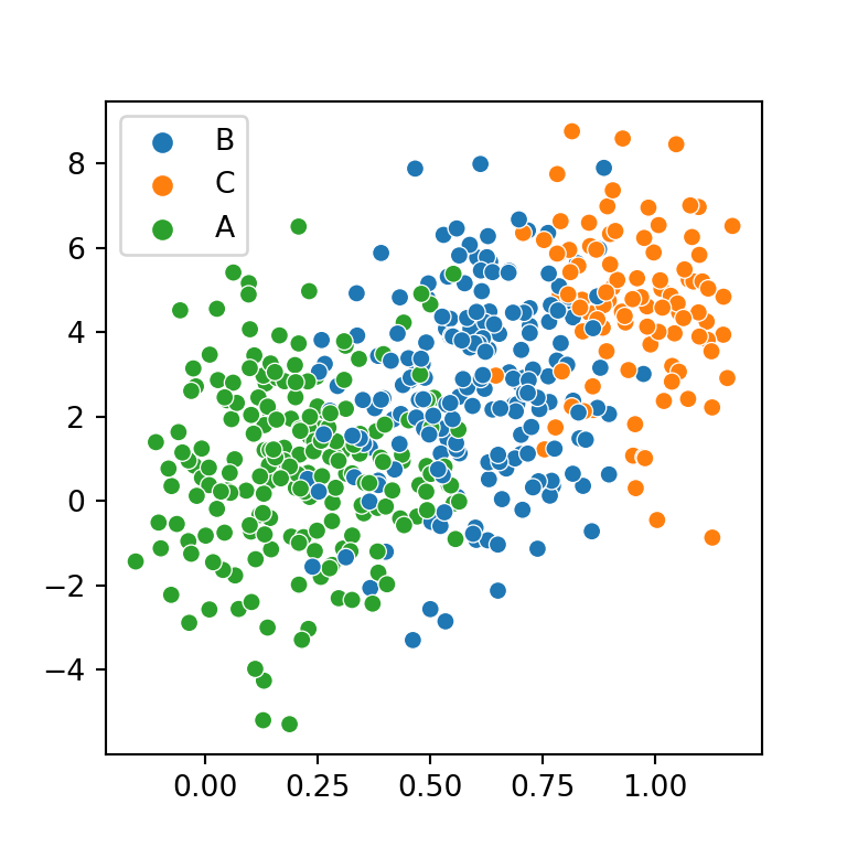
Pass the variables as keys of the data frame
Note that you can also specify a data frame and pass the variables as keys. In this scenario, the legend will also show the name of the variable as title.
import seaborn as sns

sns.scatterplot(x = "x", y = "y", hue = "group",
                data = df)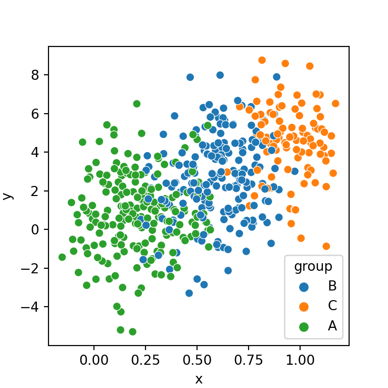
Order of the levels
The order of the categorical variable is based on the order of appearance on the data. If you want to reorder the hue order you can create the desired order and pass it to the hue_order argument, as shown below.
import seaborn as sns

hue_order = ["A", "B", "C"]

sns.scatterplot(x = x, y = y,
                hue = group, hue_order = hue_order)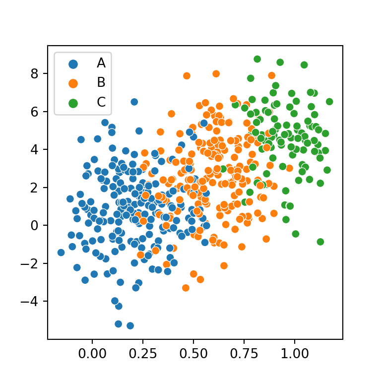
Markers by group
If you pass the categorical variable to style the markers will have a different shape based on the groups. Note that if you keep a single color across groups the markers will be difficult to recognize, so you should also set the hue argument as well.
import seaborn as sns

sns.scatterplot(x = x, y = y,
                style = group, hue = group)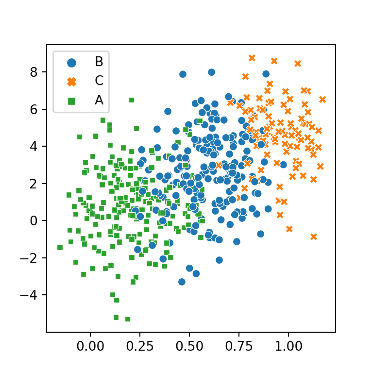
Two groups based on the color and the style of the markers
In case your data contains other categorical variable you can pass a variable to style and the other to hue. Nonetheless, you should be aware of that the variable passed to hue will be easier to read.
import seaborn as sns

sns.scatterplot(x = x, y = y,
                style = group, hue = group2)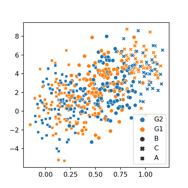
Color and markers customization
Custom color palette
In order to add a custom palette you can create a dictionary with the desired colors and pass it to the palette argument of the function.
import seaborn as sns

colors = {'A': 'blue', 'B': 'red', 'C': 'green'}

sns.scatterplot(x = x, y = y,
                hue = group, palette = colors)
Custom markers style
Similarly, you can change the markers shape. Possible values are ',', '.', 'o', 'd', 'h', 's', 'p', 'v', '^', '<', '>', '8', '*', 'H', 'D', 'P' and 'X' for the scatterplot function.
import seaborn as sns

styles = {'A': 'p', 'B': 's', 'C': 'v'}

sns.scatterplot(x = x, y = y,
                style = group, hue = group,
                markers = styles, palette = "Set1")


