The scatter function in matplotlib
Matplotlib provides a function named scatter which allows creating fully-customizable scatter plots in Python. In order to create a basic scatter plot you just need to pass arrays to the x and y arguments with your data.
import numpy as np
import matplotlib.pyplot as plt

# Data
x = np.array([3, 8, 5, 6, 1, 9, 6, 7, 2, 1, 8])
y = np.array([4, 5, 2, 4, 6, 1, 4, 6, 5, 2, 3])

# Plot
fig, ax = plt.subplots()
ax.scatter(x = x, y = y)
# plt.show()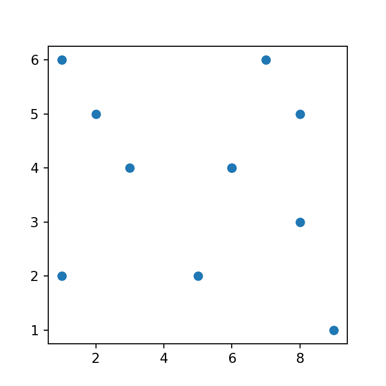
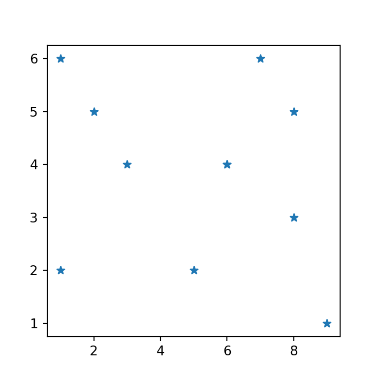
Markers customization
The default marker or symbol of a scatter plot is a circle but the argument marker allows customizing the markers. Possible options are the ones from this list.
import numpy as np
import matplotlib.pyplot as plt

# Data
x = np.array([3, 8, 5, 6, 1, 9, 6, 7, 2, 1, 8])
y = np.array([4, 5, 2, 4, 6, 1, 4, 6, 5, 2, 3])

# Plot
fig, ax = plt.subplots()
ax.scatter(x, y, marker = "*")
# plt.show()
LaTeX markers
Note that in addition to the matplotlib markers you can also use LaTeX symbols adding them the following way:
import numpy as np
import matplotlib.pyplot as plt

# Data
x = np.array([3, 8, 5, 6, 1, 9, 6, 7, 2, 1, 8])
y = np.array([4, 5, 2, 4, 6, 1, 4, 6, 5, 2, 3])

# Plot
fig, ax = plt.subplots()
ax.scatter(x, y, marker = r'$\clubsuit$')
# plt.show()
Markers color customization
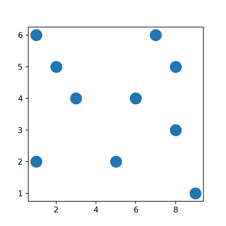
The scatter function provides several arguments to customize the markers in several ways. If you want to change the default blue color you can set a new color using c.
import numpy as np
import matplotlib.pyplot as plt

# Data
x = np.array([3, 8, 5, 6, 1, 9, 6, 7, 2, 1, 8])
y = np.array([4, 5, 2, 4, 6, 1, 4, 6, 5, 2, 3])

# Plot
fig, ax = plt.subplots()
ax.scatter(x, y, c = "red")
# plt.show()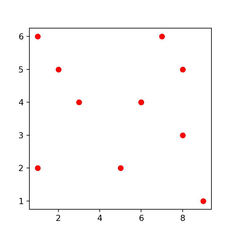
Color by group
You can also set a color by group by creating an array with colors, as in the example below.
import numpy as np
import matplotlib.pyplot as plt

# Data
x = np.array([3, 8, 5, 6, 1, 9, 6, 7, 2, 1, 8])
y = np.array([4, 5, 2, 4, 6, 1, 4, 6, 5, 2, 3])
color = np.where(x < 5, "yellow", "lightblue")

# Plot
fig, ax = plt.subplots()
ax.scatter(x, y, c = color)
# plt.show()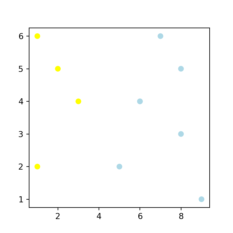
Gradient color
If you pass a numerical array to c the points will be colored with a color palette, as shown below. The default color palette (viridis) can be changed with the cmap argument.
import numpy as np
import matplotlib.pyplot as plt

# Data
x = np.array([3, 8, 5, 6, 1, 9, 6, 7, 2, 1, 8])
y = np.array([4, 5, 2, 4, 6, 1, 4, 6, 5, 2, 3])

# Plot
fig, ax = plt.subplots()
ax.scatter(x, y, c = np.sqrt(x ** 2 + y ** 2))
# plt.show()
Markers transparency
In addition, the markers transparency can be set with alpha, which ranges from 0 (invisible) to 1 (completely opaque).
import numpy as np
import matplotlib.pyplot as plt

# Data
x = np.array([3, 8, 5, 6, 1, 9, 6, 7, 2, 1, 8])
y = np.array([4, 5, 2, 4, 6, 1, 4, 6, 5, 2, 3])

# Plot
fig, ax = plt.subplots()
ax.scatter(x, y, alpha = 0.5)
# plt.show()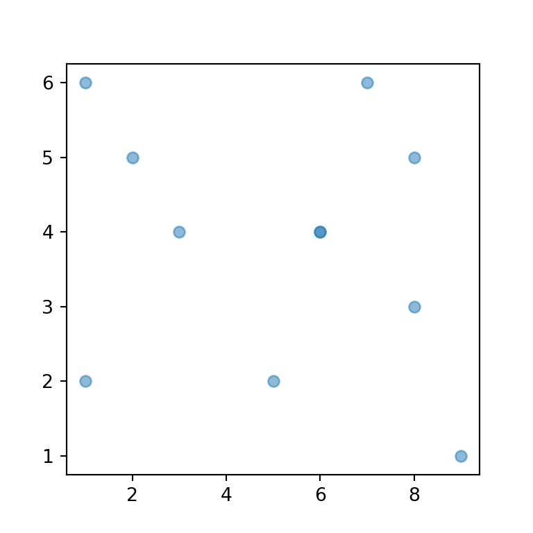
Border color of the markers
Finally, you can also customize the border of the symbol markers by using the edgecolors argument, which defaults to the fill color of the symbol. You can also customize its width with linewidths.
import numpy as np
import matplotlib.pyplot as plt

# Data
x = np.array([3, 8, 5, 6, 1, 9, 6, 7, 2, 1, 8])
y = np.array([4, 5, 2, 4, 6, 1, 4, 6, 5, 2, 3])

# Plot
fig, ax = plt.subplots()
ax.scatter(x, y, c = "white",
           edgecolors = "black", linewidths = 1.5)
# plt.show()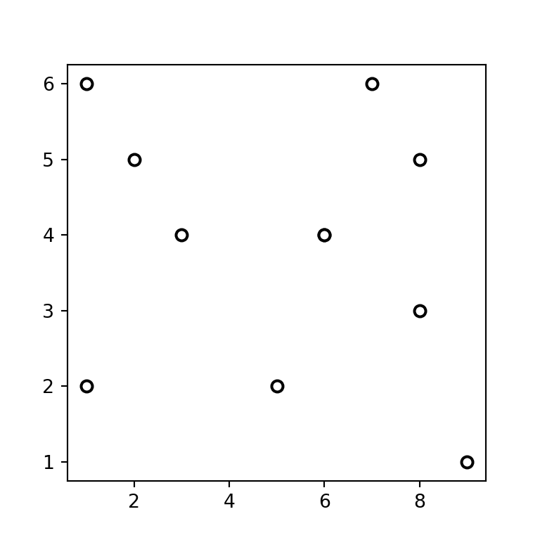
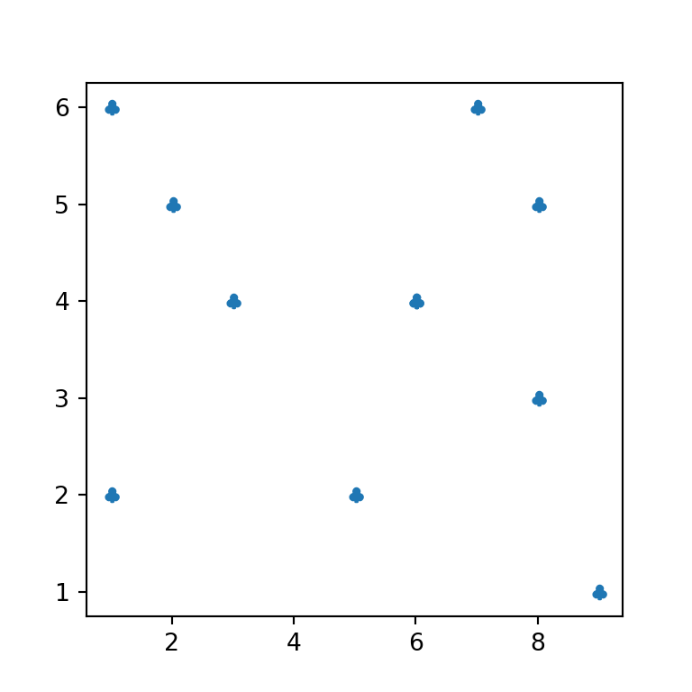
Markers size
The argument s allows customizing the markers size. The unit are “points ^ 2”.
import numpy as np
import matplotlib.pyplot as plt

# Data
x = np.array([3, 8, 5, 6, 1, 9, 6, 7, 2, 1, 8])
y = np.array([4, 5, 2, 4, 6, 1, 4, 6, 5, 2, 3])

# Plot
fig, ax = plt.subplots()
ax.scatter(x, y, s = 200)
# plt.show()
Size based on a variable
An alternative is to set the size based on a numerical variable of the same length of the data. This type of chart is known as bubble plot.
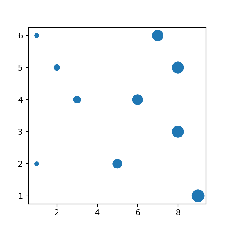
import numpy as np
import matplotlib.pyplot as plt

# Data
x = np.array([3, 8, 5, 6, 1, 9, 6, 7, 2, 1, 8])
y = np.array([4, 5, 2, 4, 6, 1, 4, 6, 5, 2, 3])
size = x * 25

# Plot
fig, ax = plt.subplots()
ax.scatter(x, y, s = size)
# plt.show()
Scatter plot legend
There are several ways to add a legend to a scatter plot in matplotlib. The selection between the methods will depend on your use case. If you want to set a label for a single marker set the name with label and place the legend with legend.
import numpy as np
import matplotlib.pyplot as plt

# Data
x = np.array([3, 8, 5, 6, 1, 9, 6, 7, 2, 1, 8])
y = np.array([4, 5, 2, 4, 6, 1, 4, 6, 5, 2, 3])

# Plot
fig, ax = plt.subplots()
ax.scatter(x, y, label = "Points")
plt.legend(loc = "upper right")
# plt.show()
Splitting the data
If you split the data in several groups and you add the points independently you can add the legend for all the groups, as in the following example.
import numpy as np
import matplotlib.pyplot as plt
import matplotlib.patches as mpatches

# Data 1
x1 = np.array([1, 1, 2, 3])
y1 = np.array([2, 6, 5, 4])

plt.scatter(x1, y1, c = "red", label = "Group 1")

# Data 2
x2 = np.array([5, 6, 7, 8, 8, 9])
y2 = np.array([2, 4, 6, 5, 3, 1])

plt.scatter(x2, y2, c = "blue", label = "Group 2")

# Add the legend
plt.legend()
# plt.show()
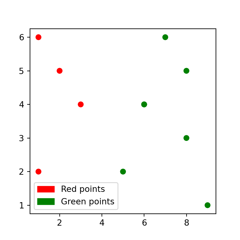
Using mpatches
Another way is to use mpatches from matplotlib.patches, but note that by default the legend won’t show the markers symbol, but rectangles.
import numpy as np
import matplotlib.pyplot as plt
import matplotlib.patches as mpatches

# Data
x = np.array([3, 8, 5, 6, 1, 9, 6, 7, 2, 1, 8])
y = np.array([4, 5, 2, 4, 6, 1, 4, 6, 5, 2, 3])
color = np.where(x < 5, "red", "green")

# Plot
fig, ax = plt.subplots()
ax.scatter(x, y, c = color, label = color)

# Legend labels
red = mpatches.Patch(color = "red", label = "Red points")
green = mpatches.Patch(color = "green", label = "Green points")

# Legend
plt.legend(handles = [red, green])
# plt.show()