Box plots in plotly with the box function
You can create box plots in plotly with the box function from plotly express. The syntax of the function is very easy, as you just need to input a numerical variable to y in order to create a vertical box plot. Note that you can also input your data as a column of a data frame.
import plotly.express as px
import numpy as np

# Sample data
np.random.seed(4)
var = np.random.normal(0, 1, 500)

fig = px.box(y = var)

# Alternative:
# import pandas as pd
# df = pd.DataFrame({'var': np.random.normal(0, 1, 500)})
# fig = px.box(df, y = 'var')

fig.show()
Horizontal box plot
If you prefer an horizontal box plot, just input your data to x instead of y.
import plotly.express as px
import numpy as np

# Sample data
np.random.seed(1)
var = np.random.normal(0, 1, 500)

fig = px.box(x = var)

fig.show()
Box plot with notch
A notch represents the 95% confidence interval for the median. You can add it to your plot setting notched = True.
import plotly.express as px
import numpy as np

# Sample data
np.random.seed(4)
var = np.random.normal(0, 1, 500)

fig = px.box(y = var, notched = True)

fig.show()
Observations
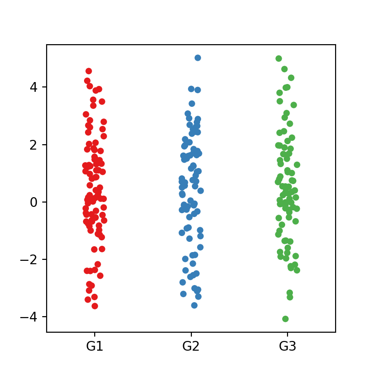
Sometimes it is important to show the observations which generate a box plot, as different observations might create the same box plot. Adding them will help you to understand the underlying distribution of the data. You will need to set the points argument to 'all' in order to add them.
import plotly.express as px
import numpy as np

# Sample data
np.random.seed(4)
var = np.random.normal(0, 1, 500)

fig = px.box(y = var, points = 'all')

fig.show()
Remove outliers
If needed, setting the points argument to False will remove the outliers, if any.
import plotly.express as px
import numpy as np

# Sample data
np.random.seed(4)
var = np.random.normal(0, 1, 500)

fig = px.box(y = var, points = False)

fig.show()
Color
It is possible to customize the color of the box plot passing a new color to the color_discrete_sequence argument inside an array, as shown below.
import plotly.express as px
import numpy as np

# Sample data
np.random.seed(4)
var = np.random.normal(0, 1, 500)

fig = px.box(y = var, color_discrete_sequence = ['green'])

fig.show()
Box plot by group
The box function from plotly allows creating box plots by group. You will need to input your categorical variable defining the groups to the color argument of the function.
import plotly.express as px
import numpy as np
import pandas as pd
import random; random.seed(1)

# Sample data
np.random.seed(4)
df = pd.DataFrame({'var': np.random.normal(0, 1, 500),
                   'group': random.choices(["G1", "G2", "G3"], k = 500)})

fig = px.box(df, y = 'var', color = 'group')

fig.show()
The color for each group can be customized passing an array of colors to color_discrete_sequence or specifying the color for each group with color_discrete_map.
import plotly.express as px
import numpy as np
import pandas as pd
import random; random.seed(1)

# Sample data
np.random.seed(4)
df = pd.DataFrame({'var': np.random.normal(0, 1, 500),
                   'group': random.choices(["G1", "G2", "G3"], k = 500)})

fig = px.box(df, y = 'var', color = 'group',
             color_discrete_map = {'G1': '#90BA4C', 'G2': '#DD9D31', 'G3': '#E25247'})

fig.show()
Note that the function also provides an argument named boxmode which can be set to 'overlay' in order to overlay the box plots. This can be useful to compare the medians for each group when the number of groups is small.
import plotly.express as px
import numpy as np
import pandas as pd
import random; random.seed(1)

# Sample data
np.random.seed(4)
df = pd.DataFrame({'var': np.random.normal(0, 1, 500),
                   'group': random.choices(["G1", "G2", "G3"], k = 500)})

fig = px.box(df, y = 'var', color = 'group',
             boxmode = 'overlay')

fig.show()