2D histograms with the hist2d function
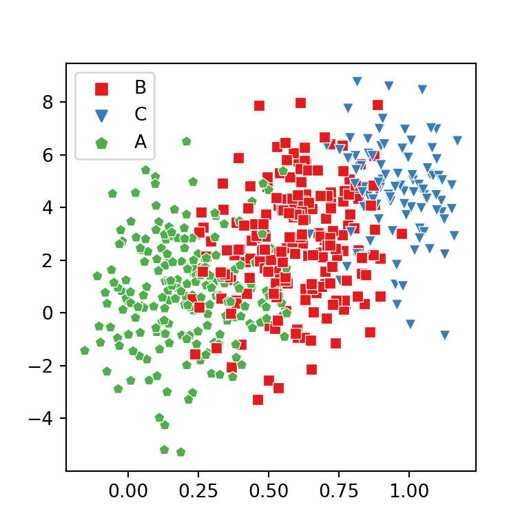
2D histograms, also known as bivariate histograms, are used for visualizing the relationship between two numerical variables when the number of observations is big. The plot is divided into several bins (areas) which are colored based on the number of points inside each area. This chart is an alternative to hexbin charts.
import numpy as np
import matplotlib.pyplot as plt

# Sample data
np.random.seed(1)
x = np.random.normal(size = 10000)
y = x + np.random.normal(size = 10000)

fig, ax = plt.subplots()

ax.hist2d(x, y)

# plt.show()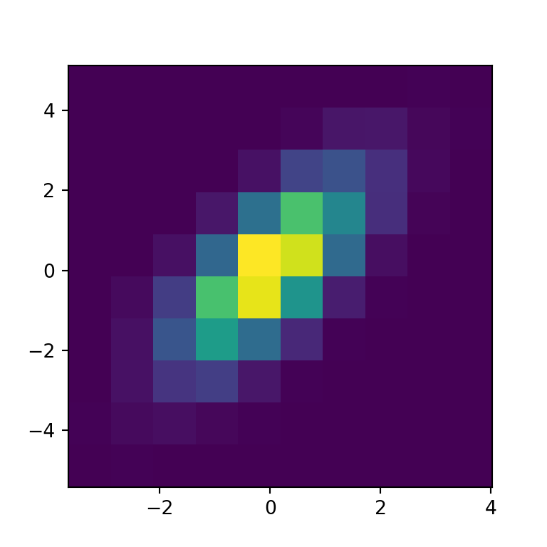
Color palette
The default color palette is viridis but you can change it with the cmap argument, as shown in the example below.
import numpy as np
import matplotlib.pyplot as plt

# Sample data
np.random.seed(1)
x = np.random.normal(size = 10000)
y = x + np.random.normal(size = 10000)

fig, ax = plt.subplots()

ax.hist2d(x, y, cmap = 'BuPu')

# plt.show()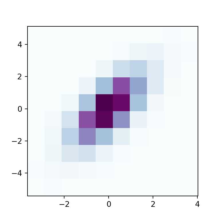
Color transparency
Note that you can also change the transparency of the colors with alpha, which values range from 0 (transparent) to 1 (opaque, the default).
import numpy as np
import matplotlib.pyplot as plt

# Sample data
np.random.seed(1)
x = np.random.normal(size = 10000)
y = x + np.random.normal(size = 10000)

fig, ax = plt.subplots()

ax.hist2d(x, y, alpha = 0.5)

# plt.show()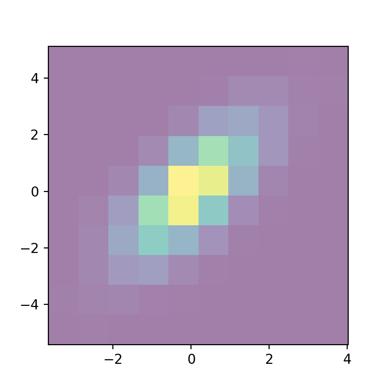
Normalization method
The norm argument of the hist2d function can be used to normalize the data between 0 and 1 before assigning colors. In the following example we are transforming the data into a log-scale, so the bins with zero count won’t be filled with color.
import numpy as np
import matplotlib.pyplot as plt
from matplotlib import colors

# Sample data
np.random.seed(1)
x = np.random.normal(size = 10000)
y = x + np.random.normal(size = 10000)

fig, ax = plt.subplots()

ax.hist2d(x, y, norm = colors.LogNorm())

# plt.show()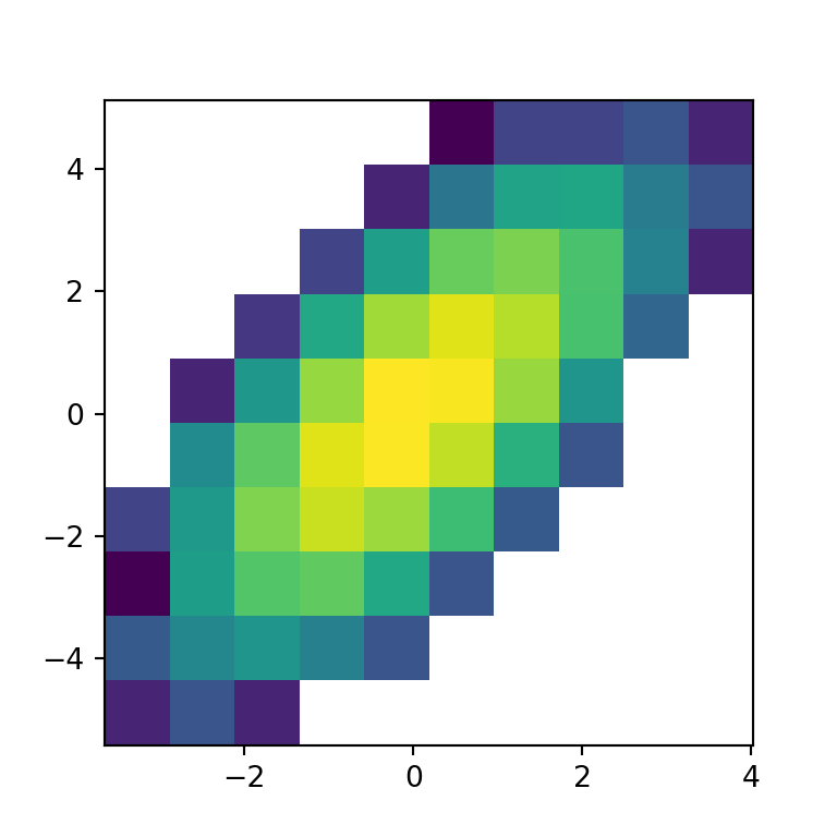
Minimum and maximum count of values
You can also set the minimum and maximum count of values for each bin to be displayed with cmin and cmax, respectively.
import numpy as np
import matplotlib.pyplot as plt

# Sample data
np.random.seed(1)
x = np.random.normal(size = 10000)
y = x + np.random.normal(size = 10000)

fig, ax = plt.subplots()

ax.hist2d(x, y, cmin = 1, cmax  = 150)

plt.show()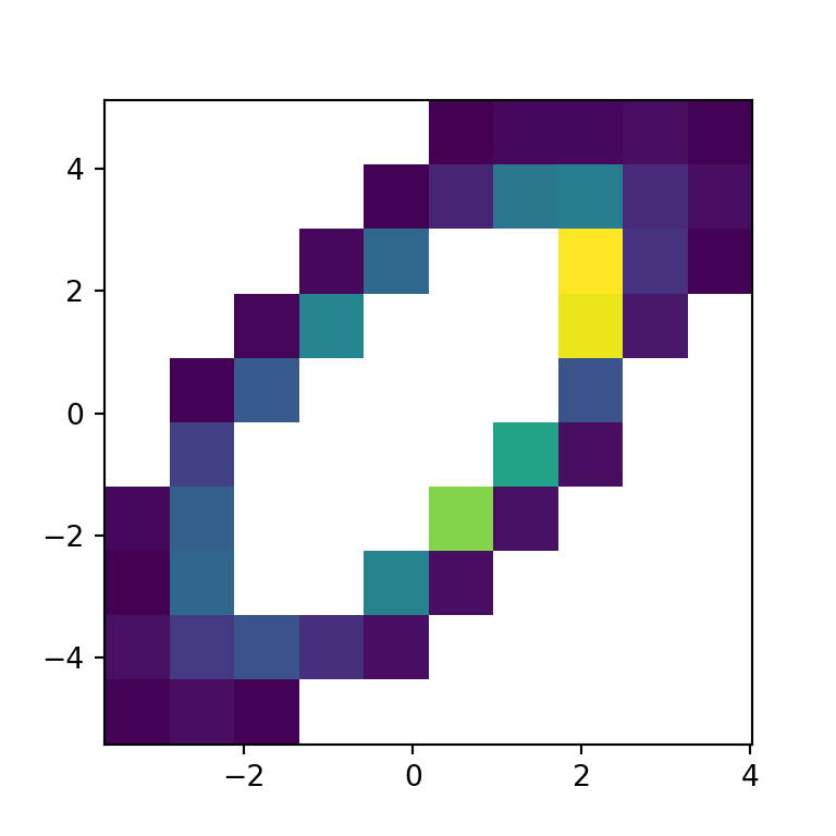
Number of bins
The number of bins or areas can be customized making use of the bins argument, which default to 10. The bin specification admits four different ways listed below:
Number of bins for the two dimensions
If you pass an int to the argument the number will be used as the number of bins for each axis.

import numpy as np
import matplotlib.pyplot as plt

# Sample data
np.random.seed(1)
x = np.random.normal(size = 10000)
y = x + np.random.normal(size = 10000)

fig, ax = plt.subplots()

ax.hist2d(x, y, bins = 30)

# plt.show()
Custom number of bins for each axis
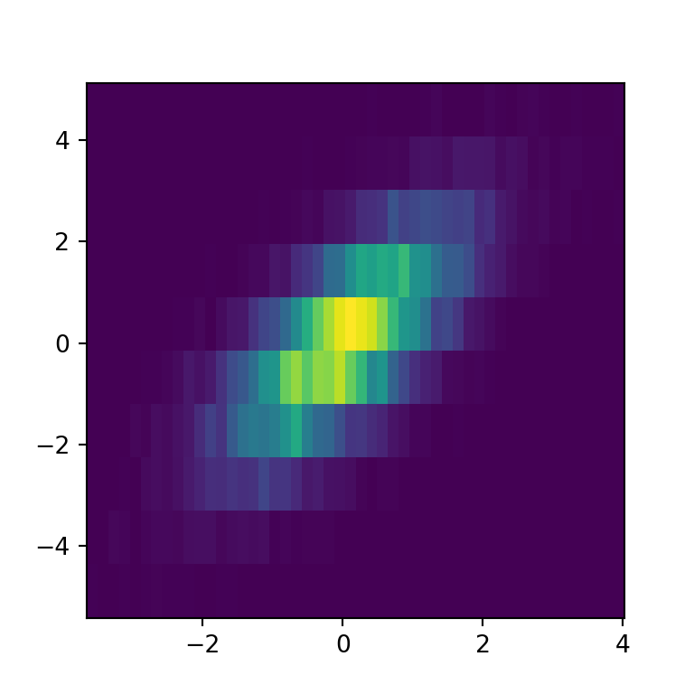
However, you can also set the number of bins for each axis with an array. The first element will be the number of bins for the X-axis while the second will be the number of bins of the Y-axis.
import numpy as np
import matplotlib.pyplot as plt

# Sample data
np.random.seed(1)
x = np.random.normal(size = 10000)
y = x + np.random.normal(size = 10000)

fig, ax = plt.subplots()

ax.hist2d(x, y, bins = [50, 10])

# plt.show()
Bin edges for the two dimensions
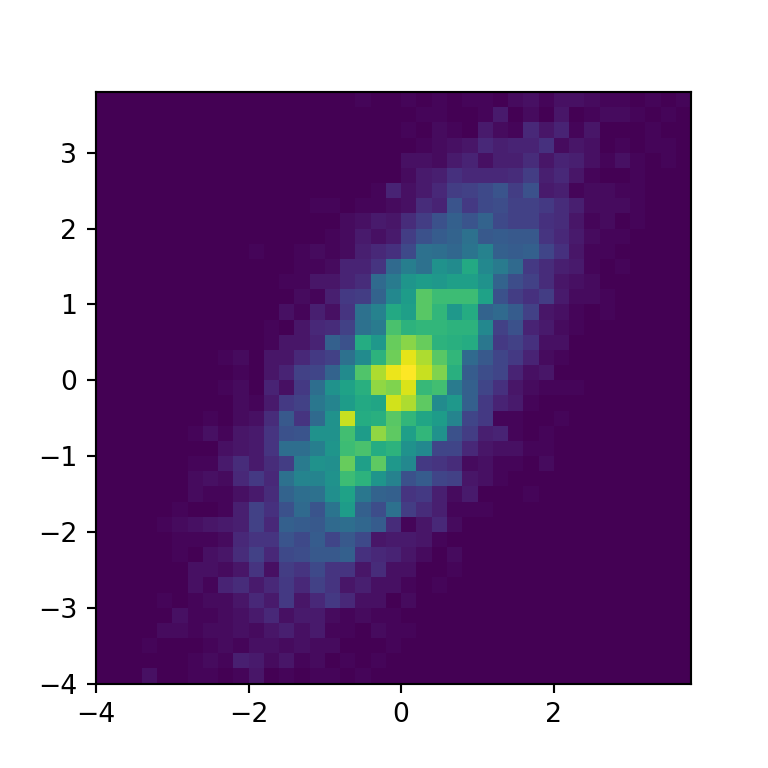
An alternative is to set the bin edges for the two dimensions passing an array of edges.
import numpy as np
import matplotlib.pyplot as plt

# Sample data
np.random.seed(1)
x = np.random.normal(size = 10000)
y = x + np.random.normal(size = 10000)

fig, ax = plt.subplots()

ax.hist2d(x, y, np.arange(-4, 4, 0.2))

# plt.show()
Bin edges for each dimension
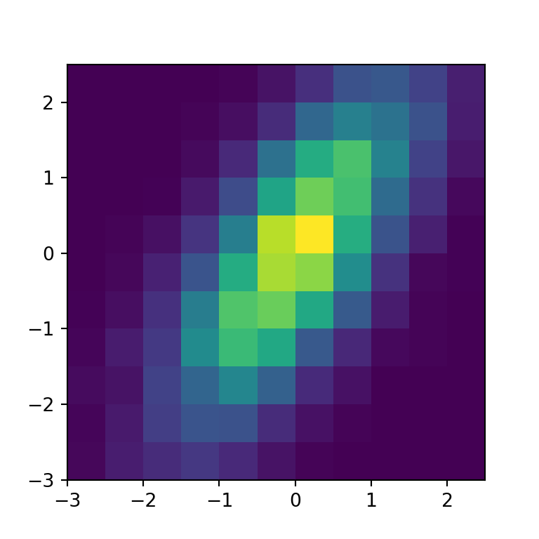
The last alternative is to set the bin edges for each dimension, as in the example below.
import numpy as np
import matplotlib.pyplot as plt

# Sample data
np.random.seed(1)
x = np.random.normal(size = 10000)
y = x + np.random.normal(size = 10000)

fig, ax = plt.subplots()

ax.hist2d(x, y, bins = (np.arange(-3, 3, 0.5), np.arange(-3, 3, 0.5)))

# plt.show()


