Sample data
Consider the following data for illustration purposes:
import pandas as pd

# Data
df = pd.DataFrame({
    "month": ["Jan", "Feb", "Mar", "Apr", "May", "Jun"],
    "revenue": [12, 15, 13, 18, 21, 19]})
Area chart in seaborn
Unlike matplotlib and plotly, seaborn does not have its own area-filling function: draw the line with lineplot and shade the area underneath with matplotlib’s fill_between on the same axes.
import seaborn as sns
import matplotlib.pyplot as plt

ax = sns.lineplot(x = "month", y = "revenue", data = df)
ax.fill_between(df["month"], df["revenue"], alpha = 0.3)

# plt.show()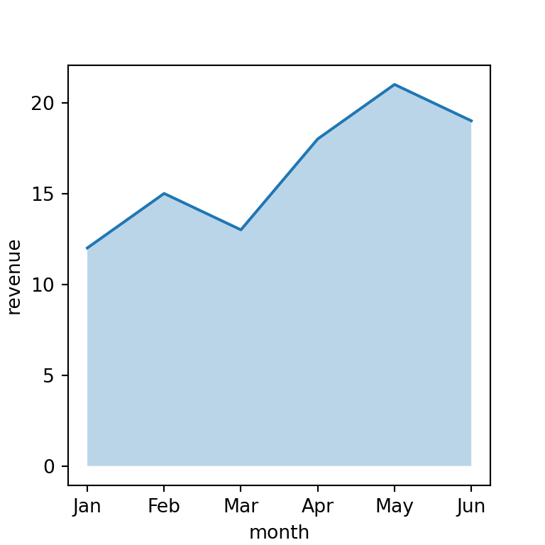
Colors
Pass the same color to both lineplot and fill_between to keep the line and the fill consistent.
import seaborn as sns
import matplotlib.pyplot as plt

ax = sns.lineplot(x = "month", y = "revenue", data = df, color = "#C44E52")
ax.fill_between(df["month"], df["revenue"], color = "#C44E52", alpha = 0.3)

# plt.show()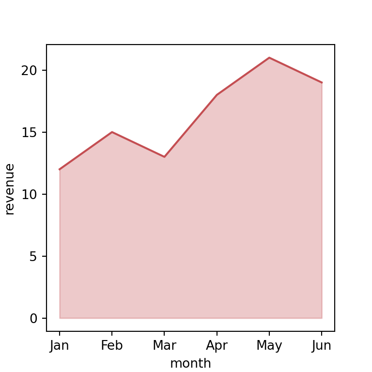
Several groups
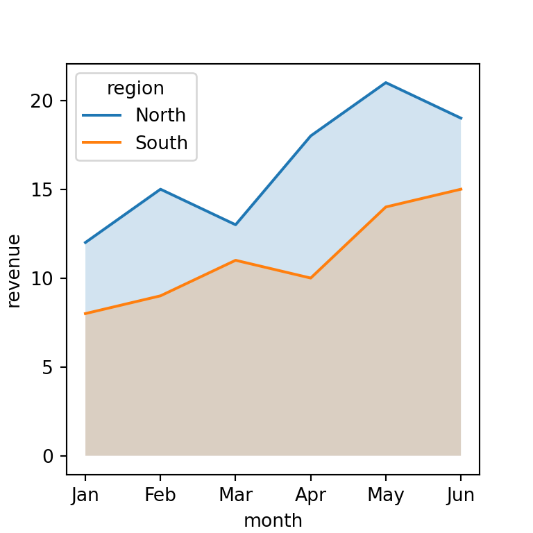
For several groups, plot each one’s line and fill separately, or let lineplot handle the hue grouping and loop only for the fills.
import seaborn as sns
import matplotlib.pyplot as plt
import pandas as pd

# Sample data
df2 = pd.DataFrame({
    "month": ["Jan", "Feb", "Mar", "Apr", "May", "Jun"] * 2,
    "revenue": [12, 15, 13, 18, 21, 19, 8, 9, 11, 10, 14, 15],
    "region": ["North"] * 6 + ["South"] * 6})

ax = sns.lineplot(x = "month", y = "revenue", hue = "region", data = df2)
for region, group in df2.groupby("region"):
    ax.fill_between(group["month"], group["revenue"], alpha = 0.2)

# plt.show()