Stacked area chart in matplotlib with stackplot
When using matplotlib, the stackplot function will allow you to create a stacked area plot in Python. The function has two ways to input data, the fist one is stackplot(x, y), being x an array for the values for the X-axis and y a multidimensional array representing the unstacked values for the series and the second one is stackplot(x, y1, y2, ..., yn) where in this case y1, y2, ..., yn are the individual unstacked arrays for each series, being n the number of series or areas. See the example below for clarification.
import numpy as np
import matplotlib.pyplot as plt

# Data
x = np.arange(2015, 2021, 1)
series1 = [2, 3, 5, 3, 5, 6]
series2 = [1, 3, 5, 2, 5, 3]
series3 = [4, 1, 2, 4, 6, 1]
y = np.vstack([series1, series2, series3])

# Stacked area plot
fig, ax = plt.subplots()

ax.stackplot(x, y)

# Equivalent to:
# ax.stackplot(x, series1, series2, series3)

# plt.show()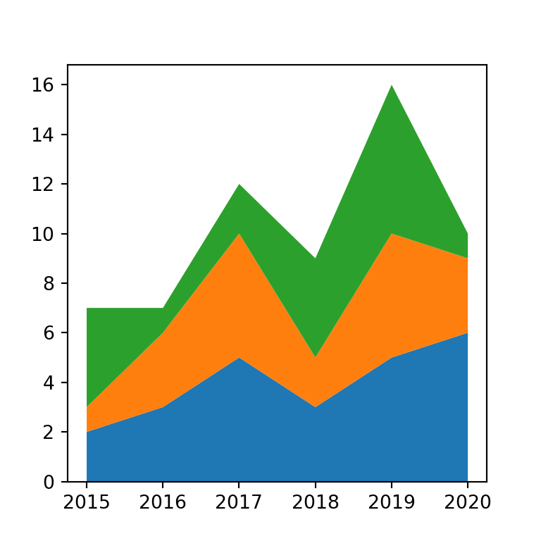
Axis limits
You might have noticed that there is a gap between the areas and the vertical lines of the box of the plot. If you want, you can set the axis limits with the following line to remove the gaps.
import numpy as np
import matplotlib.pyplot as plt

# Data
x = np.arange(2015, 2021, 1)
series1 = [2, 3, 5, 3, 5, 6]
series2 = [1, 3, 5, 2, 5, 3]
series3 = [4, 1, 2, 4, 6, 1]
y = np.vstack([series1, series2, series3])

# Stacked area plot
fig, ax = plt.subplots()

ax.stackplot(x, y)

# Set the X-axis ticks and limits
ax.set(xlim = (min(x), max(x)), xticks = x)

plt.show()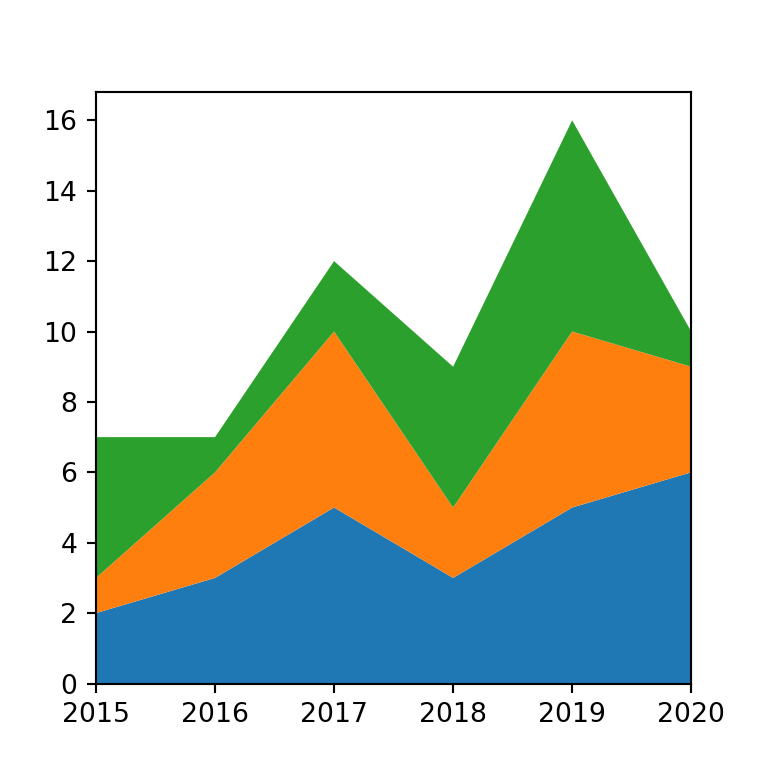
Adding a legend
Note that the stackplot function provides an argument named labels. You can pass an array of labels for each area to this argument in case you want to add a legend to the chart with ax.legend.
import numpy as np
import matplotlib.pyplot as plt

# Data
x = np.arange(2015, 2021, 1)
series1 = [2, 3, 5, 3, 5, 6]
series2 = [1, 3, 5, 2, 5, 3]
series3 = [4, 1, 2, 4, 6, 1]
y = np.vstack([series1, series2, series3])

# Stacked area plot
fig, ax = plt.subplots()

ax.stackplot(x, y, labels = ["G1", "G2", "G3"])
ax.legend(loc = 'upper left')

# Axis limits
ax.set(xlim = (min(x), max(x)), xticks = x)

# plt.show()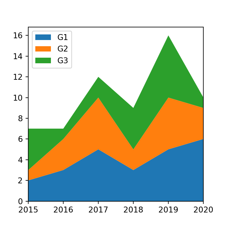
Color customization
The colors argument can be used to modify the default color palette of the area chart. You can pass as many colors as areas to this argument, as in the example below. Recall that the transparency of the areas can be set with alpha.
import numpy as np
import matplotlib.pyplot as plt

# Data
x = np.arange(2015, 2021, 1)
series1 = [2, 3, 5, 3, 5, 6]
series2 = [1, 3, 5, 2, 5, 3]
series3 = [4, 1, 2, 4, 6, 1]
y = np.vstack([series1, series2, series3])

# Array of colors
cols = ['#FDF5E6', '#FFEBCD', '#DEB887']

# Stacked area plot
fig, ax = plt.subplots()

ax.stackplot(x, y, labels = ["G1", "G2", "G3"],
             colors = cols, alpha = 0.9)

# Legend
ax.legend(loc = 'upper left')

# Axis limits
ax.set(xlim = (min(x), max(x)), xticks = x)

plt.show()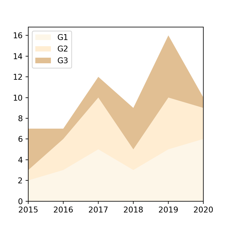
Baseline methods
The stackplot function provides several methods to customize the baseline. By default, the baseline is zero, e.g. baseline = 'zero'.
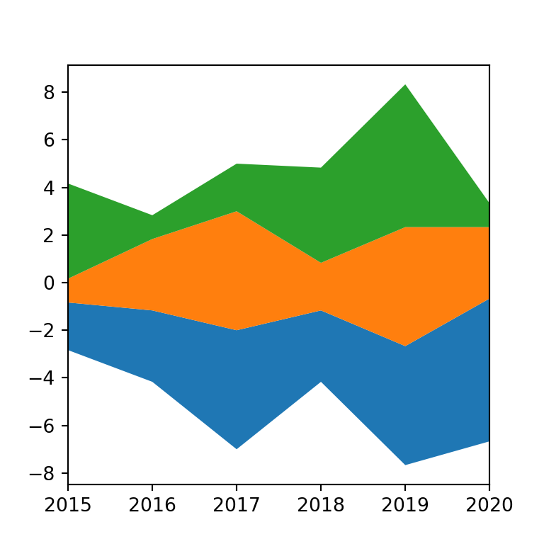
Symmetric stacked area plot around zero (ThemeRiver)
Setting baseline = 'sym' will create a symmetric stacked area chart around zero. This is sometimes called “ThemeRiver”.
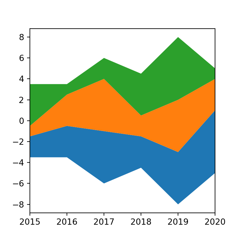
import numpy as np
import matplotlib.pyplot as plt

# Data
x = np.arange(2015, 2021, 1)
series1 = [2, 3, 5, 3, 5, 6]
series2 = [1, 3, 5, 2, 5, 3]
series3 = [4, 1, 2, 4, 6, 1]
y = np.vstack([series1, series2, series3])

# Stacked area plot
fig, ax = plt.subplots()

ax.stackplot(x, y, baseline = 'sym')

# Axis limits
ax.set(xlim = (min(x), max(x)), xticks = x)

# plt.show()
Wiggle
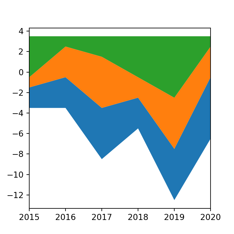
The 'wiggle' baseline minimizes the sum of the squared slopes.
import numpy as np
import matplotlib.pyplot as plt

# Data
x = np.arange(2015, 2021, 1)
series1 = [2, 3, 5, 3, 5, 6]
series2 = [1, 3, 5, 2, 5, 3]
series3 = [4, 1, 2, 4, 6, 1]
y = np.vstack([series1, series2, series3])

# Stacked area plot
fig, ax = plt.subplots()

ax.stackplot(x, y, baseline = 'wiggle')

# Axis limits
ax.set(xlim = (min(x), max(x)), xticks = x)

# plt.show()
weighted_wiggle (streamgraph)
Finally, the 'weighted_wiggle' baseline method is the same as 'wiggle' but it takes into account the size of each area. This type of chart is also called streamgraph or streamplot.
import numpy as np
import matplotlib.pyplot as plt

# Data
x = np.arange(2015, 2021, 1)
series1 = [2, 3, 5, 3, 5, 6]
series2 = [1, 3, 5, 2, 5, 3]
series3 = [4, 1, 2, 4, 6, 1]
y = np.vstack([series1, series2, series3])

# Stacked area plot
fig, ax = plt.subplots()

ax.stackplot(x, y, baseline = 'weighted_wiggle')

# Axis limits
ax.set(xlim = (min(x), max(x)), xticks = x)

# plt.show()