The scatter function from plotly
With the scatter function from Plotly Express is very easy to create scatter plots with Plotly and Python. You will need to input your data as vector or as a pandas dataframe, as in the example below.
import plotly.express as px

fig = px.scatter(x = [0, 1, 2, 3, 4, 5],
                 y = [16, 8, 4, 2, 1, 0])


# Alternative: data from pandas data frame
# import pandas as pd
# df = pd.DataFrame({'x': [0, 1, 2, 3, 4, 5],
#                    'y': [16, 8, 4, 2, 1, 0]})

# Scatter plot from data frame
# fig = px.scatter(df, x = "x", y = "y")

fig.show()
Adding labels and a title
In case you want to add a title to your plot you can pass a string to title. If you want to customize the axis labels you will need to use the labels argument as follows.
import plotly.express as px

fig = px.scatter(x = [0, 1, 2, 3, 4, 5],
                 y = [16, 8, 4, 2, 1, 0],
                 title = "Title of the plot",
                 labels = {'x': 'X-axis', 'y':'Y-axis'})

fig.show()
Color customization
Color by group
You can input a categorical variable to the color argument in order to color the observations by group.
import plotly.express as px
import pandas as pd

# pandas data frame
df = pd.DataFrame({'x': [0, 1, 2, 3, 4, 5],
                   'y': [16, 8, 4, 2, 1, 0],
                   'group': ['0', '1', '0', '1', '0', '1']})

# Scatter plot from data frame
fig = px.scatter(df, x = "x", y = "y", color = "group")

fig.show()
Color based on a numerical variable
The color can also be assigned to a numerical variable. In this scenario, the observations will have a continuous color scale based on the values of the variable passed to color.
import plotly.express as px
import pandas as pd

# pandas data frame
df = pd.DataFrame({'x': [0, 1, 2, 3, 4, 5],
                   'y': [16, 8, 4, 2, 1, 0]})

# Scatter plot from data frame
fig = px.scatter(df, x = "x", y = "y", color = "y")

fig.show()
Symbols
Symbol by group
By default, all symbols are circles, but if you pass a categorical variable to symbol each group will have a different marker.
import plotly.express as px
import pandas as pd

# pandas data frame
df = pd.DataFrame({'x': [0, 1, 2, 3, 4, 5],
                   'y': [16, 8, 4, 2, 1, 0],
                   'group': ['0', '1', '0', '1', '0', '1']})

# Scatter plot from data frame
fig = px.scatter(df, x = "x", y = "y", symbol = "group")

fig.show()
Size of the symbols based on a variable
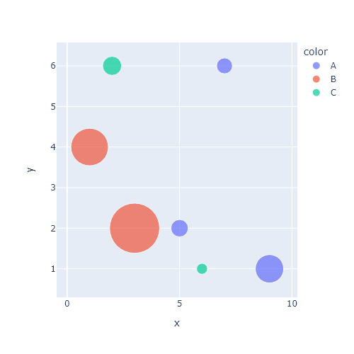
It is possible to set the size of the symbols or markers based on the values of a variable. In the following example we will use the y column to determine the size of the symbols, the greater the value, the greater the symbols.
import plotly.express as px
import pandas as pd

# pandas data frame
df = pd.DataFrame({'x': [0, 1, 2, 3, 4, 5],
                   'y': [16, 8, 4, 2, 1, 0],
                   'group': ['0', '1', '0', '1', '0', '1']})

# Scatter plot from data frame
fig = px.scatter(df, x = "x", y = "y", color = "group", size = "y")

fig.show()
Opacity
Note that you can control the opacity of the symbols with opacity. The possible values range between 0 and 1.
import plotly.express as px
import pandas as pd

# pandas data frame
df = pd.DataFrame({'x': [0, 1, 2, 3, 4, 5],
                   'y': [16, 8, 4, 2, 1, 0]})

# Scatter plot from data frame
fig = px.scatter(df, x = "x", y = "y", opacity = 0.5)

fig.show()
Scatter plot with marginal plots
The scatter function from Plotly provides the marginal_x and marginal_y arguments for adding marginal plots to the scatter plot. Possible options are "box" for box plots, "hist" for histograms, "violin" for violin plots and "rug" for rug plots.
Scatter plot with marginal box plots
import plotly.express as px
import pandas as pd

# pandas data frame
df = pd.DataFrame({'x': [0, 1, 2, 3, 4, 5],
                   'y': [16, 8, 4, 2, 1, 0]})

# Scatter plot with marginal boxplots
fig = px.scatter(df, x = "x", y = "y",
                 marginal_x = "box", marginal_y = "box")

fig.show()
Scatter plot with marginal histograms
import plotly.express as px
import pandas as pd

# pandas data frame
df = pd.DataFrame({'x': [0, 1, 2, 3, 4, 5],
                   'y': [16, 8, 4, 2, 1, 0]})

# Scatter plot with marginal rug plot
fig = px.scatter(df, x = "x", y = "y",
                 marginal_x = "histogram", marginal_y = "histogram")

fig.show()
Scatter plot with marginal violin plots
import plotly.express as px
import pandas as pd

# pandas data frame
df = pd.DataFrame({'x': [0, 1, 2, 3, 4, 5],
                   'y': [16, 8, 4, 2, 1, 0]})

# Scatter plot with marginal rug plot
fig = px.scatter(df, x = "x", y = "y",
                 marginal_x = "violin", marginal_y = "violin")

fig.show()
Scatter plot with marginal rug plots
import plotly.express as px
import pandas as pd

# pandas data frame
df = pd.DataFrame({'x': [0, 1, 2, 3, 4, 5],
                   'y': [16, 8, 4, 2, 1, 0]})

# Scatter plot with marginal rug plot
fig = px.scatter(df, x = "x", y = "y",
                 marginal_x = "rug", marginal_y = "rug")

fig.show()


