Sample data
Consider the following data for illustration purposes:
# Data
categories = ["Speed", "Power", "Range", "Comfort", "Price"]
values = [4, 3, 5, 4, 2]
Radar chart in matplotlib
A radar chart (or spider chart) compares several numeric variables on axes arranged in a circle, which is why it needs a polar projection instead of the usual cartesian one. Compute an angle per category with numpy, repeat the first value and angle at the end to close the shape, and plot with ax.plot.
import numpy as np
import matplotlib.pyplot as plt

angles = np.linspace(0, 2 * np.pi, len(categories), endpoint = False).tolist()
values_closed = values + values[:1]
angles_closed = angles + angles[:1]

fig, ax = plt.subplots(subplot_kw = dict(projection = "polar"))
ax.plot(angles_closed, values_closed)
ax.set_xticks(angles)
ax.set_xticklabels(categories)

# plt.show()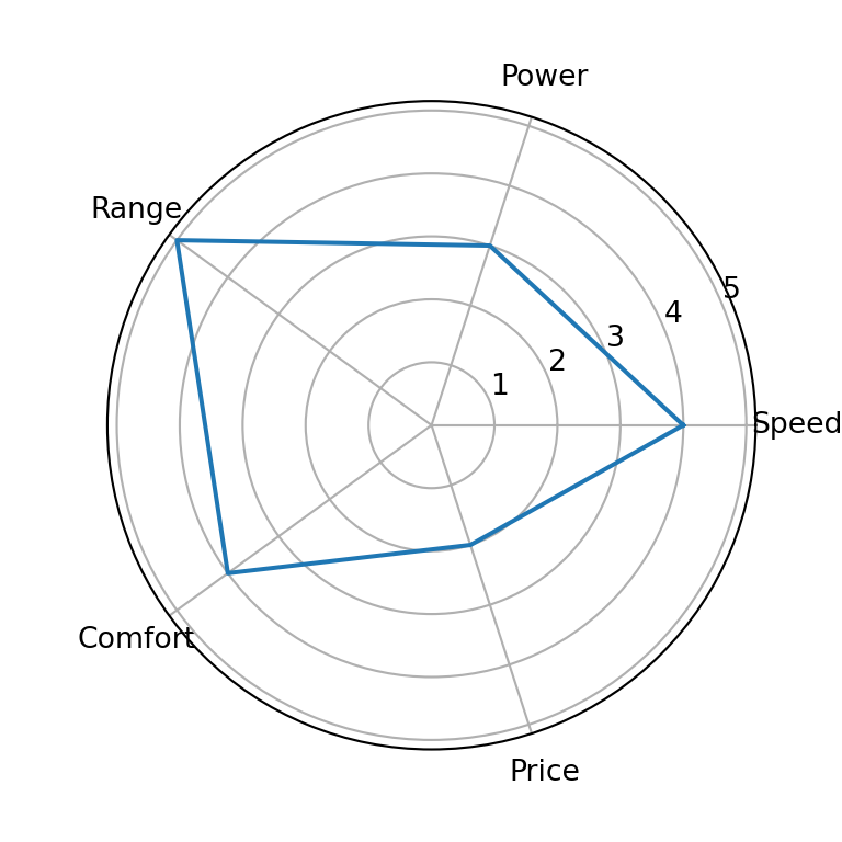
Fill
Add ax.fill right after ax.plot, using the same closed angles and values, to shade the area under the line.
import numpy as np
import matplotlib.pyplot as plt

angles = np.linspace(0, 2 * np.pi, len(categories), endpoint = False).tolist()
values_closed = values + values[:1]
angles_closed = angles + angles[:1]

fig, ax = plt.subplots(subplot_kw = dict(projection = "polar"))
ax.plot(angles_closed, values_closed)
ax.fill(angles_closed, values_closed, alpha = 0.25)
ax.set_xticks(angles)
ax.set_xticklabels(categories)

# plt.show()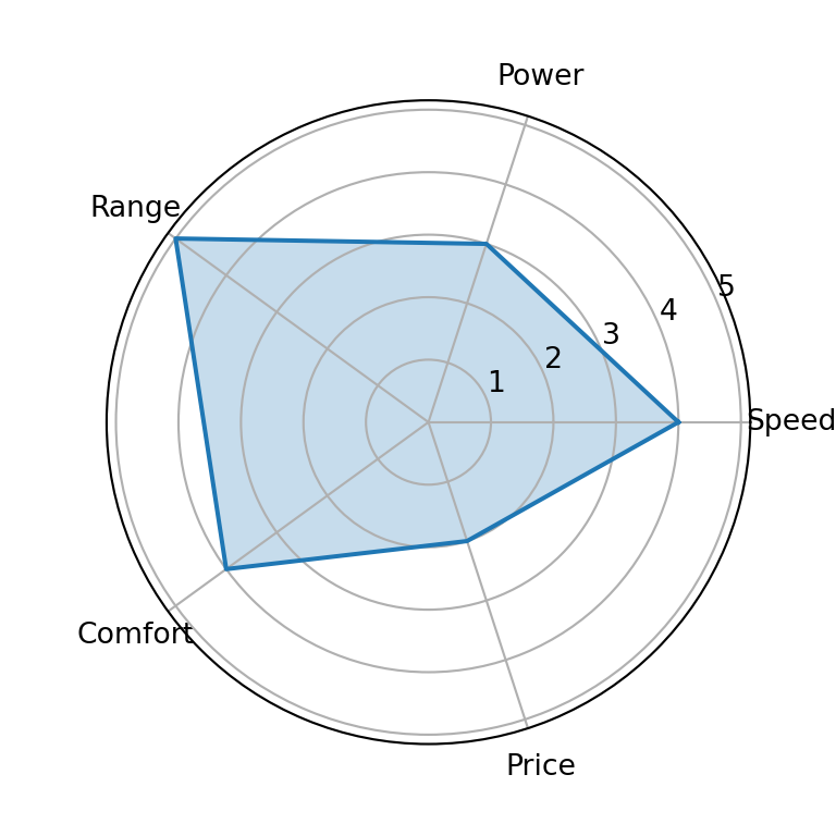
Colors
Set color on both plot and fill to change the line and fill color.
import numpy as np
import matplotlib.pyplot as plt

angles = np.linspace(0, 2 * np.pi, len(categories), endpoint = False).tolist()
values_closed = values + values[:1]
angles_closed = angles + angles[:1]

fig, ax = plt.subplots(subplot_kw = dict(projection = "polar"))
ax.plot(angles_closed, values_closed, color = "#C44E52")
ax.fill(angles_closed, values_closed, color = "#C44E52", alpha = 0.25)
ax.set_xticks(angles)
ax.set_xticklabels(categories)

# plt.show()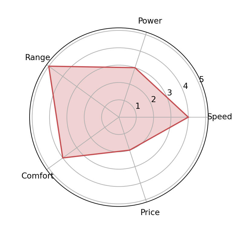
Several groups
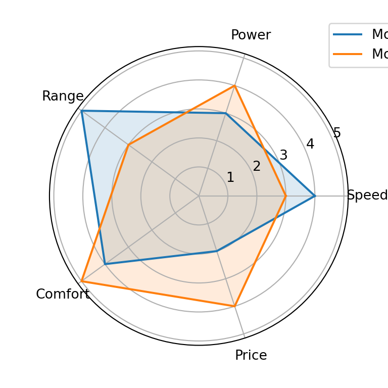
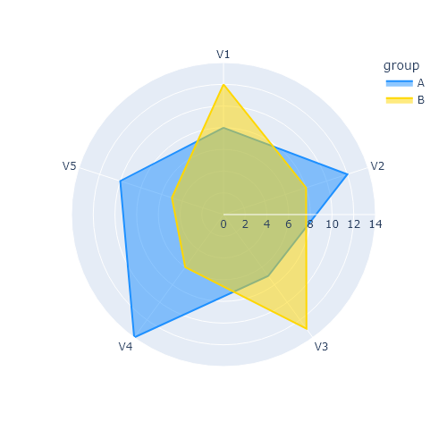
To compare more than one group, repeat the plot and fill calls for each series on the same polar axes and add a legend.
import numpy as np
import matplotlib.pyplot as plt

angles = np.linspace(0, 2 * np.pi, len(categories), endpoint = False).tolist()
angles_closed = angles + angles[:1]
values_a = values + values[:1]
values_b = [3, 4, 3, 5, 4] + [3]

fig, ax = plt.subplots(subplot_kw = dict(projection = "polar"))
ax.set_xticks(angles)
ax.set_xticklabels(categories)

ax.plot(angles_closed, values_a, label = "Model A")
ax.fill(angles_closed, values_a, alpha = 0.15)
ax.plot(angles_closed, values_b, label = "Model B")
ax.fill(angles_closed, values_b, alpha = 0.15)
ax.legend(loc = "upper right", bbox_to_anchor = (1.3, 1.1))

# plt.show()