Sample data
Consider the following data for illustration purposes:
# Data
age_groups = ["0-9", "10-19", "20-29", "30-39", "40-49", "50-59", "60-69", "70+"]
male = [12, 14, 16, 15, 13, 10, 7, 4]
female = [11, 13, 15, 16, 14, 11, 8, 6]
Population pyramid in matplotlib
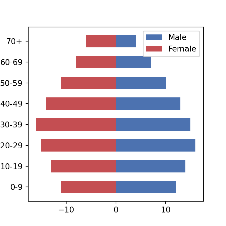
A population pyramid is a pair of back-to-back horizontal bar charts sharing the same category axis, typically used to compare two groups (such as male and female population) across age bands. Matplotlib does not have a dedicated function: draw the first group with barh as usual and the second one with its values negated, so the bars grow in the opposite direction.
import matplotlib.pyplot as plt

fig, ax = plt.subplots()
ax.barh(age_groups, male)
ax.barh(age_groups, [-f for f in female])

# plt.show()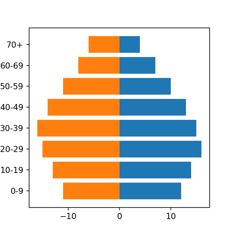
Colors and legend
Set color and label for each side, then call ax.legend as usual.
import matplotlib.pyplot as plt

fig, ax = plt.subplots()
ax.barh(age_groups, male, color = "#4C72B0", label = "Male")
ax.barh(age_groups, [-f for f in female], color = "#C44E52", label = "Female")
ax.legend()

# plt.show()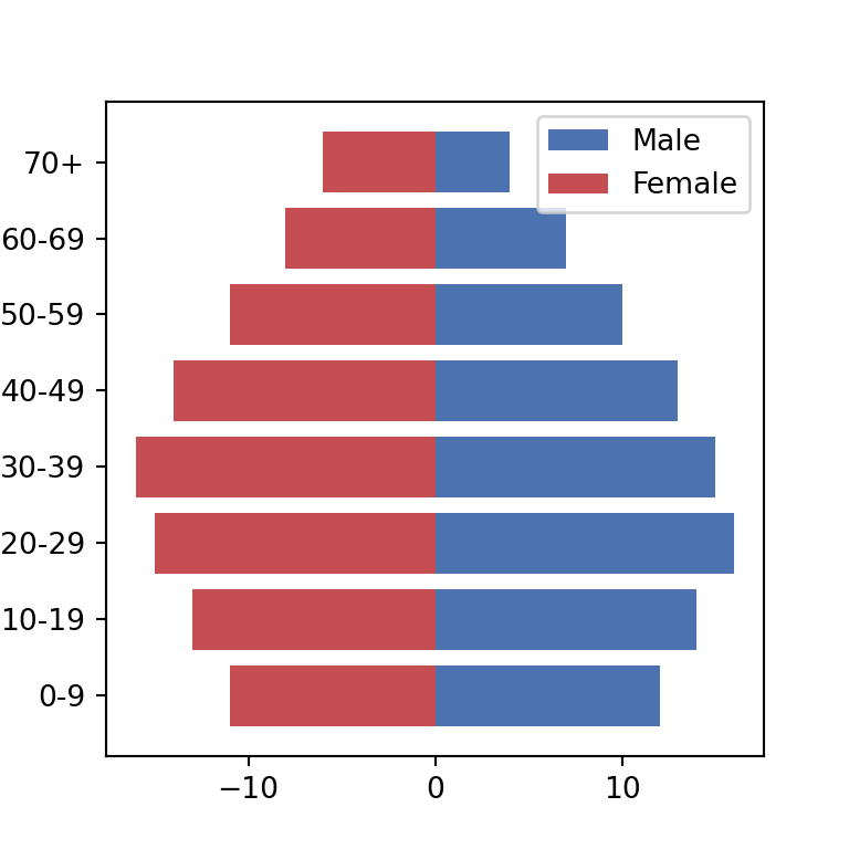
Positive axis labels
Since the left side uses negative values, the default tick labels will show negative numbers. Fix this with a custom formatter that displays the absolute value.
import matplotlib.ticker as ticker
import matplotlib.pyplot as plt

fig, ax = plt.subplots()
ax.barh(age_groups, male, color = "#4C72B0", label = "Male")
ax.barh(age_groups, [-f for f in female], color = "#C44E52", label = "Female")
ax.legend()

ax.xaxis.set_major_formatter(ticker.FuncFormatter(lambda x, pos: f"{abs(int(x))}"))

# plt.show()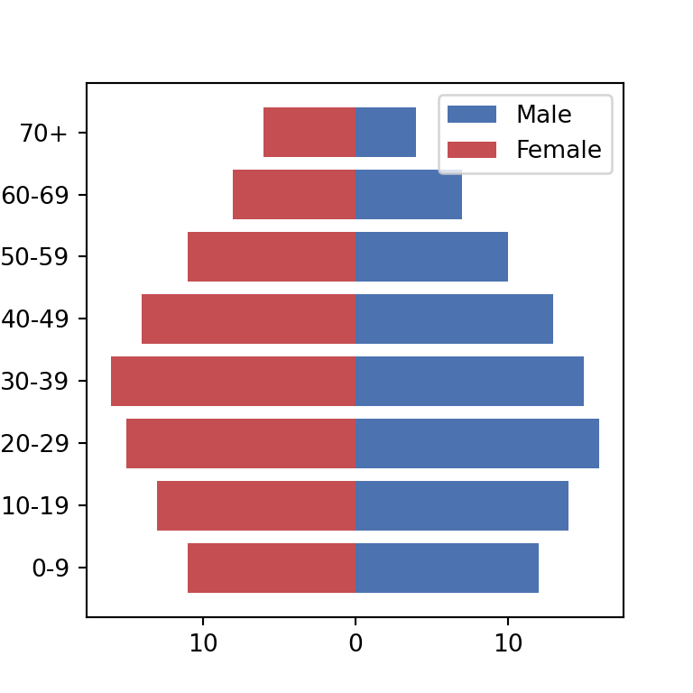
Bar width
Control the thickness of the bars the same way as in a regular bar plot, with the height argument.
import matplotlib.pyplot as plt

fig, ax = plt.subplots()
ax.barh(age_groups, male, height = 0.6, color = "#4C72B0", label = "Male")
ax.barh(age_groups, [-f for f in female], height = 0.6, color = "#C44E52", label = "Female")
ax.legend()

# plt.show()