Count plot in seaborn with countplot
The countplot function can be used to represent the number of observations of a categorical variable for each group with bars.
import seaborn as sns

data = ["A", "A", "B",
        "B", "B", "C"]

# Count plot
sns.countplot(x = data)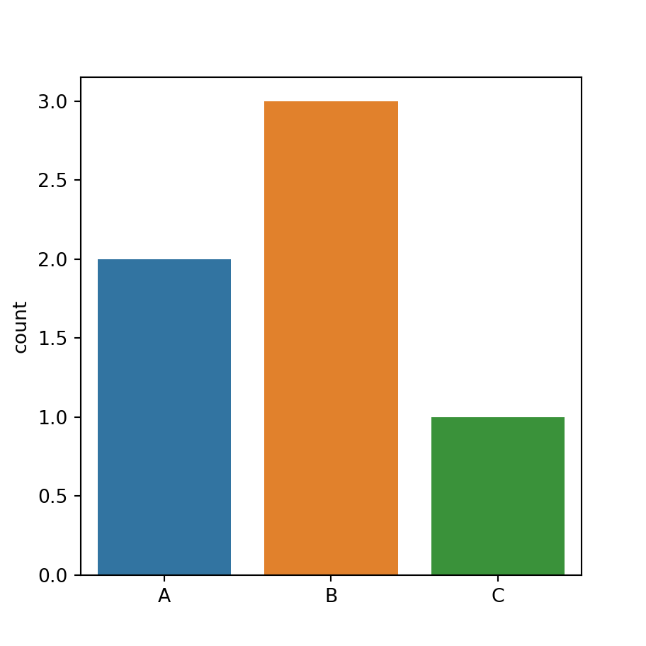
Horizontal count plot
In case you want to create an horizontal count plot you will need to pass your data to the y argument, instead of x.
import seaborn as sns

data = ["A", "A", "B",
        "B", "B", "C"]

# Count plot
sns.countplot(y = data)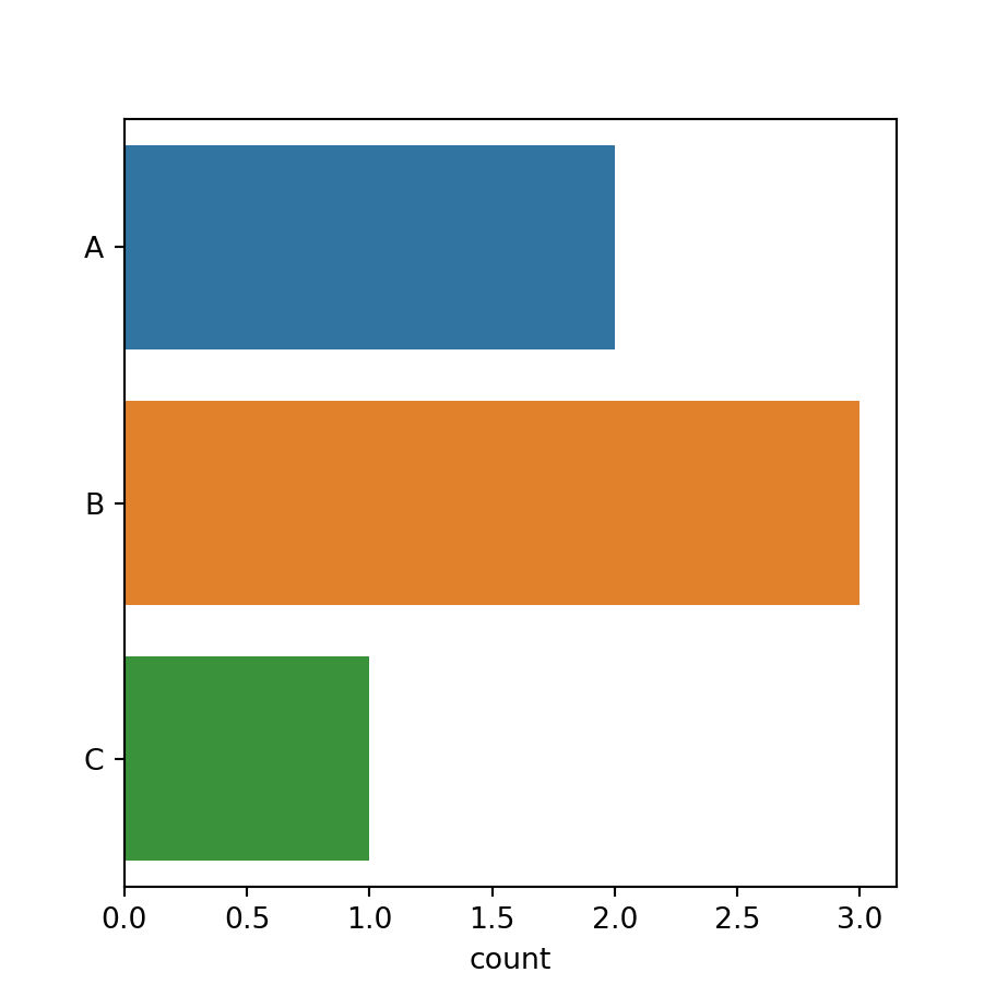
Count plot by group and subgroup
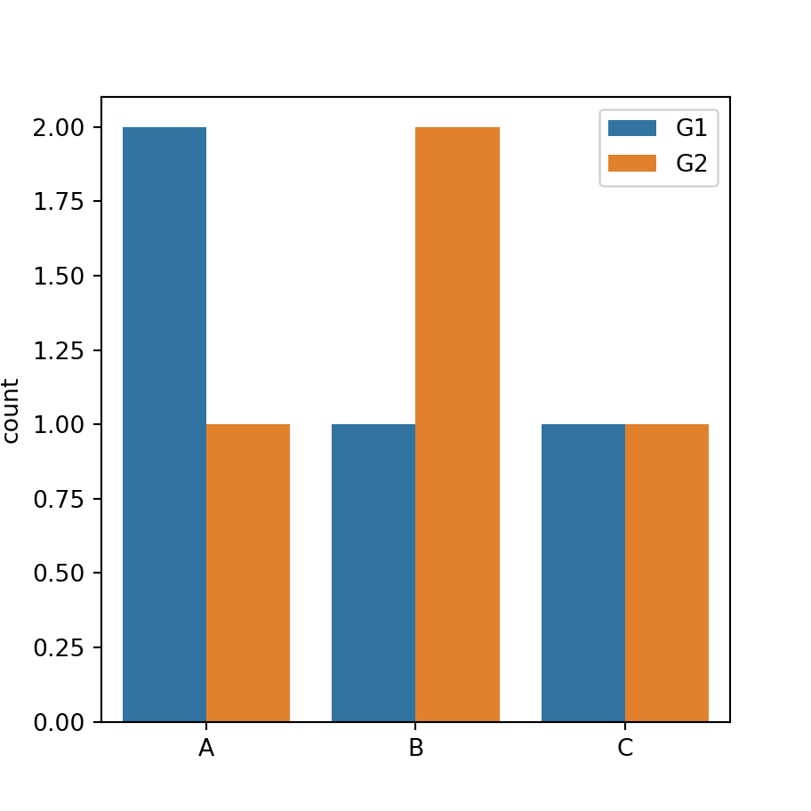
Dodged count plot
In addition, if you have another categorical variable representing subgroups you can input it to the hue argument, as shown below. Set dodge = False in case you want to overplot the bars for each group.
import seaborn as sns

data = ["A", "A", "B", "A",
        "B", "B", "C", "C"]
group = ["G1", "G1", "G2", "G2",
         "G1", "G2", "G1", "G2"]

# Count plot
sns.countplot(x = data, hue = group)
Color customization
Color saturation
The saturation of the colors of the bars is 0.75 by default. However, you can make use of the saturation argument to change it, being 0 desaturated and 1 fully saturated.
import seaborn as sns

data = ["A", "A", "B",
        "B", "B", "C"]

# Count plot
sns.countplot(x = data, saturation = 1)
Color palette
If you want to override the default color palette you can change it with the palette argument, as in the example below.
import seaborn as sns

data = ["A", "A", "B",
        "B", "B", "C"]

# Count plot
sns.countplot(x = data, palette = "Set1")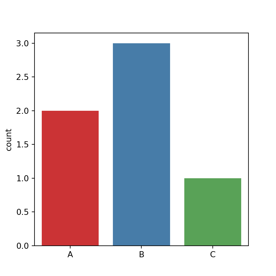
Same color for all the bars
You can also set the same color for all the bars passing a named color to the color argument of the function.
import seaborn as sns

data = ["A", "A", "B",
        "B", "B", "C"]

# Count plot
sns.countplot(x = data,
              color = "lightblue")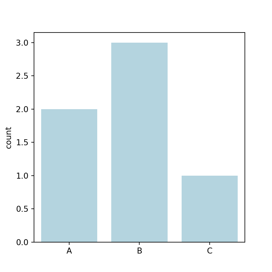
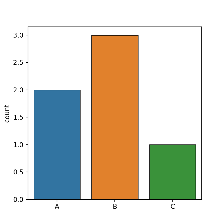
Border color
Finally, you can also modify the colors of the borders for each bar, setting a color or a vector of colors with edgecolor.
import seaborn as sns

data = ["A", "A", "B",
        "B", "B", "C"]

# Count plot
sns.countplot(x = data,
              edgecolor = "black")