Sample data
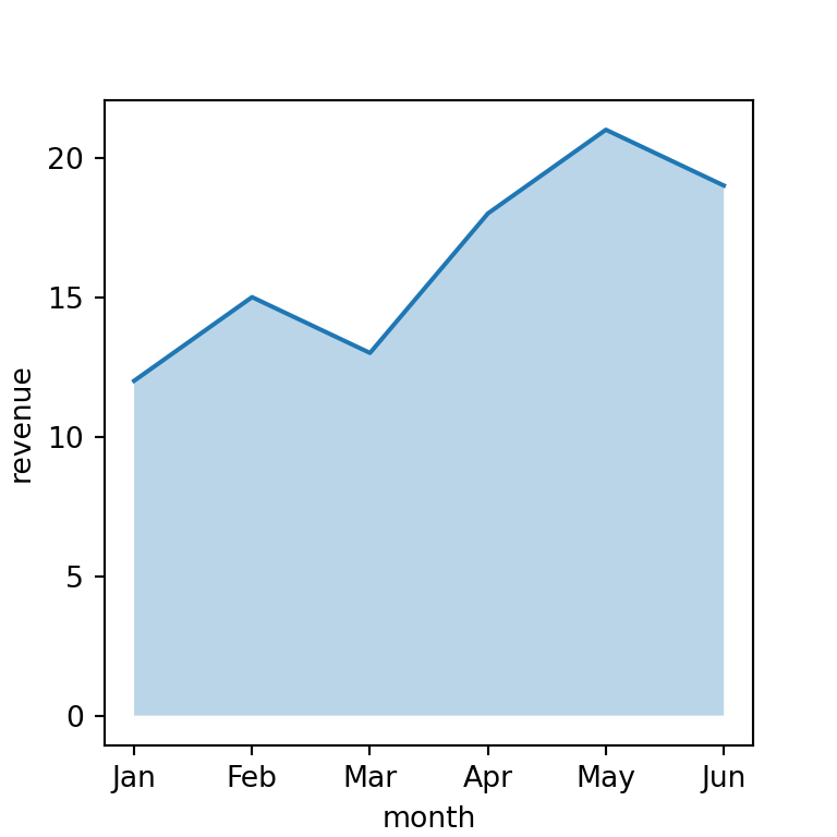
Consider the following data for illustration purposes:
import pandas as pd

# Data
df = pd.DataFrame({
    "month": ["Jan", "Feb", "Mar", "Apr", "May", "Jun"],
    "revenue": [12, 15, 13, 18, 21, 19]})
Area chart in plotly with area
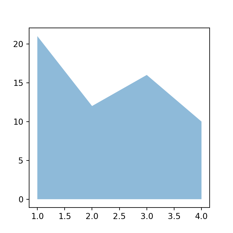
An area chart is a line chart with the space between the line and the X-axis filled in, which emphasizes the magnitude of the values over time. Use the area function from plotly express with the same syntax as line.
import plotly.express as px

fig = px.area(df, x = "month", y = "revenue")

fig.show()
Colors
Set a fixed fill color with color_discrete_sequence, and the line color/width with update_traces.
import plotly.express as px

fig = px.area(df, x = "month", y = "revenue",
             color_discrete_sequence = ["#4C72B0"])
fig = fig.update_traces(line = dict(width = 2))

fig.show()
Several groups
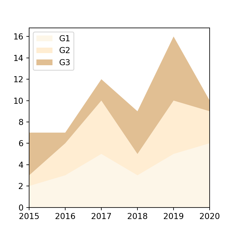
Map a categorical column to color to draw one area per group. By default plotly stacks them on top of each other.
import plotly.express as px
import pandas as pd

# Sample data
df2 = pd.DataFrame({
    "month": ["Jan", "Feb", "Mar", "Apr", "May", "Jun"] * 2,
    "revenue": [12, 15, 13, 18, 21, 19, 8, 9, 11, 10, 14, 15],
    "region": ["North"] * 6 + ["South"] * 6})

fig = px.area(df2, x = "month", y = "revenue", color = "region")

fig.show()
Non-stacked groups
To overlay the groups instead of stacking them, set groupnorm = None and switch the trace stackgroup off with update_traces(stackgroup = None), so each area is drawn from zero independently.
import plotly.express as px
import pandas as pd

df2 = pd.DataFrame({
    "month": ["Jan", "Feb", "Mar", "Apr", "May", "Jun"] * 2,
    "revenue": [12, 15, 13, 18, 21, 19, 8, 9, 11, 10, 14, 15],
    "region": ["North"] * 6 + ["South"] * 6})

fig = px.area(df2, x = "month", y = "revenue", color = "region")
fig = fig.update_traces(stackgroup = None, fillcolor = None, opacity = 0.5)

fig.show()
Line shape
Change line_shape to "spline" for a smoothed curve instead of straight segments between points.
import plotly.express as px

fig = px.area(df, x = "month", y = "revenue",
             line_shape = "spline")

fig.show()