Marginal histograms with jointplot
With the jointplot function is straightforward to create a scatter plot (and other types of plots) with marginal histograms. You will need to input your variables to create the visualization.
import seaborn as sns

df = sns.load_dataset("penguins")

sns.jointplot(data = df,
              x = "bill_length_mm",
              y = "bill_depth_mm")
An alternative to the jointplot function is JointGrid, which will provide more flexibility, if needed. jointgrid is just a lightweight wrapper of that function.
import seaborn as sns

df = sns.load_dataset("penguins")

ax = sns.JointGrid(data = df,
                   x = "bill_length_mm",
                   y = "bill_depth_mm")

ax.plot(sns.scatterplot, sns.histplot)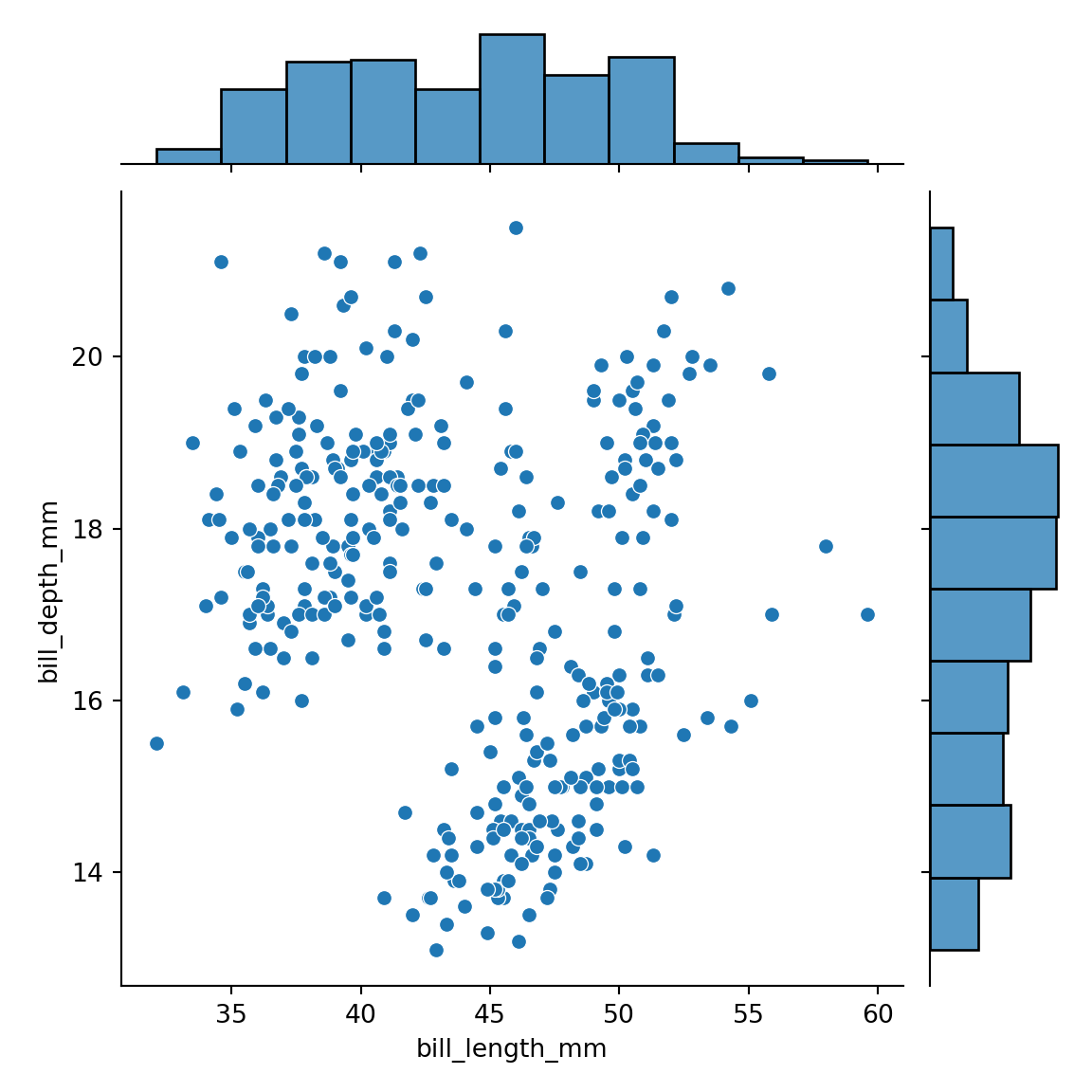
Adding a regression line and densities
The function provides an argument named kind that allows you to select between different kind of plots. Possible options are "scatter" (default), "kde", "hist", "hex", "reg" and "resid".
import seaborn as sns

df = sns.load_dataset("penguins")

sns.jointplot(data = df,
              x = "bill_length_mm",
              y = "bill_depth_mm",
              kind = "reg") # Adds regression and densities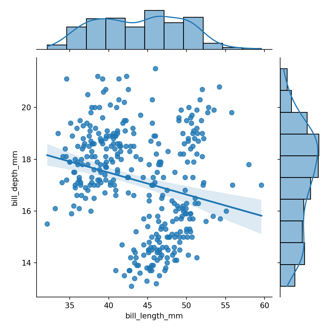
Custom marker
The marker (symbol) used to represent the observations of the scatter plot can be customized with the marker argument.
import seaborn as sns

df = sns.load_dataset("penguins")

sns.jointplot(data = df,
              x = "bill_length_mm",
              y = "bill_depth_mm",
              marker = "x")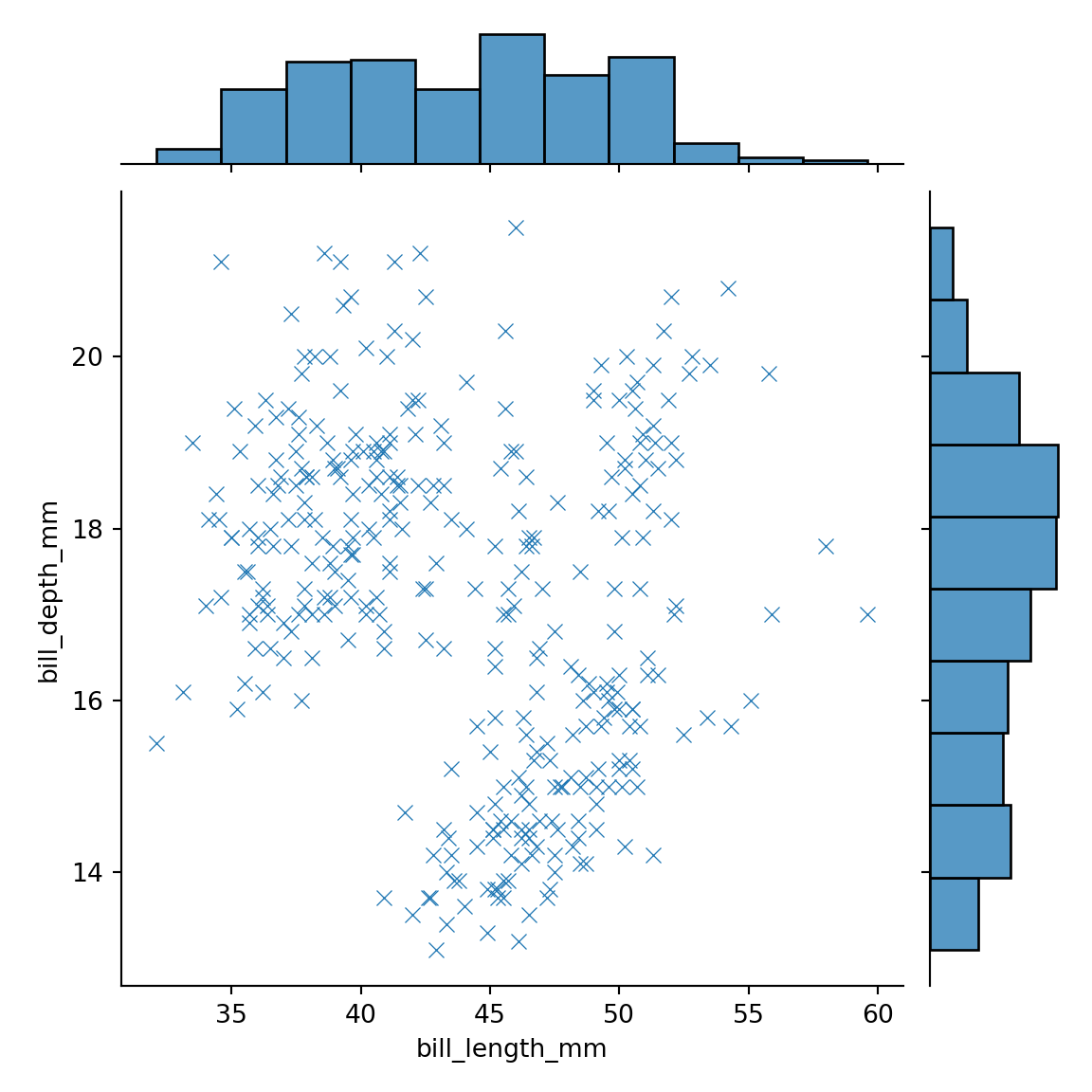
Display the axes of the marginal plots
If you want the axes of the marginal plots to be displayed you can set the marginal_ticks argument to True.
import seaborn as sns

df = sns.load_dataset("penguins")

sns.jointplot(data = df,
              x = "bill_length_mm",
              y = "bill_depth_mm",
              marginal_ticks = True)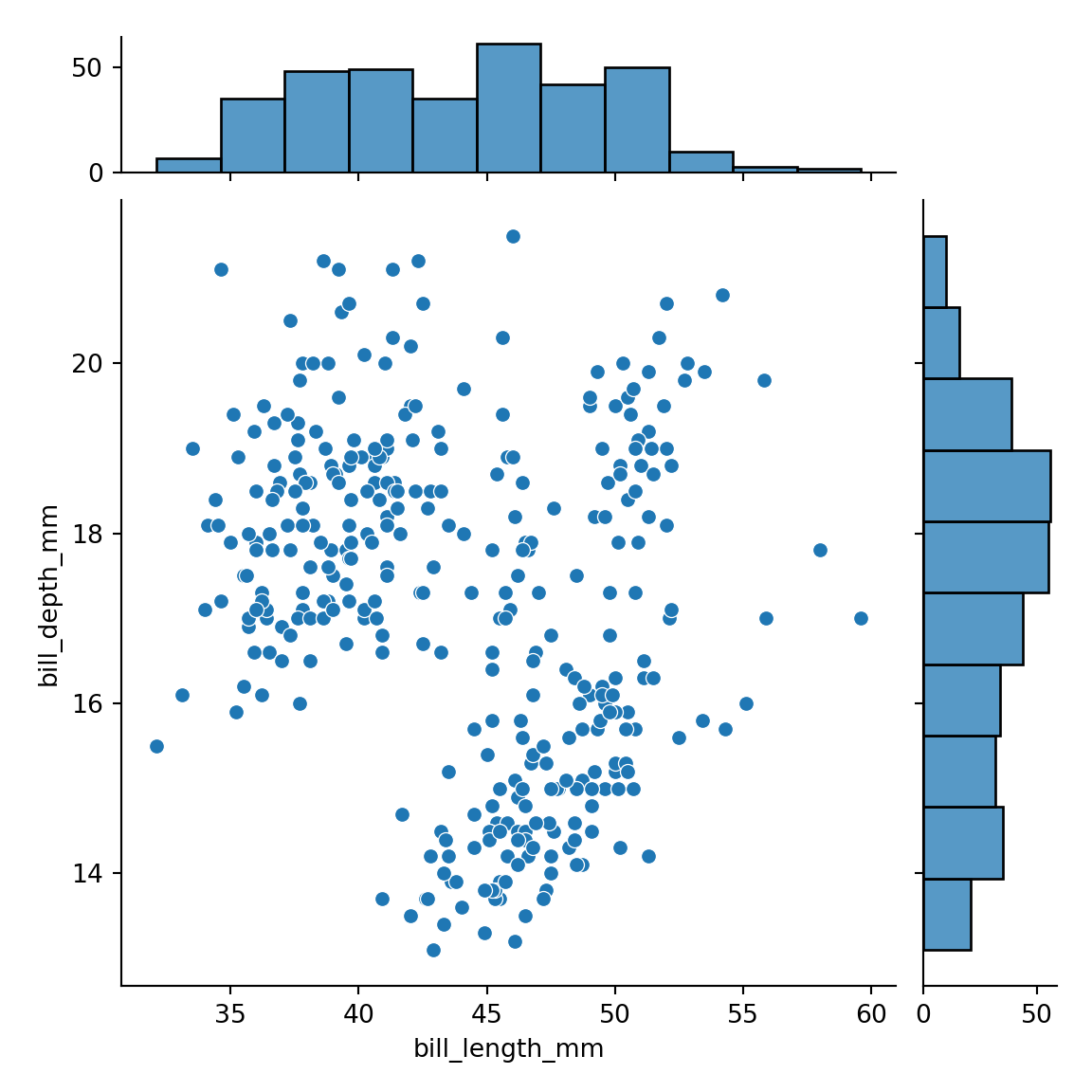
Marginal plots size
By default, the scatter plot is 5 times bigger than the marginal plots. You can change the aspect ratio with ratio. Note that this argument only allows integers as input.
import seaborn as sns

df = sns.load_dataset("penguins")

# Scatter plot two times bigger than the histograms
sns.jointplot(data = df,
              x = "bill_length_mm",
              y = "bill_depth_mm",
ratio = 2) 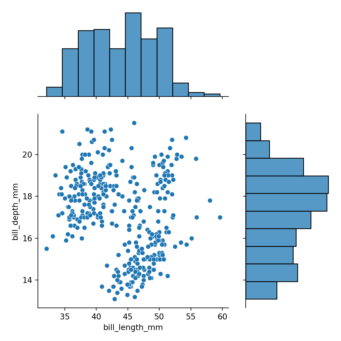
Color customization

Finally, you can also customize the colors. If you only provide a color using the color argument both the histograms and the scatter plot will have the same color.
import seaborn as sns

df = sns.load_dataset("penguins")

sns.jointplot(data = df,
              x = "bill_length_mm",
              y = "bill_depth_mm",
              color = "lavender")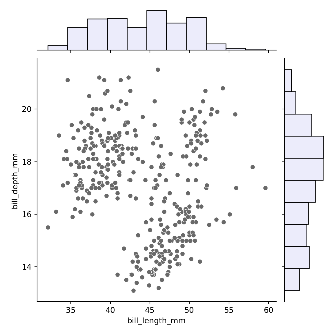
However, if you prefer a different color for the histograms you can pass a dictionary to the marginal_kws argument and select the desired color. Note that this argument can also be used to customize other arguments related to the histograms.
import seaborn as sns

df = sns.load_dataset("penguins")

sns.jointplot(data = df,
              x = "bill_length_mm",
              y = "bill_depth_mm",
              color = "dimgray",
              marginal_kws = dict(color = "lavender"))