Sample data set
The data set used on the following examples represents the population for each census section of Galicia, an autonomous community of Spain. The coordinates are given by the centroid of each census section.
import pandas as pd

df = pd.read_csv('https://raw.githubusercontent.com/R-CoderDotCom/data/main/sample_datasets/population_galicia.csv')
Heat maps with density_mapbox
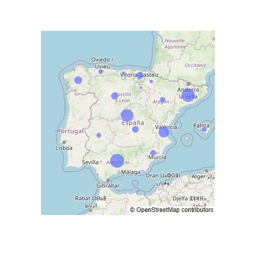
Given a data frame with coordinates and a value assigned to each point it is possible to create dynamic spatial heatmaps in Python with plotly. For this purpose you can make use of the density_mapbox function from plotly express. In the examples below we are going to use population data, but this kind of chart is very interesting for visualizing different types of data like earthquakes data, phone signal data, road congestion, etc.
The density_mapbox function requires several input arguments: the latitude (lat), the longitude (lon), the values for each coordinate (z) and the Mapbox style (mapbox_style), if you don’t have a Mapbox API token. Optionally, you will need to input: the influence radius for each point (radius. Defaults to 10), the zoom level (zoom. Between 0 and 20, defaults to 8), the center point of the map (center) and other additional parameters (like width, height, opacity, etc.).
import pandas as pd
import plotly.express as px

# Data with latitude/longitude and values
df = pd.read_csv('https://raw.githubusercontent.com/R-CoderDotCom/data/main/sample_datasets/population_galicia.csv')

fig = px.density_mapbox(df, lat = 'latitude', lon = 'longitude', z = 'tot_pob',
                        radius = 8,
                        center = dict(lat = 42.83, lon = -8.35),
                        zoom = 6,
                        mapbox_style = 'open-street-map')
fig.show()
The default Mapbox style requires an API token in order to work, so you will need to specify any of the styles that not require an API token, which are: 'open-street-map', 'white-bg', 'carto-positron', 'carto-darkmatter', 'stamen-terrain', 'stamen-toner' and 'stamen-watercolor'. If you have a token, you can use the plotly.express.set_mapbox_access_token() function to set it. The styles that require the Mapbox token are named: 'basic' (default), 'streets', 'outdoors', 'light', 'dark', 'satellite' and 'satellite-streets'.
Mapbox styles
As mentioned above, only some of the Mapbox styles can be used without an API token. The list of free-to-use styles are displayed below:
white-bg
import pandas as pd
import plotly.express as px

# Data with latitude/longitude and values
df = pd.read_csv('https://raw.githubusercontent.com/R-CoderDotCom/data/main/sample_datasets/population_galicia.csv')

fig = px.density_mapbox(df, lat = 'latitude', lon = 'longitude', z = 'tot_pob')
                        radius = 8,
                        center = dict(lat = 42.83, lon = -8.35),
                        zoom = 6,
                        mapbox_style = 'white-bg')
fig.show()
carto-positron
import pandas as pd
import plotly.express as px

# Data with latitude/longitude and values
df = pd.read_csv('https://raw.githubusercontent.com/R-CoderDotCom/data/main/sample_datasets/population_galicia.csv')

fig = px.density_mapbox(df, lat = 'latitude', lon = 'longitude', z = 'tot_pob')
                        radius = 8,
                        center = dict(lat = 42.83, lon = -8.35),
                        zoom = 6,
                        mapbox_style = 'carto-positron')
fig.show()
carto-darkmatter
import pandas as pd
import plotly.express as px

# Data with latitude/longitude and values
df = pd.read_csv('https://raw.githubusercontent.com/R-CoderDotCom/data/main/sample_datasets/population_galicia.csv')

fig = px.density_mapbox(df, lat = 'latitude', lon = 'longitude', z = 'tot_pob')
                        radius = 8,
                        center = dict(lat = 42.83, lon = -8.35),
                        zoom = 6,
                        mapbox_style = 'carto-darkmatter')
fig.show()
stamen-terrain
import pandas as pd
import plotly.express as px

# Data with latitude/longitude and values
df = pd.read_csv('https://raw.githubusercontent.com/R-CoderDotCom/data/main/sample_datasets/population_galicia.csv')

fig = px.density_mapbox(df, lat = 'latitude', lon = 'longitude', z = 'tot_pob')
                        radius = 8,
                        center = dict(lat = 42.83, lon = -8.35),
                        zoom = 6,
                        mapbox_style = 'stamen-terrain')
fig.show()
stamen-toner
import pandas as pd
import plotly.express as px

# Data with latitude/longitude and values
df = pd.read_csv('https://raw.githubusercontent.com/R-CoderDotCom/data/main/sample_datasets/population_galicia.csv')

fig = px.density_mapbox(df, lat = 'latitude', lon = 'longitude', z = 'tot_pob')
                        radius = 8,
                        center = dict(lat = 42.83, lon = -8.35),
                        zoom = 6,
                        mapbox_style = 'stamen-toner')
fig.show()
stamen-watercolor
import pandas as pd
import plotly.express as px

# Data with latitude/longitude and values
df = pd.read_csv('https://raw.githubusercontent.com/R-CoderDotCom/data/main/sample_datasets/population_galicia.csv')

fig = px.density_mapbox(df, lat = 'latitude', lon = 'longitude', z = 'tot_pob')
                        radius = 8,
                        center = dict(lat = 42.83, lon = -8.35),
                        zoom = 6,
                        mapbox_style = 'stamen-watercolor')
fig.show()
Color and opacity
You can override the default color palette used for the spatial heatmap with the color_continuous_scale argument of the function. You can input a list of valid colors, but you can also set a predefined continuous color palette from plotly. The list of available color palettes is displayed below:
import plotly.express as px

px.colors.named_colorscales()

# Named plotly continuous color palettes:

# ['aggrnyl', 'agsunset', 'blackbody', 'bluered', 'blues', 'blugrn', 'bluyl', 'brwnyl',
# 'bugn', 'bupu', 'burg', 'burgyl', 'cividis', 'darkmint', 'electric', 'emrld', 'gnbu',
# 'greens', 'greys', 'hot', 'inferno', 'jet', 'magenta', 'magma', 'mint', 'orrd', 'oranges',
# 'oryel', 'peach', 'pinkyl', 'plasma', 'plotly3', 'pubu', 'pubugn', 'purd', 'purp', 'purples',
# 'purpor', 'rainbow', 'rdbu', 'rdpu', 'redor', 'reds', 'sunset', 'sunsetdark', 'teal', 'tealgrn',
# 'turbo', 'viridis', 'ylgn', 'ylgnbu', 'ylorbr', 'ylorrd', 'algae', 'amp', 'deep', 'dense', 'gray',
# 'haline', 'ice', 'matter', 'solar', 'speed', 'tempo', 'thermal', 'turbid', 'armyrose', 'brbg',
# 'earth', 'fall', 'geyser', 'prgn', 'piyg', 'picnic', 'portland', 'puor', 'rdgy', 'rdylbu', 'rdylgn',
# 'spectral', 'tealrose', 'temps', 'tropic', 'balance', 'curl', 'delta', 'oxy', 'edge',
# 'hsv', 'icefire', 'phase', 'twilight', 'mrybm', 'mygbm']
Now you can set the desired palette:
import pandas as pd
import plotly.express as px

# Data with latitude/longitude and values
df = pd.read_csv('https://raw.githubusercontent.com/R-CoderDotCom/data/main/sample_datasets/population_galicia.csv')

fig = px.density_mapbox(df, lat = 'latitude', lon = 'longitude', z = 'tot_pob',
                        radius = 7,
                        center = dict(lat = 42.83, lon = -8.35),
                        zoom = 6,
                        mapbox_style = 'open-street-map',
                        color_continuous_scale = 'rainbow')
fig.show()
Color opacity
The colors can hide important information on the map, e.g., the name of a city. If you want, you can customize the transparency of the colors with opacity, which ranges from 0 (transparent) to 1 (opaque).
import pandas as pd
import plotly.express as px

# Data with latitude/longitude and values
df = pd.read_csv('https://raw.githubusercontent.com/R-CoderDotCom/data/main/sample_datasets/population_galicia.csv')

fig = px.density_mapbox(df, lat = 'latitude', lon = 'longitude', z = 'tot_pob',
                        radius = 7,
                        center = dict(lat = 42.83, lon = -8.35),
                        zoom = 6,
                        mapbox_style = 'open-street-map',
                        color_continuous_scale = 'rainbow',
                        opacity = 0.5)
fig.show()