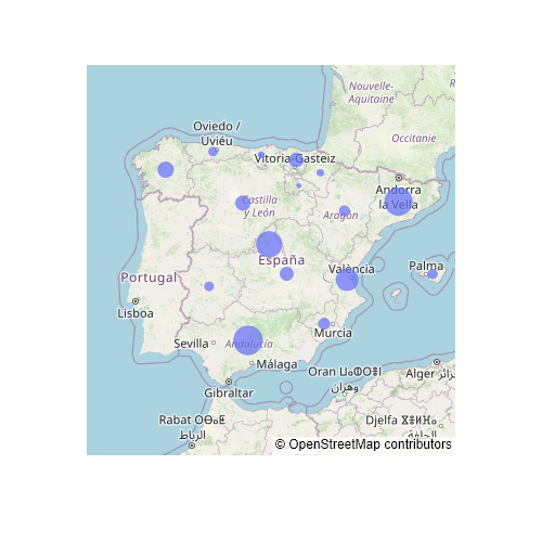
The choropleth_mapbox function from plotly
When using plotly and Python, you can make use of the choropleth_mapbox function from plotly express in order to create choropleth maps with a Mapbox map. The function is a bit complex at first glance, as you will need to input the geometries and there are several ways to do it. The most common are using a geojson for the geometries and a data frame to relate the each geometry with a value and the other is to use a shapefile with all the data stored (geometries and values).
Data from a geojson
If your geometries are stored in a geojson file you will need to import them and you will also need to import the data frame with at least an identifier and the values. After importing your data, you will need to input the data frame to data_frame and the geometry to geojson. You will also need to set featureidkey to the geojson identifier (defaults to id and in other case takes the form properties.<key>) which matches the column name passed to locations. Finally, you will need to input the name of the column of the data frame representing values to color.
The other arguments are used to set the map style, the center point of the map and the zoom level.
from urllib.request import urlopen
import json
import pandas as pd
import plotly.express as px

# Geojson
with urlopen('https://github.com/R-CoderDotCom/data/blob/main/shapefile_spain/spain.geojson?raw=true') as response:
    ccaa = json.load(response)

# Data
unemp_rates = pd.read_csv("https://raw.githubusercontent.com/R-CoderDotCom/data/main/shapefile_spain/unemployment_rates.csv",
                   dtype = {"ccaa_id": str}, encoding = 'latin-1')

fig = px.choropleth_mapbox(
    data_frame = unemp_rates,            # Data frame with values
    geojson = ccaa,                      # Geojson with geometries
    featureidkey = 'properties.ccaa_id', # Geojson key which relates the file with the data from the data frame
    locations = 'ccaa_id',               # Name of the column of the data frame that matches featureidkey
    color = 'unemp_rate',                # Name of the column of the data frame with the data to be represented
    mapbox_style = 'open-street-map',
    center = dict(lat = 40.0, lon = -3.72),
    zoom = 4)

fig.show()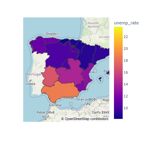
The default Mapbox style requires an API token in order to work, so if you don’t have one you will need to specify any of the styles that not require an API token, which are: ‘open-street-map’, ‘white-bg’, ‘carto-positron’, ‘carto-darkmatter’, ‘stamen-terrain’, ‘stamen-toner’ and ‘stamen-watercolor’. If you have a token, you can use the plotly.express.set_mapbox_access_token() function to set it. The styles that require the Mapbox token are named: ‘basic’ (the default), ‘streets’, ‘outdoors’, ‘light’, ‘dark’, ‘satellite’ and ‘satellite-streets’.
Data from a shapefile
If your data is from a shapefile you will need to read it with geopandas or other similar library. Then, you will need to input your data as in the example below.
import geopandas
import plotly.express as px

# Shapefile data
shp = geopandas.read_file("https://github.com/R-CoderDotCom/data/blob/main/shapefile_spain/spain.zip?raw=true")
shp = shp.to_crs("WGS84")

fig = px.choropleth_mapbox(
    data_frame = shp.set_index("ccaa_id"), # Using the id as index of the data
    geojson = shp.geometry,                # The geometry
    locations = shp.index,                 # The index of the data
    color = 'unemp_rate',
    mapbox_style = 'open-street-map',
    center = dict(lat = 40.0, lon = -3.72),
    zoom = 4)

fig.show()
Hover
If you hover over each region of Spain you can read the identifier and the unemployment rate. However, you can also pass the column name of a variable to hover_name, so that variable will also appear when hover. In the following example we are passing the name of each autonomous community.
from urllib.request import urlopen
import json
import pandas as pd
import plotly.express as px

# Geojson
with urlopen('https://github.com/R-CoderDotCom/data/blob/main/shapefile_spain/spain.geojson?raw=true') as response:
    ccaa = json.load(response)

# Data
unemp_rates = pd.read_csv("https://raw.githubusercontent.com/R-CoderDotCom/data/main/shapefile_spain/unemployment_rates.csv",
                   dtype = {"ccaa_id": str}, encoding = 'latin-1')

fig = px.choropleth_mapbox(
    data_frame = unemp_rates,
    geojson = ccaa,
    featureidkey = 'properties.ccaa_id',
    locations = 'ccaa_id',
    color = 'unemp_rate',
    hover_name = 'name',
    mapbox_style = 'open-street-map',
    center = dict(lat = 40.0, lon = -3.72),
    zoom = 4)

fig.show()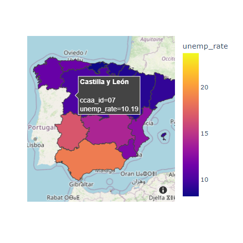
Color palette
It is possible to customize the color palette used for the choropleths passing a list of colors or a plotly color palette to color_continuous_scale. Note that you can also customize the level of transparency with opacity, which will let you see what’s behind.
from urllib.request import urlopen
import json
import pandas as pd
import plotly.express as px

# Geojson
with urlopen('https://github.com/R-CoderDotCom/data/blob/main/shapefile_spain/spain.geojson?raw=true') as response:
    ccaa = json.load(response)

# Data
unemp_rates = pd.read_csv("https://raw.githubusercontent.com/R-CoderDotCom/data/main/shapefile_spain/unemployment_rates.csv",
                   dtype = {"ccaa_id": str}, encoding = 'latin-1')

fig = px.choropleth_mapbox(
    data_frame = unemp_rates,
    geojson = ccaa,
    featureidkey = 'properties.ccaa_id',
    locations = 'ccaa_id',
    color = 'unemp_rate',
    color_continuous_scale = 'viridis',
    opacity = 0.5,
    mapbox_style = 'open-street-map',
    center = dict(lat = 40.0, lon = -3.72),
    zoom = 4)

fig.show()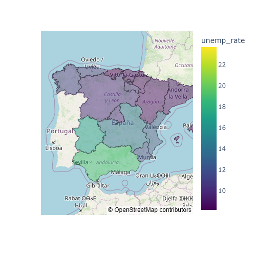
Borders style
By default, the geometries borders have a grayish color. Nonetheless, you can override the color and even the width of the lines with the marker_line_width and marker_line_color arguments from the update_traces function.
from urllib.request import urlopen
import json
import pandas as pd
import plotly.express as px

# Geojson
with urlopen('https://github.com/R-CoderDotCom/data/blob/main/shapefile_spain/spain.geojson?raw=true') as response:
    ccaa = json.load(response)

# Data
unemp_rates = pd.read_csv("https://raw.githubusercontent.com/R-CoderDotCom/data/main/shapefile_spain/unemployment_rates.csv",
                   dtype = {"ccaa_id": str}, encoding = 'latin-1')

fig = px.choropleth_mapbox(
    data_frame = unemp_rates,
    geojson = ccaa,
    featureidkey = 'properties.ccaa_id',
    locations = 'ccaa_id',
    color = 'unemp_rate',
    color_continuous_scale = 'viridis',
    mapbox_style = 'open-street-map',
    center = dict(lat = 40.0, lon = -3.72),
    zoom = 4)

fig.update_traces(marker_line_width = 2, marker_line_color = 'white')

fig.show()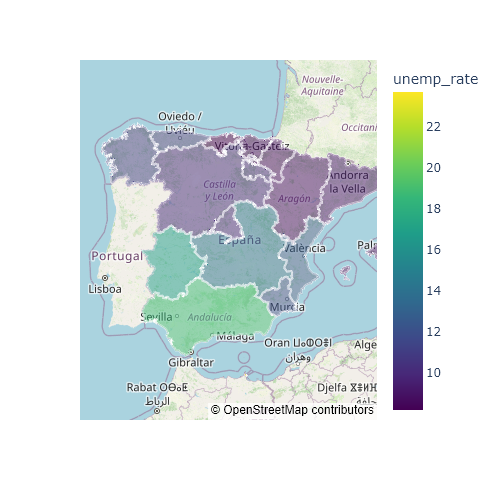
Map style
You can change the Mapbox style with the mapbox_style argument. There are several map styles available, but some require a Mapbox API token while others don’t.
from urllib.request import urlopen
import json
import pandas as pd
import plotly.express as px

# Geojson
with urlopen('https://github.com/R-CoderDotCom/data/blob/main/shapefile_spain/spain.geojson?raw=true') as response:
    ccaa = json.load(response)

# Data
unemp_rates = pd.read_csv("https://raw.githubusercontent.com/R-CoderDotCom/data/main/shapefile_spain/unemployment_rates.csv",
                   dtype = {"ccaa_id": str}, encoding = 'latin-1')

fig = px.choropleth_mapbox(
    data_frame = unemp_rates,
    geojson = ccaa,
    featureidkey = 'properties.ccaa_id',
    locations = 'ccaa_id',
    color = 'unemp_rate',
    color_continuous_scale = 'viridis',
    mapbox_style = 'stamen-terrain',
    center = dict(lat = 40.0, lon = -3.72),
    zoom = 4)

fig.show()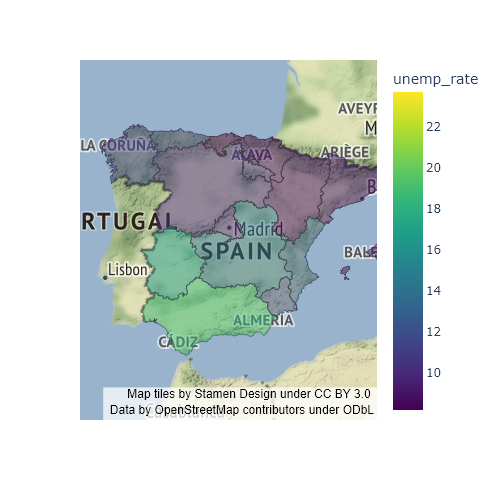
The choropleth function
The choropleth function from plotly express is an alternative to choropleth_mapbox which doesn’t depend on Mapbox. Both functions are very similar but when using choropleth you will need to set a scope (by default, scope = 'world') and you will need to pick the zoom level with update_layout. Note that you can also set a cartographic projection with projection, which default value depends on the selected scope. You fill find here the available scopes and projections.
from urllib.request import urlopen
import json
import pandas as pd
import plotly.express as px
# Geojson
with urlopen('https://github.com/R-CoderDotCom/data/blob/main/shapefile_spain/spain.geojson?raw=true') as response:
ccaa = json.load(response)
# Data
unemp_rates = pd.read_csv("https://raw.githubusercontent.com/R-CoderDotCom/data/main/shapefile_spain/unemployment_rates.csv",
dtype = {"ccaa_id": str}, encoding = 'latin-1')
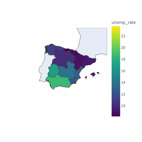
fig = px.choropleth(
data_frame = unemp_rates,
geojson = ccaa,
featureidkey = 'properties.ccaa_id',
locations = 'ccaa_id',
color = 'unemp_rate',
color_continuous_scale = 'viridis',
scope = 'europe',
center = dict(lat = 40.0, lon = -3.72))
fig.update_layout(autosize = True, geo = dict(projection_scale = 5))
fig.show()Base map visibility
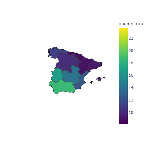
Note that this function allows to hide the base map setting basemap_visible = False.
from urllib.request import urlopen
import json
import pandas as pd
import plotly.express as px

# Geojson
with urlopen('https://github.com/R-CoderDotCom/data/blob/main/shapefile_spain/spain.geojson?raw=true') as response:
    ccaa = json.load(response)

# Data
unemp_rates = pd.read_csv("https://raw.githubusercontent.com/R-CoderDotCom/data/main/shapefile_spain/unemployment_rates.csv",
                   dtype = {"ccaa_id": str}, encoding = 'latin-1')

fig = px.choropleth(
    data_frame = unemp_rates,
    geojson = ccaa,
    featureidkey = 'properties.ccaa_id',
    locations = 'ccaa_id',
    color = 'unemp_rate',
    color_continuous_scale = 'viridis',
    scope = 'europe',
    center = dict(lat = 40.0, lon = -3.72),
    basemap_visible = False)

fig.update_layout(autosize = True, geo = dict(projection_scale = 5))

fig.show()