Data
In this tutorial we are going to use the following data for illustration purposes.
import numpy as np

# Seed
rng = np.random.RandomState(0)

# Data simulation
x = np.array(range(0, 20))
y = np.square(x) + rng.uniform(0, 100, 20)

# Data set
df = {'x': x, 'y': y}
Basic line charts with lineplot
The lineplot function from seaborn allows creating line graphs in Python. You just need to pass your data to the function to create a basic plot with a blue solid line by default.
import seaborn as sns

sns.lineplot(x, y)

# Equivalent to:
sns.lineplot(x = "x", y = "y", data = df)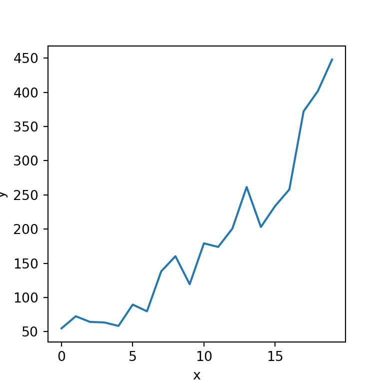
Line plot with markers
In case you want to add markers to the visualization you can set the desired marker with marker, as shown below.
import seaborn as sns

sns.lineplot(x = "x", y = "y", data = df,
             marker = "o")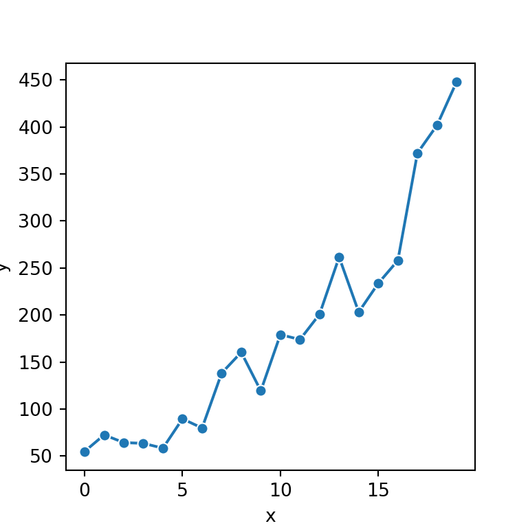
Line colors and styles
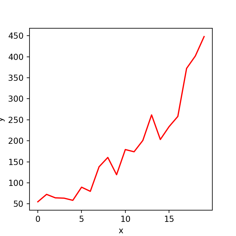
Color
The color argument of the function controls the color of the line of the plot. You can select the color you desire for your visualization.
import seaborn as sns

sns.lineplot(x = "x", y = "y", data = df,
             color = "red")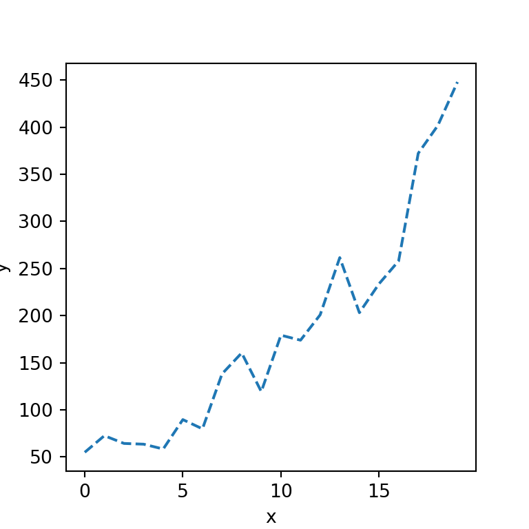
Dashed line
The style of the line can be set with the linestyle argument. In the following example we are creating a dashed line but you could also create a dotted line with "dotted".
import seaborn as sns

sns.lineplot(x = "x", y = "y", data = df,
            linestyle = "dashed")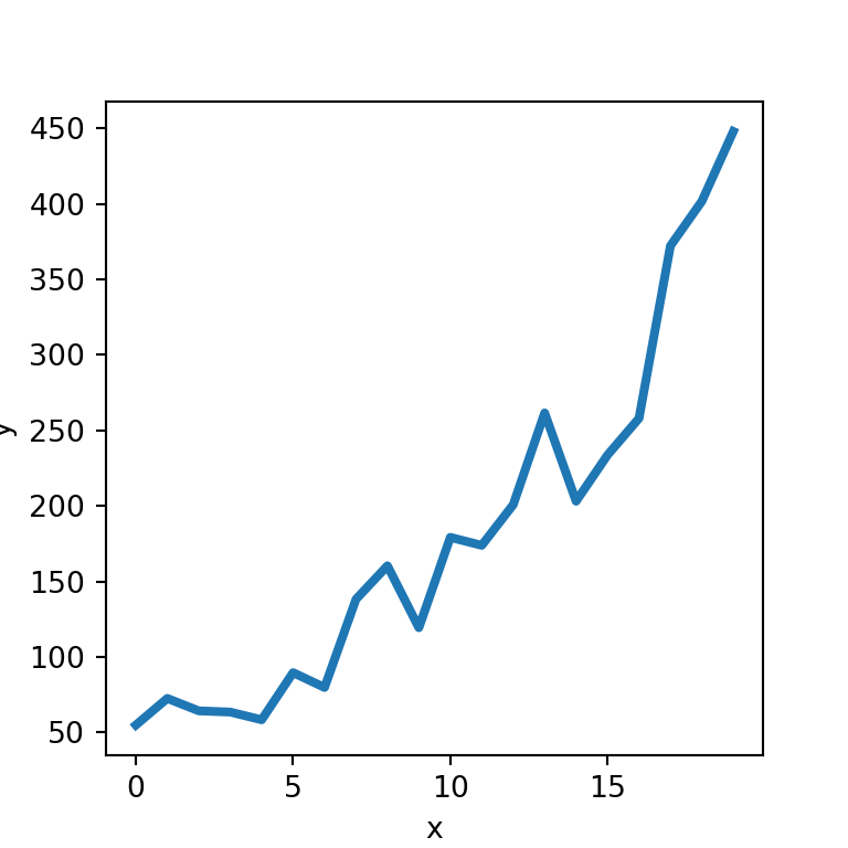
Width of the line
Finally, if you want to modify the default width of the line you can pass any value to linewidth, as in the example below.
import seaborn as sns

sns.lineplot(x = "x", y = "y", data = df,
             linewidth = 3)


