Sample data
In order to create a line chart with matplotlib you just need two arrays representing the values for the X and Y axis. The following data will be used for illustration purposes in the examples below.
import numpy as np

# Data
x = np.linspace(0, 10, 25)
y = np.sin(x) + x/2
Line graph in matplotlib with plot
Using the previous data you can create a simple line graph in Python with the plot function.
import numpy as np
import matplotlib.pyplot as plt

# Data
x = np.linspace(0, 10, 25)
y = np.sin(x) + x/2

# Line chart
fig, ax = plt.subplots()
ax.plot(x, y)
# plt.show()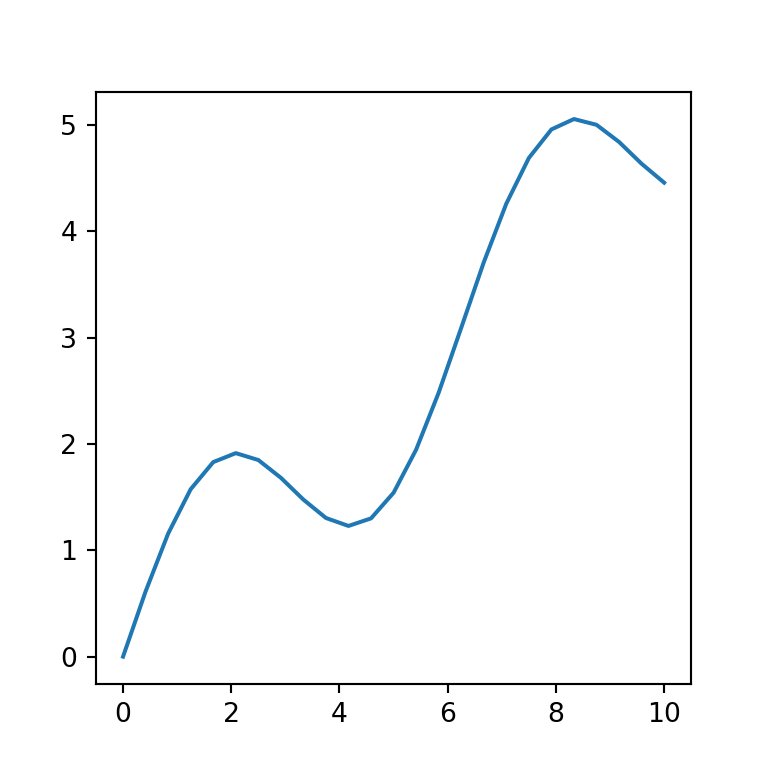
Color of the line
The line plot can be customized through several additional arguments. For instance, if you want to change the default color of the line you can use the color argument and specify a new color.
import numpy as np
import matplotlib.pyplot as plt

# Data
x = np.linspace(0, 10, 25)
y = np.sin(x) + x/2

# Line chart
fig, ax = plt.subplots()
ax.plot(x, y, color = "r")
# plt.show()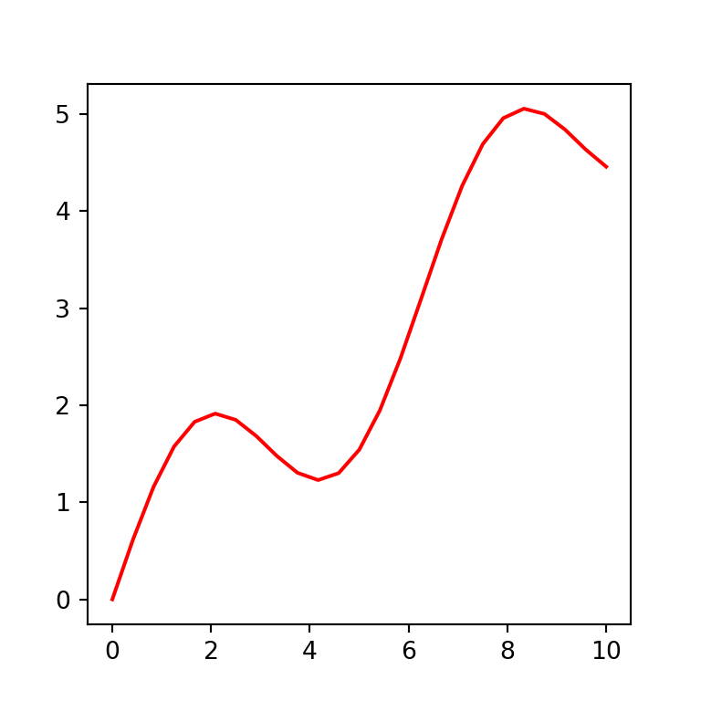
Line width
In case you want to customize the width of the line you can pass a float to linewidth or lw.
import numpy as np
import matplotlib.pyplot as plt

# Data
x = np.linspace(0, 10, 25)
y = np.sin(x) + x/2

# Line chart
fig, ax = plt.subplots()
ax.plot(x, y, linewidth = 4)
# ax.plot(x, y, lw = 4) # Equivalent
# plt.show()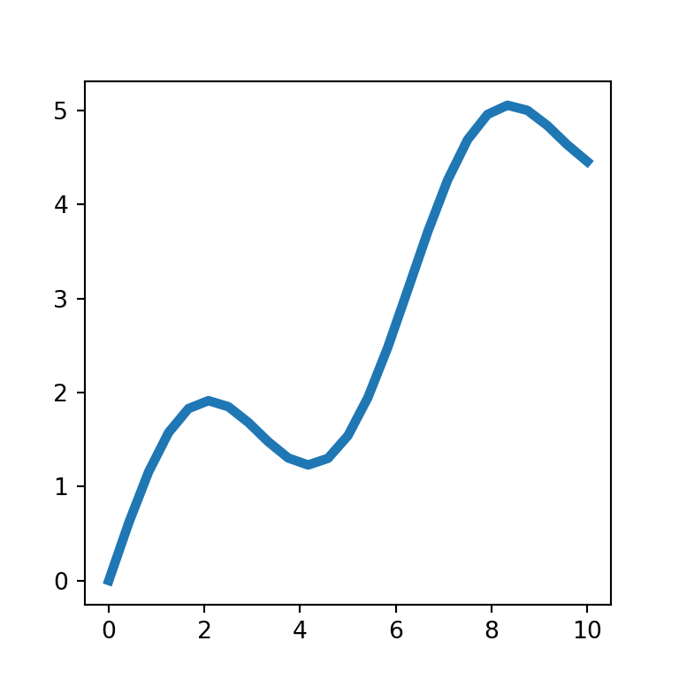
Line style
By default, the line plot is created with a solid line, but the linestyle or ls argument allows creating dashed lines ("--"), dash-dot lines ("-.") or dotted lines (":").
import numpy as np
import matplotlib.pyplot as plt

# Data
x = np.linspace(0, 10, 25)
y = np.sin(x) + x/2

# Line chart
fig, ax = plt.subplots()
ax.plot(x, y, linestyle = "--")
# ax.plot(x, y, ls = "--") # Equivalent
# plt.show()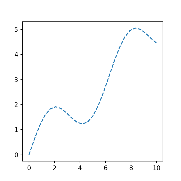
Adding markers to the points
You can add a marker for each pair of coordinates with the marker argument. There are a lots of different matplotlib markers to choose, such "o" for circles, "*" for stars or "D" for diamonds, among others. In addition, you can use the markersize or ms argument to increase or decrease the markers size.
import numpy as np
import matplotlib.pyplot as plt

# Data
x = np.linspace(0, 10, 25)
y = np.sin(x) + x/2

# Line chart
fig, ax = plt.subplots()
ax.plot(x, y, marker = "o", markersize = 5)
# ax.plot(x, y, marker = "o", ms = 5) # Equivalent
# plt.show()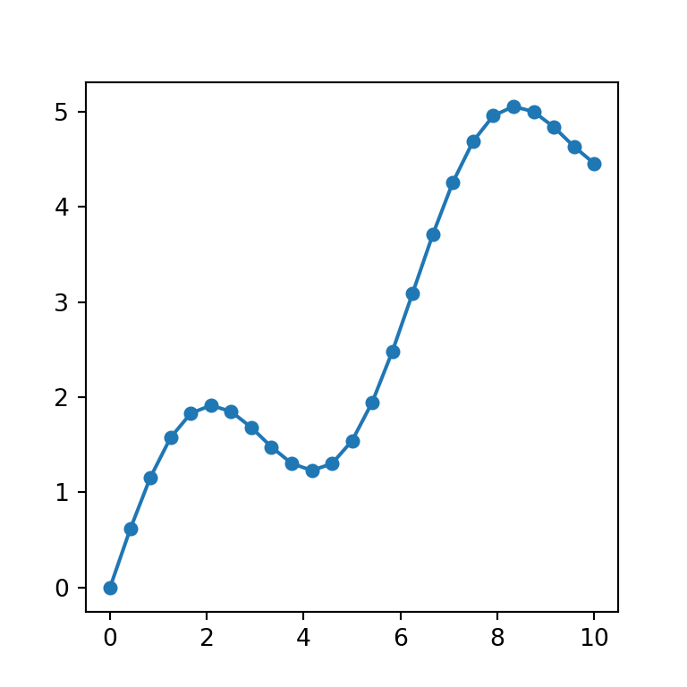
Line and markers with different color
In case you want to set a different color for the line and the markers you will need to use the markerfacecolor (or mfc) argument to change the marker fill color and the markeredgecolor (or mec) argument to customize the border color of the markers, as in the example below.
import numpy as np
import matplotlib.pyplot as plt

# Data
x = np.linspace(0, 10, 25)
y = np.sin(x) + x/2

# Line chart
fig, ax = plt.subplots()
ax.plot(x, y, color = "r", marker = 's',
        markerfacecolor = 'black', markeredgecolor = 'black')
# ax.plot(x, y, color = "r", marker = 's', mfc = 'black', mec = 'black') # Equivalent
# plt.show()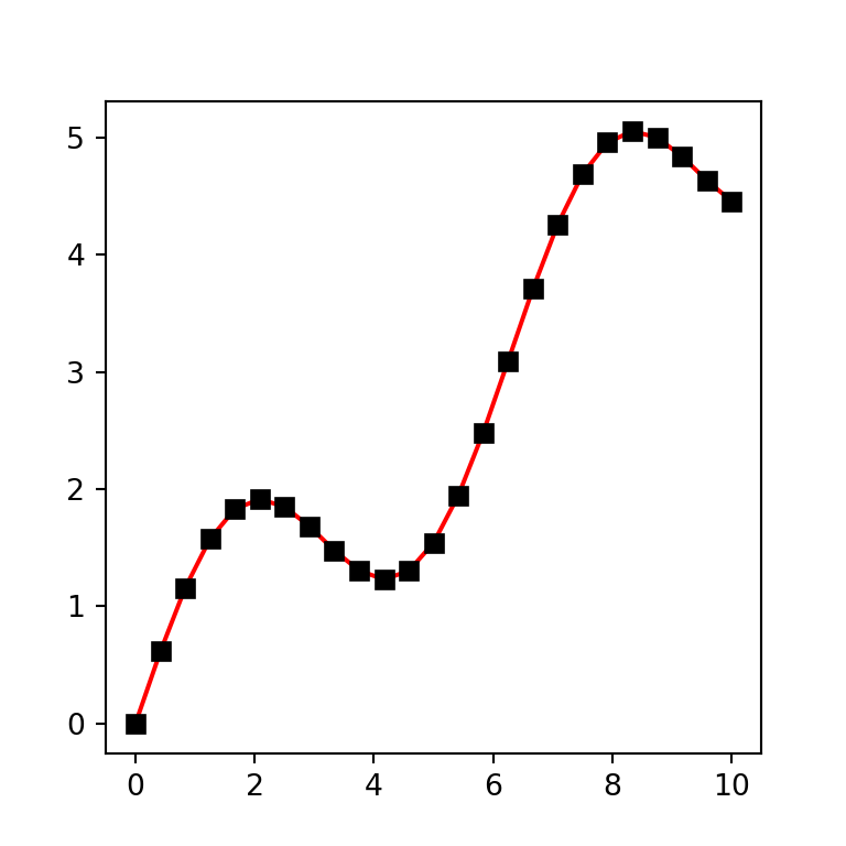
Using format strings (fmt)
The plot function provides an alternative method to set the markers, colors and line styles with format strings (fmt). These strings have the following format: fmt = '[marker][line][color]', where each element is optional. In the following example we are setting "*g-", this is, a star marker (*), green color (g) and continuous line (-).
import numpy as np
import matplotlib.pyplot as plt

# Data
x = np.linspace(0, 10, 25)
y = np.sin(x) + x/2

# Line chart
fig, ax = plt.subplots()
ax.plot(x, y, "*g-")
plt.show()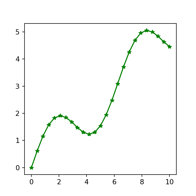
Line chart with multiple lines
It is possible to add more lines over the line graph. For this purpose there are several options and the selection of one will depend on your needs.
Option 1: calling plot multiple times
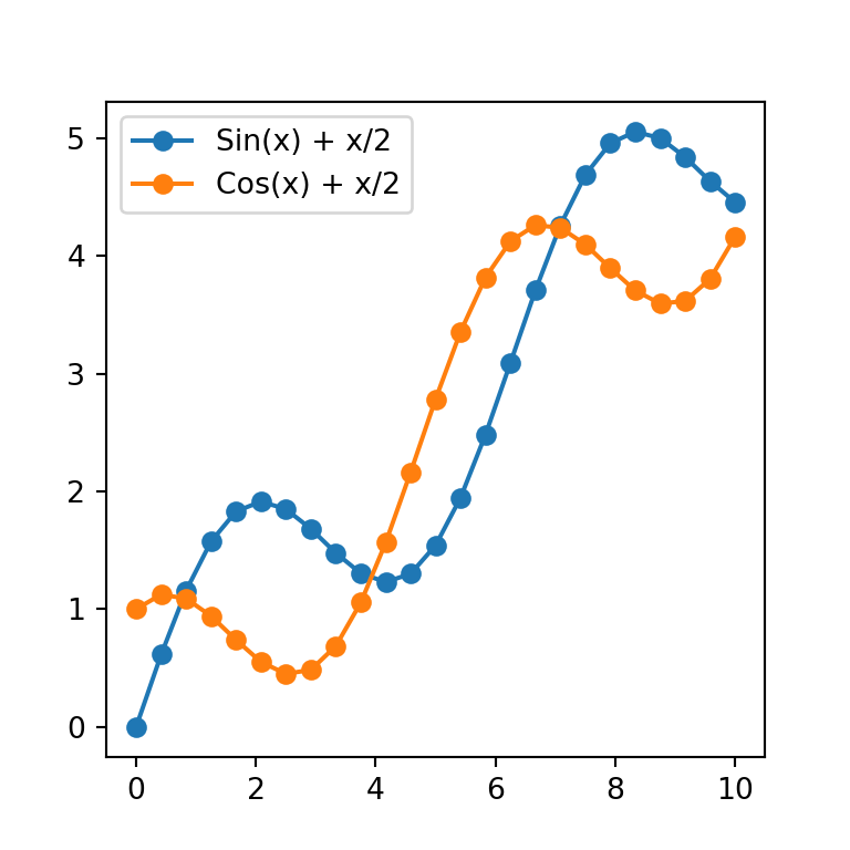
This option is the easiest way to create a line graph with multiple lines in matplotlib, but if you want to plot too many lines you should add them by using a for loop. Note that you can add an automatic legend setting the labels with label and using the legend function.
import numpy as np
import matplotlib.pyplot as plt

# Data
x1 = np.linspace(0, 10, 25)
y1 = np.sin(x) + x/2

x2 = np.linspace(0, 10, 25)
y2 = np.cos(x) + x/2

# Line chart
fig, ax = plt.subplots()
ax.plot(x1, y1, marker = "o", label = "Sin(x) + x/2")
ax.plot(x2, y2, marker = "o", label = "Cos(x) + x/2")
ax.legend()

# plt.show()
Option 2: specifying multiple sets of data
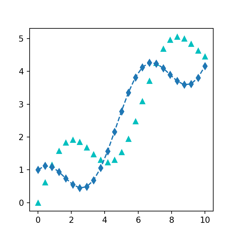
This alternative saves some lines of code but to our knowledge at this moment you can’t add legend labels in a straightforward way using the labels argument as in the previous example.
import numpy as np
import matplotlib.pyplot as plt

# Data
x1 = np.linspace(0, 10, 25)
y1 = np.sin(x) + x/2

x2 = np.linspace(0, 10, 25)
y2 = np.cos(x) + x/2

# Line chart
fig, ax = plt.subplots()
ax.plot(x1, y1, "c^", x2, y2, "d--")

# plt.show()
The last option is creating 2D arrays and passing them to the function.
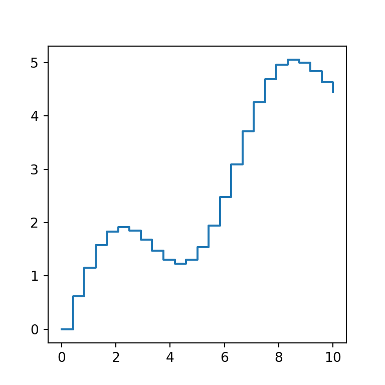
Step plot with step
Matplotlib provides other function to create a type of line charts named step plots, where the points are joined with a ‘stair’ style. The function is named step and behaves the same way as plot.
import numpy as np
import matplotlib.pyplot as plt

# Data
x = np.linspace(0, 10, 25)
y = np.sin(x) + x/2

# Line chart
fig, ax = plt.subplots()
ax.step(x, y)
# plt.show()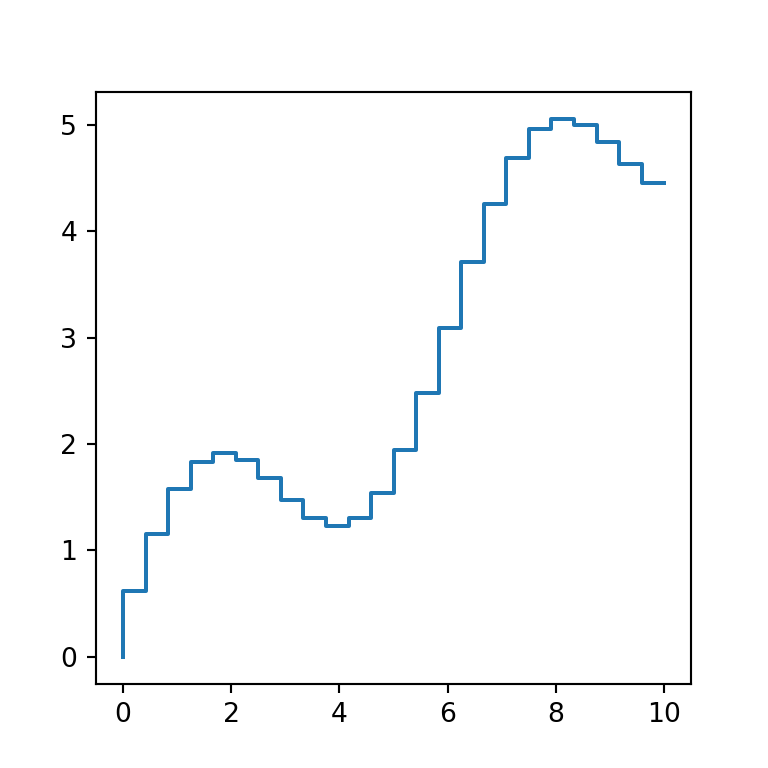
The only difference between step and plot is that the former provides the where argument, which defines where the steps should be placed. The possible options are "pre" (default), "post" and "mid".
import numpy as np
import matplotlib.pyplot as plt

# Data
x = np.linspace(0, 10, 25)
y = np.sin(x) + x/2

# Line chart
fig, ax = plt.subplots()
ax.step(x, y, where = "post")
# plt.show()