Sample data
Consider the following sample data for this tutorial, where each day between 2020-01-01 and 2023-06-30 is represented by a single value.
import numpy as np; np.random.seed(1)
import pandas as pd

# Sequence of dates
days = pd.date_range('01/01/2020', periods = 1277, freq = 'D')

# Pandas time series with random data for each day
values = pd.Series(np.random.randn(len(days)), index = days)
Calendar heatmap with calplot
In Python you can make use of the calplot library to create calendar heatmaps. This library is an update of the no longer maintained calmap library, providing easier customization in addition of new features.
In order to create the calendar you just need to input your pandas time series with data for each day to the calplot function, which will plot all the years provided on your data. Note that the suptitle argument can be used to add a title to the figure and can be customized passing a dict to suptitle_kws.
import calplot
import matplotlib.pyplot as plt

calplot.calplot(values,
                suptitle = 'Calendar',
                suptitle_kws = {'x': 0.5, 'y': 1.0})
# plt.show()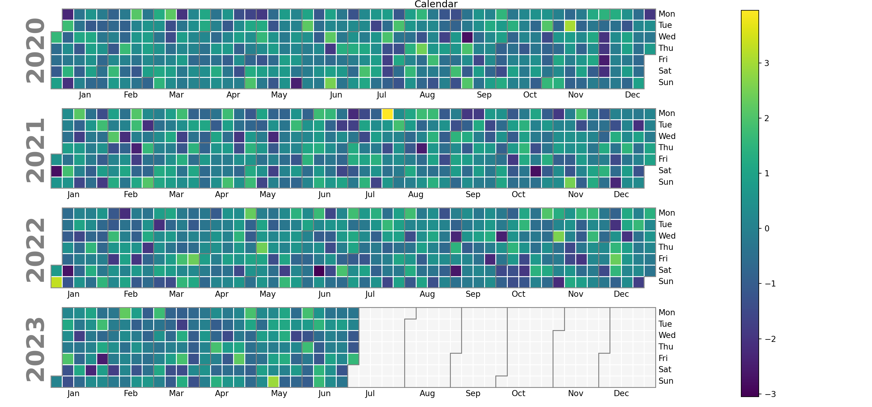
Years in descending order
By default, years are presented in ascending order, but you can reverse the order by setting yearascending = False.
import calplot
import matplotlib.pyplot as plt

calplot.calplot(values, yearascending = False,
                suptitle = 'Calendar with years in descending order',
                suptitle_kws = {'x': 0.5, 'y': 1.0})
# plt.show()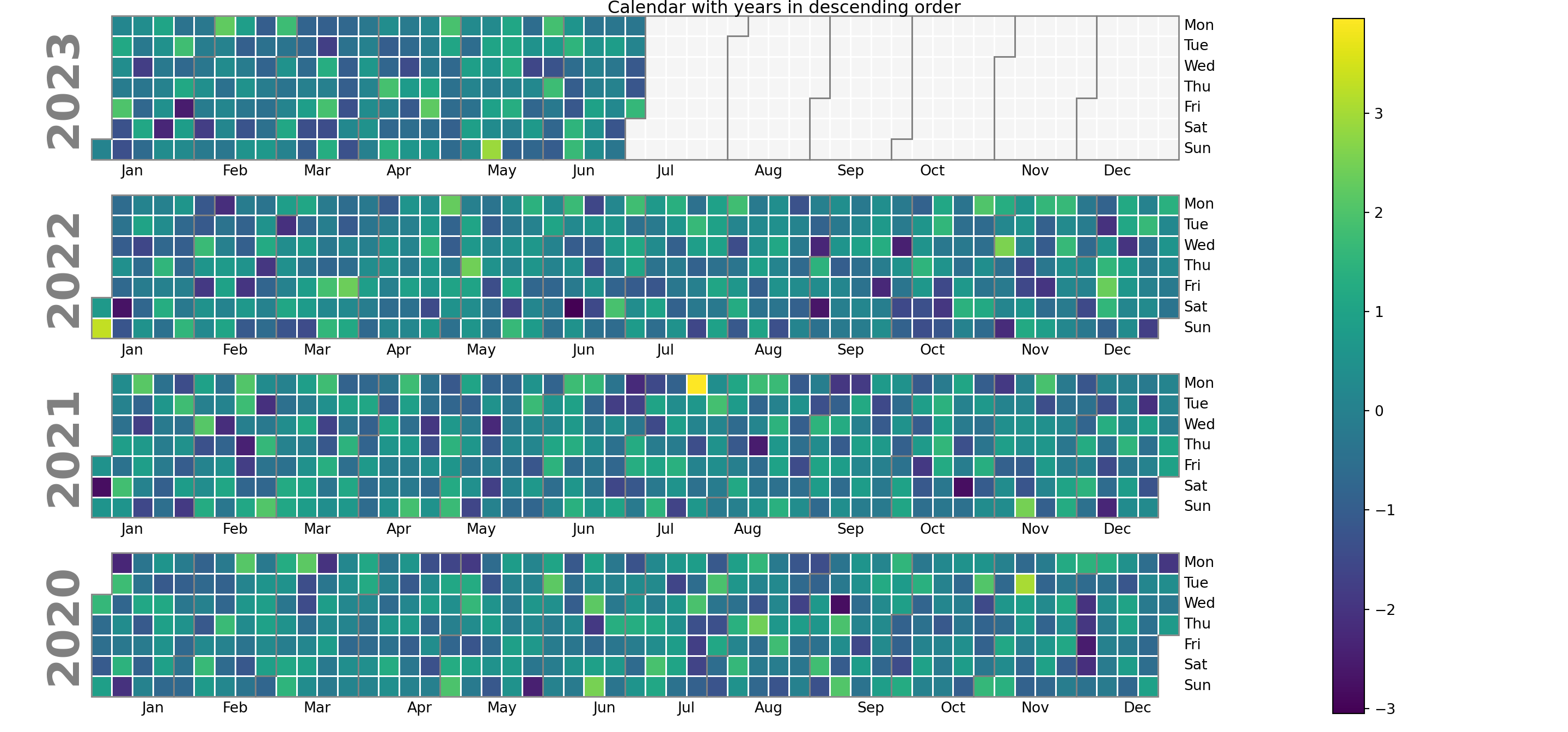
Plot only one year
If you want to specify just one year you can use the yearplot function and use the year argument. However, we recommend you to use calplot and filter your data, as calplot wraps yearplot and the output is more customizable.
import calplot
import matplotlib.pyplot as plt

# Recommended approach with calplot:
calplot.calplot(values.loc['2021'])

# With yearplot:
calplot.yearplot(values, year = 2021)

# plt.show()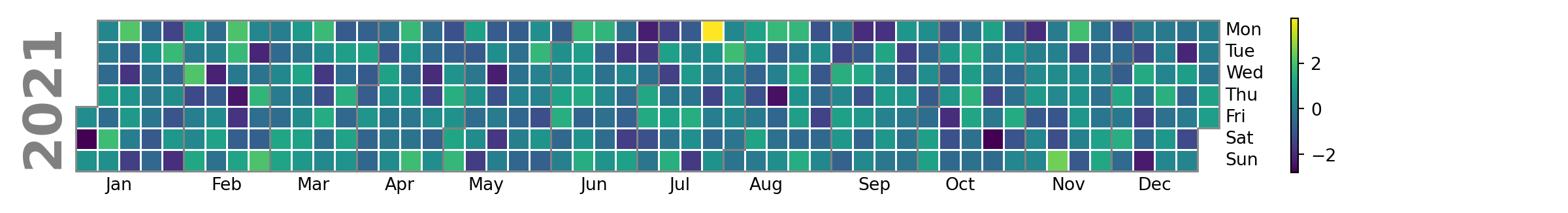
Remove the legend
Note that you can remove the legend if you wish setting colorbar = False.
import calplot
import matplotlib.pyplot as plt

calplot.calplot(values, colorbar = False)
# plt.show()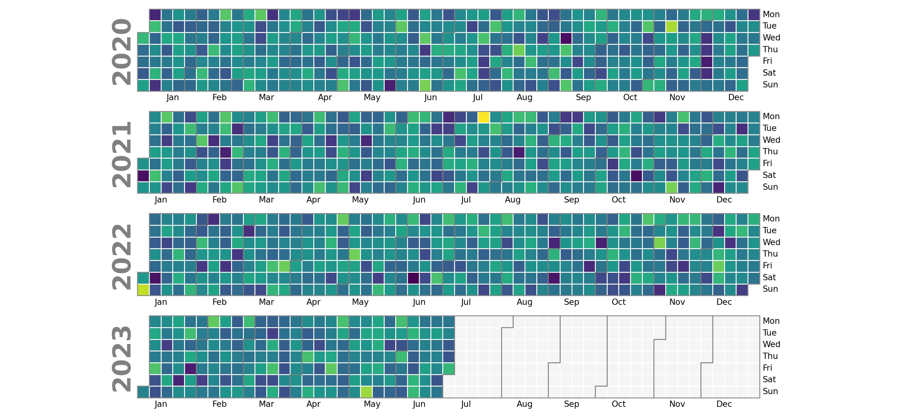
Colors
The default color palette of the heatmap ('viridis') can be customized with the cmap argument. In the following examples we will be using the 'Spectral_r' color palette.
import calplot
import matplotlib.pyplot as plt

calplot.calplot(values, cmap = 'Spectral_r')
# plt.show()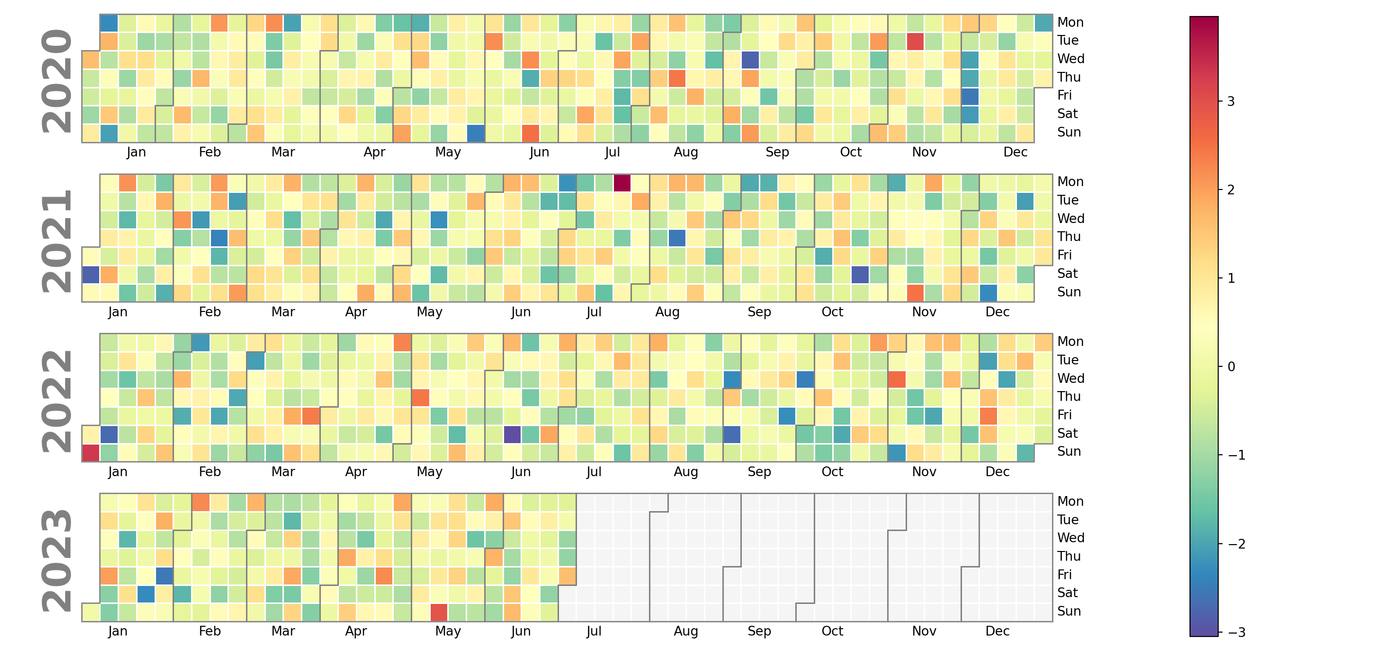
Color of the missing values
If your data contains missing values they will be colored in light gray by default. However, you can customize this color with the fillcolor argument.
import calplot
import matplotlib.pyplot as plt

calplot.calplot(values, fillcolor = 'orange', cmap = 'Spectral_r')
# plt.show()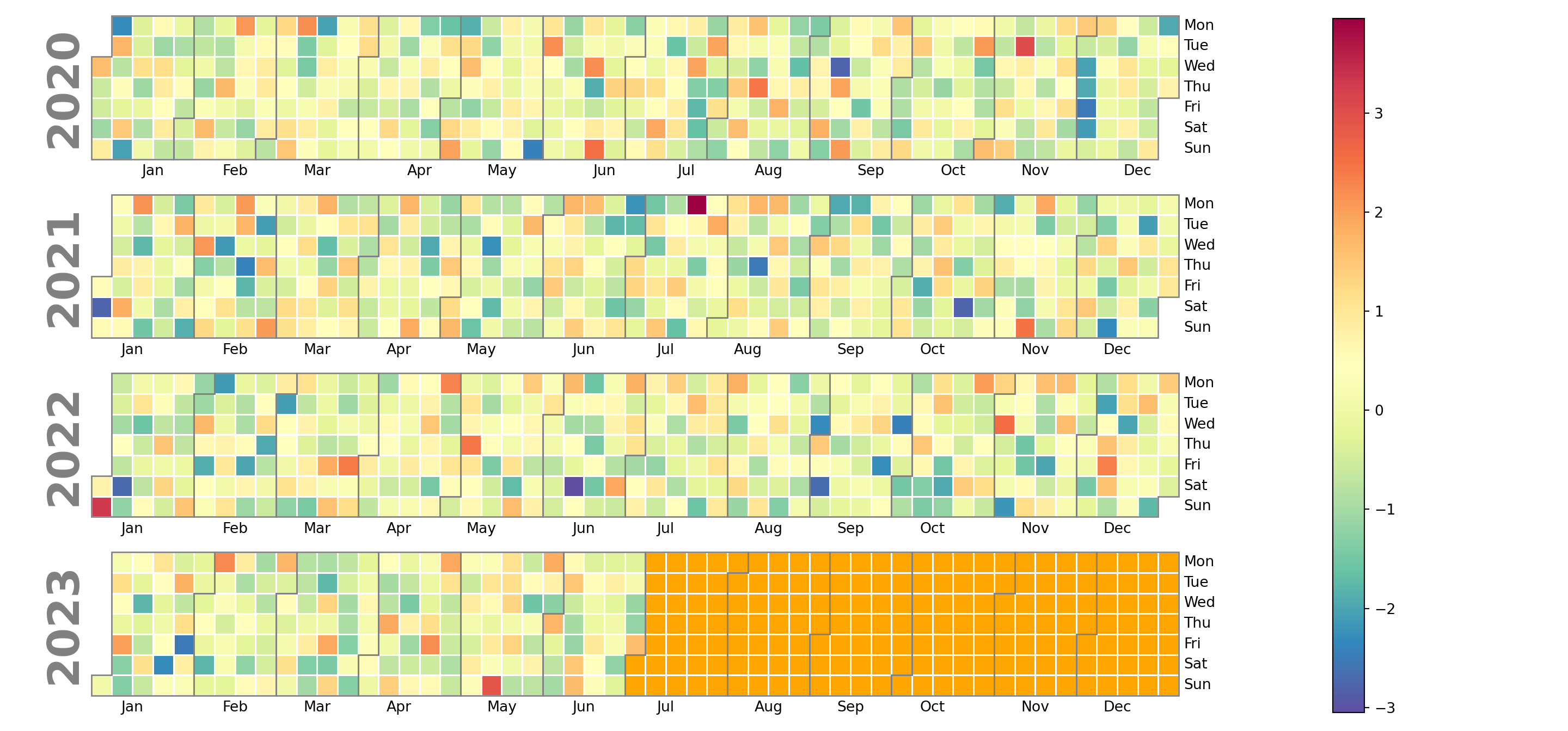
Color of the lines dividing the months
The lines dividing each month are gray by default, but you can customize its color making use of the edgecolor argument, as in the example below.
import calplot
import matplotlib.pyplot as plt

calplot.calplot(values, edgecolor = 'black', cmap = 'Spectral_r')
# plt.show()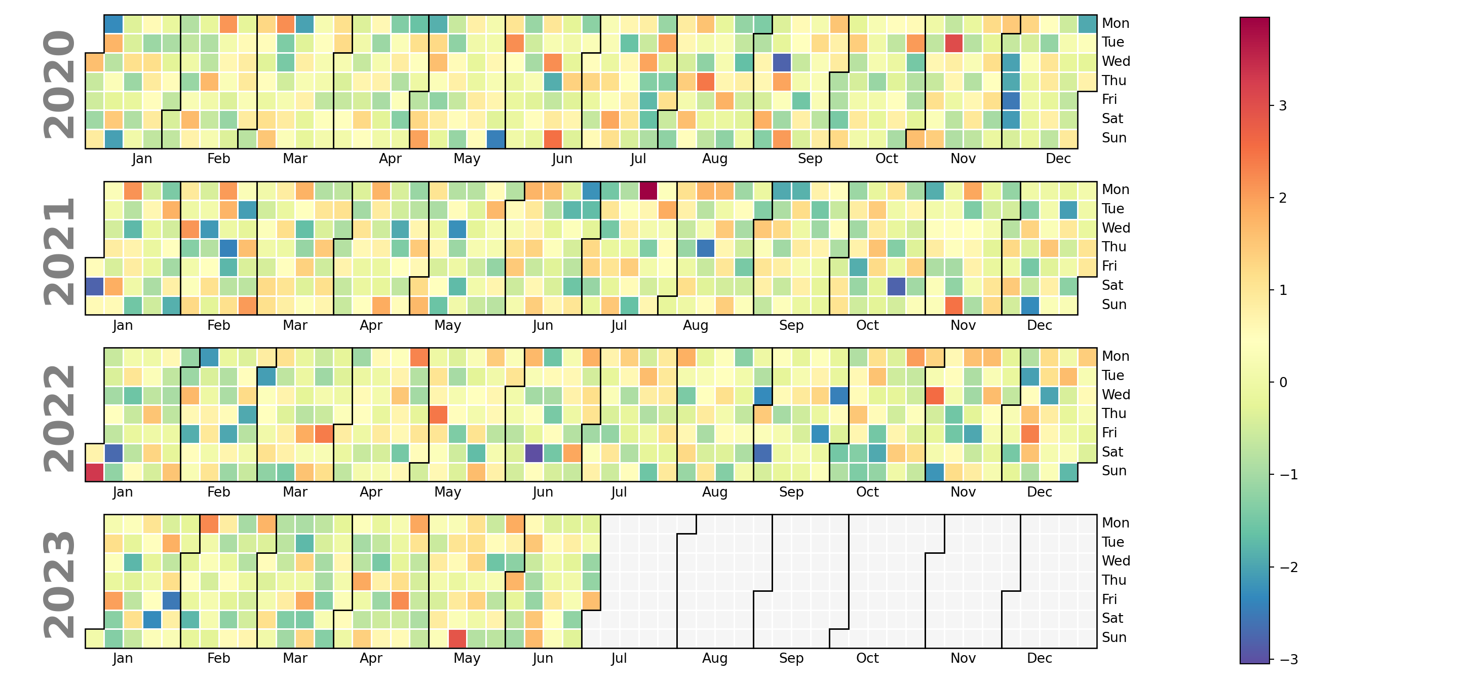
Color of the lines dividing the days
The color of the lines dividing each day can be set using linecolor. In addition, the linewidth argument, which defaults to 1, can be used to customize the width of the lines.
import calplot
import matplotlib.pyplot as plt

calplot.calplot(values, linecolor = 'green', linewidth = 1,
                cmap = 'Spectral_r')
# plt.show()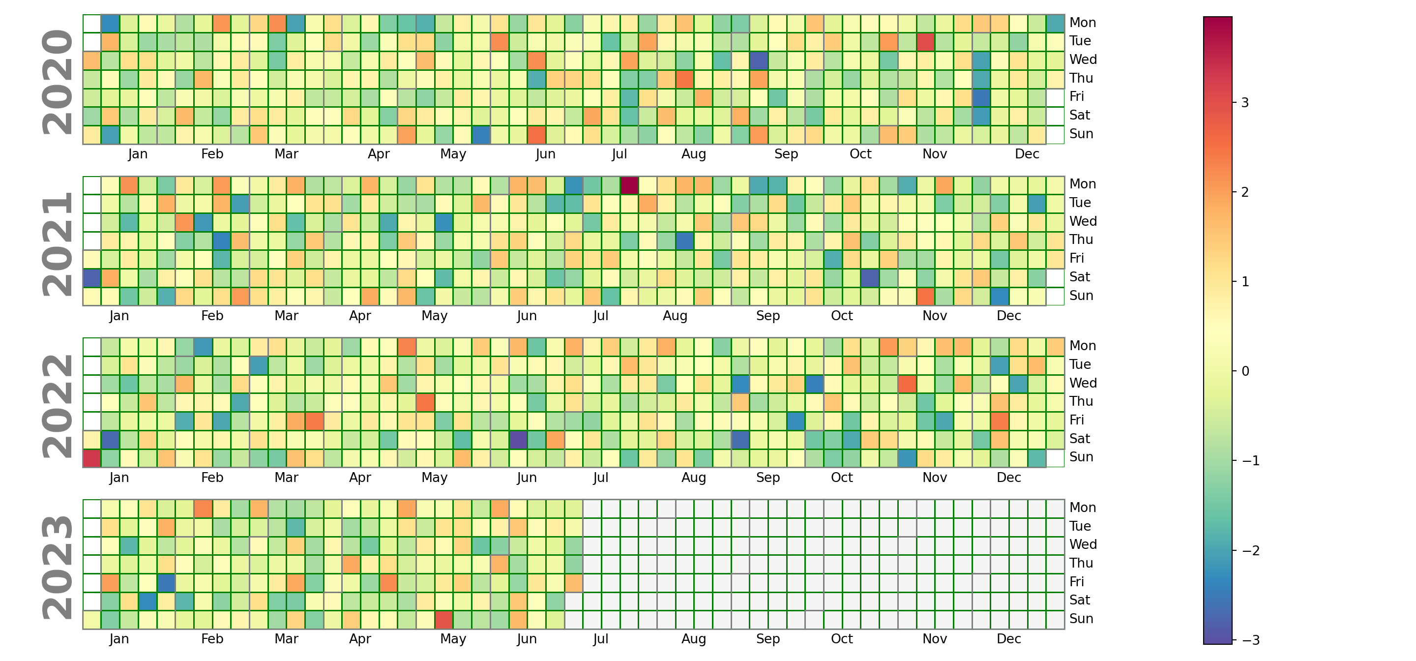
Labels
Day labels
The default day labels are the abbreviated day names in English. You can customize these labels passing a list to the daylabels argument of the function. In addition, you can also remove some day labels with dayticks passing a list of ints specifying which days to label.
import calplot
import matplotlib.pyplot as plt

calplot.calplot(values, cmap = 'RdBu',
                daylabels = ['Monday', 'Tuesday', 'Wednesday',
                             'Thursday', 'Friday', 'Saturday', 'Sunday'])
# plt.show()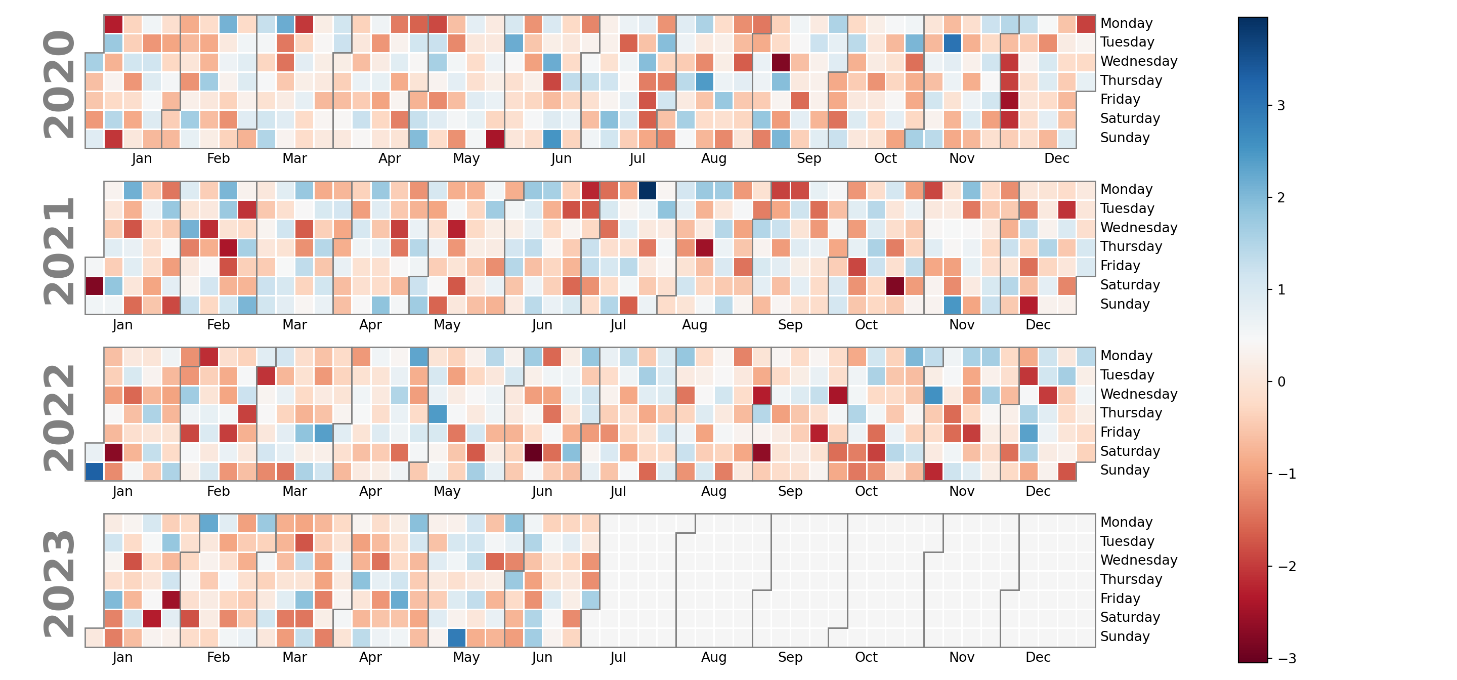
Month labels
Similar to day names you can also customize the month labels, but in this case with the monthlabels and monthticks arguments of the calplot function.
import calplot
import matplotlib.pyplot as plt

calplot.calplot(values, cmap = 'RdBu',
                monthlabels = ['January', 'February', 'March',
                               'April', 'May', 'June',
                               'July', 'August', 'September',
                               'October', 'November', 'December'])
# plt.show()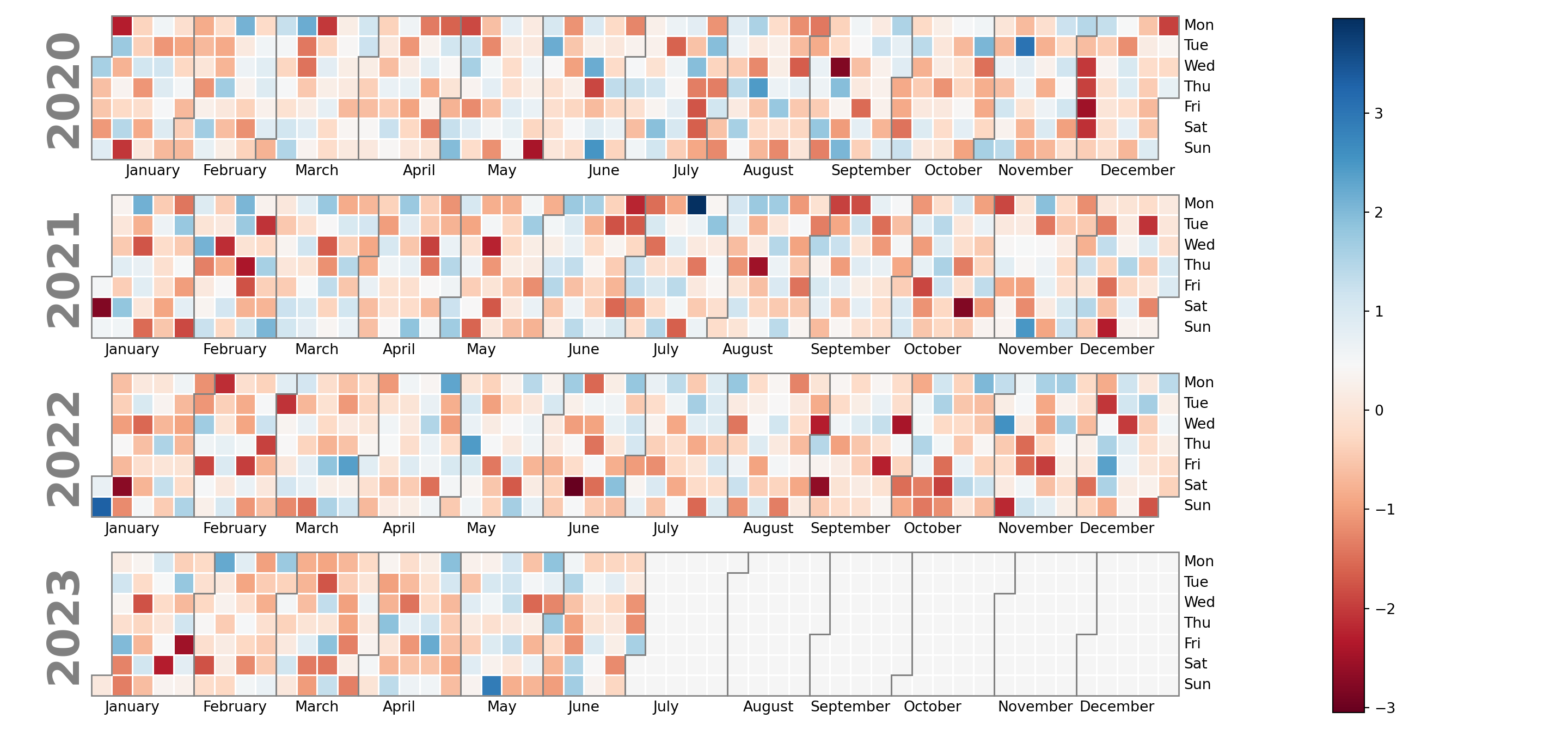
Year labels
The year labels that appear on the left can be removed setting yearlabels = False. You can also customize its size, color or other properties of the texts passing a dict to yearlabel_kws.
import calplot
import matplotlib.pyplot as plt

calplot.calplot(values, cmap = 'RdBu',
                yearlabels = True,
                yearlabel_kws = {'fontsize': 15, 'color': 'red'})
# plt.show()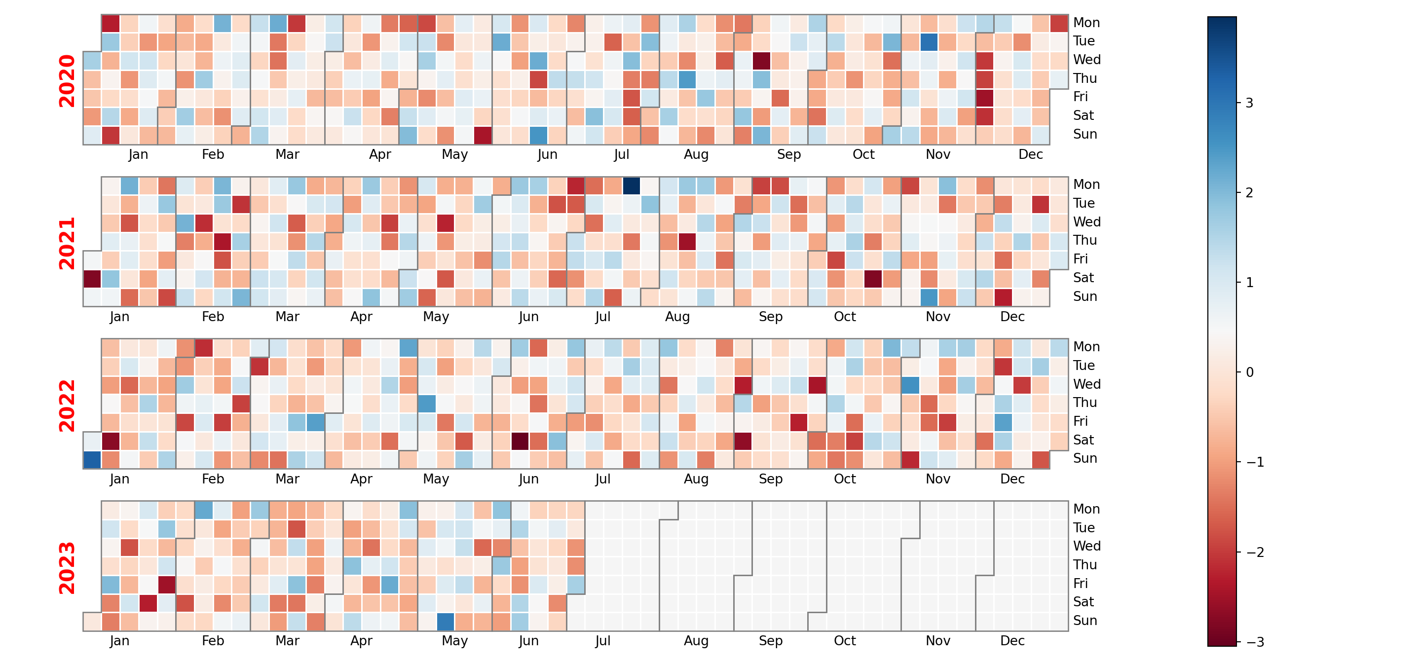
Cell labels
Finally, note that you can also add the corresponding values to the cells specifying a format to textformat. Recall that you can also set a custom text for cells without data and change the color of the texts with textcolor.
import calplot
import matplotlib.pyplot as plt

calplot.calplot(values, cmap = 'RdBu',
                textformat = '{:.0f}', textfiller = '-', textcolor = 'black')
# plt.show()